You're Overthinking Your Coffee Gallery Wall
A no-nonsense blueprint for building a coffee-themed gallery wall that looks curated, not crowded.

Most coffee gallery walls fail for one reason: too many cups, all the same size, all hung in a tidy row, all shouting the same thing. A great gallery wall has rhythm, hierarchy and a bit of breathing room. This guide walks you through the planning, pairing and hanging so you end up with something that actually feels considered.
Why a gallery wall beats a single print in kitchen and dining spaces
Kitchens are busy visual environments. You've got cabinetry, splashbacks, appliances, open shelving, hardware in two or three finishes, and probably a kettle that doesn't match anything. A single print on a kitchen wall often looks marooned, fighting all of that detail on its own.
A gallery wall holds its ground because it reads as one block of intent. Three to seven pieces grouped together create a visual anchor that competes confidently with a row of upper cabinets or a long worktop run. It also gives you flexibility: you can swap one print seasonally without rebuilding the whole wall.
The other advantage is storytelling. One coffee cup print is decoration. Five pieces that touch on coffee, ritual, mornings, citrus and a vintage café poster start to feel like a point of view.

Step 1: Choose your anchor piece (the largest cup print)
Every gallery wall needs an anchor. This is the largest print in the arrangement, the piece your eye lands on first, and the one that sets the tone for everything else. For a coffee-themed wall, this should almost always be your strongest cup print.
Aim for something in the 50x70cm or 60x80cm range as your anchor, depending on your wall. If you're working above a console, coffee bar or compact dining table, 50x70cm is the sweet spot. Above a longer run of worktop or in an open-plan dining area, push to 60x80cm or even 70x100cm.
Pick something with strong composition and a colour you actually want to live with. A muted espresso cup study in warm browns and cream will play nicely with almost any kitchen. A bold graphic print in cobalt and ochre is more demanding and will dictate the rest of your choices. Browse coffee cup wall art with this in mind: the anchor sets the colour palette for everything else.
One rule worth following: your anchor should be roughly twice the visual weight of your next largest piece. If they're too similar in size, the wall feels confused.
Step 2: Pick 2-3 complementary prints that aren't all cups
This is where most people go wrong. They find one cup print they love, then buy four more cup prints, and end up with a wall that looks like a café supply catalogue. The fix is to treat coffee as a theme, not a literal subject.
Think about what surrounds a cup of coffee in real life: a croissant, a lemon, a folded newspaper, a sprig of rosemary, morning light through a window. Those are your complementary subjects.
A reliable formula for a five-piece wall is one anchor cup print, one secondary cup or coffee-adjacent print (a cafetière, a tea pot, a steaming mug), one botanical or citrus print, one piece of typography or vintage advertisement, and one abstract or line-art piece for visual rest. That mix gives you variation without losing the thread.
Pull your supporting cast from broader food and drink art prints or kitchen art prints collections. The goal is two or three subjects that share a colour palette with your anchor but bring different shapes and textures.
Step 3: Decide on frame consistency vs. intentional mix
Frames are the unifying element when your subjects vary. You have three sensible options.
All matching frames. Same colour, same profile, same width. This is the easiest route and almost impossible to get wrong. Black frames suit modern and Scandi kitchens. Natural oak suits warm, country, or Japandi-leaning spaces. White frames disappear into pale walls and let the art do the talking.
Two-frame mix. Choose two frame finishes and alternate them with intent. Black and oak is the classic combination and works in nearly every kitchen. The trick is to balance them: if you have five prints, use three of one and two of the other, never an even split.
Intentional eclectic mix. Different frame colours, widths and even profiles, tied together by a consistent print style or palette. This looks brilliant when it works and chaotic when it doesn't. Only attempt it if your colour palette across the prints is genuinely tight.
For a kitchen specifically, framed prints are the better call than canvas. Kitchens get steamy, splashy and warm, and a properly framed print with UV-protective acrylic glaze will hold up far better near a hob or kettle than stretched canvas. The acrylic glaze (rather than glass) also means no shattering risk if a frame ever takes a knock, which matters more in a working kitchen than people think.

Layout templates: the grid, the salon hang, and the horizontal line
Three layouts cover 90% of successful coffee gallery walls. Pick one based on your wall shape and how formal you want the result.
The grid
Two rows of three, or three rows of three, all the same size, evenly spaced. Crisp, modern, almost architectural. Works beautifully above a coffee bar or in a galley kitchen where you want order and rhythm.
For a six-print grid, use 30x40cm prints with 5cm gaps. That gives you a total footprint of roughly 95x130cm, which sits well above a standard 120cm coffee station or sideboard.
The grid only works if all prints are the same size and orientation. Don't try to fudge it.
The salon hang
Mixed sizes, mixed orientations, arranged organically around a central anchor. Looks effortless, takes the most planning. This is the layout for a feature wall in a dining nook or breakfast room.
Start with your anchor slightly off-centre. Place your second-largest piece on the opposite side to balance it. Fill in with smaller prints, keeping spacing consistent (5-8cm between every frame, no exceptions) and aligning at least one edge of each frame with a neighbour. The outer perimeter should feel roughly rectangular even though the interior is varied.
The salon hang follows the rule of odds: 3, 5, 7 or 9 pieces always look better than 4, 6 or 8. Your eye finds the centre more easily.
The horizontal line
Three to five prints in a single row, all aligned along their centre line, evenly spaced. This is the workhorse layout for above a long dining table, a banquette, or a run of base cabinets where upper cabinets don't exist.
Sizes can vary slightly within a horizontal line as long as the centres align. A common pattern is small, medium, large, medium, small, with the largest in the middle as your anchor. Keep 6-8cm between frames.
If you're working with a pre-curated wall art set, the sizing decisions are already made for you, which removes most of the maths.
Sizing and spacing rules for kitchen gallery walls
The whole gallery wall should fill roughly two-thirds of the wall space above whatever it's sitting over. If your coffee bar is 120cm wide, your gallery footprint should be around 80cm wide. Wider than the furniture below and it looks unmoored. Narrower than half the furniture and it looks stingy.
Hang the centre of the arrangement at 145-150cm from the floor. That's eye-level for an average adult and the museum standard for a reason.
Above furniture, leave 15-25cm between the top of the furniture and the bottom of your lowest frame. Closer than 15cm feels cramped. More than 25cm and the art floats away from the furniture rather than relating to it.
Between frames, 5-8cm is the industry standard. Tighter looks more contemporary. Wider feels traditional. Pick a number and stick to it across the whole wall, because inconsistent spacing is the single most common reason a gallery wall looks amateur.
Plan it on the floor first. Lay the prints out, photograph the arrangement from above, then tweak. Better still, cut paper templates the size of each frame, tape them to the wall with masking tape, and live with the layout for a day before drilling anything. Most regret comes from skipping this step.
Subjects that pair brilliantly with coffee cup prints
Here's what actually works alongside kitchen cup prints, based on which subjects share visual DNA with coffee imagery.
Botanicals and herbs. Rosemary, sage, eucalyptus, olive branches. The greens and silvers complement the warm browns and creams of coffee imagery without competing. Stick to one or two botanical prints in a five-piece wall.
Citrus and fruit studies. Lemons especially. The acidic yellow against warm brown is a classic colour pairing, and citrus prints add brightness to a wall that could otherwise read too brown.
Bread, pastry and bakery illustrations. Croissants, sourdough, Victoria sponges. These are the most literal pairing and they earn their place because they share the same morning-ritual context as coffee.
Vintage advertisements and café posters. Old French café signage, mid-century Italian espresso ads, hand-lettered menu boards. These add typography and a sense of history. One per wall is plenty.
Minimalist line art. A single-line drawing of a face, a hand holding a cup, a still life. Line art gives your eye somewhere to rest between busier pieces.
Architectural and street scenes. A Parisian café exterior, a Roman piazza, a London corner shop. These work as a single statement piece within a gallery, never as a group.
The colour palette to aim for across the whole wall: warm browns, cream, sepia, soft black, with one accent colour (mustard, sage, terracotta or muted blue) repeating across two or three prints to tie everything together.

Common gallery wall mistakes and how to avoid them
Everything the same size. This is the cardinal sin. Without size variation, you have no anchor, no hierarchy and no rhythm. Even in a grid layout, the prints themselves should have varied internal compositions to compensate.
Too matchy. Five prints of coffee cups in identical illustration style with identical frames reads as flat, not cohesive. Vary at least one of: subject, illustration style, or colour intensity.
Inconsistent spacing. 4cm here, 7cm there, 10cm in the corner. Your eye reads this as carelessness even if it can't articulate why. Measure every gap.
Hanging too high. The biggest spacing mistake. People hang gallery walls at 160-170cm because that's where their eye naturally falls when they're standing at the wall holding a hammer. Step back and you'll find it floats. Centre at 145-150cm.
Ignoring the room context. A black-frame, monochrome gallery wall in a kitchen with brass hardware and warm oak cabinets will fight the room. Pull at least one finish from your existing kitchen (cabinet colour, hardware, splashback) into your frame or print palette.
Canvas near the hob or sink. Canvas is brilliant in dry rooms, but in a kitchen with steam and splashes, framed prints with proper glazing are the safer call. They wipe clean and won't warp.
Buying everything before planning. Always sketch the layout, measure the wall and decide on sizes before you order anything. Returning prints because they're the wrong size for your wall is a waste of everyone's time.
Forgetting the rule of odds. Three, five or seven pieces. Even numbers create a visual split down the middle and your eye doesn't know where to land.
Final thought
A coffee gallery wall isn't about how many cups you can fit on the wall. It's about creating a small, considered scene that makes the room feel more like yours. Start with one anchor print you genuinely love, build outwards with two or three complementary subjects, keep your spacing consistent, and hang at eye level. The rest is just decoration.


Fab-producten in dit blog
-

Poster kleurrijke koffiekopjes
Translation missing: nl.products.product.sale_price Vanaf €16,95€23,95 -

Canvas theekop lijntekening met opbeurende boodschap
Translation missing: nl.products.product.sale_price Vanaf €64,95€92,95 -

Canvas minimalistische dampende koffiekop
Translation missing: nl.products.product.sale_price Vanaf €64,95€92,95 -

Canvas koffierituelen
Translation missing: nl.products.product.sale_price Vanaf €64,95€92,95 -

Poster ochtendkoffierituelen
Translation missing: nl.products.product.sale_price Vanaf €16,95€23,95 -

Poster harmonie van gestapelde mokken
Translation missing: nl.products.product.sale_price Vanaf €16,95€23,95 -

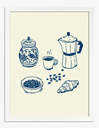
Poster koffiesfeer met mokapot en koffiebonen
Translation missing: nl.products.product.sale_price Vanaf €16,95€23,95 -

Canvas kleurrijke koffiemomenten
Translation missing: nl.products.product.sale_price Vanaf €64,95€92,95 -

Poster koffiemachine met roze mok
Translation missing: nl.products.product.sale_price Vanaf €16,95€23,95 -

Poster koffiekatten – 9 katten geïnspireerd door koffie
Translation missing: nl.products.product.sale_price Vanaf €16,95€23,95 -

Canvas minimalistisch koffiemoment in warme tinten
Translation missing: nl.products.product.sale_price Vanaf €64,95€92,95 -
Poster ochtendkoffie met croissant
Translation missing: nl.products.product.sale_price Vanaf €16,95€23,95 -

Canvas ochtendrituelen met koffie
Translation missing: nl.products.product.sale_price Vanaf €64,95€92,95 -

Poster ochtendkoffieritueel
Translation missing: nl.products.product.sale_price Vanaf €16,95€23,95 -

Canvas kleurrijke koffiemokken
Translation missing: nl.products.product.sale_price Vanaf €64,95€92,95 -
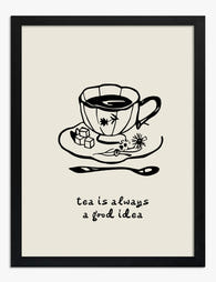
Poster theetijd inspiratie - zwart-wit
Translation missing: nl.products.product.sale_price Vanaf €16,95€23,95 -

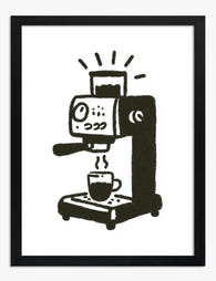
Canvas koffiemachine met kopje
Translation missing: nl.products.product.sale_price Vanaf €64,95€92,95 -

Poster minimalistisch koffiemoment in warme tinten
Translation missing: nl.products.product.sale_price Vanaf €16,95€23,95 -

Canvas gezellig koffiemoment
Translation missing: nl.products.product.sale_price Vanaf €64,95€92,95 -
Poster dagelijkse koffie – minimalistische lijntekening
Translation missing: nl.products.product.sale_price Vanaf €16,95€23,95


Meer van The Frame

Thrushes, Hares, and Peacocks: The Animals in W...
Why Morris put animals at the centre of his designs William Morris wasn't decorating walls with cute creatures. He was making a quiet argument. While Victorian factories churned out cheap,...

From Dutch Masters to Modern Minimalism: The Ke...
Search "types of flower bouquet art" and you'll get wedding centrepieces, posy guides, and cascading bridal arrangements. Useful if you're getting married. Useless if you're trying to choose what goes...

Every Flower in William Morris's World: A Guide...
William Morris designed roughly 50 wallpapers and around 30 chintzes across his career, and almost every single one features a plant. If you've ever stood in front of a Morris...