
 Bestel vandaag, levering vóór
 Beyond the Fruit Bowl: Kitchen Wall Art Ideas That Feel Fresh in 2025
Why fruit bowls and "Live Laugh Love" signs are out, and cocktail prints are the smartest kitchen upgrade of the year.


The kitchen is the most photographed, most lived-in room in your home, and yet it's usually decorated like an afterthought. A print of lemons here, a chalkboard-style coffee poster there, maybe a botanical if you're feeling brave. We think you can do better, and the good news is it doesn't require a rethink of your whole scheme.
Kitchen art clichés that need to retire (and what's replacing them)
Let's name names. The generic fruit bowl print, the sepia coffee bean chart, the "But First, Coffee" typography, the illustrated butcher's diagram of a cow, and anything featuring the words Live, Laugh, or Love in a swirly font. These were fresh once. They are not fresh now.
The problem isn't the subject matter, it's the ubiquity. When every third kitchen on the internet has the same pear illustration above the kettle, it stops feeling like a choice and starts feeling like wallpaper. Kitchen art should say something about how you cook, drink, host, and live. It should not look like it came free with the extractor fan.
What's replacing them? Cocktail and aperitif prints, considered still lifes with actual composition, vintage travel posters from wine regions, moody food photography treated as fine art, and abstract work in kitchen-adjacent palettes (think terracotta, olive, sage, amber). The through line is personality. Confidence over consensus.

Why cocktail and drinks prints are the unexpected kitchen art hero
Cocktail prints are having a proper moment, and we're all for it. Here's why they work harder in a kitchen than almost anything else.
First, the colour palettes are extraordinary. A Negroni gives you burnt orange and deep ruby. An Aperol Spritz brings that unmistakable sunset coral. A gin martini is all crisp glass, olive green, and silver. A whisky sour is amber, cream, and citrus yellow. These are richer, more sophisticated palettes than the muted greens and beiges of most botanical prints, and they photograph beautifully under warm kitchen lighting.
Second, they suit how we actually use kitchens now. The kitchen is where you host. It's where the first drink gets poured and the last one gets debated. A cocktail print acknowledges that. It bridges the home bar aesthetic into the cooking space without needing a dedicated bar cart to make it work.
Third, they age well. Botanicals can feel of-the-moment in a way that dates quickly. Cocktail illustrations, especially those with a mid-century or Art Deco leaning, sit in a longer tradition of graphic drinks design that has never really gone out of style. Our cocktail art prints collection leans into that heritage while feeling contemporary.
Finally, they're conversation starters in a way that a lemon print simply isn't. Guests notice them. They ask what the drink is. Sometimes you end up making it.
Matching art style to kitchen style
Style pairing is where most advice gets lazy. "Modern kitchens need minimal art" is not advice, it's a shrug. Here's what actually works.
Modern and minimalist kitchens
Handleless cabinets, quartz worktops, integrated appliances. Your kitchen already does restraint, so your art can do the opposite. This is where a single large statement piece earns its keep. A bold graphic cocktail print at 70x100cm, framed in black oak, hung on the wall opposite the island, will do more for the room than three smaller pieces spread out.
Look for Bauhaus-influenced geometric cocktails, high-contrast line drawings, or single-drink portraits with strong negative space. Colour-wise, one saturated hit (the orange of a Negroni, the green of a gimlet) against otherwise neutral cabinetry is very effective.
Country and farmhouse kitchens
Shaker doors, butler sinks, exposed beams if you're lucky. The temptation here is to lean into vintage food illustration, which is exactly what everyone else does. Instead, try vintage aperitif posters, the kind that once hung in French cafés advertising Suze, Byrrh, or Cinzano. They have the age and warmth country kitchens want, but they bring an edge of sophistication that stops the room tipping into pastiche.
Frame these in warm oak or walnut rather than black. A pair, hung either side of a dresser or above a farmhouse table, works better than a single piece in this style of room.
Scandinavian kitchens
Pale wood, white walls, minimal clutter, functional beauty. The mistake here is going too neutral with the art and ending up with a room that feels bloodless. Scandi kitchens can handle more colour than people think, they just want it delivered with discipline.
A clean, illustrative cocktail print in a limited palette (three or four colours, no more) hung in a pale oak frame is the sweet spot. Think stripped-back Negroni illustrations, or geometric interpretations of a Paloma or a French 75. Botanical prints also work here if you avoid the obvious, our botanical art prints collection has options that lean architectural rather than pretty.
Bold and colourful kitchens
Racing green cabinets, terracotta tiles, a pink Smeg, brass everywhere. If this is your kitchen, congratulations, you get to have the most fun. Maximalist kitchens can carry neon-bright drinks prints, pop-art cocktail portraits, retro travel posters from the Amalfi Coast, or clustered gallery walls where nothing quite matches but everything rhymes.
The rule here is that your art should be as loud as your kitchen. Timid prints look apologetic in a confident room.

Where to hang art in a kitchen (and where to absolutely avoid)
Kitchens have hazards that living rooms don't. Grease, steam, direct heat, splashing water, and swinging cupboard doors. Get placement right and your art lasts decades. Get it wrong and you're replacing prints every few years.
The safe zones:
- The wall opposite your hob or sink (facing the cooking action, not next to it)
- Above a dining table or breakfast nook
- The narrow strips between wall cabinets and worktops
- Above open shelving or a dresser
- On the wall guests see from island seating (your entertainment-facing wall)
The no-go zones:
- Directly behind the hob, and less than 60cm to either side
- Immediately above the kettle (steam plume goes straight up)
- Within 45cm of the sink taps
- Anywhere a cupboard door will hit it when opened
The classic question of whether you can put art above a kitchen sink deserves a proper answer. Yes, if the sink has a window above it you're fine, and if there's a decent expanse of wall you can hang something small. But leave at least 45cm of clearance from the tap arc, and choose a print you're happy to occasionally wipe down.
Above the hob is genuinely a bad idea regardless of extraction. Heat, steam, and aerosolised oil will find their way onto the frame and print surface over time, even with a UV-protective glaze. Save your favourite pieces for calmer walls.
Size guide: the right dimensions for kitchen walls
Size is where most people undershoot. Kitchens have busy visual environments (tiles, appliances, shelving, cookware) and small art gets swallowed. Go bigger than instinct suggests.
Above a kitchen counter or console: The print should be roughly two-thirds the width of the surface below it. For a standard 90cm run of counter, that's a 60cm-wide print. Hang the bottom edge 15 to 20cm above the worktop, high enough to feel intentional but low enough to visually connect.
Above a dining table or breakfast nook: Aim for two-thirds the width of the table. A 140cm table wants art around 90 to 100cm wide, or a diptych that adds up to that width. Bottom edge should sit 20 to 25cm above the tabletop.
Narrow walls between cabinets: These vertical strips are perfect for portrait-orientation prints at 40x50cm or 50x70cm. A single tall cocktail illustration in one of these spaces does more work than you'd expect, and it uses dead wall that would otherwise stay blank.
Above a range or open shelf run: If you have a long horizontal wall (say the one above a run of open shelving) consider a landscape 70x100cm piece, or three smaller framed prints hung as a set.
For small kitchens: Go for one considered piece rather than several small ones. Clutter reads as chaos in a compact space. A 50x70cm framed print on the main wall will make a small kitchen feel curated, whereas four postcard-sized frames will make it feel busy.
Hanging height across the board: centre of the artwork at roughly 145 to 150cm from the floor, adjusted down when the art sits above furniture so there's a visual relationship between the two.

Matte vs. glossy: why glare-free prints matter in kitchen lighting
Kitchens are the most brutally lit rooms in the house. You've usually got a combination of overhead pendants, under-cabinet LED strips, natural light from a window, and often spotlights on a track. All of them create reflection, and glossy print finishes turn into mirrors under this kind of lighting.
We're firmly on the side of matte here. Our art prints are on thick matte paper with no glare, which means you can actually see the image from any angle regardless of where the pendants are. Framed prints use a UV-protective acrylic glaze rather than glass, which also cuts reflection and, critically, doesn't shatter if something knocks into it (which happens more in kitchens than you'd think).
The other advantage of UV-protective glazing matters if your kitchen gets direct sun. Sun-facing kitchen walls fade prints quickly if the glazing isn't doing its job. Museum-quality inks combined with proper UV protection means colours stay accurate for decades rather than washing out within a couple of summers.
One thing worth flagging honestly: no framed print is truly waterproof, and no glaze protects against sustained grease exposure. Keep your art out of the immediate cooking splash zone and you're fine. Try to hang something behind the hob and no finish in the world will save it.
Our favourite cocktail prints for kitchens right now
A few directions we keep coming back to.
The single-drink portrait. One glass, styled beautifully, treated like a still life. A Negroni with its ice and orange twist, a Martini with a single olive, a coupe of Champagne mid-pour. These read as considered rather than decorative, and they scale beautifully to large sizes.
The vintage aperitif poster. Draws on a real tradition of graphic design from the 20s through 60s. Warmth, texture, typography that actually earns its place. Works in country and traditional kitchens where a modern illustration might feel out of place.
The cocktail recipe print. Ingredient lists and method illustrated with real design intelligence. Best when the drink is one you actually make, otherwise it feels like a stock photo.
The colour-blocked graphic. Bauhaus-adjacent, geometric, confident. Perfect for modern and Scandi kitchens. A Paloma reduced to three shapes and four colours can be more sophisticated than a photorealistic version.
The pairing. Two related prints hung side by side. A gin martini and a vodka martini. An Old Fashioned and a Manhattan. Works particularly well in the strips between cabinets or either side of a dresser.
For broader inspiration beyond drinks, our kitchen art prints and food and drink art prints collections cover the wider territory, but if you're pressed on where to start, start with cocktails.

One last thought
If you take one thing from this, let it be this: pick art you'd genuinely put behind a bar, not art you'd put on a fridge magnet. Kitchens deserve the same editorial thinking you'd give a living room, and cocktail prints are the shortest route we know to a kitchen that feels grown-up, hosted-in, and yours.

Fab-producten in dit blog
-

Poster verse vondsten in blauw en oranje
Aanbiedingsprijs Vanaf €16,95€23,95 -

Poster speelse keukenillustratie
Aanbiedingsprijs Vanaf €19,95€33,25 -

Poster zonnige keuken in Matisse-stijl
Aanbiedingsprijs Vanaf €19,95€33,25 -

Poster kleurrijke keukenscène
Aanbiedingsprijs Vanaf €19,95€33,25 -

Canvas speels keukengerei en ingrediënten
Aanbiedingsprijs Vanaf €65,95€94,95 -
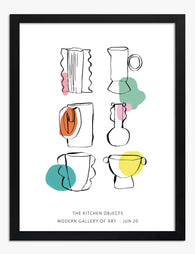
Poster kleurrijk keukengerei
Aanbiedingsprijs Vanaf €19,95€33,25 -
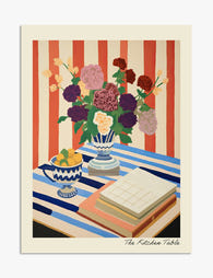
Poster bloemen op gestreepte tafel
Aanbiedingsprijs Vanaf €19,95€33,25 -

Poster smaakmakers voor de keuken
Aanbiedingsprijs Vanaf €19,95€33,25 -

Canvas mand vol blauwe ananassen
Aanbiedingsprijs Vanaf €65,95€94,95 -
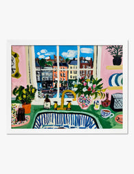
Poster kleurrijke keuken met stadszicht in Matisse-stijl
Aanbiedingsprijs Vanaf €19,95€33,25 -

Canvas keuken in moderne lijntekening
Aanbiedingsprijs Vanaf €65,95€94,95 -

Poster retro cocktail hour
Aanbiedingsprijs Vanaf €16,95€23,95 -
Poster speelse lijntekening van keukenspullen in pastel
Aanbiedingsprijs Vanaf €19,95€33,25 -
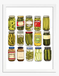
Poster parade van vintage augurkenpotten
Aanbiedingsprijs Vanaf €19,95€33,25 -

Poster speelse keukenschetsen blauw op wit
Aanbiedingsprijs Vanaf €19,95€33,25 -
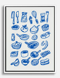
Canvas blauwe keuken lijntekening
Aanbiedingsprijs Vanaf €65,95€94,95 -
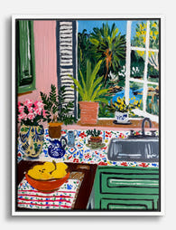
Canvas keuken met uitzicht, geïnspireerd door Matisse
Aanbiedingsprijs Vanaf €65,95€94,95 -

Poster speelse moderne keukensfeer
Aanbiedingsprijs Vanaf €19,95€33,25 -

Poster ananas met schijf
Aanbiedingsprijs Vanaf €16,95€23,95 -

Poster keukengerei in Matisse-stijl
Aanbiedingsprijs Vanaf €19,95€33,25


Meer van The Frame

Vintage Botanical Prints in Modern Homes: How t...
Botanical prints have a reputation problem. Done badly, they read as chintzy, twee, or straight out of a 1980s guest bedroom. Done well, they're one of the most timeless things...

The Complete Guide to Decorating with Botanical...
Botanical prints are the closest thing interior design has to a universal donor. They work with almost any style, palette, and period. Almost. This is a room-by-room guide with specific...

Botanical vs Floral Prints: Which Style Actuall...
Botanical and floral prints get lumped together constantly, and it's costing people the chance to get their walls right. They're not the same thing, they don't behave the same way...