Cottage, Botanical, English: Every Style of Garden Wall Art Explained
A practical guide to the five distinct styles of garden art, and how to pick the right one for your walls.

Garden art is one of the most loosely defined categories in wall decor. Type "botanical print" into any search bar and you'll get scientific line drawings, lush watercolours, abstract florals, and faded cottage scenes all lumped together. This guide untangles the five distinct styles so you can shop with intention rather than scrolling for an hour and giving up.
The five main styles of garden art prints (and what makes each one different)
Once you can name what you're looking at, shopping gets dramatically easier. The five styles below cover roughly 95% of what's sold as garden wall art, and each one has its own visual fingerprint.
English garden art is formal, layered, and painterly. Think structured borders, deep greens, and a sense of cultivation. Cottage garden art is the messier, more romantic cousin: loose brushwork, abundant blooms, and an air of charming neglect. Botanical prints isolate a single specimen against a clean background, often with scientific labelling. Contemporary garden art abstracts florals into shape and colour, leaning graphic. And vintage-style garden art borrows from any of the above but mimics the patina, paper texture, and palette of old printed material.
The differences come down to four things: composition (formal vs loose), palette (rich vs muted vs bright), level of detail (botanical accuracy vs impressionistic), and finish (painterly vs graphic). Hold those four variables in mind and you'll start recognising styles instantly.

English garden wall art: formal composition and rich colour palettes
English garden art descends from a long tradition of country house painting, where artists documented carefully designed gardens with the same seriousness as portraits. The hallmarks are unmistakable: structured pathways, clipped hedges, herbaceous borders arranged in layers, and a horizon line that almost always includes architecture (a glasshouse, a wall, a manor in the distance).
The palette runs rich and slightly moody. Deep emerald and sage greens, dusty pink roses, lavender, foxglove purples, and the warm stone colours of paths and walls. There's depth and recession in the composition: foreground flowers, mid-ground borders, background structure. It feels considered because the gardens themselves were.
Helen Allingham, the Victorian watercolourist, is the reference point most often cited for this style, though her work sits closer to cottage garden territory. For a more formal English garden look, you're after compositions with visible architecture and obvious cultivation.
This style works hardest in traditional and transitional interiors: rooms with panelling, antique furniture, layered textiles, or any home with a slightly heritage feel. It also looks brilliant in modern interiors when you go big and let one large framed print do the heavy lifting against a plain wall. A 70x100cm framed piece above a sofa creates an instant focal point.
Browse the full garden art prints collection if you want to see the range in one place.
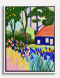
Cottage garden art prints: loose, romantic, and full of texture
If English garden art is the manor house, cottage garden art is the gardener's cottage at the end of the lane. The defining quality is looseness. Brushwork is visible, edges are soft, and flowers tumble over one another with no obvious order. There's no horizon line, no architecture, no sense of design. Just abundance.
The palette tends to be brighter and warmer than formal English garden work. Hollyhocks in coral and dusty pink, delphiniums in soft blue, foxgloves, sweet peas, climbing roses, and always a tangle of green underneath. The mood is nostalgic and slightly hazy, often painted in watercolour or gouache for that translucent, sun-bleached quality.
What makes a cottage garden painting specifically? Three things. First, density: every inch of the canvas is filled with planting. Second, informality: nothing is in straight lines. Third, romance: there's almost always a sense that someone lovely lives just out of frame.
This style suits cosy interiors with character. Older homes with original features, anything in a rural setting, farmhouse kitchens, and bedrooms that prioritise comfort over minimalism. It also slots beautifully into the wider cottagecore aesthetic that's been pulling design back towards softness, slow living, and natural materials.
Cottage garden prints work particularly well in pairs or threes at modest sizes (30x40cm or 50x70cm) along a hallway or above a bed. The looseness of the style means multiple pieces don't compete with each other.

Botanical garden prints: the scientific tradition meets modern interiors
Botanical prints have the most specific heritage of any garden art style. They descend from botanical illustration, a discipline that emerged in the 17th and 18th centuries to document plant species for scientific reference. Artists like Pierre-Joseph Redouté and Maria Sibylla Merian set the standard: a single specimen, rendered with anatomical accuracy, often with the root system, seed pods, and cross-sections shown alongside the flower.
This is where the distinction matters. Botanical illustration is scientific. It prioritises accuracy and serves the plant. Botanical art is aesthetic. It uses the same visual language but prioritises beauty over taxonomy. Contemporary artists like Billy Showell sit firmly in the second camp, painting recognisable species with technical skill but compositional flair.
What is botanical art in the context of modern wall prints? It's any work that isolates one or two plant specimens against a clean background, usually cream, white, or soft neutral, often with handwritten labels or Latin names. The look is calm, ordered, and quietly intellectual.
The clean composition and neutral palette make botanical prints the most versatile style on this list. They work in modern minimalist rooms, traditional interiors, kitchens, bathrooms, hallways, and offices. They sit happily in gallery walls because the consistent background colour ties multiple prints together visually.
For gallery walls specifically, botanical prints are unbeatable. Six matching 30x40cm framed prints in a 3x2 grid above a dining table or sideboard creates instant impact without visual noise. Explore the dedicated botanical art prints collection to see how a consistent style reads as a set.
A note on authenticity. Genuinely antique botanical prints from the 1700s and 1800s are collectible and expensive. Most "vintage botanical prints" sold today are modern reproductions of antique illustrations or new work styled to look old. Neither is dishonest, but it's worth knowing what you're buying. A well-made giclée reproduction on quality paper will look closer to the original than a cheap print on thin stock.
Contemporary garden art: abstracted florals and graphic compositions
Contemporary garden art is the youngest category and the broadest. It includes anything that takes flowers, plants, or garden imagery as a starting point and pushes them towards abstraction, graphic shape, or modern colour.
You'll see flat blocks of colour standing in for petals, line drawings of single stems, oversized florals cropped at the edges, monochrome botanicals in black ink on cream, and bold colour combinations that lean into trend (terracotta and sage, mustard and dusty pink, ochre and indigo). The mood is confident, often playful, and visually quieter than traditional garden art despite using brighter colours.
This style is the natural fit for modern interiors: clean lines, mid-century furniture, contemporary kitchens, anywhere you want garden references without country house associations. It also bridges nicely into maximalist interiors when you layer multiple contemporary florals with pattern and texture.
The graphic quality of contemporary garden art means it scales up well. A single 100x70cm print or canvas can anchor a large wall in a way that more detailed traditional work sometimes can't, because the composition reads from across the room. The trade-off is that contemporary work dates faster. A bold mustard-and-pink composition feels of its moment, where a botanical of a fern feels timeless.
The floral art prints collection is the easiest way to compare contemporary and traditional floral work side by side.

Which garden art style suits your home (a quick decision framework)
Style guides are useless if they don't help you decide. Here's a framework that cuts through it.
Start with your interior. If your home leans traditional (panelling, antiques, layered textiles, heritage paint colours), English garden or cottage garden art will feel native. If your home leans modern (clean lines, neutral palettes, mid-century or contemporary furniture), botanical or contemporary garden art will sit better. If your home is somewhere in between, botanical prints are the safest universal choice.
Then think about mood. Do you want the room to feel calm and ordered? Go botanical. Romantic and lived-in? Cottage garden. Grand and considered? English garden. Confident and current? Contemporary.
Then consider scale. Large statement walls suit English garden and contemporary work, which read well from a distance. Gallery walls suit botanical prints, which look intentional in sets. Smaller spaces (hallways, alcoves, above bedside tables) suit cottage garden prints in pairs.
Can you mix styles? Yes, but carefully. Botanical and cottage garden mix well because the loose painterly quality of cottage work softens the formality of botanicals. English garden and contemporary clash unless you commit fully to one room each. Vintage-style prints (look at the vintage art prints collection) bridge most styles because they read as artefact first, style second.
One rule worth following: pick a dominant style and let the others support it. A wall of mixed styles with no hierarchy looks indecisive. A wall that's clearly botanical with one cottage garden piece thrown in looks curated.
How to spot a well-made garden print vs. a cheap reproduction
Garden art is one of the most reproduced print categories, which means quality varies wildly. Here's what separates a print worth hanging from one that'll yellow within a year.
Paper matters more than people realise. Cheap prints use thin, glossy stock that picks up glare from every light source in the room. A serious print is on thick matte paper, ideally 200gsm or heavier, which absorbs light rather than bouncing it back. Botanical prints especially need matte paper to maintain that soft, illustrated quality.
Look at the printing process. Giclée printing (a high-resolution inkjet process developed for fine art reproduction) is the standard for quality prints. It produces deeper blacks, more accurate colours, and finer detail than standard commercial printing. If a seller doesn't mention giclée or museum-grade printing, assume it's standard.
Check the ink. Water-based pigment inks last for hundreds of years without fading, even in direct sunlight. Dye-based inks (used in cheaper prints) fade noticeably within a few years, particularly the reds and blues that dominate garden art.
Examine the frame, if framed. A lot of "framed prints" arrive with the frame and print packaged separately, leaving you to fit them together yourself. The frame is often MDF with a wood-effect veneer, which warps with humidity. A proper framed print arrives ready to hang, with the print fitted into a solid wood frame, fixtures already attached. The glazing should be UV-protective acrylic rather than glass: lighter, safer, and it blocks the wavelengths that cause fading.
Consider canvas as an alternative. For larger pieces, especially contemporary garden art and bolder cottage scenes, canvas can suit the style better than paper. A hand-stretched poly-cotton canvas on a solid wood frame gives a softer, more painterly finish, and it's lighter than a large framed print. Canvas also handles slightly humid rooms (kitchens, bathrooms) better than paper behind glazing.

Watch for resolution problems. If a print is reproduced from a low-resolution source, you'll see pixelation or fuzziness in the fine detail, particularly in the veins of leaves and the centres of flowers. Zoom in on the product photos before buying. Quality prints look sharp up close, which matters because garden art rewards close inspection.
Returns policy is a quality signal. Sellers who stand behind their work offer long, no-quibble returns. If a seller's policy is 14 days or includes restocking fees, they're hedging against complaints.
A final thought
The trick to buying garden art well is to stop thinking of it as one category. English, cottage, botanical, contemporary, and vintage garden prints are five different visual languages, and trying to shop across all of them at once is what makes the process feel overwhelming. Decide on the style first, then the size, then the specific piece. In that order, the choice gets easier with every step.

Fab-produkter som visas i denna blogg
-

Poster brittisk botanisk vy
Translation missing: sv.products.product.sale_price Från €16,95€23,95 -

Canvastavlor 'Cottage Garden' av Gustav Klimt
Translation missing: sv.products.product.sale_price Från €64,95€92,95 -

Poster brittisk botanisk oas
Translation missing: sv.products.product.sale_price Från €16,95€23,95 -

Poster förtrollande engelsk trädgård
Translation missing: sv.products.product.sale_price Från €16,95€23,95 -

Poster botaniska urklipp med gröna blad och vita blommor
Translation missing: sv.products.product.sale_price Från €16,95€23,95 -

Canvastavlor vita blommor mot olivgrön bakgrund
Translation missing: sv.products.product.sale_price Från €64,95€92,95 -

Canvastavlor Cottage Garden av Gustav Klimt
Translation missing: sv.products.product.sale_price Från €64,95€92,95 -

Poster Cotswolds blomsteridyll
Translation missing: sv.products.product.sale_price Från €16,95€23,95 -

Canvastavlor brittisk botanisk idyll
Translation missing: sv.products.product.sale_price Från €64,95€92,95 -

Poster Gustav Klimt – Cottage Garden
Translation missing: sv.products.product.sale_price Från €16,95€23,95 -

Poster Klimts cottage-trädgård
Translation missing: sv.products.product.sale_price Från €16,95€23,95 -
Canvastavlor färgstark trädgård vid charmig stuga
Translation missing: sv.products.product.sale_price Från €64,95€92,95 -
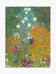
Poster Cottage Garden av Klimt
Translation missing: sv.products.product.sale_price Från €16,95€23,95 -

Poster engelsk landsbygdsidyll
Translation missing: sv.products.product.sale_price Från €16,95€23,95 -

Canvastavlor tropisk trädgård – Royal Botanic Garden, Edinburgh
Translation missing: sv.products.product.sale_price Från €64,95€92,95 -

Poster botanisk trappa
Translation missing: sv.products.product.sale_price Från €16,95€23,95 -

Poster förtrollad trädgård
Translation missing: sv.products.product.sale_price Från €16,95€23,95 -

Poster blomstermotiv från Cotswolds
Translation missing: sv.products.product.sale_price Från €16,95€23,95


Mer från The Frame

Art That Works with Patterned Wallpaper
Patterned wallpaper is having a proper moment, and the question that comes next is always the same: what on earth do you hang on it? The honest answer is that...

Art for White Walls: The Hardest Wall to Dress
Everyone tells you white walls are easy. They're not. A white wall hides nothing: every proportion mistake, every cheap frame, every clashing undertone gets magnified because there's no colour to...

Art for Pink Walls
Pink walls are the most misunderstood backdrop in interiors. People assume they're tricky, twee, or only for nurseries, when in fact pink is one of the most flattering colours you...