How to Build a Matisse Gallery Wall That Actually Looks Curated
The difference between a chaotic Matisse wall and a properly curated one comes down to six decisions.

Most Matisse gallery walls fail for the same reason: too many prints, too many colours, no editorial logic. The good news is that Matisse's work is forgiving once you understand which pieces speak to each other. This guide walks you through every decision, from print selection to the final hammer stroke.
Why Matisse is one of the best artists for a gallery wall
Matisse made roughly seven decades of work across painting, drawing, printmaking and his late paper cut-outs. That range means you can build a gallery wall using a single artist and still get genuine variety in shape, line and colour. Most artists can't carry a whole wall on their own. Matisse can.
His visual language also unifies easily. Even when you mix a 1947 cut-out with a 1935 line drawing, the hand is recognisably the same: confident outlines, flat colour, organic shapes, no fuss. That coherence is what makes a gallery wall feel curated rather than collected at random.
Bold simplicity is the other reason he works so well across multiple frames. Matisse's compositions read clearly from across a room, which is exactly what you want when prints are competing for attention on the same wall.

Picking your theme: cutouts, line drawings, or a curated mix
Before you buy anything, pick one of three directions. Don't skip this. Most chaotic gallery walls happen because people grab whatever Matisse images they like without committing to a visual lane.
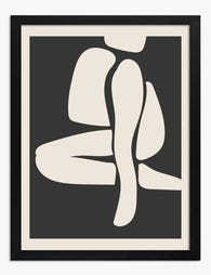
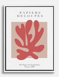
Cutouts only
The cut-outs (think The Snail, Blue Nudes, Icarus, La Gerbe) are bold, graphic and high-energy. A wall of cut-outs only is the most visually impactful option, but it needs space to breathe. If your wall is small or the room is already busy, this can tip into overwhelming.
Best for: large lounge walls, hallways, anywhere with a calm, neutral backdrop.
Line drawings only
Matisse's line work, particularly the female portraits and the Themes and Variations series from the 1940s, is the opposite. Quiet, light, almost weightless. A line-drawing-only wall feels considered and grown-up, and it works beautifully in bedrooms or studies where you want art that doesn't shout.
Best for: bedrooms, home offices, north-facing rooms where bold colour can feel cold.
A curated mix
The mix is the hardest to pull off but the most interesting when it works. The trick is roughly a 70/30 split: lead with one style, accent with the other. Three cut-outs and one line drawing reads as intentional. Two and two reads as indecisive.
Whatever you pick, browse the full Matisse art prints collection with this filter in mind rather than letting individual prints distract you.
How many prints you actually need (hint: fewer than you think)
People consistently overestimate this. A gallery wall doesn't mean a wall covered in art. It means a deliberately arranged group of pieces with breathing room.
Use these as starting points, measuring the wall area you actually want to fill (not the full wall):
- Wall width up to 1.2m: 2 to 3 prints
- Wall width 1.2m to 2m: 3 to 5 prints
- Wall width 2m to 2.5m (a typical sofa wall): 4 to 6 prints
- Wall width above 2.5m: 5 to 7 prints, maximum
Above seven prints you're no longer curating, you're tiling. The eye stops reading individual works and starts processing the whole thing as wallpaper, which defeats the point of using Matisse in the first place.
If you're hanging above a sofa specifically, your arrangement should span roughly two-thirds to three-quarters of the sofa width. A 2.2m sofa wants an art arrangement around 1.5m wide. Wider than the sofa looks awkward, much narrower looks marooned.
Layout options: grid, salon hang, or linear row
Three layouts cover ninety percent of good gallery walls. Pick one.
The grid
Two by two, three by two, or three by three. Identical frame sizes, identical spacing, perfectly aligned. The grid is the most formal option and works brilliantly with cut-outs because the rigid structure plays against the organic shapes.
Use a grid when you want polish and precision. It's also the most beginner-friendly because mistakes are obvious and easy to correct.
The salon hang
A salon hang mixes frame sizes and arranges them in a loose rectangular cluster. Done well, it looks like a thoughtful collection built over time. Done badly, it looks like a yard sale.
The rule that saves a salon hang: imagine an invisible rectangle around your whole arrangement. Every outer edge of every frame should align with one of those four invisible lines. Inside the rectangle, you can be playful. The outer boundary should be tight.
The linear row
A single horizontal line of three to five prints, all the same size, evenly spaced. This is the most underrated layout. It works above sofas, beds, sideboards and along hallways, and it's almost impossible to get wrong. If you're nervous about gallery walls, start here.

Matching frame finishes across multiple Matisse prints
Frame inconsistency is the single fastest way to make a gallery wall look amateur. Pick one finish and commit.
Black frames: Best for cut-outs. The hard black border sharpens the saturated colours and gives the cut-outs the museum-poster energy they're often associated with. Avoid for line drawings, where black can feel heavy.
Natural oak or light wood: The most flexible choice and our default recommendation for mixed walls. Wood softens the bold cut-outs and warms the line drawings. It also plays well with most interiors, from Scandi-minimal to mid-century to country.
White frames: Clean, gallery-like, recedes into a white wall so the art does the talking. Best in bright, modern rooms. Less successful on coloured walls where white frames can feel disconnected.
What you want to avoid is mixing finishes across the same arrangement. One black frame in a row of oak frames will draw the eye every time, and not in a good way.
Our framed prints come ready to hang with the print properly fitted, fixtures already attached, and UV-protective acrylic glaze rather than glass (lighter, safer, and it doesn't reflect like glass does, which matters when you're hanging multiple frames in the same line of sight). The frames themselves are solid FSC-certified wood, not MDF, which is worth knowing if you're investing in a wall you'll live with for years.
Colour coordination: keeping your gallery wall cohesive, not chaotic
Matisse used a wide palette across his career, which is both the opportunity and the risk. A few rules keep things tight.
Limit yourself to three dominant colours across the whole wall. If your anchor cut-out is heavy on cobalt blue and coral, every other print should pull from that family or sit in a neutral (cream, black, soft ochre). The moment you introduce a fourth bold colour, the wall fragments.
Pick a temperature and stick to it. Matisse's warm period work (the Nice years, the orange and pink interiors) doesn't always sit comfortably next to his cooler cut-outs (Blue Nudes, The Sheaf). Mixing temperatures can work, but only if you're deliberate. As a default, pick warm or cool and build the whole wall around it.
Echo one colour into the room. If your gallery wall features a strong sage green, drop sage into a cushion, a throw, or a ceramic. One echo. Not three. The wall should feel connected to the room, not matched to it.
For more abstract pairings or to expand beyond Matisse, the abstract art prints collection has work that sits comfortably alongside his cut-outs without competing.
Step-by-step hanging guide with spacing measurements
This is where most people go wrong. Measure twice, drill once.
What you need
- Tape measure
- Spirit level (a phone level will do at a push)
- Pencil
- Brown paper or newspaper
- Masking tape
- Hammer and picture hooks, or wall plugs and screws for heavier framed prints
Step 1: Trace and template
Lay each frame on brown paper, trace around it, cut out the templates and mark where the hanging fixture sits on the back of each one. This is the single most useful trick in gallery wall hanging and almost nobody does it.
Step 2: Tape templates to the wall
Stick the paper templates to the wall with masking tape in your planned arrangement. Live with it for at least a few hours. Walk past it. Sit on the sofa. Adjust until it feels right. It's far easier to move paper than to fill nail holes.
Step 3: Find your centre point
The centre of your gallery wall arrangement should sit at roughly 145cm to 150cm from the floor (gallery standard eye level). When hanging above furniture, leave 15cm to 25cm between the top of the sofa or sideboard and the bottom of the lowest frame. Closer than 15cm feels cramped, more than 25cm and the art floats away from the furniture visually.
Step 4: Spacing between frames
For Matisse specifically, use 5cm to 8cm of spacing between frames. Standard advice says 5cm to 7.5cm for general gallery walls, but Matisse's bold compositions need a touch more breathing room than, say, delicate botanical prints. Tighter than 5cm and the colours start to clash across frames. Wider than 8cm and the arrangement loses its sense of being one piece.
For a grid layout, keep spacing identical in every direction. For a salon hang, you can vary slightly (5cm to 8cm range) but stay consistent within rough zones.
Step 5: Hang from the anchor outwards
Identify your anchor piece, usually the largest or most colourful, and hang it first. Build outwards from there, checking level as you go. Don't hang left to right in sequence, you'll accumulate small errors.

Three gallery wall combinations we'd actually put in our own homes
These are starting points, not prescriptions. Treat them as recipes you can adjust.
The cut-out grid (above a sofa)
Four cut-out prints at 50x70cm each, hung in a two-by-two grid in oak frames. Pick four works that share a colour: for example, The Snail, Beasts of the Sea, Memory of Oceania and La Gerbe, all of which share that family of warm reds, blues and greens. Total wall span around 1.1m wide by 1.5m tall. Goes above a 2m sofa. High impact, easy to pull off, and the grid format does most of the work for you.
The line-drawing row (bedroom)
Three line-drawing prints at 40x50cm each in white frames, hung in a linear row above a bed. This is the calmest possible Matisse arrangement. Spacing of 6cm between frames, total span around 1.4m, centred on a standard double or king headboard. Quiet, considered, the kind of thing you stop noticing in the best way.
The mixed salon (large statement wall)
Five prints in a salon arrangement: one large 70x100cm cut-out as the anchor, two medium 40x50cm cut-outs from the same colour family, and two smaller 30x40cm line drawings to break up the colour. All in matching natural oak frames. This is the hardest to plan, so build it on the floor first, take a photo, then template the wall. Best on a long lounge or dining room wall with at least 2.5m of width.
If you'd rather not piece things together print by print, our pre-curated wall art sets are designed with these proportions and colour relationships already worked out.

A few last things
Start with three or four prints rather than seven. You can always add later, and a slightly under-filled wall reads as confident. An overfilled wall reads as panicked. Matisse himself spent decades editing his compositions down to fewer, bolder shapes, and the same instinct serves a gallery wall well.
Take a photo of your wall before hanging anything. Looking at the room through your phone screen flattens it the same way your eye flattens art on a wall, and it's the fastest way to spot what isn't working.

Fab-produkter som visas i denna blogg
-

Canvastavlor Matisse pappersutklipp
Translation missing: sv.products.product.sale_price Från €65,95€93,95 -

Canvastavlor Matisse-inspirerade pappersutklipp i neutrala toner
Translation missing: sv.products.product.sale_price Från €65,95€93,95 -

Poster Matisse-inspirerade pappersklipp
Translation missing: sv.products.product.sale_price Från €16,95€23,95 -

Poster pappersutklipp i Matisse-stil
Translation missing: sv.products.product.sale_price Från €16,95€23,95 -

Canvastavlor Matisse-inspirerade rosa pappersutklipp
Translation missing: sv.products.product.sale_price Från €65,95€93,95 -

Canvastavlor pappersklippt trädgård i Matisse-stil
Translation missing: sv.products.product.sale_price Från €65,95€93,95 -

Canvastavlor Matisse-inspirerade utklippta former
Translation missing: sv.products.product.sale_price Från €65,95€93,95 -

Poster Matisse-inspirerade färgglada urklipp
Translation missing: sv.products.product.sale_price Från €16,95€23,95 -

Poster Matisse-inspirerade pappersutklipp
Translation missing: sv.products.product.sale_price Från €16,95€23,95 -
Poster Matisse-inspirerad abstrakt elegans
Translation missing: sv.products.product.sale_price Från €16,95€23,95 -

Canvastavlor Matisse rött utklipp mot blå bakgrund
Translation missing: sv.products.product.sale_price Från €65,95€93,95 -
Canvastavlor rött pappersutklipp i Matisse-stil
Translation missing: sv.products.product.sale_price Från €65,95€93,95 -

Canvastavlor Matisse-kurvor Mallorca
Translation missing: sv.products.product.sale_price Från €65,95€93,95 -

Poster Matisse-inspirerade pappersutklipp
Translation missing: sv.products.product.sale_price Från €16,95€23,95 -

Canvastavlor Matisse-inspirerade färgstarka pappersklipp
Translation missing: sv.products.product.sale_price Från €65,95€93,95 -

Poster Matisse Muse organiska former
Translation missing: sv.products.product.sale_price Från €16,95€23,95 -

Canvastavlor Matisse-inspirerade former
Translation missing: sv.products.product.sale_price Från €65,95€93,95 -

Poster Matisse-inspirerad abstrakt konst i neutrala toner
Translation missing: sv.products.product.sale_price Från €16,95€23,95 -

Poster Matisse-inspirerat utklipp i blått, rött och grönt
Translation missing: sv.products.product.sale_price Från €16,95€23,95 -

Canvastavlor med abstrakta pappersutklipp i Matisse-stil
Translation missing: sv.products.product.sale_price Från €65,95€93,95


Mer från The Frame

Jungle Bedroom Ideas for Adults: Grown-Up Ways ...
Jungle bedrooms have a reputation problem. Search the term and you'll find nursery mood boards, cartoon monkeys, and bright kelly green walls that would keep anyone awake. The grown-up version...

The Strawberry Thief: Everything You Need to Kn...
Strawberry Thief is the William Morris design people search for by name. It's also the one most often bought badly: wrong size, wrong colourway for the room, wrong print quality...

Our Favourite Jungle Prints for Every Room: The...
Jungle prints have a reputation problem. Done badly, they tip a room into themed-restaurant territory faster than almost any other trend. Done well, they add depth, movement and a sense...