Small Bathroom Gallery Wall Ideas: How to Make a Big Impact in a Tiny Loo
A step-by-step system for turning your tiny loo into the most surprising room in the house.

Small bathrooms are the most overlooked walls in your home. They're also the easiest to get right, because the constraints make most of the decisions for you. This guide gives you a system: layout, sizing, quantity, frames, hanging, humidity, all of it.
Why small bathrooms are secretly the best rooms for a gallery wall
A big living room wall is a tyranny of options. You could do anything, which is exactly why most people freeze and end up with one sad canvas hung too high. A small bathroom wall, by contrast, has obvious physical limits. There's room for three prints, maybe four, and that's it. The decision gets made for you.
Small bathrooms also have an intimacy advantage. Guests in your lounge are looking at each other. Guests in your downstairs loo are looking directly at your walls, often for several minutes, with nothing else to do. It's the only room in your house with a captive audience.
And there's a practical bonus: vertical stacks of art draw the eye upward, which makes a low or cramped ceiling feel taller. If you've been wondering how to decorate a small bathroom without making it feel even smaller, a vertical gallery wall is one of the few moves that genuinely makes the room read bigger.

The vertical stack: the only layout you need for narrow walls
Forget the salon-style grid you've seen in larger rooms. In a small bathroom, you're almost always working with a narrow wall: above the toilet, beside the sink, or on the run between the door and a fitting. The vertical stack is the layout that fits.
Here's the formula. Three prints of the same size, hung in a single column, with consistent spacing between them. The bottom of the lowest frame should sit roughly 20 to 30cm above the cistern or skirting. The gap between frames should be 5 to 8cm. Centre the column horizontally on the wall, not on the toilet, unless the toilet is dead centre on the wall (it usually isn't).
The reason this works: a vertical column mirrors the proportions of a narrow wall. A horizontal row fights the wall. A grid needs more width than you have. The stack is the only layout that respects the architecture.
If your wall is genuinely tiny (think 40cm wide cloakroom alcoves), drop to two prints stacked. If you have a slightly wider wall, say 60cm or more, you can run a stack of three comfortably. Anything wider than 80cm, and you have options, but the stack still works beautifully and is hard to mess up.
The toilet-seat test
This is the only height-checking trick you need. Sit on the toilet, with the lid down if you must. Look straight ahead at the wall. The middle print of your stack should land roughly at your seated eye level. That's the height you're optimising for, because that's where the art will actually be looked at.
Most people centre prints at standing eye level, which is wrong for a bathroom. Half your time in there is spent sitting. Hang for the seated view.
How many prints is too many? The 3-print rule for small spaces
Three is the magic number for small bathroom gallery walls. Here's why.
One print on its own reads as an afterthought, especially in a room that's already busy with fittings. Two prints read as a pair, which is fine but lacks the rhythm of a proper gallery. Three prints create a composition. Your eye moves down the column and back up, and the wall feels deliberate.
Four can work if you've got the height. Five is too many in any bathroom under about 4 square metres. The wall starts to feel cluttered, the spacing gets cramped, and you lose the visual rest that makes a gallery wall feel curated rather than chaotic.
If you're tempted to do more, resist. The constraint is the point. A tight, considered three is always better than a sprawling six. Pre-curated wall art sets take the guesswork out entirely, since the prints are designed to work as a group from the start.
Choosing the right size prints (and why bigger isn't always better in here)
Sizing for small bathrooms is counterintuitive. The instinct is to go big to make a statement. The reality is that oversized prints in a small space look squashed, and the proportions feel wrong against the room's other elements (basin, mirror, towel rail).
Here's a rough sizing guide based on wall width:
- Wall under 50cm wide: 21x30cm prints (A4-ish), stacked two or three high
- Wall 50 to 70cm wide: 30x40cm prints, stacked three
- Wall 70 to 90cm wide: 40x50cm prints, stacked three
- Wall over 90cm wide: 50x70cm prints, stacked three, or consider going bolder with a single 70x100cm statement piece
The frame adds 3 to 5cm on each side, so factor that into your wall width before you commit.
A small print hung well looks expensive. A large print crammed into a tight space looks like a mistake. The whole stack should feel like it's floating in the middle of its wall, with breathing room on the left and right of at least 10cm.

Frame colour and finish: matching your bathroom hardware
The shortcut to a coherent bathroom gallery wall is matching your frame finish to your hardware. Your taps, towel rail, and light fittings have already chosen a metal for you. Use it.
- Brass or gold fixtures: warm wood frames, gold frames, or natural oak
- Chrome or polished nickel: black frames or thin silver
- Matte black taps: black frames, full stop
- Mixed metals (a current trend): black frames are the safe bridge, since they sit alongside almost any metal without clashing
The most common mistake is matching frames to your towel colour or shower curtain. Don't. Towels get swapped, hardware doesn't. Match the permanent finishes.
A note on materials: solid wood frames hold up far better than MDF or veneers in a humid environment, and they look better up close. Cheap frame composites tend to swell and warp over time, which is the last thing you want in a bathroom. Fab's frames are solid FSC-certified wood, which matters here more than in any other room.
Funny vs. sophisticated: picking a tone for your bathroom gallery
Bathrooms, especially downstairs loos, are one of the few rooms where humour actually works. They're a private moment in a house tour. A bit of wit lands well.
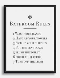
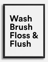
But you have to commit to a tone. Mixing a serious moody nude with a "Now Wash Your Hands" typography print creates tonal whiplash. Pick a lane.
The funny route
Lean into it. Vintage toilet illustrations, cheeky typography, retro adverts for soap. The whole point is to make people smile. Our toilet art prints collection exists precisely for this brief, and a stack of three reads as a deliberate joke rather than a single confused statement.
Typography art prints work especially well here too, because text is read in a sequence, and a vertical stack gives you that built-in reading order. Three sharp lines stacked vertically can do more for a powder room than any wallpaper.
The sophisticated route
Black and white photography, botanical etchings, abstract line drawings, vintage architectural plans. The trick is restraint. A bathroom isn't the room for your most challenging art piece. It's the room for something quietly beautiful that rewards a closer look.
Black and white art prints are the safest sophisticated choice because they sidestep colour-matching entirely and work against any wall colour, any tile, any era of fitting. Three black and white prints in matching black frames is the closest thing to a no-fail bathroom gallery wall.
Choosing between them
Ask yourself who uses this bathroom. A downstairs cloakroom that mostly serves guests? Go funny. An en-suite that's just for you and your partner? Go sophisticated, or whatever you actually want to look at every morning. The room dictates the tone.
Hanging tips for tiled and plasterboard walls
This is where most people get stuck. Bathroom walls are rarely simple plasterboard, and drilling into the wrong thing can be a costly mistake.
Plasterboard walls
The easy case. Use proper plasterboard fixings (the spring-loaded butterfly kind for anything over 2kg, plastic anchors for lighter prints). For art prints under about 1.5kg, heavy-duty Command strips are genuinely fine and won't damage the wall when you remove them. They take repositioning well, which matters if you're working out the layout by eye.
A tip: stick painter's tape to the wall in your planned layout first, with the dimensions of each frame marked out. Live with it for a day. Adjust. Then commit to the actual hanging.
Tiled walls
Drilling tile is doable but unforgiving. If you're confident: use a diamond-tipped drill bit, drill on slow speed with no hammer action, and place a piece of masking tape over the tile to stop the bit slipping. Drill into the grout line where possible rather than the tile face, because grout is more forgiving and the hole becomes invisible if you ever move the print.
If you'd rather not drill: heavy-duty adhesive hooks designed for tile (the clear silicone-backed ones) hold up to about 2kg per hook and survive humidity well. Press them firmly to clean, dry tile and leave for 24 hours before hanging anything. This is the renter-friendly answer, and it's better than people give it credit for.
Avoid hanging anything heavy directly above a sink or in any drilling-into-pipework zone. If you don't know where the pipes run, assume they're behind the wall above the basin and the toilet, and use a stud and pipe detector before you commit.

How to protect art in a humid bathroom
The biggest concern people have about bathroom art is humidity. It's a fair concern, but it's manageable, and frankly, most modern bathrooms are extracted well enough that it's less of an issue than it used to be.
Where to hang (and where not to)
Map your bathroom into zones:
- Splash zone: anywhere within 50cm of the shower head, taps, or basin. No art here, ever.
- Damp zone: the rest of the room, where humidity rises but no direct water lands. Most of your wall space falls here. This is fine for properly framed art.
- Dry zone: the wall behind the door, the entry wall. Safest of all.
Above the toilet, behind the door, and on the wall opposite the shower (not adjacent) are all good gallery wall locations.
What to look for in the print and frame
Three things matter:
- Glazing: acrylic glazing handles humidity better than glass. It doesn't fog up the same way and it won't shatter if it falls. Fab uses UV-protective acrylic on framed prints, which also stops fading from any natural light coming through the bathroom window.
- Paper and inks: thick matte giclée paper holds its shape better than thin glossy stock, which can ripple. Water-based archival inks won't run if there's any moisture ingress over time.
- Frame construction: solid wood frames cope with humidity. MDF and veneers swell. This is the single biggest factor in whether your gallery wall still looks good in two years.
Ventilation matters more than waterproofing
Run your extractor fan during showers and for at least 10 minutes afterwards. Open the window when you can. A bathroom with decent airflow is a perfectly safe home for proper art. A bathroom with no extraction and no window is a problem regardless of what you hang.
Canvas prints are also a strong option for bathrooms that run humid, since there's no glazing to fog and the stretched canvas handles moisture changes well. They give you a more relaxed, unframed look that suits a casual family bathroom.
A few common mistakes to avoid
- Buying frames before prints. Choose the art first, then frames that suit it. The reverse leads to compromises.
- Centering on the wall instead of at eye level. A wall isn't a face. Centre at viewing height, not geometric middle.
- Matching prints to your towels. Towels change. Match to permanent fixtures.
- Hanging too high. The seated eye-level rule fixes this.
- Trying too many prints. Three. The answer is three.

Refreshing your gallery wall later
One quiet advantage of the three-print stack: you can swap one print at a time to refresh the whole wall without re-hanging anything. Change the middle print seasonally, or switch all three when you fancy a new mood. Keep the frames, change the contents.
If you've sized them consistently from the start (all 30x40cm, say), this becomes a five-minute job rather than a redecoration.
Pick your wall, measure it, choose three prints in a single tone, match the frames to your taps, and hang the middle one at seated eye level. That's the whole system. The hardest part of a small bathroom gallery wall is starting. Once you commit to three prints and a vertical stack, the rest decides itself.

Fab-produkter som visas i denna blogg
-
Canvastavlor stilfulla badrumspåminnelser i svartvitt
Translation missing: sv.products.product.sale_price Från €64,95€92,95 -

Poster badrumsregler – klassisk svartvit guide
Translation missing: sv.products.product.sale_price Från €16,95€23,95 -

Poster med citat för badrum i fet typografi
Translation missing: sv.products.product.sale_price Från €16,95€23,95 -

Poster 'Best Seat' för badrum i svartvitt
Translation missing: sv.products.product.sale_price Från €16,95€23,95 -

Poster badrum – vardagsritualer i svartvit linjeteckning
Translation missing: sv.products.product.sale_price Från €16,95€23,95 -
Canvastavlor badrumscitat – fräsch start i svartvitt
Translation missing: sv.products.product.sale_price Från €64,95€92,95 -

Poster tiger i badkaret
Translation missing: sv.products.product.sale_price Från €16,95€23,95 -

Canvastavlor lekfull utter med toarulle för badrum
Translation missing: sv.products.product.sale_price Från €64,95€92,95 -

Canvastavlor nyfiken svart katt i badrummet
Translation missing: sv.products.product.sale_price Från €64,95€92,95 -

Canvastavlor vardagens badrumsritualer – svartvit linjeteckning
Translation missing: sv.products.product.sale_price Från €64,95€92,95 -

Canvastavlor med nyfiken svart katt i badrummet
Translation missing: sv.products.product.sale_price Från €64,95€92,95 -

Poster lekfull badrumshälsning i svartvitt
Translation missing: sv.products.product.sale_price Från €16,95€23,95 -

Canvastavlor för badrum – lekfullt svartvitt citat
Translation missing: sv.products.product.sale_price Från €64,95€92,95 -

Poster nyfiken svart katt i badrum
Translation missing: sv.products.product.sale_price Från €16,95€23,95 -

Poster blommor i popkonst för badrum
Translation missing: sv.products.product.sale_price Från €16,95€23,95 -

Canvastavlor botaniskt badrum med frodig grönska
Translation missing: sv.products.product.sale_price Från €64,95€92,95 -

Canvastavlor badrumscitat i svartvitt – bubbellycka
Translation missing: sv.products.product.sale_price Från €64,95€92,95 -

Canvastavlor svart katt på blomsterprydd toalett
Translation missing: sv.products.product.sale_price Från €64,95€92,95


Mer från The Frame

How to Create an Eclectic Gallery Wall That Loo...
You love a botanical line drawing, a moody abstract, and a vintage portrait, and you want them all on the same wall. The fear is that it'll look like a...

How to Build a Gallery Wall Around Mountain Art...
Mountain prints are some of the most rewarding pieces to anchor a gallery wall with, and some of the easiest to get wrong. Their horizontal weight, dramatic tonal range, and...

Kitchen Gallery Wall Ideas: How to Plan, Hang, ...
Most kitchen gallery walls fail before a single nail goes in. The prints arrive, you eyeball the layout, drill optimistically, and end up with something that feels chaotic instead of...