Why Nostalgic Art Prints Hit Harder Than Statement Pieces
Why the quiet print of a corner shop will outlast the loud abstract every time.

The bold abstract you bought eighteen months ago. Do you still actually look at it, or has it become wallpaper? Most "statement" art has a shelf life shorter than a houseplant, and there's a reason the prints people keep for decades tend to be quieter, softer, and more emotionally specific.
This is an argument for nostalgic art prints over the loud stuff. Not as a style category, but as a design principle.
The problem with 'statement' art: bold fades, quiet endures
Statement art is designed to do one thing: get noticed. Big shapes, saturated palettes, oversized typography, something that announces itself the second you walk in. It works brilliantly on a showroom wall and even better on Instagram.
The trouble is that announcement only lands once. After the third week, your eyes stop registering it. After six months, you're mentally rearranging the room around it. After a year, you're quietly looking up replacements.
We've watched this cycle play out with shoppers who return for second and third pieces. The bold abstract was the impulse buy. The print they bought next, the one they keep buying variations of, is almost always quieter. A coastal scene. A worn book. A kitchen window in afternoon light. Art that doesn't shout because it doesn't need to.
There's nothing wrong with making a statement. But statements get old. Feelings don't.

Why nostalgia is the most reliable emotion in interior design
Interior trends move on a roughly two-year cycle. Sage green, then terracotta, then chrome, then mushroom. Whatever you bought at the peak of a trend tends to feel slightly embarrassing by the time the next one arrives.
Nostalgia doesn't move on a cycle because it isn't a trend. It's an emotional response. Your brain doesn't get bored of feeling comforted, the way it gets bored of looking at a colour.
This is why nostalgic art prints tend to hold up across renovations, house moves, and entire life stages. The piece that reminded you of your grandmother's hallway when you were 28 will still remind you of it when you're 45. The neon-pink Bauhaus print you bought the same year probably won't make the second move.
Designers know this. The pieces that get passed down, the ones that survive house clearances and end up on someone else's wall, are almost never the loudest things in the room. They're the ones with feeling baked in.
What makes a nostalgic print work: ordinary scenes, extraordinary feeling
Here's the trick people miss: nostalgic art is rarely about grand subjects. It's about ordinary scenes rendered in a way that makes you feel something specific.
A coffee cup on a wooden table. A pair of boots by a back door. A bowl of lemons. A bicycle leaning against a stone wall. None of these are dramatic. All of them, done well, can stop you in your tracks.
The visual ingredients tend to be consistent:
- Familiar imagery: objects, rooms, or scenes you recognise from real life rather than from a mood board
- Soft focus or painterly handling: edges that feel slightly remembered rather than photographed sharp
- Vintage or muted palettes: warm ochres, faded blues, dusty pinks, the colours memory tends to apply to old footage
- Quiet composition: one or two focal points, plenty of breathing space, no visual shouting
- Imperfection: a slight grain, a softened line, the suggestion of something hand-made
The opposite of all this, hyper-saturated, perfectly symmetrical, graphically bold, can be beautiful. But it tends to register as decoration rather than memory.
This is also where it's worth drawing a line between nostalgic and sentimental. Sentimental art tells you exactly how to feel. It puts the emotion on the surface, often in cursive script. Nostalgic art leaves room for you to bring your own feeling to it. One ages well. The other becomes the "Live Laugh Love" of 2027.
The science bit: why familiar imagery triggers comfort at home
Nostalgia used to be considered a medical condition. Seventeenth-century physicians diagnosed it in homesick soldiers. For most of modern history, it was treated as something close to depression.
That changed largely thanks to research led by Constantine Sedikides and his team at the University of Southampton, who reframed nostalgia as a psychologically useful emotion. Their research has linked nostalgic reflection with elevated mood, increased self-esteem, stronger feelings of social connection, and a greater sense of meaning in life. Nostalgia, it turns out, is something the brain reaches for when it wants comfort.
Which is exactly what you want from your home.
The walls you live with aren't a gallery. They're the visual environment your nervous system marinates in every evening. Art that quietly nudges you toward feelings of belonging, warmth, and continuity is doing something genuinely useful, not just decorative.
This also explains why people often describe a good nostalgic print as "calming" without being able to say why. The image isn't doing anything dramatic. It's triggering a low-level emotional response your brain associates with safety.

Childhood nostalgia art prints: personal vs collective memory
Not all nostalgia works the same way, and the distinction matters when you're choosing where to hang it.
Personal nostalgia is specific to you. The exact shade of your nan's kitchen tiles. The specific make of car your dad drove. A coastal town only you've been to. These pieces hit hardest for the person who lived the memory and can feel slightly opaque to everyone else.
Collective nostalgia is shared. Penny sweets in jars. A red telephone box. A train station tea room. A summer holiday on a British coast that millions of people remember in roughly the same way. These pieces work because the memory is recognisable across a generation.
Both are valid. They just suit different rooms.
Collective nostalgia tends to work better in shared spaces, living rooms, hallways, kitchens, where guests will see it. The shared reference creates a small moment of connection. Personal nostalgia tends to work better in private spaces, bedrooms, home offices, snugs, where the only audience is you and the people who already know your stories.
A lot of vintage art prints sit somewhere on this spectrum. The strongest ones manage to be specific enough to feel real and universal enough to invite anyone in.
How to pick a nostalgic print you'll still love in five years
The hard part isn't finding nostalgic art. It's choosing pieces that will keep working long after the initial emotional hit.
Here's the rough framework we use.
Start with the feeling, not the room
Don't lead with "I need something for the gap above the sideboard." Lead with the feeling you want that wall to give you when you walk past it on a Tuesday evening. Calm? Wistful? Cosy? Curious? The brief gets much easier from there.
Apply the boring conversation test
Imagine you've been cornered at a party by someone telling you, in detail, about their loft conversion. You glance at the artwork on the wall behind them. If you'd genuinely rather keep looking at the print than re-engage with the conversation, it has staying power. If the print is just background noise, it isn't earning its place.
Check the colour temperature
Nostalgic palettes tend to skew warm and slightly desaturated. They feel like memory, which is to say, slightly faded. If a piece is screaming with saturation, it might be a great print, but it probably isn't a nostalgic one. That doesn't disqualify it. It just means it'll behave differently on your wall over time.
Ask if it survives the trend graveyard
If every visual element in the piece could appear in a magazine from 1972, 1992, or now, it's probably doing something timeless. If it leans heavily on a current visual trend (specific typography, current Pantone-of-the-year palettes, hyper-stylised digital effects), assume a shorter shelf life.
Be honest about the difference between "I love this" and "this would look great on my feed"
Both are valid reasons to buy art. They're just different reasons. The Instagram piece often gets replaced. The piece you genuinely love tends to come with you when you move.
Consider the framing seriously
This is where a lot of nostalgic prints get let down. A beautifully chosen image in a warped frame, or a print that arrives separately from its frame and doesn't fit properly, will undo the emotional effect entirely. We frame our prints in solid FSC-certified wood (no MDF, no veneer), use UV-protective acrylic glaze instead of glass to prevent fading and reduce weight, and ship the print and frame together in one box, properly fitted, ready to hang. The frame should disappear and let the image do the work.

When statement art still wins
To be fair to the loud stuff: there are rooms where a quiet nostalgic print is genuinely the wrong call.
Commercial spaces, restaurants, clinics, offices, often need art that registers fast and reads from across the room. Maximalist interiors, where the wall art is supposed to be part of a deliberate sensory crescendo, can absorb bold pieces that would overwhelm a calmer space. Some people genuinely enjoy rotating their walls every couple of years and treat art more like a seasonal wardrobe than a long relationship. All of that is fine.
The argument isn't that nostalgic art is universally better. It's that for most people, in most homes, choosing the piece that moves you over the piece that "makes a statement" gives you something that lasts.
Our picks: nostalgic art prints that stop people mid-conversation
A few categories worth looking at if you're starting to build (or rebuild) a wall around emotional resonance rather than visual noise.
Coastal and seaside scenes. British summers, faded promenades, deck chairs, lighthouses. Strong collective nostalgia, and they tend to work in living rooms, kitchens, and bathrooms equally well. Good in larger sizes (60x80cm and above) where they can breathe.
Domestic still lifes. A bowl of fruit, a cup and saucer, a vase of garden flowers, a stack of books. Quiet, painterly, easy to live with. Particularly effective in kitchens, dining rooms, and reading corners. Smaller sizes work in clusters.
Vintage travel and railway imagery. Old railway posters and travel illustrations have a built-in nostalgic quality because the visual language belongs to a specific era. Good for hallways and stairwells where they reward a closer look.
Rural and pastoral scenes. Hedgerows, harvest fields, stone cottages, farm animals. They tend to work whether or not you've ever lived rurally, which is the giveaway of strong collective nostalgia. Brilliant in living room wall art arrangements alongside softer textiles.
Quiet interior scenes. Windows, doorways, empty chairs, half-finished cups of tea. The "someone has just left the room" genre. Some of the most emotionally durable art you can hang. Perfect for bedrooms and home offices.
Faded floral and botanical studies. Particularly older botanical illustrations or pieces rendered in muted, slightly washed-out palettes. They sidestep the trend cycle that catches more graphic floral pieces.
If you're browsing the wider art prints range with this lens in mind, the question to keep asking is simple: does this image do something to me, or does it just look good?

The point
Buy art that means something. Not because it's the safer choice (it isn't always), but because emotional resonance is the only design quality that doesn't depreciate. A wall full of pieces you genuinely feel something for will outlast every trend cycle, every house move, and every well-meaning friend who suggests you "make more of a statement." The statement is already there. It's just quieter than people expect.

Fab-produkter som visas i denna blogg
-
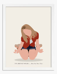
Poster 90-tals popnostalgi
Translation missing: sv.products.product.sale_price Från €16,95€23,95 -
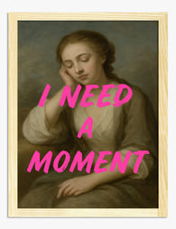
Poster vilsam eftertanke
Translation missing: sv.products.product.sale_price Från €16,95€23,95 -

Poster tidlös reflektion
Translation missing: sv.products.product.sale_price Från €16,95€23,95 -

Poster meningsfulla relationer
Translation missing: sv.products.product.sale_price Från €16,95€23,95 -

Poster eftertänksam ro – kvinnoporträtt i oliv och blått
Translation missing: sv.products.product.sale_price Från €16,95€23,95 -

Poster meditativt uttryck i Jawlensky-stil
Translation missing: sv.products.product.sale_price Från €16,95€23,95 -

Poster hemkär – röd typografi med hjärta
Translation missing: sv.products.product.sale_price Från €16,95€23,95 -

Poster abstrakt stilleben i mjuka neutrala toner
Translation missing: sv.products.product.sale_price Från €16,95€23,95 -

Poster eftertänksam i ränder
Translation missing: sv.products.product.sale_price Från €16,95€23,95 -

Poster mjuka reflektioner i neutrala och blå toner
Translation missing: sv.products.product.sale_price Från €16,95€23,95 -

Canvastavlor porträtt av eftertänksam kvinna bland blommor
Translation missing: sv.products.product.sale_price Från €64,95€92,95 -

Canvastavlor musa vid vägg med vintagetallrikar
Translation missing: sv.products.product.sale_price Från €64,95€92,95 -

Poster eftertänksam morgonmusa
Translation missing: sv.products.product.sale_price Från €16,95€23,95 -

Poster stilleben med skålar i mjuka neutrala nyanser
Translation missing: sv.products.product.sale_price Från €16,95€23,95 -

Canvastavlor med Cézanne-citat i handskriven stil
Translation missing: sv.products.product.sale_price Från €64,95€92,95 -

Poster van Goghs reflektion
Translation missing: sv.products.product.sale_price Från €16,95€23,95 -

Poster själens tillflykt
Translation missing: sv.products.product.sale_price Från €16,95€23,95


Mer från The Frame

How to Build a Minimalist Plant Gallery Wall Th...
Most gallery walls fail in the same way: too many prints, mismatched frames, and spacing that looks accidental. A minimalist plant gallery wall flips the formula. You're not filling a...

How to Build a Calming Gallery Wall That Actual...
Most gallery walls promise serenity and deliver visual static. The fix isn't softer colours or gentler subjects, it's restraint, repetition, and a few specific measurements that almost nobody gets right....

How to Build a French-Themed Gallery Wall That ...
A French-themed gallery wall sits on a knife edge. Done well, it reads like a well-travelled friend's flat in the 6th arrondissement. Done badly, it looks like the back wall...