Art Above a Dining Table: The Rules Nobody Tells You
The proportion tricks, height formulas and chandelier workarounds that separate a polished dining room from an awkward one.

Most guides on this topic repeat the same three rules and call it a day. The truth is messier. Real dining rooms have off-centre tables, pendant lights in the way, and walls that don't behave like the ones in catalogues.
This is the article for when you've already read the basic advice and still feel stuck.
Start with the rule everyone teaches (then we'll break it)
The standard formula: your art should be two-thirds to three-quarters the width of the table below it. For a 180cm (6 foot) table, that means art roughly 120 to 135cm wide. For a 240cm (8 foot) table, you're looking at 160 to 180cm.
This works because it creates a clean visual relationship between the two largest objects in the room. Your eye reads them as a pair instead of two unrelated things.
But the rule assumes a single piece of art. If you're working with a diptych, triptych, or grid, treat the whole arrangement as one rectangle and apply the same maths to its total width, including the small gaps between pieces.

Centre to the table, not the wall
This is the mistake we see constantly, and it's the one that makes rooms look subtly off without anyone being able to say why.
If your dining table isn't centred on the wall behind it (and in most homes, it isn't), centre the art to the table. Not the wall. The table is the anchor of the room. The wall is just a backdrop.
This matters even more in open-plan layouts, where you see the dining area from the kitchen or lounge at an angle. From those sightlines, the relationship between art and table is what registers. The wall edges are barely visible.
The exception: if your table is dramatically off-centre, say pushed close to one corner of the room because of a doorway, splitting the difference can look more intentional than rigidly centring to either one. Stand back, squint, and trust your eye.
The height question (and why 60 inches is a starting point, not gospel)
The standard advice is to hang art so its centre point sits at 152cm (60 inches) from the floor. This is roughly average eye level for a standing adult, and it's the height galleries use.
Above a dining table, you can usually ignore this. Here's why: people are seated when they look at art above a dining table. The viewing context is different. What matters more is the gap between the top of your chair backs (or buffet, if there's one between the table and the wall) and the bottom of the frame.
Aim for 15 to 30cm of clear space between the top of the furniture and the bottom of the art. Less than 15cm and the art looks like it's resting on the furniture. More than 30cm and it starts to float untethered.
If there's nothing between the table and the wall, treat the table itself as the reference and aim for 50 to 75cm of space between the tabletop and the bottom of the frame.
Going slightly bigger is almost always right
The single most common mistake is art that's too small. A 40x50cm print above a 200cm table looks lonely, like someone forgot to finish decorating.
Undersized art creates a "floating" effect. The eye doesn't know how to connect it to the table, the chairs, or the room. You end up with a piece of decoration instead of a focal point.
When in doubt, size up. A piece that feels almost too big in the box will usually look exactly right on the wall. The room absorbs scale better than you'd think, especially with ceilings of 2.4m or higher.
For most dining rooms, this means you're shopping at the 70x100cm mark for single framed prints, or going to canvas if you need to push beyond that. Our canvas prints go up to 150x100cm, which is the right scale for an 8-foot table or a long farmhouse setup.
Chandeliers and pendants: the bit nobody mentions
If you have a pendant light or chandelier above the table (and most dining rooms do), it changes the rules.
The light fixture is part of the visual composition whether you want it to be or not. When you look at the wall behind the table, you see the bottom of the pendant, the air between, and the art. Those three things have to relate.
Two practical guidelines. First, leave at least 30cm of vertical clearance between the bottom of the light fixture and the top of the art frame. If they overlap visually from a normal viewing angle, the room looks cluttered.
Second, if the pendant is dark or visually heavy, choose art that holds its own. A delicate watercolour with lots of white space will get bullied by a dramatic black chandelier. Match the weight.

Behind a buffet vs. directly behind the table
These are two different problems and most guides conflate them.
Directly behind the table: the art needs to relate to the table's footprint. Two-thirds to three-quarters width, centred on the table, with that 50 to 75cm vertical gap.
Above a buffet or sideboard: the art relates to the buffet, not the table. Use two-thirds to three-quarters the buffet's width, and drop your spacing to 15 to 25cm above the buffet surface. The buffet acts as a visual base, so the art can sit lower and closer.
This second setup is more forgiving. You can lean smaller pieces against the wall on the buffet itself, or layer a larger print behind a few objects. The styling vocabulary is broader.
What to hang above a dining table
The dining room is one of the few rooms where you can be properly bold. You're not sleeping here, you're not relaxing for hours at a time. You're eating, talking, sometimes drinking. A bit of visual drama works.
Things that tend to work:
- Large-scale abstracts. Easy on the eye, sets a mood, doesn't compete with conversation. Browse abstract art prints if this is your direction.
- Moody still lifes or food-adjacent imagery. Vintage botanicals, wine country landscapes, old market scenes. Thematic without being on the nose.
- Black and white photography. Crisp, gallery-like, plays well with any colour scheme you've already committed to.
- A single statement landscape. Particularly effective if the dining area is in an open-plan space and you want to give it its own identity.
Things to think twice about: anything too busy or detailed. Above a dining table you're often viewing from a seated angle, slightly upward. Fine detail gets lost. Bold composition reads better.
A note on mirrors: yes, you can hang one above a dining table, and they're brilliant for small dining rooms because they bounce candlelight and double the sense of space. The same proportion rules apply.
Canvas or framed: which works better here?
Honest answer: both, but for different reasons.
Framed prints look more polished and formal. The frame creates a clean edge that reads as "intentional," and our framed art prints come with a UV-protective acrylic glaze that won't cause the glare problems you get with glass. That matters above a dining table where you've got pendant lights and often candles.
Canvas is lighter, cheaper at large sizes, and gives you a softer, more relaxed feel. Good for farmhouse, coastal, or eclectic rooms. The mirrored edge wrap means you don't lose any of the image, and there's no glass to reflect a chandelier back at you.
Our take: if your dining room is formal, go framed. If it's relaxed or you're working at very large sizes (above 100cm wide), canvas is usually the smarter choice.

Real-world complications
Your table isn't centred on the wall
Centre the art to the table, as covered above. If the asymmetry looks too aggressive, balance the empty wall space with a tall plant, a floor lamp, or a console with a smaller secondary piece above it. You're creating visual weight on the empty side without competing with the main artwork.
You have sconces, a thermostat, or a fuse box on the wall
Work around them rather than pretending they don't exist. A vertical orientation print can sit between two sconces beautifully. A diptych can flank a thermostat at eye level so it disappears into the composition.
You rent and can't drill big holes
Lean a large canvas or framed piece on top of a buffet or sideboard, propped against the wall. This is a legitimate styling choice, not a compromise. It reads as relaxed and considered.
Your ceilings are very high
Push the art higher and go bigger. A 60x80cm print on a 3m ceiling looks like a postage stamp. Consider a vertical orientation or a stacked pair of prints to fill the vertical space.
Your ceilings are very low
Horizontal orientation, every time. It visually widens the room and stops the eye travelling up to a ceiling you'd rather not draw attention to.
You've fallen for a piece that's the "wrong" size
This is the most common rule-break and often the most successful. If the piece is too small for the wall, give it a generous mat or pair it with a second piece to create a duo. If it's too large, lean into it. Oversized art in an undersized space is a confident look that designers use all the time.
Lighting: what to watch for
Glare is the silent killer of dining room art. If you've got a pendant directly above the table and the art is glossy, you'll see the bulb's reflection from half the seats at the table.
Our framed prints use UV-protective acrylic rather than glass, which cuts reflections significantly. Canvas has a matte finish that essentially eliminates the problem.
If you want to highlight the art at dinner, a slim picture light mounted above the frame works beautifully and creates a gallery effect. Low-voltage LED versions are cheap, easy to install, and battery-operated options exist if you don't want to rewire.
One large piece or a gallery wall?
For most dining rooms, one large piece is the better choice. Gallery walls are busy, and a busy wall behind a dining table fights with the table setting, the food, and the conversation.
If you want multiple pieces, go for a clean diptych or triptych of related images rather than an eclectic gallery wall. The repeated frame style and shared subject matter read as a single composition.
The budget temptation is to buy three or four small pieces because they're cheaper individually. Resist it. One properly scaled art print at 70x100cm will make the room look more expensive than four small prints that total the same cost.
Trust your eye
The rules exist because they work most of the time. But every dining room has its own quirks, and the goal isn't to pass a maths test. It's to walk into the room and feel like everything is where it should be.
Measure twice, hang once, and stand back across the room before committing. If something feels off, it usually is. Adjust by 5cm at a time and you'll find the right spot faster than you'd expect.


Fab-produkter som visas i denna blogg
-

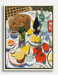
Canvastavlor dansa på bordet – svartvit
Translation missing: sv.products.product.sale_price Från 719.00 kr1,027.00 kr -

Poster solbelyst dukning utomhus
Translation missing: sv.products.product.sale_price Från 180.00 kr257.00 kr -

Poster färgsprakande bordsdukning med blåvitt porslin och blommor
Translation missing: sv.products.product.sale_price Från 180.00 kr257.00 kr -

Poster färgstarkt kvinnoporträtt i morgonro
Translation missing: sv.products.product.sale_price Från 180.00 kr257.00 kr -
Canvastavlor solbelyst picknickdukning
Translation missing: sv.products.product.sale_price Från 719.00 kr1,027.00 kr -

Poster festligt dukat bord med tulpaner och ljus
Translation missing: sv.products.product.sale_price Från 180.00 kr257.00 kr -

Canvastavlor solig brunch och blommor
Translation missing: sv.products.product.sale_price Från 719.00 kr1,027.00 kr -

Poster dansa på bordet – bryt reglerna med stil
Translation missing: sv.products.product.sale_price Från 180.00 kr257.00 kr -

Poster färgstark dukning vid matbord
Translation missing: sv.products.product.sale_price Från 180.00 kr257.00 kr -

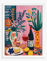
Poster medelhavsbord av Matisse
Translation missing: sv.products.product.sale_price Från 180.00 kr257.00 kr -

Poster matsalen, Vernonnet - Bonnard
Translation missing: sv.products.product.sale_price Från 180.00 kr257.00 kr -

Canvastavlor färgstarkt porträtt med eftertänksam morgonstund
Translation missing: sv.products.product.sale_price Från 719.00 kr1,027.00 kr -

Canvastavlor brunch vid Medelhavet av Matisse
Translation missing: sv.products.product.sale_price Från 719.00 kr1,027.00 kr -

Poster färgstark dukning med frukt och vin
Translation missing: sv.products.product.sale_price Från 180.00 kr257.00 kr -

Poster dukat bord med tulpaner och levande ljus
Translation missing: sv.products.product.sale_price Från 180.00 kr257.00 kr -
Poster stilleben med citrus, blommor och rödvin
Translation missing: sv.products.product.sale_price Från 180.00 kr257.00 kr -

Poster livfullt stilleben med dukat bord
Translation missing: sv.products.product.sale_price Från 180.00 kr257.00 kr -
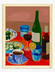
Poster livfull dukning på rött bord
Translation missing: sv.products.product.sale_price Från 180.00 kr257.00 kr -

Canvastavlor matsalen i Vernonnet av Bonnard
Translation missing: sv.products.product.sale_price Från 719.00 kr1,027.00 kr -
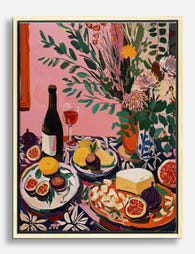
Canvastavlor färgstarkt stilleben med vin, fikon, citroner och ost
Translation missing: sv.products.product.sale_price Från 719.00 kr1,027.00 kr


Mer från The Frame

The Bedroom Finishing Guide: Art, Scale, and Light
Most bedrooms get decorated, but very few get finished. The difference is not how much you put on the walls, it is whether the art, the scale of your furniture,...

One Statement Piece Is All Your Living Room Needs
Most blank walls stay blank because the brief feels enormous. You don't actually need a gallery, a grid, or a curated grouping you'll second-guess for six months. You need one...

Art That Works with Patterned Wallpaper
Patterned wallpaper is having a proper moment, and the question that comes next is always the same: what on earth do you hang on it? The honest answer is that...