
 Beställ idag, leverans senast
 Coffee Prints for the Kitchen: Exactly Where to Hang Them and Which Styles Actually Work
A styling guide for kitchens that love coffee but refuse to look like a novelty gift shop.


Coffee art has a bad reputation, and it's mostly earned. Too many kitchens end up looking like a rustic cafe theme park, with three "But First, Coffee" signs and a chalkboard nobody actually writes on. Done properly, though, a well-chosen coffee print anchors a kitchen with warmth and personality, no gimmick required.
Four styles of coffee print (and which one matches your kitchen)
Before you buy anything, work out which of the four main coffee print styles actually suits your kitchen. Getting this wrong is why so many coffee-themed walls look off. A vintage Italian espresso poster in a sleek handleless kitchen will always feel like a costume.
Vintage cafe prints
These are the classic French and Italian coffee advertisements, hand-lettered signage, and mid-century cafe illustrations. They lean warm, with mustard, cream, deep reds, and hand-drawn typography. They belong in farmhouse kitchens, country cottages, and any space with visible wood, open shelving, or exposed brick.
If your cabinets are shaker style, if you have a butler sink, or if there's a rug on the floor, vintage coffee art will feel right at home. Browse the full vintage art prints collection for options that go beyond the obvious.
Minimalist line art
Single-line drawings of a coffee cup, a moka pot, or a barista pouring. Usually black on white, or black on a warm off-white. These are the sophisticated choice for contemporary and Scandinavian kitchens, where cabinets are flat-fronted, colours are muted, and clutter is the enemy.
Minimalist coffee prints work because they nod to the theme without shouting it. A stranger walking into your kitchen would clock it as art first, coffee art second.
Illustrative and watercolour
Painterly renderings of coffee cherries, latte art, cafe scenes, or botanical studies of the coffee plant. These have more colour and texture than line art, which makes them ideal for eclectic kitchens, colourful spaces, and homes where the walls already carry pattern.
If you have a green or blue kitchen, patterned tiles, or a mix of finishes, illustrative prints slot in beautifully because they've got enough personality to hold their own.
Bold typography
Large-scale word art. "Espresso." "Café." A menu board effect, or a single strong statement in a heavy typeface. This is where things go wrong most often. Skip anything that reads like a novelty mug slogan.
Well-designed typography prints, particularly in monochrome or with a strong industrial feel, look excellent in modern kitchens with dark cabinets, concrete, or exposed metal. Restraint is everything: one typographic print per kitchen, maximum.

How to make your kitchen feel like a cafe without going overboard
There's a simple rule we come back to: three elements, no more. One piece of art. One functional display (the machine, a grinder, a set of matching cups on a shelf). One accent, which might be a small plant, a wooden tray, or a linen tea towel folded on a hook.
That's it. The moment you add a fourth thing, whether it's another quote print or a decorative "COFFEE" sign, the whole corner starts to feel staged.
Colour restraint matters too. Stick to two or three colours in your coffee corner: your cabinet colour, one warm neutral (cream, oatmeal, camel), and one accent that ties to the art. If your print has a hit of terracotta, echo it in a small mug or a ceramic tray. Don't try to match every colour in the artwork.
And please, avoid quote overload. One piece with words is charming. Three pieces with words is a Pinterest board printed onto your walls.
Sizing guide: from the coffee station nook to the big blank wall
This is where most guides fall apart. "Choose a medium size" tells you nothing. Here's what actually works, dimension by dimension.
The coffee station nook
If you have a dedicated coffee area, usually a stretch of worktop with your machine, grinder, and mugs, you want a single print in the 40x50cm to 50x70cm range. Anything smaller gets swallowed by the equipment. Anything larger overwhelms the nook and starts to look like a display window.
Hang it centred above the machine, but crucially: at least 30cm above the highest point where steam escapes. Espresso machines and pour-over kettles produce more moisture than people realise, and that steam rises. More on that in the framing section.
The awkward wall between cabinets
Every kitchen has one. A narrow strip of wall between two runs of cabinets, or the space beside the fridge. For these, go vertical: a single 30x40cm portrait-orientation print, or a stack of two 21x30cm prints with 5cm between them.
Measure the width of the wall strip first. Your print should be roughly 60 to 70 percent of that width, no more. Leave breathing room on either side.
The big blank wall
If you've got a full unbroken wall, usually behind a breakfast table or opposite the range, you have two good options. Go big with a single statement piece at 70x100cm, or build a small gallery of three prints in matching frames, each around 40x50cm, spaced 8cm apart.
For gallery walls, we recommend a maximum of one or two coffee-themed prints out of three. The rest should be complementary: a botanical, an abstract in coffee tones, or a still life. This is the ratio that keeps a kitchen themed without tipping into thematic.
Above the breakfast table
Two-thirds the width of the table. That's the rule. A 120cm table wants art that spans roughly 80cm, whether that's a single 60x80cm print or a pair of 30x40cm prints hung side by side. Hang the bottom edge 20 to 25cm above the tabletop.
Eye level, for everything else
The professional standard is to hang art so the centre of the piece sits at 145 to 150cm from the floor. In kitchens, adjust for the fact that you're often standing rather than sitting, so lean towards the taller end. If the art sits above a worktop, treat the worktop as your floor and centre the piece 60 to 70cm above it.

Colour palettes that tie coffee art into your existing kitchen scheme
The easiest way to make coffee art feel intentional is to pick prints that pull from colours already in your kitchen.
White or cream kitchens handle almost anything, but they look best with warm-toned prints: caramel, terracotta, ochre, deep brown. Cold blacks and greys can feel stark against cream.
Sage green kitchens pair beautifully with cream, rust, and soft brown coffee art. Avoid anything with strong blue tones, which will fight the green.
Navy or deep blue kitchens need warmth to balance the depth. Look for prints with cream backgrounds and warm accents. Vintage cafe posters work particularly well here.
Dark kitchens (charcoal, black, deep green) are made for bold typography or high-contrast line art. Keep the frame dark to match, or go for solid oak for a warmer contrast.
Wood-heavy kitchens with lots of natural oak or walnut need art that doesn't compete. Muted watercolours, botanical illustrations of the coffee plant, or soft abstracts in coffee tones all work. Save the punchy vintage posters for painted kitchens.
If you don't want anything explicitly coffee-themed, warm abstract art or botanical prints featuring coffee plants, coffee cherries, or general foliage in the right palette will give you the cafe feeling without the literal imagery.
Framed vs unframed: why framing quality matters in steamy rooms
Kitchens are the toughest room in the house for art. Steam, grease, temperature swings, and the occasional splash all conspire against paper prints. This is where cheap framing shows itself immediately, usually with warped mounts, bubbling prints, or condensation between the glass and the paper.
Two things matter here.
First, keep art out of direct splash zones. Never hang above the sink, and give the hob a wide berth. Behind a coffee machine is fine as long as you follow the 30cm clearance rule above the steam point.
Second, buy properly. Our framed prints use UV-protective acrylic glaze rather than glass, which is significantly safer near worktops (no shattering), lighter to hang, and won't fog the way cheap glass does when temperatures shift. The frames are solid FSC-certified wood, so they won't warp in humidity the way MDF or veneered frames will within a year. Everything ships fitted together in one box, so the print arrives properly mounted, not curling out of a flimsy backing board.
Canvas prints are also worth considering for kitchens. They're lighter, they don't have any glazing to fog, and the hand-stretched poly-cotton handles humidity better than paper does. If you're hanging near a coffee machine or in a small kitchen with a lot of steam, canvas is genuinely the more practical choice. It also has a softer, more relaxed look that suits farmhouse and rustic kitchens particularly well.
The one place we'd always frame rather than go canvas: a formal breakfast area or a kitchen with lots of hard finishes (marble, polished concrete, high-gloss cabinets). Framed prints look more finished in those spaces.

Pairing coffee prints with other kitchen art for a cohesive look
A kitchen full of coffee art is a kitchen with a personality disorder. The trick is treating your coffee print as an anchor and building around it with related but non-literal pieces.
The one-in-three ratio works well. In a gallery of three, one coffee piece and two supporting prints. In a gallery of five to seven, no more than two coffee-themed pieces total.
Good pairings include botanical studies (particularly herbs, citrus, or coffee plants), still-life food illustrations, warm abstract art, vintage kitchen equipment prints, and typography that isn't coffee-related (a recipe card, a market sign, a poem). Browse kitchen art prints for pieces designed to sit alongside coffee art without repeating the theme.
Frame consistency matters more than you'd think. If your coffee print is in a black frame and your other kitchen art is in oak, it will always look accidental. Pick one frame finish per wall and stick to it. Mixing frame styles works in a lounge or hallway, but kitchens have enough visual noise already.
Match your metals too. If your handles, tap, and light fittings are brass, warm-toned frames and prints with gold or ochre tones will feel cohesive. If everything's chrome, cooler black frames and prints with more contrast will look sharper.
Our top coffee print picks for modern, rustic, and minimal kitchens
Here's what we'd actually put on each type of wall.
For modern kitchens
A single large-scale minimalist line drawing of a moka pot or espresso cup, in black on off-white, framed in slim matte black. Size it generously: 60x80cm as a solo piece above a coffee station, or 50x70cm if it's part of a small gallery.
Alternatively, one bold typographic print in a strong industrial typeface, kept in monochrome. Nothing cursive, nothing with quirky illustrations. One clean word, one clean frame.
For rustic and farmhouse kitchens
A vintage French or Italian coffee advertisement in warm ochre and cream tones, framed in solid oak. These prints have enough character to carry a wall on their own, so resist the urge to add more. If you want a pair, choose two complementary vintage prints in the same colour family and hang them with matching frames.
Canvas is a strong option here too. The soft matte finish suits the informality of a farmhouse kitchen and it handles kitchen humidity beautifully.
For minimal and Scandinavian kitchens
Single-line coffee illustrations, small in scale, hung with plenty of white space around them. A 30x40cm print in a slim oak or black frame, centred on a stretch of wall that would otherwise stay empty. Resist the temptation to add a second piece. Restraint is the whole point of this aesthetic.
For colour, a soft watercolour of coffee cherries or a botanical study of the coffee plant works beautifully as a subtle nod that doesn't announce itself. Our beverage art prints collection has pieces that work across all three of these categories.

The short version
Pick one style of coffee print that matches your kitchen's actual aesthetic, not the aesthetic you saw on Pinterest. Size it properly for the wall you're filling. Keep it 30cm clear of any steam. Frame it well or go canvas if the room is genuinely humid. And whatever you do, stop at one coffee print. The second one is always where things go wrong.

Fab-produkter som visas i denna blogg
-
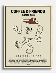
Canvastavlor kaffemys med retromuggar
Försäljningspris Från 733.00 kr1,048.00 kr -
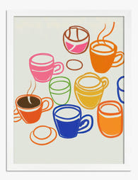
Poster färgglada kaffekoppar
Försäljningspris Från 184.00 kr262.00 kr -

Poster kaffemugg i retrostil – varma beige toner för kök och matplats
Försäljningspris Från 184.00 kr262.00 kr -

Coffee Marker Drawing Art Print
Försäljningspris Från 184.00 kr262.00 kr -

Coffee Marker Drawing Canvas Print
Försäljningspris Från 733.00 kr1,048.00 kr -

Poster morgonkaffe på språng
Försäljningspris Från 184.00 kr262.00 kr -
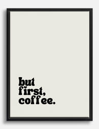
Canvastavlor morgonens kaffestund i svartvitt
Försäljningspris Från 733.00 kr1,048.00 kr -

Poster kaffe först – morgonritual
Försäljningspris Från 184.00 kr262.00 kr -

Poster cafétypografi i svart och grått
Försäljningspris Från 184.00 kr262.00 kr -

Canvastavlor med kafékänsla
Försäljningspris Från 733.00 kr1,048.00 kr -

Canvastavlor kaffe i varm minimalistisk stil
Försäljningspris Från 733.00 kr1,048.00 kr -
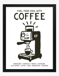
Poster kaffe – kaffemaskin i svartvitt
Försäljningspris Från 184.00 kr262.00 kr -

Canvastavlor morgonpepp med kaffekopp på språng
Försäljningspris Från 733.00 kr1,048.00 kr -

Poster kaffebönor, mokakanna och kopp
Försäljningspris Från 184.00 kr262.00 kr -

Poster kaffe och croissant
Försäljningspris Från 184.00 kr262.00 kr -

Poster minimalistisk kaffestund i varma toner
Försäljningspris Från 184.00 kr262.00 kr -

Canvastavlor morgonkaffe – två take away-muggar
Försäljningspris Från 733.00 kr1,048.00 kr -
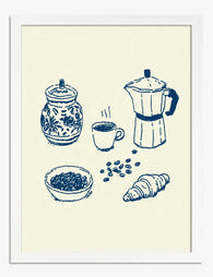
Poster morgonens kafferitual
Försäljningspris Från 184.00 kr262.00 kr -

Canvastavlor djärv cafétypografi i svartvitt
Försäljningspris Från 733.00 kr1,048.00 kr -

Canvastavlor färgglada kaffestunder
Försäljningspris Från 733.00 kr1,048.00 kr


Mer från The Frame

Botanical Bedroom Ideas: How to Use Plant Print...
Botanical prints belong in bedrooms more than any other room in the house. The trick is choosing the right subjects, sizing them properly, and understanding how a printed leaf on...

Why Kew Gardens Became the World's Most Famous ...
Kew Gardens holds around 200,000 botanical illustrations, the largest collection of its kind anywhere. Behind that number is a story of royal ambition, global exploration, and artists sent to the...

Are Botanical Prints Still in Style? Why They W...
Yes, botanical prints are still in style. But the version of botanical art that feels current in 2025 looks very little like the pastel rose bouquets in gilt frames you...