The Complete Guide to Styling Botanical Prints Like a Pro
The opinionated guide to leaf prints that doesn't end with your living room looking like a garden centre.

Leaf prints are the most forgiving subject in wall art, which is exactly why so many people get them wrong. They go with almost everything, so people stop thinking critically about scale, frame finish, and colour cohesion. This guide is the antidote: opinionated, specific, and willing to tell you what not to do.
Why leaf prints are the easiest subject to get right (and wrong)
Botanicals work in almost any interior style. Mid-century, Scandi, Japandi, classic English, coastal, even industrial lofts. That universality is the trap. Because they "go with anything," people buy three or four prints on impulse, hang them above the sofa, and end up with a wall that feels less like considered styling and more like the lobby of a chain hotel.
The good news: leaf prints punish bad decisions less harshly than, say, abstract art or portraits. The bad news: they also reward good decisions less obviously, so it takes a sharper eye to push them from "fine" to genuinely beautiful. Everything that follows is about that gap.

The colour palette rule: matching your greens to your room's undertone
This is the single biggest thing competitors skip, and it's the difference between a print that disappears into a room and one that fights it. Greens have undertones, just like paint and skin. Broadly, they fall into two camps:
Warm greens lean towards yellow, olive, lime, and chartreuse. Think fern fronds in golden light, or dried eucalyptus.
Cool greens lean towards blue, sage, and forest. Think rubber plant leaves, monstera in deep shadow, or pressed botanical illustrations on cream.
Look at your room's largest soft surfaces, the sofa, the rug, the curtains, and ask whether the whites read creamy or crisp, whether the wood tones are honey or ashy, whether the metals are brass or chrome. Warm rooms (creamy whites, oak, brass, terracotta) want warm greens. Cool rooms (chalky whites, walnut or ash, chrome, navy) want cool greens.
Mixing the two camps is the fastest way to make a print look cheap, even if the print itself is beautifully made. A lime-green palm leaf hung in a sage-and-chrome bathroom will always look slightly off, and you won't be able to articulate why.
If you want to browse with this in mind, our green art prints collection is the easiest place to compare undertones side by side.
Single statement vs gallery wall: when each approach works
There are two legitimate ways to use leaf prints, and they're not interchangeable.
Go statement when
You have a clear focal wall (above a sofa, bed, console, or fireplace), and the rest of the room is already doing something visually. One large print, ideally 70x100cm framed or up to 100x150cm on canvas, anchors the space and lets the room breathe around it. This is the more sophisticated choice nine times out of ten.
A single oversized monstera, banana leaf, or palm frond reads as deliberate. Three smaller ones often read as "I couldn't decide."
Go gallery when
You have a long wall (above a stairwell, a hallway, or a wide bedroom wall behind the bed) and the rest of the room is restrained. Gallery walls of botanicals work best when they share a strict visual constraint: all the same frame, all the same paper background, or all the same species drawn in the same style.
Mixing wildly different illustration styles (a watercolour fern next to a graphic line-drawing palm next to a photographic close-up of a leaf) creates visual noise. Pick a lane. The vintage scientific illustration look is one lane. Modern minimal line art is another. Photographic close-ups are a third. Don't blend them.
Frame finishes that elevate leaf prints (and the one to avoid)
Everyone tells you to use black or gold frames. They're half right.
Natural oak or light ash in a clean, narrow profile is the most universally flattering finish for leaf prints. It picks up the organic quality of the subject without competing with it. If you only buy one frame finish, buy this one.
Matte black in a thin profile works beautifully for graphic, high-contrast botanical illustrations, especially line drawings or silhouettes. Avoid black on softer watercolour leaves; the contrast is too aggressive and the print ends up looking like a poster.
White frames disappear, which can be exactly what you want if your wall colour is doing the heavy lifting (a deep forest green or terracotta wall, for instance). On a white wall, white frames make the print feel ungrounded.
The finish to avoid: honey-toned or orange-tinted wood, and any ornate or "antiqued" gold. Honey oak makes leaf prints look like they belong on a 1990s conservatory wall. Ornate gold makes them look like they were rescued from a stately home gift shop. Slim, clean, modern profiles only.
One more rule: pick one frame finish and stick with it across the whole room. Mixing frame finishes on botanicals almost always looks unintentional. Save the eclectic frame mixing for galleries of mixed-subject art.
If you'd rather skip the framing decision entirely, canvas is a perfectly valid alternative. Hand-stretched canvas reads softer and slightly more casual, and it works particularly well for large, painterly leaf compositions in humid spaces like bathrooms or kitchens.

Room-by-room placement
Living room
The most common mistake in living rooms is hanging leaf prints too high above the sofa. The bottom edge of the frame should sit roughly 15 to 25cm above the back of the sofa, not floating awkwardly halfway up the wall. If you can fit a hand and a half between the sofa back and the frame, you're about right.
Scale matters even more here. Above a three-seater sofa (roughly 2 metres wide), a single print should be at least 60x80cm, ideally 70x100cm or larger. Anything smaller looks like a postage stamp and shrinks the whole room. For more options sized for this wall, browse our living room art prints.
Bedroom
Above the bed is the obvious spot, and it's where most people overthink it. One large horizontal print, or a tight pair, works better than three. The print should be narrower than the bed itself, never wider. A 100x70cm landscape print above a king-size bed is close to perfect.
Avoid hanging anything tropical or aggressively green directly above where you sleep if your bedroom is small. Big monstera leaves loom. Save those for rooms with more breathing space.
Hallway
Hallways are where gallery walls actually earn their keep. You walk past them rather than sit and stare, so the visual complexity reads as interesting rather than busy. A vertical run of three or four matching botanical prints up a stairwell, all the same size, all the same frame, with consistent spacing of around 5 to 8cm between frames, looks considered and expensive.
Bathroom
Bathrooms are the one place where canvas often beats framed prints, simply because the humidity is less kind to paper over years. That said, with a UV-protective acrylic glaze and a properly sealed frame, a quality framed print holds up fine in any normal bathroom. Skip anything overly tropical here; ferns, eucalyptus, and pressed-leaf illustrations feel more spa-like than a giant banana leaf.
Mixing leaf prints with other subjects without creating visual chaos
Botanicals mix beautifully with a few specific subjects and badly with most others.
Works well: abstract landscapes in muted tones, vintage still-life paintings, architectural line drawings, black-and-white photography (especially of natural subjects like water, stone, or mountains). The common thread: anything with a quiet, natural mood.
Works badly: bold typography prints, pop art, busy figurative work, anything in a clashing colour palette. A neon-pink slogan print next to a fern is a fight, not a conversation.
The simplest mixing rule: one botanical, one non-botanical, repeated. A gallery wall of alternating leaf prints and quiet abstracts in a shared palette feels curated. A gallery wall of one of everything feels chaotic.
And the trap nobody warns you about: matching your leaf prints to your real houseplants. If you have a monstera in the corner and a monstera print on the wall, you've crossed into theme-park territory. Pick prints of leaves you don't already own as plants. Restraint reads as taste.

Common mistakes: going too small, hanging too high, and over-matching
Going too small
This is the most common and most expensive mistake. People buy a 30x40cm print, hang it above a sofa, and wonder why the room feels off. As a rule, your wall art should fill roughly two-thirds of the width of the furniture below it. Below a 2-metre sofa, that's around 130cm of total art width. One large print, two medium prints with a small gap, or a tight three-print arrangement.
If you're hanging above nothing (a blank wall in a hallway, say), the print should be sized to the wall, not to your hesitation. When in doubt, size up.
Hanging too high
The eye-level rule: the centre of the print should sit roughly 145 to 155cm from the floor. This is gallery standard, and it's lower than most people instinctively hang. Above furniture, ignore eye level and use the 15 to 25cm above the back of the sofa rule instead.
Over-matching
The "three-green maximum" is a useful constraint. Count the distinct greens in your room: the plant in the corner, the cushion, the rug pattern, the print, the throw. If you're past three, something needs to come out. Botanical prints work hardest when they're the dominant green note in a space, not one of seven.
This applies to subject matter too. One bold tropical print plus one delicate herb illustration plus one palm photograph is too many ideas. Pick a botanical mood (lush and tropical, or delicate and scientific, or graphic and modern) and commit.
Choosing seasonal subjects you'll regret
Some leaf prints date faster than others. Autumnal red and orange foliage, holly, and anything overtly Christmassy reads as seasonal and feels wrong by February. Evergreen subjects, monstera, palm, fern, eucalyptus, fig, rubber plant, olive, work year-round and won't look tired in three years.
Buying cheap prints that look cheap
The two giveaways of a low-quality botanical print are visible pixelation in the leaf detail and washed-out or oversaturated greens. Botanicals live or die on the subtlety of their colour gradients. Look for prints described as giclée on matte paper, ideally with strong colour fidelity claims, and avoid anything printed on thin, shiny stock. Glare on a leaf print kills the entire effect.
Our botanical art prints and leaves art prints are all printed on thick matte paper specifically to avoid that glare problem, and the frames ship pre-fitted so you're not assembling anything at home.

Where to start
If you're styling from scratch: pick one statement print, sized properly for its wall, in a frame finish that matches your room's undertone, and live with it for a fortnight before adding anything else. Most rooms need less leaf art than people think, and the ones that need more will tell you clearly once the first piece is up.

Fab-produkter som visas i denna blogg
-

Poster botanisk plansch i vintagestil
Translation missing: sv.products.product.sale_price Från 180.00 kr257.00 kr -

Poster botanisk trappa
Translation missing: sv.products.product.sale_price Från 180.00 kr257.00 kr -

Poster brittisk botanisk vy
Translation missing: sv.products.product.sale_price Från 180.00 kr257.00 kr -

Poster gröna krukväxter på gul bakgrund
Translation missing: sv.products.product.sale_price Från 180.00 kr257.00 kr -

Poster botaniska salviablad i gråskala
Translation missing: sv.products.product.sale_price Från 180.00 kr257.00 kr -

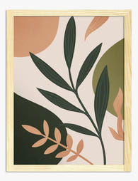
Poster moderna blad i frodigt grönt
Translation missing: sv.products.product.sale_price Från 180.00 kr257.00 kr -

Poster boho vaser med gröna blad
Translation missing: sv.products.product.sale_price Från 180.00 kr257.00 kr -

Poster krukväxter på hylla
Translation missing: sv.products.product.sale_price Från 180.00 kr257.00 kr -

Poster botanisk blomma i modern stil
Translation missing: sv.products.product.sale_price Från 180.00 kr257.00 kr -
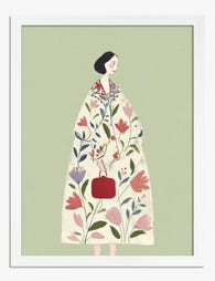
Poster botanisk modeillustration – kvinna i blommig kappa
Translation missing: sv.products.product.sale_price Från 180.00 kr257.00 kr -

Poster botanisk harmoni i boho-stil
Translation missing: sv.products.product.sale_price Från 180.00 kr257.00 kr -

Poster botanisk trappa med krukväxter
Translation missing: sv.products.product.sale_price Från 180.00 kr257.00 kr -

Canvastavlor botaniskt statement i modern stil
Translation missing: sv.products.product.sale_price Från 720.00 kr1,028.00 kr -

Poster botaniska former i boho-stil
Translation missing: sv.products.product.sale_price Från 180.00 kr257.00 kr -

Poster handritad botanisk ört i svartvitt med oliv- och beige ränder
Translation missing: sv.products.product.sale_price Från 180.00 kr257.00 kr -
Poster botaniska blad i modern boho-stil
Translation missing: sv.products.product.sale_price Från 180.00 kr257.00 kr -

Poster bohemisk botanisk oas med krukväxter
Translation missing: sv.products.product.sale_price Från 180.00 kr257.00 kr -

Poster modernt botaniskt motiv i neutrala toner
Translation missing: sv.products.product.sale_price Från 180.00 kr257.00 kr -

Poster botanisk vintage med gröna blad
Translation missing: sv.products.product.sale_price Från 180.00 kr257.00 kr


Mer från The Frame

The Art of Calm: How to Use Wall Art to Make Yo...
You've tidied, you've decluttered, you've maybe even bought the linen cushions. So why does the room still feel a bit off? Nine times out of ten, the walls are the...

Garden Art for Living Rooms: What to Hang, How ...
Why the living room is where garden art prints earn their keep The living room is the wall art stress test. It's where you sit for hours, where guests form...

Cottage, Botanical, English: Every Style of Gar...
Garden art is one of the most loosely defined categories in wall decor. Type "botanical print" into any search bar and you'll get scientific line drawings, lush watercolours, abstract florals,...