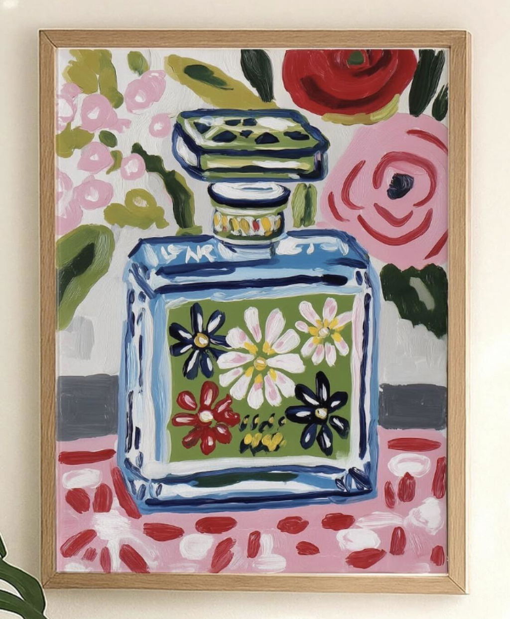
Solid wood. Professionally framed. Arrives ready to hang.
Make your print ready to hang.
Blue Art Prints
4.8
Blue does a lot of work in a room: it cools a bright wall, calms a busy one, and holds a scheme together without shouting. Here you'll find every register of it, from pale washed skies to deep navy. Swimmers mid-stroke, Mediterranean tables, harbours and headlands. If you want water specifically, the ocean art prints lean deeper and moodier, while coastal art prints stay light and sunlit. Abstract art prints give you colour without a subject.
I Googled the Colors I Wanted and Found my Perfect Print
I just moved from a three-bedroom, two story house to a two bedroom ground floor apartment. This is the start of my new life and I want new things in my new place. I stumbled across Fab by Googling, "Print, gold, teal, brown" and they popped up. I found the perfect picture in the perfect orientation with the perfect frame. My anal-retentive brother came over and hung it for me--Perfectly level! It looks perfect. I'm already eyeballing another print for my bedroom that has yet to be decorated. I'll definitely buy from them again.
The colors are vibrant and the quality of the print is excellent. The paper it is printed on is very good quality, too. Will definitely buy more prints from you, I've very impressed with overall.
Bought 2 prints. Excellent matt finish.Almost a screen printed look and feel. Quality paper. They came beautifully
Packed. Very happy with purchase ease, quality prints and great packaging. They look fabulous. Thank you.
recently purchased this print and I couldn't be happier with it. The quality is outstanding — the colors are vibrant, the details are crisp and sharp, and it looks even better in person than in the photos. It arrived quickly and well-packaged, with no creases or damage at all.
The print has brought so much life and personality to my wall. It's beautifully designed and really fibishes the look off.
You've narrowed it down to blue. Good. The trouble is that "blue" covers everything from a near-black navy to an electric cobalt, and the wrong shade on your wall can...
Yes, you can hang art in a bathroom. The internet has somehow convinced everyone this is risky business reserved for people with dehumidifiers and degrees in conservation, and that simply...
Choosing blue art: your questions

Shade matching, framing choices, where blue works best, and how your print arrives ready to hang
What's the difference between navy, cobalt, teal and turquoise blue in wall art?
Navy is the darkest of the four, a near-black blue that behaves almost like a neutral and anchors a wall the way charcoal does. Cobalt is a pure, vivid mid-blue with a slight violet lean, named for the pigment synthesised in 1802 and later favoured by Van Gogh, so cobalt prints read as a focal point. Teal is a deeper, muted blue-green; turquoise is lighter, brighter and greener, with a coastal feel. For restful bedrooms, choose navy or teal; for energy in kitchens or kids' rooms, cobalt or turquoise. Royal blue sits between navy and cobalt.
What is Prussian blue, and why does it look so distinctive in Japanese wave prints?
Prussian blue is the first modern synthetic pigment, created by accident in Berlin around 1706 and later carried to Japan through Dutch and Chinese trade, where print workshops nicknamed it bero-ai, or Berlin indigo. Ukiyo-e designers including Hokusai embraced it in the 1820s and 1830s because it printed deeper, more saturated and far more fade-resistant than the older indigo and dayflower blues. In The Great Wave, printers combined and overprinted Prussian blue with indigo, so bright blue swells sit against near-black water. That built-in contrast is why wave prints still read as crisp and graphic on a wall.
Which blue art prints suit a Mediterranean or Greek-island style kitchen?
Look for crisp blue-and-white subjects: whitewashed Cycladic villages with cobalt domes, Aegean coastline and harbour scenes, blue shutters and doors, azulejo or delft-style tile patterns, olive branches and lemons rendered in indigo, and Greek key or amphora motifs. Cycladic blues in the cobalt to deep sea range read best against warm white walls, terracotta floors, and natural wood. Group two or three prints above a banquette or open shelving, keep compositions simple near a busy tiled splashback, and choose framed pieces in white, natural wood, or black for a clean finish.
Which shade of blue works best for a living room?
For a living room, we'd steer you towards navy blue wall art or deep cobalt blue art prints. These deeper tones anchor a room without overwhelming it, especially against neutral walls like warm white or soft grey. A large 70x100cm framed navy print above a sofa creates an instant focal point and makes the whole space feel considered. If your room already runs dark, a blue and white art print with plenty of negative space keeps things from feeling heavy.
What colours should I pair with blue art prints on my walls?
Blue art prints are remarkably easy to build around. Our go-to pairing is blue artwork alongside warm neutrals like terracotta, sand, or ochre, because the warm-cool contrast stops a room from feeling one-note. If you're working with a grey or white scheme, add a mustard cushion or brass lamp near the print to give the eye somewhere else to land. Avoid pairing blue with too many other cool tones unless you genuinely want a calm, almost clinical feel (which can work beautifully in a bathroom or study, just not usually in a living room).
Are light blue prints a good choice for a bedroom?
Honestly, light blue prints for a bedroom are one of the safest bets in interior decorating. Soft blues lower your heart rate (there's actual science behind this) and pair perfectly with white bedding, linen textures, and natural wood furniture. We'd recommend a pair of framed light blue prints, around 30x40cm each, hung symmetrically above your bedside tables. Our giclée prints on thick matte paper have zero glare, so they won't catch the light from a bedside lamp and distract you at night.
How do I choose between abstract blue art and blue coastal prints?
It comes down to the mood you want. Blue coastal prints bring a literal sense of place, think ocean horizons and shorelines, and they work brilliantly in open-plan kitchens, hallways, or holiday homes where you want that breezy, relaxed energy. Blue abstract art prints are more versatile and tend to suit modern or minimalist interiors where you want colour and texture without a specific narrative. If you're replacing an old print that never quite felt right, abstract is usually the safer bet because it doesn't lock you into a coastal theme for the whole room.
Will blue art prints fade if I hang them near a window?
Not ours. Every framed blue art print we sell comes with UV-protective acrylic glazing that prevents fading even in direct sunlight, and we use museum-grade inks rated to last hundreds of years. This matters more than people realise, because blue pigments are historically some of the most light-sensitive (it's why old posters in shop windows always fade to that washed-out cyan). You can hang your print opposite a south-facing window without a second thought. The acrylic glaze also eliminates glare, so you'll see the actual artwork rather than a reflection of your room.
Choosing a selection results in a full page refresh.