


 Order today for delivery by
Brown Art Prints
Brown covers a lot of ground: cocoa and chestnut, saddle leather, faded sepia, the tea-stained look of old book pages. That range is useful. A deep brown print anchors a pale wall, while softer shades sit quietly behind furniture. Browse by mood as much as subject here, and if you want the tone lighter or dustier, the beige art prints and earthy tones art prints run alongside this one.


Basset Hound Modern Portrait Art Print

Irish Setter Portrait with Aubergine Collar Art Print

Collie with Terracotta Red Collar Art Print

Staffordshire Bull Terrier with Blue Bandana Art Print
More Fab art curations





Hanging in 100k+ homes
What people say about Brown Art Prints
Auto-generatedRich, vivid colours and clear detail stand out, while well-framed prints arrive securely and suit studies, dining rooms and galleries.
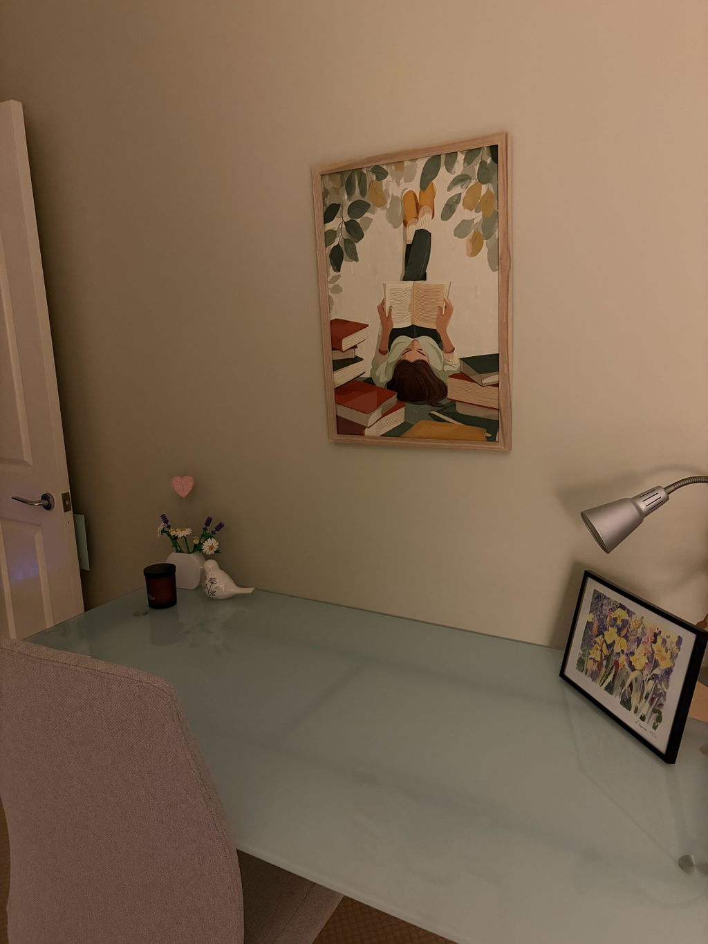
Loved my Fabart print for my study
Loved my Fabart print for my study. It looks amazing and arrived perfect - ready to hang!
 Reviewed
The Reader Beneath the Leaves Art Print →
Another great catching art print
I just love the simplicity of this print, goes so well in my home office
 Reviewed
Cat at the Open Door Art Print →
Beautiful print
Beautiful print, looks like an original
 Reviewed
Watercolour Dachshund Charm Art Print →








 Questions about brown prints



Quick answers on shades of brown, framing choices, wall placement and how returns work