


 Order today for delivery by
 Gradient Art Prints
Gradient art is colour doing all the work: one tone dissolving into the next, with no hard edges to argue with the rest of the room. Warm sunset fades read cosy over a bed; cool blues and greys keep a workspace calm. Pick by the colour you already live with, then decide how soft you want the shift. If you like the glow but want less structure, aura art prints go hazier, while colour field art prints hold larger, flatter blocks of tone.


Ambient — Iridescent Flow Poster Art Print

Neon Sunset Glow Art Print

Golden Hour Curve Art Print

Angel Numbers 777 Luck Aura Art Print
More Fab art curations




Colour And Composition, From The Frame
Reading on blending colour, scale and where soft tones sit best from The Frame, Fab's blog.
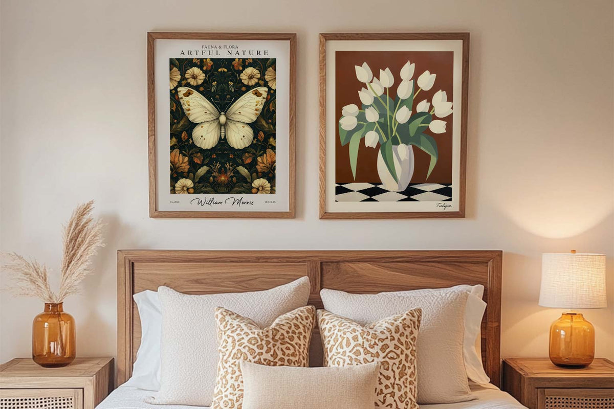
Starter Art Prints for First-Time Buyers
A blank wall can be intimidating. You know you want art, but where do you even start? You scroll through endless options online, walk through galleries feeling lost, or stare...
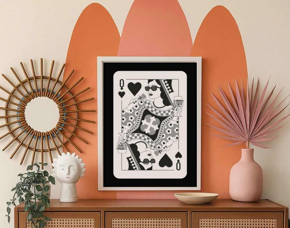
Decorating with Black and White Wall Art
You love the look of black and white art, but you're worried it might make your home feel like a doctor's office. Or maybe you think it's too safe, too...
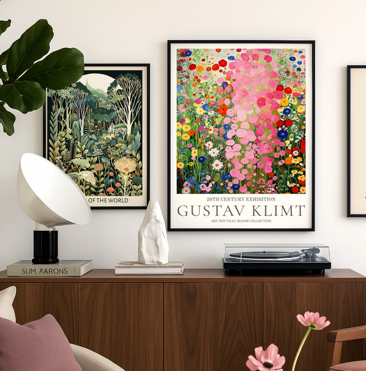
Discover Gustav Klimt Art Prints with Fab
Gustav Klimt wasn’t just an artist — he was a master of seduction through pattern, color, and symbolism. At Fab, we celebrate his work not just as art history, but...
 Questions about gradient prints



Short answers on picking colours, choosing framed or unframed, and where a fade tends to sit best