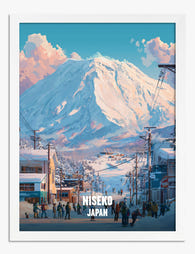
Solid wood. Professionally framed. Arrives ready to hang.
Make your print ready to hang.
Ski Resort Art Prints
4.8
Ski resort art takes in cable cars strung over a white bowl, village rooftops under snow, terraces at last light and the graphic pull of a piste map. Some pieces are bold and poster-like, others quietly painterly. If it's the peaks you're after, French Alps art prints go wider; vintage ski posters bring stronger colour, while chalet art prints suit a warmer, lodge-lit corner.
Ski wall art generally falls into a few recognizable styles: vintage travel-poster designs, retro graphic illustrations of famous slopes and trail maps, alpine landscape scenes, and action photography of skiers in motion. Vintage and Art Deco-inspired poster reproductions suit a nostalgic, lodge-like look, while photographic and painterly mountain scenes read more contemporary. Deciding on the mood you want first makes narrowing down a print much faster.
Vintage ski posters or modern alpine photography — which should I pick?
Vintage-style ski posters use bold flat colour, strong typography and a nostalgic feel, so they work well in groups and bring warmth to wood-panelled or neutral rooms. Modern alpine photography and landscape prints lean cooler and quieter, with more white and blue, and tend to suit minimal interiors as a single statement piece. If your room already has lots of texture, one calm photographic scene often balances it better than several busy posters.
Where do ski prints work best in a home?
Entryways, mudrooms and stairwells are natural spots, since ski art sets a mountain mood the moment you walk in. A living room or den can carry a larger single print above the sofa or fireplace, while a corridor suits a row of same-size resort posters hung in a line. Bedrooms and home offices work too if you choose calmer snowy landscapes rather than high-energy action imagery.
What colours go well with ski and alpine wall art?
Ski art usually leans on snow whites, glacier blues and deep evergreen, so it sits comfortably against warm wood, cream, stone grey and charcoal walls. If the print is a vintage-style poster with strong reds, oranges or yellows, pull one of those accent tones into cushions or a throw so the artwork feels intentional. Keep surrounding decor fairly restrained and let the mountain palette do the work.
Choosing a selection results in a full page refresh.