Transform Any Room with a Cohesive Pink Gallery Wall
A practical formula for building a pink gallery wall that reads as considered and grown-up, not saccharine.

Pink is one of the trickiest colours to gallery-wall well. Get it wrong and the whole thing reads juvenile or chaotic, like a teenager's mood board. Get it right and you have one of the most sophisticated, light-filled walls in the house.
The difference comes down to a few decisions made early: how many shades of pink, which sizes, and crucially, how you frame the lot. Here's the system.
Why a tonal gallery wall works better than a 'matchy-matchy' set
There's a temptation, when buying art in a single colour, to choose pieces that look like siblings. Same artist, same palette, same mood. It feels safe. It also tends to look flat.
A tonal gallery wall does something more interesting. Instead of repeating the same pink across every print, you stay within a controlled range, say warm blush through to dusty rose, and let the variation do the work. The eye reads the connection (pink) before it reads the differences (a peachy abstract here, a rose-toned botanical there). That tension is what makes a wall feel curated rather than bought.
Matchy sets are also harder to expand. Add one new piece and the whole thing falls apart. A tonal wall, by contrast, can absorb a new print easily as long as it sits within your colour range. You're building a system, not a frozen arrangement.
The professional consensus from interior stylists is broadly the same: cohesion comes from one or two anchoring elements (colour, frame, subject), and everything else is allowed to vary. For a pink wall, colour is your anchor. We'll come to the second one shortly.

Picking your pink palette: staying within two to three tonal ranges
The single biggest mistake with pink art prints is treating "pink" as one colour. It isn't. Hot pink, blush, salmon, dusty rose, fuchsia and millennial pink behave like entirely different colours on a wall. Throw them all together and the eye doesn't know where to land.
Pick two tonal ranges, three at most. Some combinations that consistently work:
- Warm blush + peachy coral. Soft, sunlit, flattering in north-facing rooms.
- Cool rose + dusty mauve. More grown-up, slightly moody, excellent in bedrooms.
- Blush + terracotta + a single hot pink accent. Earthy and modern, the accent stops it feeling too sweet.
Notice what's missing from each list: fuchsia next to baby pink, or millennial pink next to coral. Tones that sit too close on the colour wheel but read as different temperatures will fight each other.
A practical test before you order: pull every image up on screen at the same time, then squint. If one print jumps out as "wrong pink," it is. Swap it.
Decorating with blush pink works best when you treat blush as the base note and let one or two deeper or warmer tones provide contrast. All-blush walls flatten out. A spectrum from cream-pink to clay-pink has depth.
How many prints you actually need (and the sizes that work best together)
For most walls, the magic number is between five and nine prints. Fewer than five and it stops reading as a gallery and starts looking like a sparse hang. More than nine and you're into salon-wall territory, which is a different project altogether and harder to control tonally.
Here's a formula that works for a standard sofa wall (around 2.4 metres / 8 feet):
- 2 large prints at 50x70cm or 60x80cm
- 3 medium prints at 30x40cm or 40x50cm
- 2 to 4 small prints at 21x30cm (A4) or 30x40cm
The total wall arrangement should span roughly two-thirds of the furniture width below it. Any narrower and the wall looks top-heavy with empty space; any wider and it overwhelms the sofa.
For a bedroom wall above a standard double bed, scale up slightly: two 60x80cm anchors with three or four medium prints around them. For a narrow hallway, drop to four or five prints, all small to medium.
If you don't want to source pieces individually, pre-curated wall art sets take most of the guesswork out. They're designed to sit together tonally and in scale, which solves two problems at once.
One thing to avoid: buying prints all the same size. A grid of nine identical squares isn't a gallery wall, it's a pattern. Variation in scale is what gives the eye somewhere to rest and somewhere to focus.

The one rule that holds it all together: consistent framing
If colour is your first anchor, framing is your second, and frankly the more important one. Inconsistent frames are what make most pink gallery walls look like a charity-shop haul.
Pick one frame finish and stick to it across every print. Three options that consistently flatter pink art:
- Natural oak. Warm, soft, takes the edge off cooler roses and makes blush feel less precious. Our top pick for most pink palettes.
- Matte black. Anchors the wall and gives sweeter pinks a graphic, gallery-like backbone. Excellent in living rooms with darker furniture.
- White. Disappears into the wall and lets the art do everything. Best in small rooms or where you want maximum lightness.
Avoid mixing finishes. A black frame next to an oak frame next to a gold frame doesn't read as eclectic, it reads as accidental. If you want variation, vary mat width or frame thickness within the same finish, not the finishes themselves.
A note on mats: a white or off-white mat board around each print adds breathing room and another layer of consistency. For warmer pinks (blush, peach, terracotta), an ivory or cream mat sits more naturally than bright white. For cooler pinks (rose, mauve), pure white is sharper and better.
This is also where quality genuinely matters. The most common failure with framed prints is warping, ill-fitted glazing, or frames that arrive separately and have to be assembled. Our framed prints come ready to hang in a single box, with the print properly fitted behind UV-protective acrylic and FSC-certified solid wood frames. The acrylic also matters for pink specifically, because pink pigments are among the first to fade in direct sunlight. UV protection keeps blush looking blush, not beige, years in.
Mixing styles: pairing abstract pink prints with photography and line art
A wall of nine pink abstracts is a lot of pink abstract. Mixing genres is what stops a tonal wall feeling one-note.
A reliable ratio is roughly 60% abstract to 40% representational. So in a seven-print wall, that's four pink abstract art prints and three pieces of something else: a botanical illustration, a piece of pink-toned photography, a minimal line drawing of a figure.
The representational pieces give the eye something to recognise and rest on. The abstracts provide the colour fields and texture. Without the abstracts, the wall looks like a set of illustrations. Without the representational pieces, it looks like swatches.
Botanical art prints work especially well in pink palettes because the pink usually appears as a flower or stem against a neutral background, which gives you visual breaks between the more saturated abstract pieces. Peonies, magnolias, dahlias and cherry blossoms all do this naturally.
Line art is the other workhorse. A simple ink drawing of a face or figure on a cream background introduces black or charcoal into the wall, which stops the pink reading too sweet. If your wall feels like it's tipping into Barbie territory, this is the fix.
Permission to break your own rule: if the wall still feels too pink, swap one piece for a black-and-white photograph or a fully neutral abstract. One non-pink "grounding" piece, especially in a corner of the arrangement, sharpens everything else.
Layout planning: the sofa-length rule and how to space prints properly
Before you put a single nail in the wall, plan the layout flat on the floor.
Lay every print out on the floor in front of the wall it's going on. Push them around until the arrangement feels balanced. Two principles to follow:
The sofa-length rule. The total width of your gallery wall should be roughly two-thirds the width of the furniture beneath it. For a 200cm sofa, aim for around 130 to 140cm of wall art. Centre it horizontally on the sofa, not the wall (the two are rarely the same).
The 5cm spacing rule. Leave around 5cm (2 inches) of negative space between each frame. Tighter than that and the prints crowd each other. Wider and the arrangement falls apart into separate pieces. Keep the spacing consistent across the whole wall, both horizontally and vertically.
Distribute your largest prints first, ideally not symmetrically. Symmetry on a gallery wall reads as formal and slightly stiff. Off-centre placement, with one anchor print sitting slightly higher or to one side, reads as considered and lived-in.
Hang at eye level. The standard museum height is to position the centre of the arrangement around 145 to 150cm from the floor. Above a sofa, drop the bottom edge of the lowest print to around 15 to 20cm above the sofa back so the art relates to the furniture rather than floating.
Once the floor layout looks right, mock it up on the wall with painter's tape or paper cutouts of each frame size. Live with it for a day. You'll see things at 8am that you didn't see at 8pm, and it's much easier to move tape than to fill nail holes.

From box to wall: hanging a gallery wall in under an hour with ready-to-hang prints
The execution step is where most gallery wall projects stall. Frames arrive separately from prints, hardware is missing, the print doesn't fit the frame. A weekend evaporates.
If your prints arrive ready to hang, with fixtures already attached, the actual hanging takes well under an hour. Here's the quickest workflow:
- Lay everything out one final time on the floor, in the exact arrangement you want.
- Measure each print's hanging point (most have a sawtooth or wire hanger on the back, sit a few centimetres below the top edge).
- Transfer your paper-cutout layout to the wall using painter's tape and a spirit level. Mark the nail position on each cutout.
- Hammer in nails or picture hooks at each marked point. Tear the paper away.
- Hang the largest pieces first, then work outward to the smaller ones. Adjust as you go.
- Step back every two or three prints. Tilt and tweak. A gallery wall almost never goes up perfectly the first time, and that's fine.
For renters or anyone wary of holes, command strips rated for the print weight work well on smaller pieces. Anything 50x70cm or larger should go on a proper picture hook for safety.
A few things to avoid
- Too many pink shades. Cap it at three.
- Mismatched frame finishes. Pick one and commit.
- All the same size. Vary scale or it reads as a pattern.
- Symmetry. Off-centre anchors look more confident.
- Crowding. Keep your 5cm spacing consistent.
- Skipping the mock-up. Tape and paper save you from regret.

A pink gallery wall isn't really about pink. It's about restraint: a tight palette, a single frame finish, a considered ratio of abstract to representational, and proper spacing. Get those four right and the wall will look intentional whether you spend a weekend on it or an hour. Start with the colours that genuinely live in your room already, the cushions, the throw, the rug, and build the wall to echo them. That's how a gallery wall stops looking like a Pinterest board and starts looking like yours.

In diesem Blog vorgestellte Fab-Produkte
-

Poster Rosa Café-Szene mit Freunden und Hunden
Translation missing: de.products.product.sale_price Ab €16,95€23,95 -

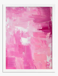
Poster Abstrakte Harmonie in Korallenrot & Rosé
Translation missing: de.products.product.sale_price Ab €16,95€23,95 -

Poster Abstrakte Farbblöcke in Pink, Koralle & Orange
Translation missing: de.products.product.sale_price Ab €16,95€23,95 -

Leinwandbild Botanische Blüte in Rosa & Grün – Pink Pop
Translation missing: de.products.product.sale_price Ab €64,95€92,95 -

Poster Londoner Stadthaus in Pastellrosa
Translation missing: de.products.product.sale_price Ab €16,95€23,95 -

Poster Weiße Wolke vor rosarotem Himmel
Translation missing: de.products.product.sale_price Ab €16,95€23,95 -
Poster Strahlkraft in Pink
Translation missing: de.products.product.sale_price Ab €16,95€23,95 -

Leinwandbild Abstrakte Pinselstriche in Rosa
Translation missing: de.products.product.sale_price Ab €64,95€92,95 -
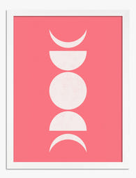
Poster Mondphasen in Rosa
Translation missing: de.products.product.sale_price Ab €16,95€23,95 -

Leinwandbild Fließende botanische Linien in Pink
Translation missing: de.products.product.sale_price Ab €64,95€92,95 -

Leinwandbild Strahlendes Korallenrosa
Translation missing: de.products.product.sale_price Ab €64,95€92,95 -

Poster Geometrische Blumen in Blau, Beige und Weiß auf Puderrosa
Translation missing: de.products.product.sale_price Ab €16,95€23,95 -

Leinwandbild Bauhaus-Geometrie in Rosa
Translation missing: de.products.product.sale_price Ab €64,95€92,95 -

Leinwandbild Pastellrosa Stadthausfassade
Translation missing: de.products.product.sale_price Ab €64,95€92,95 -

Leinwandbild Bauhaus: konzentrische Kreise in Pink
Translation missing: de.products.product.sale_price Ab €64,95€92,95 -

Leinwandbild Wolke vor pinkem Himmel
Translation missing: de.products.product.sale_price Ab €64,95€92,95 -

Leinwandbild Kräftige grafische Blüten in rosa Vase
Translation missing: de.products.product.sale_price Ab €64,95€92,95 -

Poster Wolke vor zartrosafarbenem Himmel
Translation missing: de.products.product.sale_price Ab €16,95€23,95 -

Poster Geometrische Bauhaus-Komposition in Pink
Translation missing: de.products.product.sale_price Ab €16,95€23,95 -

Poster Abstrakte Kunst in Koralle, Orange und Rosa
Translation missing: de.products.product.sale_price Ab €16,95€23,95


Mehr aus The Frame

The Sophisticated Cartoon Art Edit: Curated Pic...
Cartoon art has a reputation problem in adult homes, and it's almost entirely a framing and scale problem rather than a content problem. A vintage Tintin lithograph in a thick...

Bathroom Gallery Wall Ideas: 5 Layouts That Wor...
Bathroom walls break the rules that work everywhere else in your home. They're narrower, interrupted by towel bars and light switches, and you're standing two feet away from them while...

Minimalist Mountain Prints: Why They Work in Al...
Mountain prints have quietly become one of the most popular ways to bring calm into a home, and for good reason. They carry the weight of a landscape painting without...