Aura Colour Pairings: How to Build a Gallery Wall with Gradient Prints
A practical playbook for combining gradient aura prints into pairs, trios and gallery walls that actually work together.

Aura prints look effortless on their own, but combining two or more is where most people freeze. This guide gives you the colour theory, the layout templates, and the exact measurements to build a gallery wall that feels intentional rather than accidental.
Why aura prints are uniquely suited to gallery walls
Most gallery walls fail because the prints fight each other. One has a bold black line illustration, another a moody photograph, another a quiet typography piece. The eye has nowhere to rest.
Aura prints solve this by default. They're built around a single visual idea: colour bleeding into colour. That means even when you combine prints with wildly different palettes, the underlying language is consistent. Soft gradients, no hard subjects, no competing focal points.
This makes aura art prints one of the most forgiving categories to collect in multiples. You're not trying to balance a portrait against a landscape. You're balancing colour against colour, which is a much simpler problem to solve.
The other advantage is scale flexibility. A gradient looks complete at 30x40cm and equally complete at 100x150cm, because there's no detail being lost when you size up or down. You can mix sizes freely without anything feeling cropped or stretched.

Colour theory you actually need
You don't need a design degree. You need three concepts.
Warm versus cool
Warm colours (red, orange, yellow, warm pinks, peach, coral) feel like they advance towards you. Cool colours (blue, teal, green, lavender, cool pinks) feel like they recede. A room that gets a lot of north-facing light tends to read cooler, so warm-toned gradients add energy. South-facing rooms full of golden afternoon light already feel warm, so cool gradients balance them out.
The shortcut: hold the print up against your wall in daylight. If the wall makes the print look muddy, it's the wrong temperature. If the print suddenly glows, you've matched it.
Complementary colours
Complementary colours sit opposite each other on the colour wheel: blue and orange, red and green, yellow and purple. They create maximum contrast and visual tension when paired. Useful when you want a gallery wall to feel bold and gallery-ish rather than soothing.
Analogous colours
Analogous colours sit next to each other on the wheel: pink, red, and orange. Or blue, teal, and green. They create harmony rather than contrast. Useful when you want a gallery wall that feels calm and cohesive, almost like one large piece.
Most successful aura gallery walls lean analogous with one small complementary accent. That's the formula. Hold onto it.
The safest pairing: two prints sharing one overlapping colour
If you're buying two prints and you want a guaranteed result, follow this single rule: at least one colour must appear in both gradients.
A pink-to-purple gradient pairs beautifully with a purple-to-blue gradient because purple is the bridge. A peach-to-coral pairs with a coral-to-magenta because coral is the bridge. The shared colour acts as a handshake between the two pieces and the eye reads them as related.
This works regardless of which colours sit at the outer edges of each print. You can have something as warm as yellow on one end of one print and something as cool as deep blue on the far end of the other, as long as the middle territory overlaps.
For two-print displays, we'd suggest:
- Two 50x70cm prints hung vertically, 5cm apart, centred at eye level (roughly 145cm from floor to centre point)
- Two 60x80cm prints hung horizontally, 8cm apart, above a sofa or sideboard
- One large 70x100cm anchor with a smaller 40x50cm companion offset to one side, 10cm gap
The overlap rule means you can shop the colourful art prints collection without paralysis. Pick your favourite. Then find a second print that contains at least one shade from the first.
Bold pairings: contrasting gradients for visual tension
Sometimes you don't want safe. You want a wall that makes guests stop and look.
Bold pairings work by intentionally placing complementary colours next to each other. A pink-to-orange gradient beside a teal-to-blue gradient creates real charge. The warm print pulls forward, the cool print pushes back, and the wall develops depth that a single piece can't achieve.
The trick to keeping this from looking chaotic is to match the saturation and the gradient style. If one print is a soft watercolour blur in dusty tones, its bold partner shouldn't be a hard-edged neon gradient. Same energy, opposite temperature. That's the brief.
A few combinations we'd actually hang:
- Sunset peach-and-coral with deep ocean teal-and-navy
- Lavender-and-rose with sage-and-forest green
- Buttercream-and-amber with slate-and-charcoal
Bold pairings tend to work best in rooms with a relatively neutral palette. White walls, oatmeal sofa, oak floor. The room provides the calm and the prints provide the contrast. If your room is already loud, go analogous instead.
Three-print layouts with exact spacing
Three is the sweet spot for most rooms. Enough to feel like a curated collection, not so many that you're committing to a full wall.
Layout 1: The horizontal triptych
Three prints of equal size, hung in a horizontal row. The cleanest, most architectural option.
- Three 50x70cm prints in portrait orientation
- 8cm between each print (measured frame edge to frame edge)
- Total wall width occupied: roughly 166cm
- Centre point of the middle print at 145cm from floor
This works above a sofa (minimum sofa width: 200cm), above a bed, or along a hallway. Gradients can run in the same direction across all three for a cinematic effect, or alternate direction for rhythm.
Layout 2: Centre anchor with flankers
One large print in the middle, two smaller ones on either side. More dynamic, slightly more forgiving if your wall isn't perfectly symmetrical.
- One 60x80cm print in the centre
- Two 40x50cm prints flanking, hung so their vertical centres align with the centre print's vertical centre
- 10cm gap between the centre print and each flanker
- Total wall width occupied: roughly 160cm
Pair the centre print's dominant colour with one shared shade in each flanker. The flankers don't need to match each other.
Layout 3: Stacked vertical trio
Three prints stacked vertically, ideal for narrow walls between doorways or beside tall furniture.
- Three 40x50cm prints
- 6cm between each, vertically
- Total wall height occupied: roughly 162cm
- Bottom of the lowest print at around 90cm from floor
Run the gradient in the same direction in all three for the most natural visual flow. If the top print fades from light to dark top-to-bottom, the next two should do the same. The eye reads it as one continuous waterfall.

Five-plus prints: a full gallery wall without chaos
Once you go past four prints, you're no longer hanging art. You're composing a wall. The rules tighten.
The grid approach
The most foolproof option for five or more prints. Equal size, equal spacing, arranged in a perfect rectangle.
- Six 30x40cm prints arranged 3 wide x 2 tall
- 5cm gap between every print
- Total wall area: roughly 100cm wide x 85cm tall
Grids reward variation. If every print is a different colour palette but they all share the same gradient style and frame, the grid holds together. This is where wall art sets earn their keep, because the prints have already been curated to work as a unit.
The salon hang
Asymmetrical, varied sizes, looser. Trickier to pull off but more characterful when it works.
The rules:
- Pick one "anchor" print that's notably larger than the others (at least 60x80cm)
- All other prints should be smaller than the anchor
- Maintain consistent spacing of 6 to 8cm between every print, even when sizes vary
- Cap the total at 7 prints. Past that you're in maximalist territory and the rules change
Lay your prints out on the floor first. Photograph the arrangement from above. Adjust until the visual weight feels balanced (a heavy dark print on the left should be balanced by something with similar visual weight on the right, even if it's smaller).
The colour journey
This is the most ambitious approach and the most rewarding. Sequence five or more prints so they form a continuous colour story across the wall, like a single enormous gradient broken into pieces.
Start with a yellow-to-orange print on the far left. Next, an orange-to-pink. Then pink-to-purple. Then purple-to-blue. Then blue-to-teal on the far right. The eye travels across the wall and the colour evolves with each print.
Use identical sizes and spacing for this. Variation in colour is doing all the work, so everything else needs to be uniform.
Mixing gradient styles and direction
A common worry: can you mix soft watercolour gradients with sharper, more graphic ones?
Yes, but cautiously. Aim for an 80/20 split. If most of your wall is watercolour-style aura prints, one graphic gradient can act as a punctuation mark. Reverse the ratio and the watercolours start looking accidental.
Gradient direction matters more than people realise. A horizontal gradient (colour shifting left to right) feels calmer and more landscape-like. A vertical gradient (top to bottom) feels more atmospheric, like sky or weather. Diagonal gradients feel kinetic and modern.
For a unified wall, keep direction consistent. For a more energetic wall, vary it deliberately. What you want to avoid is two prints with nearly-but-not-quite the same direction, which reads as a mistake rather than a choice.
Frame colour choices that tie the collection together
Frames are the connective tissue of any gallery wall. Get them right and disparate prints feel like a set. Get them wrong and even matching prints feel disjointed.
Three reliable approaches:
All-black frames
The default for a reason. Black grounds bright gradients and gives the wall architectural weight. Best in modern rooms with white or pale walls. Works particularly well with bold or contrasting pairings because it prevents the colours from floating off the wall.
All-natural oak frames
Warmer, softer, more Scandinavian. Best in rooms with wood furniture, linen textiles, or warm wall colours like clay, oat, or cream. Oak frames let the gradient be the loudest thing in the room without the frame disappearing entirely.
All-white frames
Best on coloured or wallpapered walls where you want the print to feel framed but not contained. White frames almost vanish on white walls, which is occasionally the goal for a softer, less defined gallery wall.
The rule we'd hold to: pick one frame finish and stick to it across the whole wall. Mixing black and oak frames in the same gallery wall almost never works, even when the prints themselves harmonise. Frame consistency is what separates a curated wall from a chaotic one.
A note on what you're actually getting. Frames worth committing to are made from solid wood rather than MDF, which warps over time, especially in bathrooms or kitchens. UV-protective glazing matters more than people think for gradient prints specifically, because the pink and purple pigments in many aura palettes are the first to fade in direct sunlight. And if you're hanging multiples, having frames arrive ready-fitted rather than flat-packed saves a genuinely tedious afternoon.

Warm versus cool rooms: matching gradients to your space
Walk into your room at the time of day you use it most. Notice the light.
Cool rooms (north-facing, lots of grey, blue or green walls, concrete or stone floors) come alive with warm gradients: peach, coral, amber, rose, terracotta. The print acts as a heat source.
Warm rooms (south or west-facing, beige or yellow walls, oak or terracotta floors, lots of brass or wood) need cool gradients to feel balanced: lavender, teal, sage, dusty blue, lilac. The print acts as a window.
Neutral rooms (true white walls, mixed furniture) can take either, which is why most styling images you see online are shot in neutral spaces. Don't be fooled into thinking your room needs to look like a studio. It doesn't. It just needs to be honest about its temperature.
Pink and purple gradients are particularly worth thinking about here, because they shift dramatically under different lighting. A blush-to-lavender print can look almost grey under cool LED bulbs and gloriously warm under a 2700K incandescent. Test before committing to a five-print wall.

Common mistakes to avoid
A few patterns that consistently sink aura gallery walls:
- Every print in the same narrow colour family. Five pink gradients side by side read as muddy, not harmonious. You need at least some variation in temperature or saturation.
- Too many high-contrast prints. One bold pairing per wall is plenty. Three bold pairings competing for attention create chaos, not drama.
- Inconsistent print quality. Sharp, high-resolution gradients next to soft, pixelated ones make the soft ones look broken. Stick to one source so the print quality is uniform.
- Hanging too high. The centre point of a gallery wall should sit at roughly 145cm from the floor, regardless of ceiling height. Above sofas, the bottom of the lowest print should sit 15 to 25cm above the back of the sofa.
Your starting point
If you're stuck, start with two prints that share one overlapping colour, both in the same size and frame finish. Hang them 8cm apart at eye level. Live with them for a fortnight. Then add a third only when you can describe out loud why it belongs.
Gallery walls are built, not bought. The best ones grow over months, not weekends. For more options to draw from as your wall evolves, the abstract art prints collection sits naturally alongside aura gradients and gives you room to expand the conversation without breaking it.

In diesem Blog vorgestellte Fab-Produkte
-

Poster Aura-Ausrichtung 222
Translation missing: de.products.product.sale_price Ab CHF 16.00CHF 22.00 -

Leinwandbild Leuchtender Orange-Blau-Farbverlauf mit Sternenfunken
Translation missing: de.products.product.sale_price Ab CHF 61.00CHF 87.00 -

Poster blaue Aura mit leuchtendem Farbverlauf
Translation missing: de.products.product.sale_price Ab CHF 16.00CHF 22.00 -

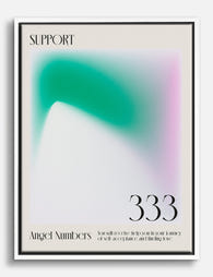
Poster Unterstützende Aura 333 – Grün & Rosa
Translation missing: de.products.product.sale_price Ab CHF 16.00CHF 22.00 -

Poster Leuchtender Farbverlauf in Koralle, Pfirsich & Blau
Translation missing: de.products.product.sale_price Ab CHF 16.00CHF 22.00 -

Poster 333 Aura des Rückhalts – Blau und Violett
Translation missing: de.products.product.sale_price Ab CHF 16.00CHF 22.00 -

Leinwandbild Aura Harmony 222
Translation missing: de.products.product.sale_price Ab CHF 61.00CHF 87.00 -
Leinwandbild Engelhafte Aura 333
Translation missing: de.products.product.sale_price Ab CHF 61.00CHF 87.00 -

Poster 555 – Aura des Wandels
Translation missing: de.products.product.sale_price Ab CHF 16.00CHF 22.00 -

Poster Lucky Aura 777 – Farbverlauf in Violett und Blushrosa
Translation missing: de.products.product.sale_price Ab CHF 16.00CHF 22.00 -

Leinwandbild Libra Aura Harmony – Blau und Grün auf Rosa
Translation missing: de.products.product.sale_price Ab CHF 61.00CHF 87.00 -

Leinwandbild Aura des Glücks 777
Translation missing: de.products.product.sale_price Ab CHF 61.00CHF 87.00 -

Leinwandbild Lucky Aura 777 – Lavendel, Rosa & Himmelblau
Translation missing: de.products.product.sale_price Ab CHF 61.00CHF 87.00 -

Leinwandbild Engelsaura 444 in Pfirsich & Rosa
Translation missing: de.products.product.sale_price Ab CHF 61.00CHF 87.00 -

Leinwandbild Aura des Wandels
Translation missing: de.products.product.sale_price Ab CHF 61.00CHF 87.00 -

Poster Reflektierende Aura 666
Translation missing: de.products.product.sale_price Ab CHF 16.00CHF 22.00 -
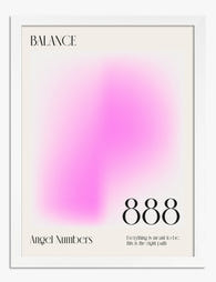
Poster Balance Aura 888 – abstrakt in Rosa und Violett
Translation missing: de.products.product.sale_price Ab CHF 16.00CHF 22.00 -

Poster Venn-Diagramm der Farblehre
Translation missing: de.products.product.sale_price Ab CHF 16.00CHF 22.00 -

Leinwandbild Engelhafter 333-Schimmer
Translation missing: de.products.product.sale_price Ab CHF 61.00CHF 87.00 -

Poster Sternzeichen Zwillinge Aura-Glow
Translation missing: de.products.product.sale_price Ab CHF 16.00CHF 22.00


Mehr aus The Frame

Botanical Prints vs Floral Prints: Which Style ...
Most online stores use "botanical" and "floral" as if they mean the same thing. They don't. The difference shapes the mood of a room, the furniture it pairs with, and...

Pink Gallery Wall Ideas: 7 Looks from Soft and ...
Pink is having a long moment, and a gallery wall is the most flexible way to commit to it without painting your walls. The trouble is that "pink gallery wall"...

How to Decorate Your Living Room with Vintage A...
Vintage art is having a moment, and most people are still hesitating because they worry their lounge will end up looking like a tea room. It won't, if you follow...