
 Heute bestellen, Lieferung bis
 The Best Beige Art Prints for Bedrooms (And Exactly Where to Hang Them)
The bedroom-specific sizing rules, placement maths, and style decisions no one else spells out.


Most guides tell you how to hang art, but not which beige prints actually suit a bedroom, or what size to buy for your specific bed. This one does both. By the end, you'll know exactly what to put above your headboard, how big it should be, and how high to hang it.
Why bedrooms and beige art are a natural fit
Bedrooms are the one room in the house where you actively want less stimulation. Bright, saturated art belongs in kitchens, hallways and home offices, places where you want energy. Above a bed, that same energy stops you switching off.
Beige works because it sits in the calmest part of the visual spectrum. It reflects light softly rather than bouncing it around, which matters when your bedside lamp is the main light source for half the year. And unlike stark white, beige has warmth, so it reads as restful rather than clinical.
There's a practical benefit too. Beige tones flatter almost every other colour in a room, from oak furniture to sage bedding to charcoal curtains. You're unlikely to redecorate around a beige print, whereas a bold cobalt piece will lock you into a palette for years.

Abstract vs. botanical vs. landscape: which subject suits your sleep space
The three subjects that dominate the beige category behave very differently on a bedroom wall. Choosing between them is less about taste and more about the mood you want when you walk in at 10pm.
Abstract
Abstract beige prints are the safest and, in our view, the most sophisticated choice for a bedroom. Loose brushwork, sand-toned washes and gestural shapes give the eye something to rest on without demanding interpretation. You don't have to decode anything before sleep.
Choose abstract if your bedroom leans modern, minimal, or Scandinavian, and if you tend to redecorate every few years. Abstract prints outlast trends because they don't commit to a specific reference. Browse our full abstract art prints if this is where you're heading.
Botanical
Botanical beige prints, think pressed grasses, dried palm fronds, sepia-toned florals, add texture and softness without adding colour. They suit bedrooms with natural materials already in play: linen bedding, rattan pendants, oak floors, jute rugs.
The trade-off is that botanicals feel more feminine and more traditional than abstracts. If your bedroom is very minimal, a botanical can tip it into cottagecore territory quickly. Our botanical art prints work best when they echo something else natural in the room.
Landscape
Beige landscape prints, desert dunes, misty fields, Tuscan hills, bring a sense of distance to a small room. Because bedrooms are often the smallest room in the house after the bathroom, this can make them feel larger.
Choose landscape if you want a single statement piece rather than a set, and if your bedroom already has a strong horizontal line (a low headboard, a long dresser). Landscapes reinforce horizontals and can make a low-ceilinged room feel more grounded.
Size guide: matching print dimensions to your bed and wall
This is where most guides fail you. They tell you the art should be "60 to 75% of the width of the headboard", which is technically correct but useless when you're trying to decide between a 50x70cm and a 70x100cm print at 11pm.
Here's the direct translation for standard UK and US beds.
Single / Twin bed (90cm / 38 inches wide)
- One print: 40x50cm or 50x70cm
- Set of two: two 30x40cm prints hung side by side
Double / Full bed (135cm / 54 inches wide)
- One print: 50x70cm or 60x80cm
- Set of two: two 40x50cm or 50x70cm prints
Queen bed (150cm / 60 inches wide)
- One print: 70x100cm
- Set of two: two 50x70cm prints
- Set of three: three 40x50cm prints
King bed (150cm UK / 76 inches US)
- One print: 100x150cm (canvas) or 70x100cm (framed)
- Set of two: two 60x80cm or 70x100cm prints
- Set of three: three 50x70cm prints
Super king (180cm)
- One print: 100x150cm canvas
- Set of two: two 70x100cm prints
A quick note on the framed vs. canvas split. Framed prints max out at 70x100cm in our range, so if you want a single piece above a king or super king, canvas is the way to go. Canvas is also lighter, which matters when you're hanging something large directly above where you sleep.

Above the headboard: the only placement rule you need
Hang the bottom of your art 15 to 20cm (6 to 8 inches) above the top of your headboard.
That's it. Not the centre of the frame at 145cm, not the middle of the wall, not eye level. Bedrooms are the one room where eye level doesn't matter, because you spend most of your time in the room lying down.
The 15 to 20cm gap does two things. It visually connects the art to the bed, so the two feel like one composition rather than a floating print and a random headboard. And it leaves enough breathing room that the art doesn't look crammed.
If you have no headboard, hang the centre of the art at roughly 145 to 150cm from the floor, which puts the visual centre where a headboard would sit. If your ceilings are unusually high (over 3 metres), you can push this up slightly, but resist the urge to fill the whole wall. A print floating too high looks stranded.
The tape test
Before you drive a nail into plaster, cut a piece of paper or newspaper to the exact size of your print and blu-tack it to the wall. Live with it for 48 hours. Look at it in morning light, evening light and with your bedside lamp on.
You'll know within a day whether the size is right. Almost everyone we speak to who regrets a print regrets the size, not the image.
Single print or a set of 2? How to decide
The single vs. set question comes down to three things: your headboard, your bedside tables, and your symmetry preference.
Choose a single large print if:
- Your headboard is upholstered, wide, or heavily detailed
- Your bedside tables are asymmetric or mismatched
- You want the bed itself to be the focal point
A single print above a busy headboard acts as an anchor. Two prints compete with the headboard for attention and the wall starts to feel cluttered.
Choose a set of two if:
- Your bedside tables and lamps are perfectly symmetric
- Your headboard is low, simple, or you don't have one
- You want the wall itself to feel structured
Two prints reinforce the symmetry of matched bedside lamps and create a strong horizontal line. Hang them with a 5 to 10cm gap between frames, and treat the pair as one unit for the 60 to 75% headboard-width rule.
Sets of three work best above king and super king beds, and only when you're happy with a more formal, gallery-like feel. For most bedrooms, three prints is one too many.
Frame finishes that work in bedrooms (and the one to avoid)
Frame finish matters more in bedrooms than anywhere else because the light is often low, and reflective surfaces catch every glint from bedside lamps and morning sun.
Light oak: Our top pick for beige prints in bedrooms. It warms the tone of the print without competing, and it disappears into most walls. Particularly good with linen, wool and rattan textures.
Black: The most versatile frame if your bedroom has any dark accents (a charcoal throw, a black pendant, dark curtain rods). Slim black frames give beige prints definition and stop them fading into the wall.
White: Works if your walls are cream or off-white and you want the print to feel gallery-clean. On a truly white wall, a white frame can disappear entirely, which sometimes you want.
Avoid: high-gloss metallics (gold, silver, chrome). They reflect bedside lamp light directly back at you when you're trying to read, and they clash with the calmness beige is meant to create. Save gold frames for the lounge.
One thing worth knowing: our framed prints use a UV-protective acrylic glaze rather than glass, so you don't get the harsh reflection you'd get from a traditional glass frame. That matters in a bedroom where you're often looking at the wall from an angle, in bed.

What to do if your bedroom walls are already beige
This is the most common pain point in the whole category, and it's where most guides go silent. If your walls are beige and your print is beige, does the print just disappear?
It can, yes. But it doesn't have to, if you get one of three things right.
1. Change the tone temperature
If your walls are warm beige (think putty, magnolia, tan), choose a print with cool beige tones (greige, taupe, stone). If your walls are cool beige, go the other way. The contrast between warm and cool is what makes the print read as separate from the wall, even when they're technically the same colour family.
2. Add tonal depth
Even within beige, there's a huge range from near-white to deep sand. Choose a print with at least three distinct tones, ideally including one that's noticeably darker than your wall. A print that's uniformly the same tone as your wall will look like a beige rectangle stuck to a beige wall.
3. Let the frame do the work
If tone matching is too subtle for your eye, a defined frame gives the print structure regardless of what's inside it. Black frames work particularly well on beige walls because the frame line itself becomes the graphic element, and the beige print sits inside it like a soft interior.
The disappearing art test
Stand in your bedroom doorway. Look at the wall where the print will hang. Now imagine a photograph of your favourite beige print in that spot. If you can't picture it clearly, it's going to disappear. Choose something with more contrast, more tonal range, or a defined frame.

A note on print quality with subtle tones
Beige is unforgiving. Any banding, colour shift or muddy printing shows up immediately because there's nowhere for flaws to hide. Bold colours can mask a mediocre print job. Beige can't.
Two things to check when buying beige prints online: the paper (matte, thick, non-reflective) and the printing method (giclée is the professional standard, and produces the smoothest tonal gradients). Both are what we use for our beige art prints, specifically because the category demands it.
The other thing that goes wrong is framing. Frames arriving in separate boxes to prints, warping in humid rooms, glass with visible reflections, prints not sitting flush inside the mount. If you've bought art online before, you've probably had at least one of these issues. Everything in our bedroom wall art range ships already framed and fitted in one box, ready to hang, which removes the most common failure point in the category.
The five-minute decision framework
If you've read this far and still can't decide, work through this:
- Measure your headboard width in cm.
- Multiply by 0.65 for a single print, or 0.7 for a set of two (that's total width including the gap).
- Choose abstract if you want longevity, botanical if your room already has natural texture, landscape if you want the room to feel bigger.
- Match the frame finish to something already in the room (oak floor, black pendant, white bedding).
- Blu-tack a paper template up before you buy.
Beige art in a bedroom is one of the few decor decisions that's almost impossible to get badly wrong, as long as you get the size right and leave 15 to 20cm above the headboard. Everything else is preference.

In diesem Blog vorgestellte Fab-Produkte
-

Poster Skandinavische organische Linien in Taupe & Creme
Translation missing: de.products.product.sale_price Ab CHF 16.00CHF 22.00 -

Poster Van Goghs Schlafzimmer
Translation missing: de.products.product.sale_price Ab CHF 16.00CHF 22.00 -

Poster Urban Earth – Abstrakte Farbfelder in Grün, Beige & Schwarz
Translation missing: de.products.product.sale_price Ab CHF 16.00CHF 22.00 -

Poster Gestreifte Eleganz
Translation missing: de.products.product.sale_price Ab CHF 16.00CHF 22.00 -

Leinwandbild skandinavisch – abstrakte organische Formen in Beige
Translation missing: de.products.product.sale_price Ab CHF 62.00CHF 89.00 -

Leinwandbild Van Goghs Schlafzimmer – Ruhe
Translation missing: de.products.product.sale_price Ab CHF 62.00CHF 89.00 -

Poster Zartes Rosa-Flüstern
Translation missing: de.products.product.sale_price Ab CHF 16.00CHF 22.00 -

Poster Strahlender Blütenwirbel in Pfirsichtönen
Translation missing: de.products.product.sale_price Ab CHF 16.00CHF 22.00 -

Quiet Girl in Green Stripes Art Print
Translation missing: de.products.product.sale_price Ab CHF 16.00CHF 22.00 -

Poster Sie ging ihren eigenen Weg
Translation missing: de.products.product.sale_price Ab CHF 16.00CHF 22.00 -

Two Figures in Soft Pink Art Print
Translation missing: de.products.product.sale_price Ab CHF 16.00CHF 22.00 -
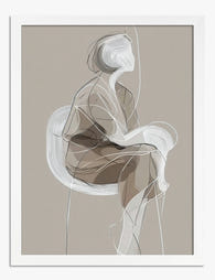
Poster Minimalistische Muse
Translation missing: de.products.product.sale_price Ab CHF 16.00CHF 22.00 -

Poster Soft Harmony Minimal – Abstrakt in Beige und Weiß
Translation missing: de.products.product.sale_price Ab CHF 16.00CHF 22.00 -

Poster Nachdenkliche Ruhe – Frauenporträt
Translation missing: de.products.product.sale_price Ab CHF 16.00CHF 22.00 -

Leinwandbild in urbanen Erdtönen
Translation missing: de.products.product.sale_price Ab CHF 62.00CHF 89.00 -

Poster Abstrakte moderne Pinselstriche in Schwarz und Beige
Translation missing: de.products.product.sale_price Ab CHF 16.00CHF 22.00 -

Poster Gestreifter Krug mit Pfirsichen
Translation missing: de.products.product.sale_price Ab CHF 16.00CHF 22.00 -

Poster minimalistische Muse – Markante Formen in Olive & Schwarz
Translation missing: de.products.product.sale_price Ab CHF 16.00CHF 22.00 -

Poster Abstrakt – Sonnenlicht am Fenster
Translation missing: de.products.product.sale_price Ab CHF 16.00CHF 22.00 -

Poster Pastell-Oase der Ruhe
Translation missing: de.products.product.sale_price Ab CHF 16.00CHF 22.00


Mehr aus The Frame

The Most Famous William Morris Designs, Ranked:...
William Morris designed over 50 patterns in his lifetime, and roughly six of them get all the attention. That's mostly fair, but not entirely. Here's our honest ranking of the...

Urban Jungle Interiors: Using Wall Art Instead ...
The urban jungle look is having a moment that refuses to end. But most of the people pinning those plant-drenched living rooms will never own 47 monsteras, and that's fine....

Room by Room: How to Hang William Morris Floral...
You've fallen for Morris. The question now is which floral goes where, at what size, in what frame. This guide skips the Arts and Crafts lecture and gets straight to...