The Best Botanical Prints for Your Conservatory (That Won't Fade in the Sun)
A practical guide to choosing botanical art that thrives in glass-walled rooms, from UV protection to sizing for narrow pillars.

Conservatories are sun traps, and most art prints are not built for them. The same light that makes the space so lovely to sit in will cook a poorly made print within a few summers. This guide covers how to choose botanical prints that actually survive the conditions, and which subjects, sizes and palettes work best in a room mostly made of glass.
Why conservatories are tricky for wall art (and how to solve it)
A conservatory throws three problems at a print at once: high UV exposure, swinging temperatures, and erratic humidity. South-facing rooms can climb past 35°C in summer and drop close to freezing on a winter night, while humidity bounces around with the weather and any plants you keep in there. Standard prints, ordinary frames and cheap glazing simply give up under those conditions.
The fade itself is a chemical process called photolysis. UV light breaks down pigment molecules in inks and dyes, and the more vivid colours tend to go first. Reds and yellows fade fastest, which is why an unprotected botanical print eventually ends up looking like a washed-out study in blue and grey.
The fix is not complicated, but it does need to be deliberate. You want archival-quality giclée inks rather than cheap dye-based printing, UV-filtering glazing rather than ordinary glass, and frames built from solid wood rather than veneer or MDF that will warp as the temperature shifts. Get those three things right and you can hang serious art in a glass room without worrying about it.

UV protection matters: what to look for in framing and print quality
Glazing is the single most important decision you will make for conservatory art. Ordinary picture glass blocks very little UV, around 45% at best, which is nowhere near enough for sustained direct sunlight. Museum glass blocks roughly 99% of UV, and conservation-grade UV-filtering acrylic blocks around 98%. The difference between regular glass and proper UV glazing is the difference between a print lasting a couple of summers and lasting decades.
We strongly prefer acrylic glazing in a conservatory for two practical reasons. First, it is far lighter than glass, which matters when you are mounting a large frame on a thin pillar or a glazing bar. Second, if a frame ever falls, acrylic does not shatter into the cushions and the floor. The acrylic glaze on our framed prints filters UV across the spectrum, which is what stops the pigments breaking down.
The print itself matters almost as much as the glazing. Look for museum-grade giclée printing with pigment-based inks rather than dye-based prints. Giclée inks, properly archived, can hold their colour for hundreds of years even in direct sunlight. Watercolour originals and traditional lithographs are the most vulnerable to UV, which is why we would never recommend hanging an unprotected paper print in a south-facing conservatory.
Then there is the frame. Solid FSC-certified wood handles temperature swings far better than veneered MDF, which delaminates as humidity climbs. A well-built solid wood frame will move slightly with the seasons, which is what you want. A glued composite frame will not move, it will warp.
Greenhouse botanical prints in a conservatory: meta or perfect?
There is an obvious question about hanging botanical glasshouse prints in a room that is, essentially, a small glasshouse. Is it too on-the-nose?
We think it is the opposite. A conservatory is the one room where a Victorian glasshouse illustration or a Kew-style palm study makes total contextual sense. The architecture of the room is doing half the work for you, and the prints lean into the building's identity rather than fighting it. The same prints would feel slightly affected in a bedroom but look completely at home next to a real monstera.
The trick is to vary the register. If your conservatory has a strong Victorian or Edwardian feel, lean into period botanical illustrations: detailed engravings, fern studies, palm cross-sections. If the space is more modern, a contemporary photographic study of a single leaf or a graphic monochrome line drawing of a glasshouse interior will sit better. Mixing the two registers, which is the most common mistake, makes the room read as cluttered.
Our botanical greenhouse art prints collection is built around exactly this idea, with archival inks and UV-protective framing as standard. If you want something less literal, the broader botanical art prints range covers everything from minimalist single-stem studies to richer Dutch-still-life inspired pieces.
Sizing for conservatory walls: working with narrow pillars and limited space
Conservatories are mostly glass, which means your hanging real estate is usually limited to a few narrow brick pillars, the corner posts where the structure meets the house, and the solid wall where the conservatory joins the main building. Each of these surfaces has different proportions, and choosing the wrong size is the most common mistake we see.
For narrow pillars between glazing panels, typically 30 to 50cm wide, a single tall portrait print works far better than trying to cluster smaller pieces. A 40x60cm or 50x70cm framed print in portrait orientation fits the proportions naturally and draws the eye up, which makes the conservatory feel taller. A horizontal print on a vertical pillar looks awkward almost every time.

The house wall, where the conservatory joins the main building, is your one large hanging surface. This is where you can go big. A 70x100cm framed print or a 100x150cm canvas anchors the room and gives the eye somewhere to rest amid all the glass. We would not recommend going smaller than 60x80cm here, as anything less gets visually swallowed by the surrounding glazing.
For corner posts, lean rather than hang. A framed print or a stretched canvas leaning against the post and resting on a sideboard or a low plant stand looks deliberate and avoids drilling into structural timbers. It also lets you rotate pieces seasonally without dealing with picture hooks.
Colour palettes that complement conservatory light (warm vs. cool-facing rooms)
The light in a conservatory changes the colours of your prints more than the light in any other room. A south or west-facing conservatory floods with warm golden light for most of the day, which pushes cream backgrounds slightly yellow and makes warm reds and oranges glow. A north or east-facing conservatory has cooler, flatter light that brings out blues and greens and tends to mute warmer tones.
For warm-facing rooms, we would lean into deeper, richer botanical palettes: olive greens, terracotta, burnt umber, dusty pinks. Dutch-still-life-style botanicals with dark backgrounds also look extraordinary in warm light because the contrast really sings. Avoid pale washed-out pastels here, as the golden light will flatten them further.
For cool-facing rooms, the opposite holds. Pale sage greens, soft cream backgrounds, watercolour-style botanicals and crisp line drawings all benefit from the cleaner light. Rich dark backgrounds can read as gloomy in cool light, particularly on overcast days, so we would steer clear of them unless the conservatory is well lit artificially in the evening.
Across both, green is the safest colour family. It harmonises with whatever real plants you have in the space and ties the prints into the garden visible through the glass. Our green art prints collection groups pieces by tonal range, which makes it easier to match what is already in the room.
Framed vs. unframed: what holds up better in fluctuating temperatures
This is the question we get asked most, and the honest answer is: it depends on the medium.
A framed paper print with proper UV-filtering acrylic and a sealed back is the most robust option for a conservatory. The acrylic protects the print from UV, the frame protects it from humidity swings, and a sealed back stops moisture creeping in from behind. The trade-off is weight (though acrylic glazing keeps this manageable) and a slightly more formal look.
A stretched canvas handles humidity surprisingly well. Poly-cotton canvas is more dimensionally stable than paper, and a solid wood stretcher frame moves slightly with the seasons without warping. Canvas also works without glazing, which makes it lighter and easier to hang on awkward surfaces. The catch is that canvas is more vulnerable to direct UV if the print is not made with archival pigment inks. With proper giclée printing, this is largely a non-issue.
An unframed paper print is the option we would not recommend in a conservatory. Without glazing, the paper is exposed to UV, humidity will cause it to ripple, and temperature swings will make it cockle within a season.
Our canvas prints are hand-stretched over solid FSC-certified wood, which is what gives them the stability to handle conservatory conditions. They can hang unframed for a minimal look or framed for something more polished, and both arrive properly fitted in a single box, no shipping the frame separately and hoping it fits.

Five botanical conservatory wall art picks for different styles
Here is how we would approach botanical conservatory wall art for five common conservatory styles. These are starting points, not rules.
The Victorian conservatory
Lean into period authenticity. A pair of tall portrait fern engravings in slim dark wood frames on the narrow pillars, plus a large palm study on the house wall in a deeper moulded frame. Cream backgrounds with detailed line work. Detailed Victorian glasshouse illustrations, the kind that look like they belong in a botanical journal, sit perfectly here.
The modern lean-to
Minimal, graphic, restrained. A single large monochrome leaf study on the house wall, ideally 70x100cm, in a thin black or natural oak frame. Skip the clusters. One strong piece does more work than three medium pieces fighting for attention.
The garden room
A relaxed cluster of three to five medium pieces (40x50cm or 50x70cm) on the house wall, mixing pressed-flower-style botanicals with looser watercolour-inspired pieces. Soft palette, mostly greens with hints of dusty pink and cream. Keep the frames consistent (we would go with natural oak) to stop the cluster looking chaotic.
The Mediterranean-style sun room
Warm terracotta and olive palette, with botanical subjects that nod to the climate: citrus studies, olive branches, fig leaves, cypress silhouettes. Deeper-toned backgrounds work brilliantly in the warm light. One large piece plus one smaller paired piece on an adjacent pillar.
The plant-filled jungle conservatory
If the room is already full of real plants, the art needs to complement rather than compete. We would go for one large abstract or graphic botanical, monstera leaves or a single banana palm frond, in a calm palette of greens and creams. Avoid busy realistic botanicals that fight the actual foliage for attention.
For broader inspiration across all five styles, the nature art prints collection covers landscape and botanical pieces together, which is useful if you want the conservatory to feel connected to the garden beyond the glass.
A few practical things to get right
Hang prints away from the glass where you can. The closer a print sits to a south-facing pane, the more direct UV it takes, even with proper glazing. The house wall is almost always the kindest spot.
Check the back of the frame seasonally. If you spot any sign of moisture (which is rare with a properly sealed frame, but worth checking), wipe it down and improve ventilation in the room. Most conservatory issues come from condensation rather than ambient humidity.
If you are buying art for a south or west-facing conservatory with significant direct sun, prioritise UV-filtering glazing over almost everything else. A beautiful print with the wrong glazing will fade. A modest print with the right glazing will outlast you.
And give yourself permission to rotate. There is no rule that says the same art has to live in the conservatory all year. Some people swap pieces between the conservatory and the rest of the house seasonally, which extends the life of every print and keeps the room feeling fresh.

Choose archival giclée prints, UV-filtering acrylic, and solid wood frames, and a conservatory becomes one of the most rewarding rooms in the house to hang art in. The light is generous, the architecture does half the work, and the right botanical print will look as good in twenty years as it does the day it arrives.

In diesem Blog vorgestellte Fab-Produkte
-
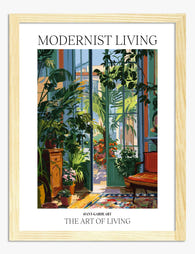
Poster botanische Oase im modernen Wintergarten
Translation missing: de.products.product.sale_price Ab CHF 16.00CHF 22.00 -

Poster sonnige Pflanzen am Fenster
Translation missing: de.products.product.sale_price Ab CHF 16.00CHF 22.00 -

Poster Botanische Gewächshaus-Oase in sattem Grün
Translation missing: de.products.product.sale_price Ab CHF 16.00CHF 22.00 -

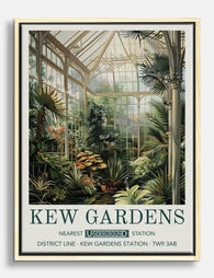
Poster botanisches Refugium – Gewächshaus der Kew Gardens
Translation missing: de.products.product.sale_price Ab CHF 16.00CHF 22.00 -

Poster Botanische Oase – Tropische Blätter im Sonnenlicht
Translation missing: de.products.product.sale_price Ab CHF 16.00CHF 22.00 -

Poster Botanisches Refugium
Translation missing: de.products.product.sale_price Ab CHF 16.00CHF 22.00 -

Leinwandbild moderne botanische Oase
Translation missing: de.products.product.sale_price Ab CHF 61.00CHF 86.00 -

Poster Botanische Pflanzen auf dem Regal vor gelbem Hintergrund
Translation missing: de.products.product.sale_price Ab CHF 16.00CHF 22.00 -

Poster Sonnendurchflutetes botanisches Zimmer von Matisse
Translation missing: de.products.product.sale_price Ab CHF 16.00CHF 22.00 -

Leinwandbild Treppen-Oase mit Zimmerpflanzen
Translation missing: de.products.product.sale_price Ab CHF 61.00CHF 86.00 -
Leinwandbild Üppiges Gewächshaus in Kew
Translation missing: de.products.product.sale_price Ab CHF 61.00CHF 86.00 -

Leinwandbild Sonnige Fensterbank
Translation missing: de.products.product.sale_price Ab CHF 61.00CHF 86.00 -

Leinwandbild Tropisches Gewächshaus – Grünes Refugium
Translation missing: de.products.product.sale_price Ab CHF 61.00CHF 86.00 -

Leinwandbild Botanische Oase
Translation missing: de.products.product.sale_price Ab CHF 61.00CHF 86.00


Mehr aus The Frame

Living Room Botanical Prints: The Right Way to ...
Botanical prints are one of the most forgiving categories of wall art to choose, and one of the easiest to ruin with bad framing. A warped frame, the wrong glazing,...

Why William Morris Animal Prints Work in Modern...
Morris's floral patterns get all the attention, but his animal designs are quietly the easier win. A fox or a hare gives your eye somewhere to land, which means these...

Arts and Crafts Cat Art: Victorian Roots, Moder...
Cat art is everywhere right now, and most of it is forgettable. The pieces that actually hold up on a wall borrow from a much older tradition, one that runs...