How to Decorate a Home Library That Feels Curated, Not Cluttered
A design intervention for anyone whose books look beautiful but whose room still feels like a showroom.

Most home libraries fail in the same way. The shelves are gorgeous, the spines are arranged with care, and yet the room feels strangely lifeless, like a set rather than somewhere you'd actually want to sit for three hours with a novel. The problem is almost never the books. It's everything around them.
The number one home library mistake: treating it like a bookshop instead of a room
A bookshop is designed to display inventory. A library is designed to be lived in. The moment you start treating every surface as an opportunity to add more bookish content, more themed accessories, more "this room is about reading" signalling, you've crossed from curated into costume.
Real libraries, the kind you find in old houses and well-edited flats, breathe. They have empty walls. They have a chair that doesn't match anything. They have one good lamp doing most of the work. The books carry the room, and everything else stays out of the way.
If you've already done the hard part (sourcing the shelving, organising the books, finding furniture you actually like), the rest of the job is mostly subtraction. Decide what stays clear. Decide where the eye rests. Then add art and lighting only where the room genuinely needs it.

Walls vs shelves: how to decide which surfaces get art and which stay clear
In a library, your shelves are already doing what wall art does in any other room: providing texture, colour, and visual interest. So the rule shifts. You're not decorating walls, you're identifying the few surfaces that need a counterweight to all that book-spine density.
Walk into the room and find the negative space. Negative space is any wall, or section of wall, that isn't carrying shelving. It might be the wall opposite your main bookcase. It might be a strip above a doorway, the panel beside a window, or the section of plaster between two built-ins. These are your candidates.
Now eliminate ruthlessly. Not every empty wall needs art. The wall behind your reading chair, for example, often works better left bare or lightly painted, because your eye needs somewhere to rest when it lifts from the page. The wall opposite the shelves, on the other hand, is usually crying out for a single strong piece to balance the visual weight.
A useful test: stand in the middle of the room and squint. The walls that read as too heavy, too busy, or too symmetrical with the shelving need nothing. The walls that read as flat or empty in a dead way are where art belongs.
When shelving covers everything
If your library is genuinely floor-to-ceiling on every wall, you have three options that don't involve drilling into woodwork. Hang art above doorways, where there's almost always a strip of unused wall. Lean a larger framed piece on top of a low bookcase, which adds height without permanence. Or use the back panels of open shelving as miniature gallery space, propping smaller prints against the books themselves.
That last move is the most underused. A 30x40cm framed print resting on a shelf in front of a row of paperbacks adds a layer without taking anything away.
Choosing literary wall art that complements your book collection's colour palette
Here's where most people go wrong. They pick wall art for a library based on theme (typewriters, quills, open books, vintage maps) without checking whether it actually goes with the books they own.
Walk over to your shelves and look at the dominant spine colours. If you have a lot of Penguin Classics, you're working with cream, black, and orange. If you've got serious hardback collections, you're probably looking at deep greens, oxbloods, navy, and gold lettering. Modern fiction trade paperbacks tend to be brighter and more chaotic, all hot pinks and yellows and acid greens.
Pick art that pulls from this existing palette rather than competing with it. A botanical print in muted sage and rust will sit beautifully against a wall of cloth-bound classics. A moody architectural etching in sepia and cream will feel inevitable next to vintage hardbacks. A bolder abstract in jewel tones can work alongside contemporary fiction if you let it dominate one wall and keep everything else quiet.
The vintage art prints collection is a good place to start if your books skew classic, because the tonal range (faded golds, library greens, ink blacks) was developed alongside the same era of book design.
The colour palette paradox
What if your favourite books have spines that genuinely clash? You love them, you re-read them, but the lurid yellow on that hardback fights with everything. The answer isn't to hide them backwards (a trend that should die quietly). It's to give the room enough cohesion elsewhere that one or two outlier spines read as personality, not chaos. Strong wall art helps here because it gives the eye somewhere intentional to land.

Size and placement: where to hang prints when every wall has shelving
The instinct in a book-heavy room is to go small with art, on the assumption that smaller pieces will feel less intrusive. This is almost always wrong. Small prints scattered around a library look like afterthoughts and contribute to the cluttered feeling you're trying to avoid.
Go larger than feels comfortable. One 70x100cm framed piece on the main feature wall will do more work than four A4 prints scattered across three walls. The scale signals confidence and gives your eye a clear destination.
For placement, the centre of the artwork should sit at roughly 145 to 150cm from the floor, which is standard gallery height. In a library, where you're often seated, you can drop this slightly to 140cm so the piece reads naturally from a reading chair.
If you do want multiple pieces, treat them as a deliberate set rather than an accumulation. A pair of prints flanking a doorway, or three of identical size stacked vertically beside a tall bookcase, will always read more curated than a free-form gallery wall fighting for attention with the shelves. Browse wall art sets if you want pieces designed to hang together.
Working around architecture
Old houses bring molding, picture rails, wainscoting, and fireplaces into the equation. Don't hide these features behind art. Hang prints to sit comfortably within the architectural divisions: above the picture rail if there is one, centred within wall panels, or above the fireplace at a height that respects the mantelpiece. The architecture is doing free design work for you. Use it.
Lighting your library art without washing out the room
Library lighting has two jobs that pull in opposite directions. You need warm, low ambient light for reading, and you need targeted light for art. Most rooms get this wrong by trying to use one bright overhead source for everything, which flattens the books, glares on framed glass, and makes the room feel like a meeting space.
Layer instead. Start with low ambient lighting (a couple of warm 2700K bulbs in table or floor lamps near seating). Then add picture lights or small directional spots specifically for the art. The contrast between dim ambient and brighter accent lighting is what makes a library feel cinematic rather than clinical.
Glare is the practical problem. Standard glass-fronted frames bounce light back at you from every angle, which is why we use UV-protective acrylic glaze on framed prints. It cuts reflection significantly and won't fade the print even if the wall catches direct sun in the afternoon. If you've ever squinted at a beautifully lit print and seen only your own ceiling, you'll understand why this matters.
Position any picture light so it casts down at roughly 30 degrees onto the artwork. Closer to vertical and you get hot spots. Further away and you light the wall instead of the print. If you're using ceiling spots, angle them toward the art, not straight down.
For seating, keep the reading lamp on the opposite side of the room from your main wall art so the two light sources don't interfere. A reading lamp pointed at the page should never also be lighting a framed print across the room.

Common design pitfalls: floating shelves, quote prints, and the 'too themed' trap
A short list of things that consistently push a library from sophisticated to costume-y.
Quote prints. "She is too fond of books, and it has turned her brain." It's a great line. It does not need to be on your wall. Literary quote typography prints are the fastest route to a room feeling like a gift shop. If you love a particular line, write it in the front of the book it came from.
Floating shelves arranged as ledges with books face-out. Once or twice in a room, fine. As a primary decorating strategy, it screams stylist. Books are designed to be shelved, not displayed like album covers.
Overly literal themes. Vintage typewriters on every surface, miniature globes, fake leather-bound prop books, novelty bookends shaped like Sherlock Holmes. Pick one or two genuine objects you actually love and bin the rest.
Mismatched literary references. A Moby Dick whale print, a Pride and Prejudice silhouette, and an Alice in Wonderland teacup in the same room is not "literary." It's three different fan posters competing.
Gallery walls of small prints. In a library, these compete with the shelves and lose. One large piece does more work than twelve small ones.
The general principle: your books are already telling everyone you love books. Anything that repeats the message starts to feel anxious.
A simple formula for a home library that actually feels like you
If you want a usable framework, this is the one we'd give a friend.
One feature wall, one strong piece. Identify the single wall in the room with the most negative space and hang one large framed print there. Make it something that pulls colours from your book collection but isn't literally about books. Botanical, architectural, abstract, landscape. Restraint reads as taste.
One transitional wall, one set or pair. A secondary surface (above a doorway, beside a window, between shelving sections) gets a smaller pair or trio. Keep the framing consistent with your feature piece.
One wall left bare. Pick a wall and commit to nothing. This is your visual rest area, and the room will feel calmer for it.
Two layers of light. Warm ambient from lamps near seating. Targeted accent on the art. Never one big overhead doing both.
One personal object that breaks the rules. A weird ceramic, an inherited globe, a print that doesn't quite go with anything. The room needs one piece of evidence that a real person lives here.
Reading room or living space?
The formula shifts slightly depending on what kind of library you're building. A dedicated reading room can lean moodier, darker, and more focused, with art that feels contemplative. A library that's part of a living room needs to play nicely with the rest of the house, so colour palettes should bridge between rooms rather than declaring independence.
If you're starting from scratch on art selection, the books and literary art prints collection is the obvious place to look, but don't limit yourself there. The best library art often isn't bookish at all.

The takeaway
Your books are the loudest thing in the room, and they should stay that way. Everything else (the art, the lighting, the objects on the shelves) is in service of making the books look better and the space feel more livable. When in doubt, take something away. A library that breathes will always feel more curated than one that's trying to prove itself.

In diesem Blog vorgestellte Fab-Produkte
-

Poster Lebendige Retro-Villa im Mid-Century-Stil
Translation missing: de.products.product.sale_price Ab CHF 16.00CHF 22.00 -

Leinwandbild Gemütliche Leseecke im Wohnzimmer
Translation missing: de.products.product.sale_price Ab CHF 61.00CHF 87.00 -

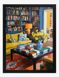
Poster Gemütliche Bibliothek mit gelbem Sofa
Translation missing: de.products.product.sale_price Ab CHF 16.00CHF 22.00 -

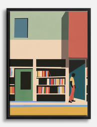
Poster Gemütliche Bibliothek
Translation missing: de.products.product.sale_price Ab CHF 16.00CHF 22.00 -

Poster Gemütliche Leseecke in der Bibliothek
Translation missing: de.products.product.sale_price Ab CHF 16.00CHF 22.00 -

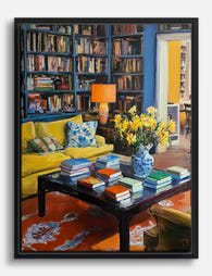
Leinwandbild Gemütliche Bibliothek mit gelbem Sofa
Translation missing: de.products.product.sale_price Ab CHF 61.00CHF 87.00 -
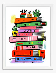
Poster bunter Buchstapel mit Pflanzen
Translation missing: de.products.product.sale_price Ab CHF 16.00CHF 22.00 -

Leinwandbild Farbenfrohes Bücherregal
Translation missing: de.products.product.sale_price Ab CHF 61.00CHF 87.00 -

Poster Gemütliche Bibliothek mit gelbem Sofa
Translation missing: de.products.product.sale_price Ab CHF 16.00CHF 22.00 -
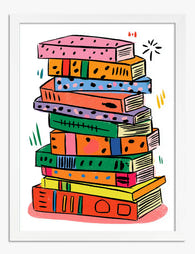
Poster Farbenfroher Bücherstapel
Translation missing: de.products.product.sale_price Ab CHF 16.00CHF 22.00 -

Leinwandbild Gemütliche Bibliothek im Sonnenlicht
Translation missing: de.products.product.sale_price Ab CHF 61.00CHF 87.00 -

Poster Gemütlicher Buchladen im Vintage-Stil
Translation missing: de.products.product.sale_price Ab CHF 16.00CHF 22.00 -

Leinwandbild Charmanter Buchladen in Aquarell
Translation missing: de.products.product.sale_price Ab CHF 61.00CHF 87.00 -
Poster Gemütliche Leseecke
Translation missing: de.products.product.sale_price Ab CHF 16.00CHF 22.00 -

Leinwandbild Farbenfroher Bücherstapel
Translation missing: de.products.product.sale_price Ab CHF 61.00CHF 87.00 -

Leinwandbild Gemütliche Leseecke
Translation missing: de.products.product.sale_price Ab CHF 61.00CHF 87.00 -
Leinwandbild Gemütliche Leseecke mit Bücherregalen
Translation missing: de.products.product.sale_price Ab CHF 61.00CHF 87.00 -
Leinwandbild Farbenfrohe Buchhandlung
Translation missing: de.products.product.sale_price Ab CHF 61.00CHF 87.00


Mehr aus The Frame

Vintage Venice Travel Posters: Why They're Havi...
Something has shifted in the way people are decorating walls. The minimalist beige phase is fading, and in its place: saturated colour, graphic shapes, and a romantic pull towards somewhere...

How to Build a Minimalist Plant Gallery Wall Th...
Most gallery walls fail in the same way: too many prints, mismatched frames, and spacing that looks accidental. A minimalist plant gallery wall flips the formula. You're not filling a...

How to Build a Calming Gallery Wall That Actual...
Most gallery walls promise serenity and deliver visual static. The fix isn't softer colours or gentler subjects, it's restraint, repetition, and a few specific measurements that almost nobody gets right....