How to Decorate with Dragonfly Art Without It Feeling Theme-y
The sophisticated decorator's guide to dragonfly prints, from frame finishes to gallery walls that don't tip into novelty.

Dragonfly art has a reputation problem. Done badly, it reads as gift shop or grandmother's bathroom. Done well, it sits comfortably alongside ferns, abstracts, and tonal photography in some of the most considered rooms you'll see.
The difference isn't the dragonfly. It's how you treat it.
The number one mistake people make with subject-led art
The mistake is treating dragonfly art as "dragonfly decor." The moment you start collecting matching sets, layering in dragonfly cushions, and hanging three near-identical prints in a row, the room reads as themed rather than designed.
Sophisticated dragonfly styling works on the opposite principle. You treat the dragonfly print as a botanical subject that happens to feature an insect, not as the centrepiece of a coordinated dragonfly moment. One strong piece, surrounded by quieter botanicals or abstracts in a shared palette, will always look more grown-up than a wall of winged friends.
Call it the one anchor piece rule. You get one dragonfly print per room, occasionally two if they're stylistically distinct (a vintage scientific study and a moody tonal photograph, for instance). Beyond that, you're decorating a theme park.
The other red flags to avoid: glitter accents, 3D metallic pieces, cartoon eyes, motivational quotes overlaid on the wings, and oversaturated rainbow colourways. These are the visual cues that drag the subject into novelty territory regardless of how well you style around them. Look for prints with the restraint of a scientific illustration or the softness of a watercolour botanical study.

Pairing dragonfly prints with botanicals, abstracts, and tonal pieces
Pairing is where most dragonfly arrangements succeed or fail. The instinct is to surround your dragonfly with more insects (butterflies, bees, beetles), which immediately pushes the wall into curiosity-cabinet territory. That can work, but it's a specific look and very easy to overdo.
A safer and more sophisticated route is botanical pairing. Not bright florals (which compete with the dragonfly's delicacy) but the quieter end of the botanical world: ferns, grasses, seed pods, branches, fig leaves, eucalyptus. These share the same scientific-illustration sensibility as a good botanical dragonfly print and let the dragonfly read as part of a wider study of the natural world rather than a standalone novelty.
Abstracts are the other strong pairing, particularly in tones that echo the dragonfly's wings. Soft washes of sage, dusty blue, or warm grey work as visual breathing room between more detailed pieces. They bridge the gap between the literal (the dragonfly) and the atmospheric (the rest of the room).
Tonal black-and-white photography is the third move worth knowing. A grainy landscape, a moody still life, or a piece of architectural photography grounds a dragonfly print and stops it floating off into preciousness. Think of the photograph as the adult in the room.
Frame finishes that elevate dragonfly art: oak, black, and white compared
Frame choice is the single most underrated decision in dragonfly styling, and it's where most people go wrong. The wrong frame can make a beautiful print look cheap, and the right one can elevate even a modest piece.
Oak
Light oak is your default for soft, watercolour-style dragonfly prints and vintage botanical illustrations. The warmth of the wood reinforces the natural-history mood without making the print feel precious. Oak also works beautifully in rooms with other natural materials: linen, rattan, jute, stone. If your dragonfly print has cream or off-white backgrounds and muted wing tones, oak is almost always the right call.
Black
Black is the sophistication shortcut. It pulls a dragonfly print firmly into "considered art" territory and works particularly well with high-contrast prints, scientific illustrations on white backgrounds, or any piece with strong graphic lines. Black frames suit modern and transitional interiors, and they're the right choice when you want the dragonfly to read as a serious piece of art rather than a soft accent. The trade-off: black frames are unforgiving. Any wonkiness in hanging or alignment shows up immediately.
White
White frames are the trickiest of the three. Done well, they create a clean, gallery-style look that suits minimal interiors and bathrooms beautifully. Done badly, they read as flatpack and cheap. The trick is the quality of the frame itself: a solid wood white frame with a proper depth looks entirely different from a thin painted one. We'd reach for white when the wall behind is darker (clay, sage, deep blue) and you want the print to pop, or in an all-white scheme where you want continuity.
What to avoid: ornate gold frames (unless the piece is genuinely antique), heavy carved wood, and anything with a distressed or "shabby chic" finish. These finishes have a particular relationship with novelty subjects that's almost impossible to escape.
A practical note: framed prints with UV-protective acrylic glaze are worth seeking out, particularly if your dragonfly print will hang anywhere with daylight. Acrylic is lighter than glass, doesn't shatter, and proper UV glazing means the inks won't fade for decades.

Building a two- or three-piece arrangement with a dragonfly print as anchor
Once you've accepted the one anchor piece rule, the question becomes what to put around it. Two or three pieces is the sweet spot. Beyond that you're building a gallery wall, which has its own rules.
For a two-piece arrangement, pair your dragonfly with a single botanical of similar size and frame finish. Hang them side by side with around 5 to 8cm between frames. The relationship should feel like a diptych, not two unrelated pieces sharing a wall. A dragonfly print with a fern study, both in oak, both 40x50cm, is a near-foolproof combination.
For a three-piece arrangement, the dragonfly sits at the centre with two supporting pieces flanking it. The centre piece can be slightly larger (say 50x70cm with two 30x40cm flanking pieces) or all three can match in size for a more rhythmic feel. Mix subjects: a grass study on one side, an abstract wash on the other, dragonfly in the middle. Curated wall art sets can save you the work of building these combinations from scratch.
If you're hanging above furniture, the bottom of the lowest frame should sit roughly 15 to 20cm above the surface. Above a sofa, aim for the arrangement to span around two-thirds of the sofa's width. Smaller than that and it floats; wider than that and it feels overstuffed.
Colour palettes that work
Vague colour advice (just say "soft blues and greens") doesn't help anyone execute a real room. Here are three palette formulas that genuinely work with dragonfly art.
Sage, warm grey, brass. Sage walls or a sage-toned dragonfly print, warm grey upholstery, brass picture light or hardware. This is the most versatile dragonfly palette and works in living rooms, bedrooms, and hallways. It's calm without being cold and it lets the dragonfly's iridescent wing tones do the work.
Dusty blue, cream, natural wood. Best for bedrooms and bathrooms. The dusty blue picks up the cooler tones in many dragonfly prints, the cream softens the contrast, and natural wood (oak floors, walnut furniture) grounds the scheme. Avoid pure white in this palette: it tips the room into nautical.
Warm neutral, terracotta accent, black frame. A more contemporary route. Off-white or putty walls, a single terracotta or rust accent (a cushion, a vase), and your dragonfly print in a black frame. The black frame is doing heavy lifting here, pulling the print into a more graphic, modern register.
Across all three palettes, muted metallics work as accents (brass, brushed bronze, blackened steel) but high-shine gold and silver fight with dragonfly art. Keep the metallics warm and slightly aged. Browse green art prints if you want to build the rest of the wall around your dragonfly anchor in tonal harmony.
Sizes that work: when to go statement and when to keep it small
Scale is where dragonfly art often goes wrong. Too small in a big room and it looks like an afterthought. Too large in a small room and it tips into novelty by sheer presence.
For a living room anchor piece, 50x70cm to 70x100cm is the sensible range. Anything smaller gets lost above a standard three-seater sofa. If you're going for proper statement scale (above a fireplace, on a feature wall), a canvas at 100x150cm in a single dragonfly composition can look genuinely arresting, particularly if the print is more atmospheric than literal. Canvas works particularly well at this scale because it sits flush to the wall without the visual weight of a frame.
For bedrooms, 40x50cm to 50x70cm above the bed or on a side wall is comfortable. Pairs work better than singles in bedrooms, where symmetry tends to read as restful.
For bathrooms and powder rooms, smaller is almost always better. 20x30cm to 30x40cm prints feel right against the smaller scale of bathroom fittings. Bathrooms are actually one of the best rooms for dragonfly art: the natural-history mood suits the room, the steam-resistant matte papers and acrylic glazing of a properly made framed print handle humidity, and the smaller scale forces the restraint that keeps the look sophisticated.
For hallways, narrow vertical compositions or pairs hung vertically work well. Skip the horizontal landscape format here.

Real room examples
The sage living room. Walls in a soft sage, a putty-coloured linen sofa, oak floors. Above the sofa, a three-piece arrangement: a 50x70cm dragonfly print in the centre in a black frame, flanked by two 40x50cm botanical studies (one fern, one grass) in matching black frames. A brass picture light above the centre piece. The dragonfly here doesn't read as the subject of the room. It reads as one piece in a considered natural-history triptych.
The powder room. Compact space, walls in a deep clay colour, brass tap, white basin. A single 30x40cm vintage-style dragonfly print in a light oak frame, hung at eye level above the towel rail. Nothing else on the walls. The restraint is what makes it work; the room would collapse into theme territory with even one more piece.
The modern bedroom. White walls, walnut bed frame, charcoal bedding. Above the bed, a single statement canvas at 100x70cm featuring a single oversized dragonfly on a soft cream background, unframed for a clean modern edge. The scale and the minimalism (no flanking pieces, no cushions echoing the subject) keep it firmly in art territory.
If you want to start building any of these from scratch, browse the full dragonfly art prints collection and pick the anchor first. Everything else, frame finish, palette, supporting pieces, follows from that one decision.

The edit-down test
When you're not sure whether your arrangement has tipped into theme territory, run this test. Stand in the doorway. What's the first thing you notice? If it's the room, the light, the proportions, you're fine. If it's "oh, dragonflies," you've got one too many pieces, one too many cushions, or one too many coordinating accessories.
Remove the smallest piece first. Then the most literal one. Then anything that explicitly matches the dragonfly print rather than complementing it. Sophistication in subject-led art is almost always a subtraction problem, not an addition one.

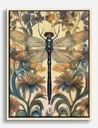
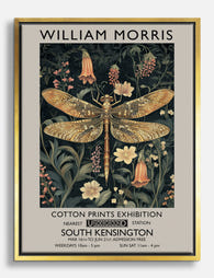
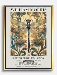
In diesem Blog vorgestellte Fab-Produkte
-

Poster Libelle im botanischen Vintage-Stil
Translation missing: de.products.product.sale_price Ab CHF 16.00CHF 22.00 -

Poster Libelle – Botanische Eleganz
Translation missing: de.products.product.sale_price Ab CHF 16.00CHF 22.00 -

Leinwandbild Libelle in Naturtönen
Translation missing: de.products.product.sale_price Ab CHF 61.00CHF 87.00 -
Leinwandbild Libelle und Wildblumen – Vintage-Stil
Translation missing: de.products.product.sale_price Ab CHF 61.00CHF 87.00 -
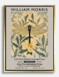
Leinwandbild Libelle im Flug – inspiriert von William Morris
Translation missing: de.products.product.sale_price Ab CHF 61.00CHF 87.00 -

Leinwandbild Elegante Libelle von Morris
Translation missing: de.products.product.sale_price Ab CHF 61.00CHF 87.00 -

Poster Libelle – inspiriert von William Morris
Translation missing: de.products.product.sale_price Ab CHF 16.00CHF 22.00 -

Poster Libellenmotiv von William Morris
Translation missing: de.products.product.sale_price Ab CHF 16.00CHF 22.00 -

Poster Morris Libellen-Eleganz in Grün und Weiß
Translation missing: de.products.product.sale_price Ab CHF 16.00CHF 22.00 -

Leinwandbild Libellengarten von William Morris
Translation missing: de.products.product.sale_price Ab CHF 61.00CHF 87.00 -

Poster Libelle und Pfingstrosen – Eleganz
Translation missing: de.products.product.sale_price Ab CHF 16.00CHF 22.00 -

Poster Libelle von William Morris
Translation missing: de.products.product.sale_price Ab CHF 16.00CHF 22.00 -

Poster Libelle und Pfingstrosen – stille Eleganz
Translation missing: de.products.product.sale_price Ab CHF 16.00CHF 22.00 -
Leinwandbild Libelle – inspiriert von William Morris
Translation missing: de.products.product.sale_price Ab CHF 61.00CHF 87.00 -

Leinwandbild Libelle und Pfingstrosen
Translation missing: de.products.product.sale_price Ab CHF 61.00CHF 87.00 -

Poster Libelle von William Morris
Translation missing: de.products.product.sale_price Ab CHF 16.00CHF 22.00 -

Leinwandbild William Morris Libellenmotiv
Translation missing: de.products.product.sale_price Ab CHF 61.00CHF 87.00 -

Poster Libellen-Eleganz – inspiriert von William Morris
Translation missing: de.products.product.sale_price Ab CHF 16.00CHF 22.00 -
Leinwandbild Libelle im William-Morris-Stil
Translation missing: de.products.product.sale_price Ab CHF 61.00CHF 87.00 -

Poster Botanische Libelle im Stil von William Morris
Translation missing: de.products.product.sale_price Ab CHF 16.00CHF 22.00


Mehr aus The Frame

How to Decorate with Vintage London Prints (Roo...
Vintage London prints are everywhere right now, from Brooklyn brownstones to Bristol terraces. The trick is making them feel collected and considered rather than like you raided a National Trust...

How to Build a Gallery Wall Around One Inspirat...
Most gallery walls fail because they try to say too much. A truly great inspirational display works like a well-edited sentence: one strong message, supported by quieter elements that hold...

How to Build a City-Themed Gallery Wall That Ac...
Most failed gallery walls die at the same step: someone buys five prints they love individually, hangs them, and realises they have nothing in common. City art is especially prone...