How to Build a Gallery Wall Around Town and Village Scenes
A practical playbook for arranging town and village prints into a gallery wall that feels curated, not chaotic.

You've fallen for town prints. Maybe a hilltop village in Provence, a cobbled lane in Whitby, a market square you walked through once and never forgot. The question is how to put them together on one wall without it looking like a souvenir shop. This guide gives you the layouts, measurements, and rules that actually work.
Why town scenes work so well as a gallery wall theme
Town and village scenes have a built-in coherence that abstract art and botanicals don't. They share a vocabulary: rooftops, windows, streets, skies. That shared language means the wall reads as one idea rather than a scrapbook, even when the individual prints come from different artists or regions.
They also age well. Unlike trend-led abstracts, a beautifully rendered village street looks just as good in five years as it does today. And because the subject matter is recognisable, town prints invite people in. Guests will lean in to read the shopfronts and find themselves quietly debating which one they'd most like to visit.
The trap is that themed collections can drift into monotony. Seven sun-bleached Mediterranean villages stacked together start to blur. The fix isn't fewer prints, it's smarter pairing. That's what the rest of this article covers.

Choosing a unifying thread: colour, region, or style
Before you buy a single print, pick your unifying thread. This is the through-line that holds the wall together when everything else is varying. Without it, the wall feels random. With it, you can mix far more boldly than you'd expect.
You have three good options:
Colour palette. Every print shares a dominant colour family. Sun-warmed terracottas and ochres for a Mediterranean wall. Sage greens, slate greys and cream for British countryside. Faded blues and chalky whites for Greek islands or Cornish coast. The subjects can vary wildly as long as the colour story holds.
Region. All prints come from the same country or coastline. A Cotswolds wall. A Tuscan wall. A Cornish fishing village wall. This is the easiest unifier for beginners because the architecture and light naturally rhyme.
Style. All prints share the same artistic treatment. Loose watercolour. Linocut. Mid-century illustration. Photographic. Style coherence lets you span the world geographically while still looking like one collection.
Pick one. Don't try to unify across all three or you'll end up with a wall so identical it's dull. One strong thread, then deliberate variety inside it.
The best layout for 3, 5, and 7 town prints
Forget the "start with your biggest piece and work outward" advice. That works for eclectic walls. For themed collections, geometry first, instinct second. Here are layouts that work.
3 prints
Go with a horizontal row at equal heights, all the same size. 40x50cm or 50x70cm prints sit beautifully in a row of three above a sofa or sideboard. Centre the middle print on the furniture below and space the outer two evenly. This layout is hard to get wrong and looks polished even when the prints are quite varied.
If you want a touch more interest, try a triptych where the centre print is portrait orientation (50x70cm) flanked by two landscape prints (50x40cm) at the same outer dimensions. The varied shapes give the eye somewhere to travel.
5 prints
The five-print grid is the workhorse of themed gallery walls. Two configurations:
The 2-1-2 cluster: two prints stacked on the left, one large print in the middle, two prints stacked on the right. Use 30x40cm prints for the four outer pieces and a 50x70cm portrait in the centre. Total wall span around 180cm wide.
The horizontal salon row: five prints in one line at the same height, alternating sizes. For example, 30x40cm, 50x70cm, 40x50cm, 50x70cm, 30x40cm. Vary the orientations so the bottom edges align but the top edges create a soft skyline.
7 prints
Seven is where it gets fun. The most reliable layout is the 3-1-3 grid: three prints on the left in a tight cluster, one feature print in the middle, three on the right mirroring the left. Use 24x30cm or 30x40cm for the six outer prints and 50x70cm or 60x80cm for the central anchor.
For a more relaxed look, try the scattered grid: imagine a 3x3 grid with two squares left empty (top-right and bottom-left, for instance). This gives asymmetry without chaos. Use mixed sizes but keep all prints aligned to the invisible grid lines.
Browse the town art prints collection with these layouts in mind, you'll find the planning much easier when you know exactly how many pieces you're shopping for.
Size combinations that actually work
"Mix sizes" is useless advice without numbers. Here are combinations that have visual rhythm rather than random scaling.
For a sofa wall (around 200cm wide):
- 1x 70x100cm centre + 2x 30x40cm flanking
- 3x 50x70cm in a row
- 1x 60x80cm + 4x 30x40cm in a 2-1-2 cluster
For a narrow wall or stairwell (around 100cm wide):
- 3x 30x40cm stacked vertically
- 1x 50x70cm + 2x 24x30cm offset to one side
For a statement wall (around 250cm+ wide):
- 7 prints in a 3-1-3 with 50x70cm centre and 30x40cm satellites
- 5 large prints, all 50x70cm, in a horizontal row
The rule that matters: have at least two different sizes on the wall, but no more than three. Two sizes feel intentional. Four or more feel chaotic. The ratio between your largest and smallest print should be roughly 2:1, not 5:1.

Mixing coastal town prints, market town scenes, and European villages
The honest answer: yes, you can mix them, but you need a strong unifying thread to pull it off.
A wall that combines a Cornish fishing village, a Cotswolds market square, and a Provençal hilltop town will feel scattered if the only common factor is "places with old buildings." It works when colour or style ties them together. Three watercolour town scenes from three different countries, all in soft greys and creams, can look stunning. Three photographic town scenes from three different countries, in wildly different palettes, will look like a holiday slideshow.
A few specific pairings that work:
Coastal towns + European villages: pair them when both sit in a warm Mediterranean palette. A Greek harbour, a Sicilian hill town and an Amalfi cliffside read as one trip even though they're different scenes. Start with coastal art prints and add inland villages that share the same light.
British market towns + countryside villages: easy win because the architectural language and palette overlap heavily. Stone, slate, sage, cream.
European villages from different countries: works beautifully if you stick to one art style. Browse European art prints by visual treatment rather than location.
What rarely works: mixing photographic prints with illustrated ones in the same gallery wall. The eye reads them as different mediums and the wall fragments. Pick a lane.
To prevent monotony when subject matter is similar, vary perspective deliberately. One aerial view, one street-level view, one harbour-from-the-sea view. This is one of the best small town artwork prints tactics there is. Same theme, three different vantage points, instant visual interest.
Frame consistency vs deliberate contrast: our recommendation
For themed collections, frame consistency wins. Almost always.
The general gallery wall advice tells you to mix frame styles for character. That works when your subject matter is wildly varied (a portrait, an abstract, a botanical, a poster). When your subject matter is already cohesive, mixed frames create visual noise that competes with the prints rather than supporting them.
Pick one frame finish and stick to it across the entire wall. Black for a graphic, modern feel. Natural oak for warmth. White for an airy, Scandi-leaning room. Walnut for a richer, more traditional look.
The exception: if your wall is large (seven prints or more) and you want a salon-hung feeling, you can use two frame finishes in roughly a 70/30 split. For example, mostly oak with two black frames as accents. Don't go three or more finishes.
If you're worried about frames warping or arriving separately from the print (a common frustration in this category), our framed prints come fully fitted in solid FSC-certified wood frames with UV-protective acrylic glaze, ready to hang straight from the box. The acrylic also means you can hang in a sunny lounge without worrying about fading.
A note on matting. For themed gallery walls, matting often isn't necessary. Borderless framed prints feel contemporary and let you fit a larger image in the same wall space. Save matting for when you want a more formal, traditional gallery feel.
Spacing, height, and hanging tips for a clean result
The single most common mistake is hanging too high. Gallery walls should be hung so the visual centre of the arrangement sits at roughly 145-150cm from the floor, which is gallery standard. Above a sofa or sideboard, leave 15-20cm between the top of the furniture and the bottom of the lowest print. Any more and the art floats away from the room.
Spacing between prints: 5-7cm is the sweet spot. Tighter (3-4cm) for small prints clustered together. Wider (8-10cm) for very large prints with breathing room. Be ruthlessly consistent. Uneven spacing is the fastest way to make a careful arrangement look amateur.
Plan on the floor first. Lay out the full arrangement on the floor in front of the wall before you put a single nail in. Take a photo from above. Adjust until it looks right. Only then transfer it to the wall.
For the wall itself, cut paper templates the exact size of each frame and tape them up with masking tape. Live with it for 24 hours. Move things around. Mark the nail positions through the paper, then hammer in.
If you're hanging seven pieces, it's worth investing 20 minutes in a long spirit level and a tape measure. Eyeballing seven prints will not work.

Where to place your gallery wall for maximum impact
Not every wall is a gallery wall. The best spots:
Above a sofa. The classic position. The sofa anchors the arrangement and gives it scale. Aim for the gallery wall to span roughly two-thirds to three-quarters the width of the sofa.
Above a sideboard or console. Town scenes look particularly good here because the eye level is lower and you can lean into detail-rich prints that reward close looking.
Stairwells. A vertical or stepped arrangement of village prints up a staircase is one of the great underused decorating moves. The changing eye level as you climb means each print gets its moment.
Dining rooms. Town scenes are conversation starters and a long horizontal row above a sideboard or running along the wall opposite a dining table works beautifully.
Hallways. Narrow walls can take vertical stacks of three prints brilliantly. Great for collecting small town artwork prints over time.
Where to avoid: bathrooms with poor ventilation (humidity will warp paper-based art over time, though canvas handles damp better), and walls in direct competition with strong architectural features like a fireplace surround or a busy bookshelf.
If you're building your collection over time rather than buying everything at once, start with your largest anchor print, then add satellites every few months. The wall art sets are a useful starting point if you want a coordinated foundation you can expand later.
One last thought on town artwork ideas for home: don't be afraid to break your own theme with one or two non-town pieces if the wall starts to feel too literal. A single botanical or quiet abstract among six town scenes can give the eye a place to rest. Just keep it inside your colour or style thread, and it'll feel like a deliberate pause rather than a mistake.
Get the unifying thread right, pick a clean layout, commit to consistent framing, and the wall will do the rest. Most of the magic in decorating with village prints is in the editing, not the buying.


In diesem Blog vorgestellte Fab-Produkte
-

Leinwandbild Dorfspaziergang
Translation missing: de.products.product.sale_price Ab CHF 62.00CHF 88.00 -
Poster farbenfrohe Stadtlandschaft
Translation missing: de.products.product.sale_price Ab CHF 16.00CHF 22.00 -

Poster Festliche Stadtszene im Winter
Translation missing: de.products.product.sale_price Ab CHF 16.00CHF 22.00 -
Leinwandbild Stadtbummel & kleine Momente
Translation missing: de.products.product.sale_price Ab CHF 62.00CHF 88.00 -
Leinwandbild Dorfpromenade in Pastellfarben
Translation missing: de.products.product.sale_price Ab CHF 62.00CHF 88.00 -

Poster Charmante Marktszene in Wells
Translation missing: de.products.product.sale_price Ab CHF 16.00CHF 22.00 -

Poster Dorfidylle von Vincent van Gogh
Translation missing: de.products.product.sale_price Ab CHF 16.00CHF 22.00 -

Leinwandbild Winterdorf im Schnee mit warmem Lichterglanz
Translation missing: de.products.product.sale_price Ab CHF 62.00CHF 88.00 -
Poster Sonniger Dorfspaziergang in Pastell
Translation missing: de.products.product.sale_price Ab CHF 16.00CHF 22.00 -

Leinwandbild Stadtspaziergänge und grüne Ecken
Translation missing: de.products.product.sale_price Ab CHF 62.00CHF 88.00 -

Poster Winterdorf bei Nacht – Weihnachtsmann am Sternenhimmel
Translation missing: de.products.product.sale_price Ab CHF 16.00CHF 22.00 -

Leinwandbild Farbintensive Stadtszene
Translation missing: de.products.product.sale_price Ab CHF 62.00CHF 88.00 -
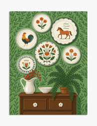
Poster Volkskunst-Charme mit Wandtellern
Translation missing: de.products.product.sale_price Ab CHF 16.00CHF 22.00 -

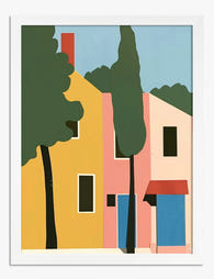
Leinwandbild Italienisches Dorf in leuchtenden Farben
Translation missing: de.products.product.sale_price Ab CHF 62.00CHF 88.00 -
Poster Lebendiges Dorf-Flair
Translation missing: de.products.product.sale_price Ab CHF 16.00CHF 22.00 -
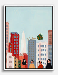
Leinwandbild Farbenfrohe Stadtskyline
Translation missing: de.products.product.sale_price Ab CHF 62.00CHF 88.00 -

Poster Farbenfrohes Toskana-Dorf
Translation missing: de.products.product.sale_price Ab CHF 16.00CHF 22.00 -

Leinwandbild Farbenfrohes Toskana-Dorf
Translation missing: de.products.product.sale_price Ab CHF 62.00CHF 88.00 -

Leinwandbild Wandteller mit Blumen, Hahn und Pferd im Volkskunst-Stil
Translation missing: de.products.product.sale_price Ab CHF 62.00CHF 88.00


Mehr aus The Frame

Boho Sun Wall Art: How to Nail the Look Without...
Boho sun art has a reputation problem. Done badly, it screams student halls and macramé overload. Done well, it's one of the warmest, most grounding aesthetics you can put on...

Every Animal in William Morris's Designs: The C...
Most people know the thrush in Strawberry Thief and stop there. But Morris's wider body of work contains foxes, hares, peacocks, ravens, lions, herons, woodpeckers, deer, and doves, often half-buried...

Countryside Decor Ideas: How to Bring Rural Cal...
Countryside art has quietly become one of the most versatile choices in modern interiors. Not the chintz-and-bunting version, but the kind of soft, considered pastoral scenes that bring the outside...