Vintage Butterfly Prints: From Scientific Illustration to Your Living Room Wall
How 17th-century entomology became one of the most quietly sophisticated wall art choices you can make today.

Butterfly prints have a reputation problem. For decades they were filed under "pretty but generic," the sort of thing you bought to fill a wall without thinking too hard. That's a shame, because the best butterfly illustrations belong to one of the most fascinating chapters in art history, and on a modern wall they look extraordinary.
A brief history of butterfly illustration (and why it was revolutionary)
Before the late 17th century, butterflies were rarely drawn with any scientific accuracy. They turned up in the margins of illuminated manuscripts or as decorative flourishes in still lifes, but no one was paying attention to the actual creature. Then came Maria Sibylla Merian.
Merian was a German-born naturalist and illustrator who, in 1699, sailed to Suriname at the age of 52 with her daughter, funding the trip herself. She spent two years documenting tropical insects, and the resulting book, Metamorphosis Insectorum Surinamensium, changed scientific illustration forever. She drew butterflies alongside their host plants, showing the full life cycle from caterpillar to chrysalis to adult. No one had done that before.
What made her work revolutionary wasn't just the detail. It was the idea that insects were worth observing in their own ecosystems, on their own terms. She treated butterflies as subjects, not ornaments. Her plates are still reproduced today and they still look astonishingly modern.
Merian opened a door, and a procession of illustrators walked through it. Dru Drury catalogued exotic species in 18th-century England. Charles Waterhouse produced meticulous Victorian plates. In the early 20th century, the French designer E.A. Séguy fused entomology with Art Deco in his pochoir-printed butterfly portfolios, which remain some of the most stylistically influential insect images ever made.

Scientific illustration vs. artistic interpretation: knowing the difference
Not every butterfly print is a scientific illustration, and that matters when you're choosing one. The two traditions share a visual language but pursue very different goals.
A scientific illustration is built around accuracy. Wings are shown flattened and symmetrical, often pinned-specimen style, with anatomical detail visible down to the antennae and leg segments. Latin names usually sit beneath the image. The composition is rigorous, the palette restrained, and the background is typically blank cream or aged parchment. Think Merian, Drury, Waterhouse.
An artistic interpretation borrows the look but takes liberties. Wings might be tilted in flight, colours heightened, species combined in compositions that would never occur in nature. Séguy is the obvious example: his butterflies are dazzling, decorative, and entirely uninterested in taxonomy.
Both can be beautiful. The question is which mood you want. Scientific plates feel scholarly, calm, and slightly austere. Artistic interpretations are bolder, more graphic, and sit closer to fashion illustration than natural history. A serious gallery wall often mixes the two, but you should know which you're buying.
Visual markers to look for: hand-lettered species names, plate numbers in the corner (often Roman numerals), a single specimen or grid arrangement, and that distinctive slightly-warm paper tone are all signs the print is rooted in the scientific tradition.
Why vintage butterfly prints are having a moment in modern interiors
There's been a noticeable return to natural history aesthetics over the last few years. Call it grandmillennial, call it the cottagecore hangover, call it the quiet rebellion against minimalism. Interiors are getting warmer, more layered, and more personal, and vintage botanical and entomological prints fit that mood perfectly.
Part of the appeal is colour. The aged paper, faded vermilion, soft ochre and dusty teal of antique butterfly plates align beautifully with the warm neutrals dominating current interior palettes: clay, mushroom, oat, sage, terracotta. They look at home next to limewash walls and oiled oak.
There's also the biophilic angle. Designers have been talking for years about bringing nature indoors, and butterfly prints do this without leaning into anything twee. They're nature filtered through scholarship, which gives them a quiet seriousness that, say, a generic floral poster doesn't have.
And there's an ethical dimension worth mentioning. Mounted butterfly specimens under glass have a long collecting tradition, but most people are rightly uncomfortable with displaying actual preserved insects today. A high-quality reproduction of a Merian or Séguy plate gives you the visual richness of a Victorian curiosity cabinet without anything having been pinned. Browse our vintage art prints collection and you'll see this thread running through a lot of what's currently resonating.
What to look for in a quality vintage-style butterfly print
This is where most shoppers go wrong. A cheap butterfly print and a museum-quality one can look almost identical in a thumbnail image, but in person the gap is enormous. Here's what actually separates them.
Print technique. Original 18th and 19th-century plates were produced by engraving, etching, or lithography, then hand-coloured. Modern reproductions can't replicate that process, but the best ones use giclée printing, which lays down ink at very high resolution with accurate colour separation. A good giclée on the right paper holds detail that cheap digital printing simply loses, particularly in the fine venation of butterfly wings.
Paper. Thick matte paper is non-negotiable. Glossy paper kills a vintage print instantly. It introduces glare, flattens the colour, and makes the whole thing look like a poster. Matte paper holds ink the way the originals did and lets the warm undertones of vintage palettes breathe.
Colour authenticity. Look closely at the colours. Original hand-coloured plates have a particular muted quality, slightly chalky, never neon. If the oranges look fluorescent or the blues look digital, the file has been over-corrected. Good reproductions preserve the gentle desaturation of the original.

Detail at close range. A great butterfly print should reward stepping closer. You should be able to see individual scales suggested in the wing pattern, the fine hairs on the thorax, the precise lettering. Cheap prints fall apart the moment you get within a metre.
Source material. The Biodiversity Heritage Library, the Smithsonian, and major museum archives have digitised huge numbers of historical natural history plates. Reproductions sourced from high-resolution scans of original plates will always beat reproductions sourced from reproductions of reproductions. It's worth asking, or at least looking at how sharp the lettering is.
Fab's butterfly art prints are produced on thick matte paper using museum-grade giclée, with water-based inks rated to last hundreds of years even in direct sunlight. That last point matters more than people realise: butterfly prints often end up in sunny rooms because that's where you want them, and fade-resistance is the difference between a print that ages gracefully and one that turns greenish in five years.
Room pairings: where vintage butterfly art looks its absolute best
Butterfly prints are more versatile than they're given credit for, but they sing in certain settings.
The reading nook or study. This is the obvious one and it's obvious for a reason. A single large butterfly plate, around 50x70cm, above a wingback chair or a reading lamp, paired with a small stack of books on the floor, gives you instant cottage-library energy. Mid-century walnut furniture works particularly well here. The honey tones of the wood echo the aged paper.
The dining room. A grid of four or six smaller butterfly prints on one wall of a dining room is one of the most underrated moves in interior design. It gives the room a curated, slightly continental feel, especially when paired with linen upholstery, candlelight, and ceramics. Aim for matching frame finishes for cohesion.
The bedroom. Butterfly prints work beautifully above a bed, but go bigger than you think. A single 70x100cm framed print, centred above the headboard, looks far more considered than three small ones in a row. The soft palettes of vintage butterflies suit bedrooms because they don't shout.
The living room. In a living room setting, butterfly prints earn their place when they're treated as proper art rather than decoration. Hang them at gallery height (centre of the image around 145-150cm from the floor) and give them breathing room. One large print over a sofa beats a cluttered cluster every time.
The hallway or staircase. Long, narrow walls love a sequence of butterfly plates. Three or five prints in matching frames, evenly spaced, transform a transitional space into something memorable.
Where they struggle: ultra-glossy, highly modern interiors with a lot of chrome and high-contrast black-and-white. The warmth of vintage butterfly palettes wants warmth around it.
Framing vintage butterfly prints: solid wood, white mount, no shortcuts
This is where so many vintage prints get let down. The right frame elevates a butterfly plate into something gallery-worthy. The wrong frame makes it look like a gift shop souvenir.
The rules are simple. Use solid wood, never MDF or plastic with a wood-look finish. Choose a slim profile in natural oak, walnut, or a clean matte black. Ornate gilded frames can work if you're going full maximalist, but for most modern interiors they fight the print rather than support it.
A white or cream mount (the card border between the print and the frame) is essential. It does two things: it gives the image space to breathe, and it echoes the cream paper of the original plates. Without a mount, vintage prints feel cramped and contemporary in the wrong way. With one, they immediately read as considered.

On glazing: traditional framers use glass, but glass has two problems. It reflects, and it's heavy, which is a real issue when you're shipping a framed print or hanging it on plasterboard. UV-protective acrylic glaze gives you the same clarity without the glare and without the weight, and crucially it blocks the UV that causes fading. For prints with the rich, faded palettes we love in vintage butterflies, fade protection isn't optional.
The other thing worth flagging: a lot of framed prints from online retailers arrive in two boxes, with the frame and print shipped separately and assembled by the customer. This is where things go wrong. Mounts misalign, prints warp from humidity in transit, dust gets trapped behind the glazing. Look for prints that arrive properly fitted in a single box, ready to hang. It sounds minor; it isn't.
How to mix vintage butterfly prints with contemporary art
The most sophisticated way to display vintage butterfly prints is alongside contemporary work, not in a themed butterfly-only collection. A wall of nothing but butterflies tips quickly into kitsch.
The trick is to treat the butterfly print as the historical anchor in a mixed gallery wall. Pair it with abstract line drawings, a modern landscape photograph, or a graphic typography print. The contrast between the scholarly, detailed butterfly plate and the loose, contemporary work makes both feel more intentional.
Keep one element consistent across the wall. Usually this is the frame: matching oak frames with white mounts will hold a wildly varied set of images together. Alternatively, you can vary the frames but keep a colour thread running through the artwork, picking a shared accent that appears in each piece.
Scale matters in a mixed display. Don't hang everything at the same size. One large piece (often the butterfly plate works as the centrepiece) anchors the arrangement, with smaller works orbiting around it. Aim for uneven spacing that still feels balanced. Lay it out on the floor first.
Butterfly prints also pair beautifully with botanical art prints. The two traditions grew up together (Merian herself drew plants alongside her insects) and they read as a natural family on a wall. A single butterfly plate flanked by two botanical illustrations is a classic, foolproof arrangement.
A final word
The reason vintage butterfly prints feel right now isn't trend-driven, or not only. They sit at the intersection of art, science, and natural beauty, and they carry a story most wall art doesn't. Choose one with proper provenance, frame it like you mean it, and give it space. The rest takes care of itself.


In diesem Blog vorgestellte Fab-Produkte
-

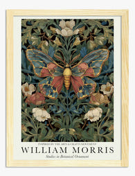
Poster Botanischer Schmetterling im William-Morris-Stil
Translation missing: de.products.product.sale_price Ab CHF 16.00CHF 22.00 -

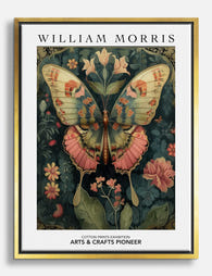
Leinwandbild Schmetterling im William-Morris-Stil
Translation missing: de.products.product.sale_price Ab CHF 61.00CHF 87.00 -

Poster Schmetterling und Blüten von William Morris
Translation missing: de.products.product.sale_price Ab CHF 16.00CHF 22.00 -

Leinwandbild Schmetterling im William-Morris-Stil
Translation missing: de.products.product.sale_price Ab CHF 61.00CHF 87.00 -

Poster Botanischer Schmetterling im William-Morris-Stil
Translation missing: de.products.product.sale_price Ab CHF 16.00CHF 22.00 -

Poster Schmetterling im botanischen Stil von Morris
Translation missing: de.products.product.sale_price Ab CHF 16.00CHF 22.00 -
Poster Botanischer Schmetterling im William-Morris-Stil
Translation missing: de.products.product.sale_price Ab CHF 16.00CHF 22.00 -

Leinwandbild Schmetterling, inspiriert von William Morris
Translation missing: de.products.product.sale_price Ab CHF 61.00CHF 87.00 -

Poster Schmetterlings-Eleganz im Stil von William Morris
Translation missing: de.products.product.sale_price Ab CHF 16.00CHF 22.00 -

Poster Schmetterling zwischen floralen Ornamenten in Erdtönen
Translation missing: de.products.product.sale_price Ab CHF 16.00CHF 22.00 -

Poster Botanischer Schmetterling – inspiriert von William Morris
Translation missing: de.products.product.sale_price Ab CHF 16.00CHF 22.00 -

Poster Schmetterling über Vintage-Blüten von William Morris
Translation missing: de.products.product.sale_price Ab CHF 16.00CHF 22.00 -

Leinwandbild Botanischer Schmetterling im William-Morris-Stil
Translation missing: de.products.product.sale_price Ab CHF 61.00CHF 87.00 -

Leinwandbild Schmetterlings-Eleganz von William Morris
Translation missing: de.products.product.sale_price Ab CHF 61.00CHF 87.00 -
Leinwandbild Schmetterling im William-Morris-Stil
Translation missing: de.products.product.sale_price Ab CHF 61.00CHF 87.00 -

Leinwandbild Schmetterlingsparade im Vintage-Stil
Translation missing: de.products.product.sale_price Ab CHF 61.00CHF 87.00 -

Poster Schmetterling mit floralem Design von William Morris
Translation missing: de.products.product.sale_price Ab CHF 16.00CHF 22.00 -

Leinwandbild Schmetterling – inspiriert von William Morris
Translation missing: de.products.product.sale_price Ab CHF 61.00CHF 87.00 -

Poster Botanischer Schmetterling im Stil von William Morris
Translation missing: de.products.product.sale_price Ab CHF 16.00CHF 22.00 -

Leinwandbild Schmetterlings-Eleganz von William Morris
Translation missing: de.products.product.sale_price Ab CHF 61.00CHF 87.00


Mehr aus The Frame

Why William Morris Prints Look Brilliant in Mod...
William Morris has been quietly miscategorised for decades. His patterns get filed under "country cottage" or "Arts and Crafts revival" and rarely escape, which is a shame because his tree...

Why Arts and Crafts Nature Prints Are the Antid...
The minimalism hangover: why bare walls stopped feeling calming For about a decade, the aspirational interior was a white box with one boucle chair in it. That look has officially...

Botanical Petal Art: Why Close-Up Prints Feel M...
Full florals have had a long run, and they're not going anywhere. But if you've noticed that the botanical art appearing in design magazines, boutique hotel lobbies, and the better-styled...