The Acanthus Leaf in William Morris's Work: History, Symbolism, and How to Style It
How Morris took a 2,000-year-old classical motif, set it in motion, and made it the most dramatic pattern in his catalogue.

The acanthus leaf has decorated Western buildings for over two thousand years, but William Morris was the designer who finally made it move. His 1875 Acanthus pattern took a stiff, classical motif carved into Greek temples and turned it into a living, rolling, almost three-dimensional thing. If you're considering a william morris acanthus print, it helps to know what you're actually putting on your wall.
Acanthus leaves from ancient Greece to William Morris's workshop
The acanthus story usually starts with the Roman architect Vitruvius, who claimed the Corinthian column was inspired by acanthus leaves growing around a basket on a young girl's grave. Whether or not that's true, by the 5th century BC the spiky, deeply lobed acanthus leaf was carved into the capitals of temples across the Mediterranean, then onto Roman friezes, Byzantine churches, and eventually Renaissance ceilings.
For two millennia, acanthus meant architecture. It was symmetrical, formal, and almost always used as a frame for something else: a column, a doorway, a portrait. It rarely grew. It just sat there looking dignified.
Morris broke that tradition deliberately. Rather than studying Greco-Roman precedents, he turned to medieval illuminated manuscripts, particularly the Books of Hours where acanthus borders curled and tangled in the margins. The result, designed in 1875 and printed by Jeffrey & Co. using thirty separate woodblocks and fifteen colours, was unlike anything else in Victorian wallpaper. It set the leaves into motion.

What acanthus symbolises: endurance, craftsmanship, and natural growth
So what do acanthus leaves symbolize? The honest answer is that the meaning has shifted dramatically depending on who's been looking at it.
In ancient Mediterranean cultures, acanthus stood for immortality and enduring life. The plant grows back aggressively when cut, which is why it ended up on so many funerary monuments. Roman families used it to suggest their lineage, and by extension their wealth, would outlast death itself.
Christian tradition complicated things. The plant's spiky lobes were sometimes read as a symbol of pain, sin, or the punishment of the Fall, particularly in medieval church carving. Two opposite meanings, depending on which century you stood in.
By Morris's time, Victorian floriography (the so-called "language of flowers") had assigned acanthus a third meaning entirely: art itself. To his educated audience, an acanthus pattern wasn't just decorative. It was a quiet declaration that the home valued craftsmanship, beauty, and the dignity of design as a discipline. Given Morris's lifelong belief that good design was a moral act, you can see why he gravitated to it.
What's clever about Morris's interpretation is that he stripped away most of the classical and Christian baggage and let the leaf become what it really is: a plant. Vigorous, structural, alive.
Morris's Acanthus design: what makes it one of his most dramatic patterns
Acanthus marked a turning point in Morris's career. Before 1875, his patterns were largely flat, repeating, and observational. With Acanthus, he committed to scale, depth, and a heightened three-dimensional effect that none of his earlier work attempted.
The original was issued in two colourways: a rich green version dominated by sage, olive and forest tones, and a reddish-brown version with terracotta, ochre and rust. Both used fifteen separate colours printed from thirty woodblocks, making it one of the most technically ambitious wallpapers Morris & Co. ever produced. At sixteen shillings a roll, it was also one of the most expensive, which meant it appeared mostly in the homes of wealthy clients and artistic circles in its early years.
What gives the pattern its drama is the rhythm. The leaves don't repeat in a tidy grid. They overlap, twist, fold back on themselves, and create the illusion that you're looking through one layer into another. Morris understood that a pattern needs to work both at a distance, where it reads as overall texture, and up close, where it reveals the line work. Acanthus does both better than almost anything else in his catalogue.
If you're exploring the wider william morris plant designs, Acanthus sits at the maximalist end. It's not background. It's the event.
Where to hang an Acanthus print for maximum impact
Morris held a counterintuitive view about scale. He believed large-scale patterns often worked better in small rooms, not large ones, because they gave a small space character and intimacy rather than overwhelming it. This is genuinely useful advice and most people get it backwards.
A few specific suggestions:
Entryway or hallway. Narrow halls benefit enormously from a single large Acanthus print on the longest wall. The architectural quality of the pattern adds weight and drama to a transitional space that often feels like an afterthought. Hang the centre of the print at roughly 145cm from the floor.
Dining room. Acanthus has a formality that suits dining rooms beautifully. The greens and golds catch candlelight and lamp light in a way that flatter food, faces, and conversation. A 70x100cm print above a sideboard is hard to beat.
Snug or reading corner. Small, low-ceilinged rooms are exactly where Morris said large patterns should live. An Acanthus print behind a wingback chair turns a corner into a destination.
Bedroom (with caution). Acanthus can work in bedrooms but it's busy. If you want Morris in your bedroom and prefer something calmer, Willow Boughs is the better choice. We'll come back to this.
Where Acanthus tends not to work: open-plan kitchens with a lot of competing visual noise, very modern minimalist spaces where it can feel marooned, and bathrooms where the humidity isn't ideal for any framed paper print.

Colour palette breakdown: pairing Acanthus greens and golds with your room
The original green colourway is built around three families: deep forest and olive greens for the main leaves, soft sage and celadon for the secondary leaves, and warm gold, ochre and cream tones in the highlights and stems. Understanding this layering makes pairing it with paint, fabric and furniture much easier.
What works:
- Warm off-whites and clotted cream walls. These let the print breathe and pull out the gold tones.
- Deep, saturated wall colours: ink blue, oxblood, plaster pink, or a darker green from the same family. Dark walls behind a framed Acanthus print are spectacular.
- Natural materials: oak, walnut, rattan, linen, wool. Morris's whole philosophy was rooted in honest materials, and his patterns repay that honesty.
- Brass and aged bronze hardware. Avoid chrome.
What to avoid:
- Cool greys, which fight the warm undertones in the print.
- Glossy, high-contrast modern finishes. Acanthus needs a bit of softness around it.
- Other large-scale botanical prints in the same room. One Morris pattern per space, ideally.
If you're building a green-led palette and want to see how other prints might layer in, the broader green art prints collection is a useful reference for tonal range. The reddish-brown Acanthus colourway, meanwhile, sits beautifully against terracotta plaster, soft pinks, and unfinished wood, and feels warmer and more autumnal than the green version.
Acanthus vs Willow Boughs: choosing between Morris's two most iconic plant designs
These are the two Morris plant patterns most people end up choosing between, and they serve genuinely different purposes. The right answer depends entirely on what you want the room to feel like.
Acanthus (1875) is architectural, dramatic, three-dimensional, and medieval in inspiration. The leaves overlap and twist. The colour palette is rich and layered. It commands a wall and changes the energy of a room. Choose it when you want a statement, when the room is small or transitional, or when you want a pattern with weight and history.
Willow Boughs (1887) is naturalistic, soothing, and observational. Morris designed it after watching willow trees from a window. The pattern is finer, the colours are softer, the rhythm is gentler. Choose it for bedrooms, calm living rooms, en-suites, or any space where you want the pattern to recede slightly rather than dominate.
A simple decision rule: if you want guests to notice the wall the moment they walk in, choose Acanthus. If you want to live with a pattern for years without it ever becoming tiring, Willow Boughs is the more forgiving choice.
You don't have to pick one forever. Many people put Acanthus in their hallway or dining room and Willow Boughs in their bedroom, and the two patterns coexist happily as long as they're in separate rooms.

Framing and sizing recommendations for Acanthus prints
Acanthus is a complicated pattern with a lot of internal detail, which has implications for both size and framing.
Size. Don't go small. The pattern needs room to breathe and the rhythm of the leaves only really works at scale. As a rough guide:
- Above a console, sideboard, or fireplace: 70x100cm is the minimum, and the largest available framed size at that ratio is the right call for most rooms.
- Hallways: a single large print works far better than a gallery wall here. Acanthus is busy enough on its own.
- Above a sofa or bed: the print should span roughly two-thirds the width of the furniture below it. For a standard three-seat sofa, that means going large.
If you want something even bigger, our canvas prints go up to 100x150cm with the image wrapped around the edges rather than cropped. Canvas works particularly well for Acanthus because the matte finish suits the painterly quality of the original woodblock printing.
Framing. A solid wood frame is non-negotiable for a pattern with this much historical weight. Veneers and MDF cheapen the effect. Black, natural oak and walnut all work; we'd lean toward natural oak for the green colourway and walnut for the reddish-brown.
A few practical points worth knowing. Our framed prints arrive in a single box with the print already fitted, the fixtures attached, and a UV-protective acrylic glaze rather than glass. The acrylic matters for two reasons: it doesn't shatter in transit, and it protects the inks from fading even in direct sunlight. The frames themselves are FSC-certified solid wood, which is the standard you want for anything you intend to keep for decades.
The biggest failure point with botanical prints in general is poor framing: warped mounts, prints arriving separately from frames, paper that bubbles within months. None of that should happen with a properly made print, and if it does, you should send it back.
A final thought
Acanthus rewards confidence. It's a pattern with two thousand years of history, designed by a man who believed decoration was a serious moral pursuit, and printed in fifteen colours from thirty woodblocks because that was what the design demanded. Treat it accordingly: hang it large, frame it well, give it a wall worth looking at, and don't apologise for it. If you'd like to see how it sits alongside Morris's other plant work, the wider botanical art prints collection is the natural next stop.


In diesem Blog vorgestellte Fab-Produkte
-

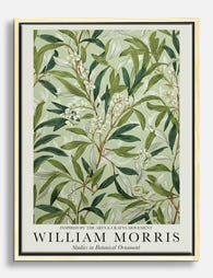
Poster Acanthus von William Morris
Translation missing: de.products.product.sale_price Ab CHF 16.00CHF 22.00 -

Poster Botanisches Muster im William-Morris-Stil
Translation missing: de.products.product.sale_price Ab CHF 16.00CHF 22.00 -

Leinwandbild Botanische Blätter im William-Morris-Stil
Translation missing: de.products.product.sale_price Ab CHF 61.00CHF 87.00 -

Poster Botanische Blätter im William-Morris-Stil
Translation missing: de.products.product.sale_price Ab CHF 16.00CHF 22.00 -

Poster Botanische Blätter – inspiriert von William Morris
Translation missing: de.products.product.sale_price Ab CHF 16.00CHF 22.00 -
Leinwandbild botanische Blätter von William Morris
Translation missing: de.products.product.sale_price Ab CHF 61.00CHF 87.00 -

Leinwandbild Anemone von William Morris
Translation missing: de.products.product.sale_price Ab CHF 61.00CHF 87.00 -

Leinwandbild Acanthus von William Morris
Translation missing: de.products.product.sale_price Ab CHF 61.00CHF 87.00 -

Poster William Morris – Anemone
Translation missing: de.products.product.sale_price Ab CHF 16.00CHF 22.00 -
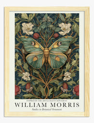
Poster Botanischer Schmetterling – inspiriert von William Morris
Translation missing: de.products.product.sale_price Ab CHF 16.00CHF 22.00 -

Poster William Morris – botanische Vase
Translation missing: de.products.product.sale_price Ab CHF 16.00CHF 22.00 -

Poster Botanische Herbstmotive im William-Morris-Stil
Translation missing: de.products.product.sale_price Ab CHF 16.00CHF 22.00 -

Poster Baum des Lebens von William Morris
Translation missing: de.products.product.sale_price Ab CHF 16.00CHF 22.00 -

Poster Baum des Lebens – inspiriert von William Morris
Translation missing: de.products.product.sale_price Ab CHF 16.00CHF 22.00 -

Poster Botanisches Blattwerk in Grün – inspiriert von William Morris
Translation missing: de.products.product.sale_price Ab CHF 16.00CHF 22.00 -

Poster Baum des Lebens von William Morris
Translation missing: de.products.product.sale_price Ab CHF 16.00CHF 22.00 -

Leinwandbild rote Blätter in einer Vase – im Stil von William Morris
Translation missing: de.products.product.sale_price Ab CHF 61.00CHF 87.00 -

Poster Fruchtmuster von William Morris
Translation missing: de.products.product.sale_price Ab CHF 16.00CHF 22.00 -

Poster Botanischer Schmetterling im William-Morris-Stil
Translation missing: de.products.product.sale_price Ab CHF 16.00CHF 22.00 -

Poster Botanischer Schmetterling im William-Morris-Stil
Translation missing: de.products.product.sale_price Ab CHF 16.00CHF 22.00


Mehr aus The Frame

Why William Morris Prints Look Brilliant in Mod...
William Morris has been quietly miscategorised for decades. His patterns get filed under "country cottage" or "Arts and Crafts revival" and rarely escape, which is a shame because his tree...

Why Arts and Crafts Nature Prints Are the Antid...
The minimalism hangover: why bare walls stopped feeling calming For about a decade, the aspirational interior was a white box with one boucle chair in it. That look has officially...

Botanical Petal Art: Why Close-Up Prints Feel M...
Full florals have had a long run, and they're not going anywhere. But if you've noticed that the botanical art appearing in design magazines, boutique hotel lobbies, and the better-styled...