
 Heute bestellen, Lieferung bis
 Narzissen Poster
Narzissen bringen schneller als fast alles andere Gelb in den Raum. Mal locker und malerisch, mal klar botanisch, im Krug auf dem Tisch oder als Streifen übers Frühlingsfeld. Dieses Gelb ist Gold wert im dunklen Flur oder über der Küchenzeile. Für noch mehr Saisonfeeling passen Tulpen-Poster bestens dazu, während florale Stillleben-Poster leiser und tiefer wirken.


Keine Produkte gefunden
Weitere Fab Kunstkurationen


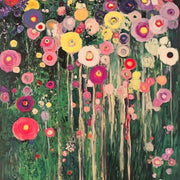

Gelb, Blüten und Wandideen aus The Frame
Farben, Platzierung und Kombi-Ideen für Blumen-Poster from The Frame, Fab's blog.
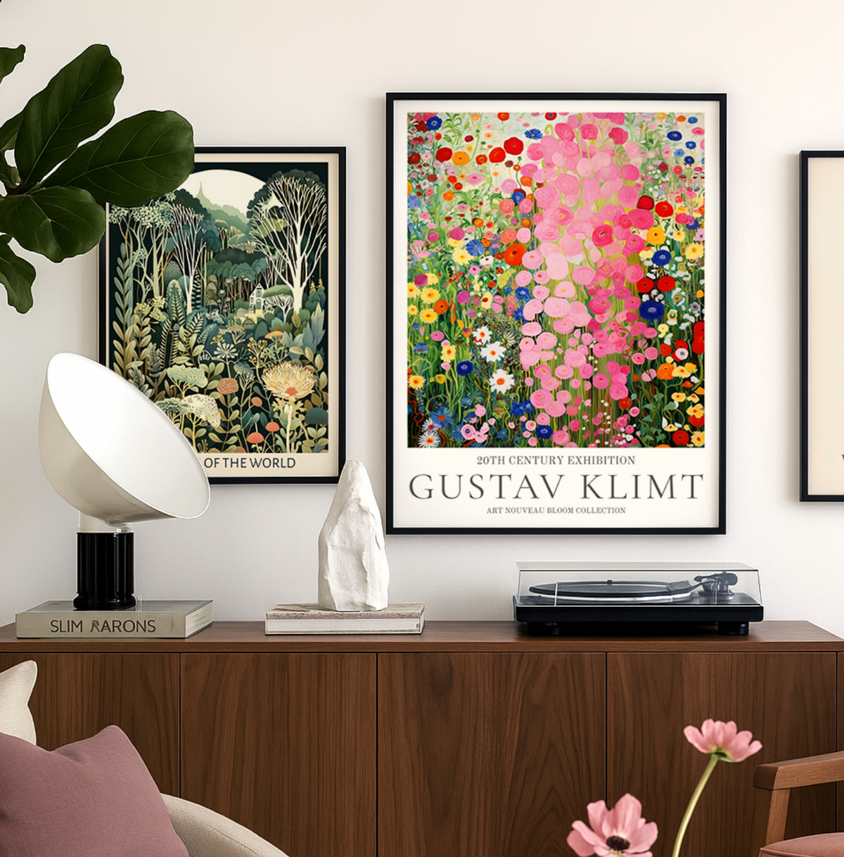
Entdecke Gustav‑Klimt‑Kunstdrucke bei Fab
Vom „Kuss“ bis zur „Goldenen Adele“: Entdecke kuratierte Klimt‑Kunstdrucke, wähle das passende Format und erfahre, wie du sie stilvoll inszenierst und lange bewahrst – für jedes Zuhause und jeden Einrichtungsstil.
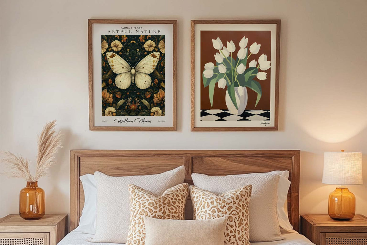
Kunstdrucke für Einsteiger: So findest du dein ...
Leere Wände machen nervös? Dieser Guide zeigt, worauf Erstkäufer achten sollten: Lieblingsfarben, Motivwahl, Platzierung, Größe und Budget – plus einfache Tipps, die dich schnell zu deinem ersten Kunstdruck führen.
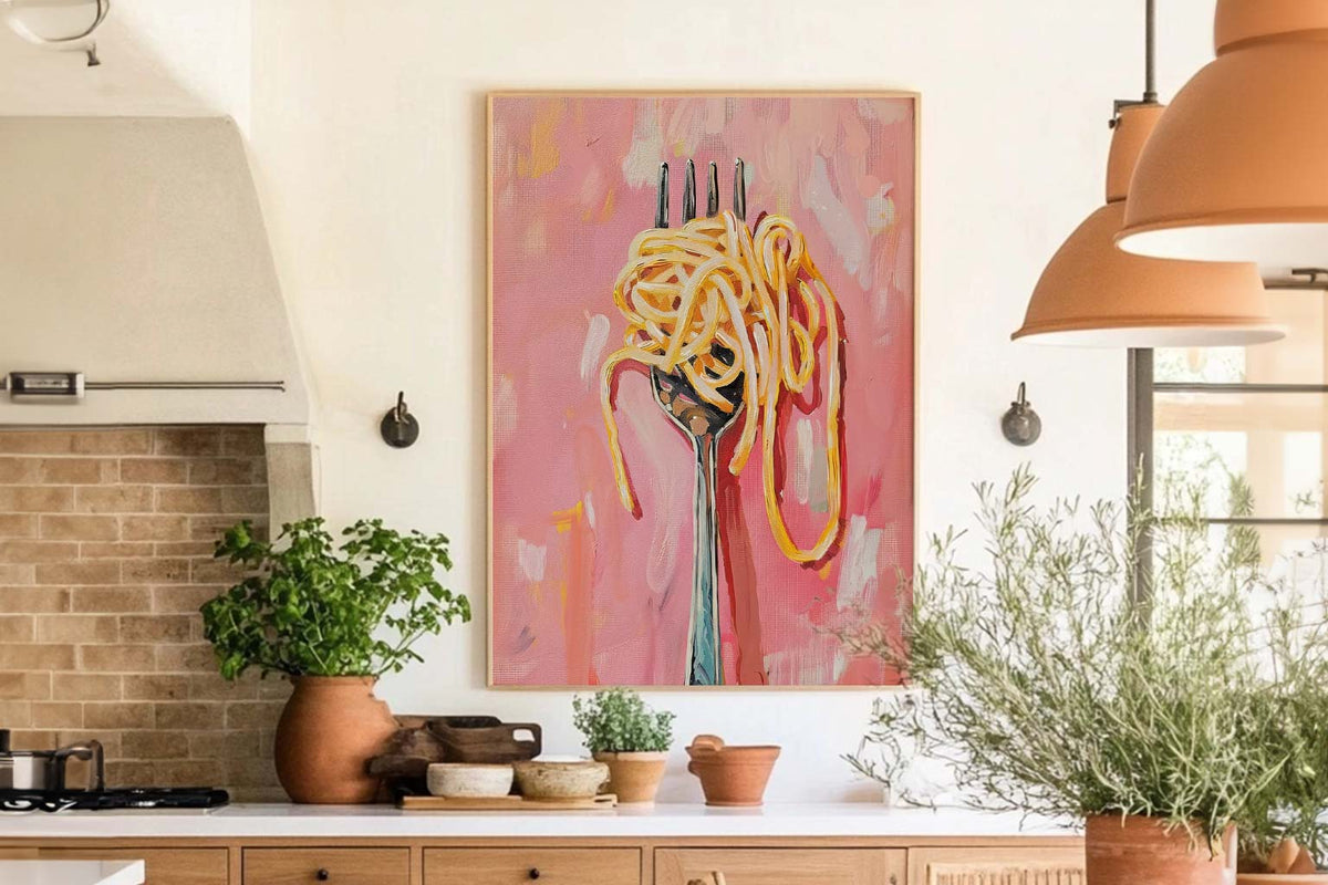
Die besten Wandbilder für Küche und Esszimmer
Wandkunst-Ideen für Küche und Esszimmer: Welche Motive passen, welche Farben wirken, wie du richtig platzierst – plus praktische Tipps zu Rahmen, Größe, Licht und Pflege.
 Das richtige Narzissen-Poster wählen



Kurz und knapp: Poster oder gerahmtes Poster, Farbtipps, wo diese Motive am besten wirken – und wie der Kauf bei Fab funktioniert.