How to Plan a Hallway Gallery Wall That Actually Works
You don't need a designer's eye to nail the gallery wall look. You need a system.

Most gallery wall advice is some variation of "just trust your eye." If you trusted your eye, you wouldn't be reading this. What you need is a set of rules, a few measurements, and permission to stop overthinking it.
Gallery walls in hallways: why they work so well (and where they go wrong)
Hallways are the best room in the house for a gallery wall, and almost no one treats them that way. They're transitional spaces, which means you're never sitting and staring at the wall. You glance, you walk past, you absorb the art in motion. That's a gift. It means you can be bolder with colour, denser with composition, and more personal with subject matter than you'd ever dare in the lounge.
The flip side is that hallways are unforgiving about three specific things: scale, lighting, and alignment. A print that would look fine on a 4-metre living room wall can feel cramped above a 90cm-wide console. Hallways are often poorly lit, which flattens prints and dulls colour. And because you walk past them at close range, every wonky frame and uneven gap is a magnet for your eyes.
The fix is planning. Not vibes.

Choosing a layout: column, grid, or salon style for your space
Three layouts cover 95% of hallways. Pick one based on your wall, not on what looks pretty on Pinterest.
The grid
A grid is two or more rows of identical-sized prints with identical spacing. It's the most forgiving layout because the rules do the work. If your hallway has at least 1.5 metres of uninterrupted wall and you want a calm, considered look, choose this.
Grid templates that work:
- 2x2 grid: four 30x40cm prints, ideal for short hallways or above a console
- 2x3 grid (two rows of three): six 30x40cm prints, ideal for 2 to 3 metre runs
- 3x3 grid: nine 30x40cm prints, ideal for 3 to 4 metre hallways
- Single row of three: three 50x70cm prints in a horizontal line, ideal for narrow halls under 90cm wide
The column
A column is a vertical stack of two or three prints. This is non-negotiable if your hallway is under 90cm wide. You don't have the breathing room for horizontal layouts, and a column draws the eye upward, which makes a tight space feel taller. Two 40x50cm prints stacked with 5cm between them, hung centred on a wall, is one of the most underrated decorating moves in any small home.
Salon style
Salon style is the asymmetric, mixed-size, gloriously dense layout you've seen on every design blog. It's the hardest to get right, which is why most people end up frustrated. Use it when you have a generous wall (2.5 metres plus), at least 7 prints in varying sizes, and the patience to mock it up properly.
If you're nervous, do not start with salon style. Do a grid first, get confident, then go salon in the next room.
How many prints you actually need (less than you think)
Almost everyone overbuys. They see a salon wall with 15 frames and assume more is more. In a hallway, more is usually mess.
Here's the honest maths:
- Hallway under 2 metres: 2 to 3 prints
- Hallway 2 to 3 metres: 4 to 6 prints
- Hallway 3 to 4 metres: 6 to 9 prints
- Hallway over 4 metres: 9 to 12 prints, or break it into two separate clusters
A pre-curated wall art set takes the guesswork out of this entirely. You get prints that have been designed to live together, in compatible proportions, with a unified palette. If you're already nervous about getting it wrong, this is the single biggest stress reducer available to you.
Spacing rules: the 5cm guideline and when to break it
Here is the rule competitors won't give you: leave 5cm between frames. Measure frame edge to frame edge, not print edge to print edge. This works for almost every grid and column layout you'll ever attempt.
Why 5cm? It's tight enough that the prints read as one composition, not as separate pieces of art floating in isolation. It's loose enough that each piece has room to breathe. Anything less than 3cm starts to feel cramped. Anything more than 8cm and the gallery wall stops feeling like a gallery wall and starts feeling like decorations spaced around the room.
When to break the rule:
- Salon style: vary spacing between 4cm and 7cm to create rhythm. Identical spacing in a salon layout looks robotic.
- Large prints (70x100cm and up): increase to 7 or 8cm. Big pieces need more visual breathing room.
- Mixing portrait and landscape orientations in a row: align the centre lines, not the top edges. Spacing stays at 5cm.
Now the height rule. Hang the centre of your gallery wall (not the centre of any individual print, the centre of the whole composition) at 145 to 150cm from the floor. This is gallery standard, calibrated to average eye level. Drop it 5 to 10cm if everyone in your house is short, raise it slightly if your ceilings are over 3 metres.
If you're hanging above a console table, leave 15 to 20cm between the top of the console and the bottom of the lowest frame. Closer than 15cm and the art feels like it's sitting on the furniture. Further than 25cm and it floats.

Picking a cohesive colour palette across multiple prints
The fastest way to make a gallery wall look chaotic is to pick prints you love individually without considering how they look together. The fastest way to make one look intentional is the three-colour rule.
Choose three colours. One dominant (60% of the visual weight), one secondary (30%), one accent (10%). Every print in your gallery wall should contain at least two of those three colours. Doesn't have to be exact, doesn't have to be precious, just has to roughly hold true.
A palette that works in almost any hallway:
- Dominant: warm cream or off-white
- Secondary: charcoal or deep navy
- Accent: ochre, rust, or sage green
If you can't face choosing colours at all, default to black and white. A run of black and white art prints sidesteps the palette problem entirely and looks effortlessly considered. Architectural photography, line drawings, and high-contrast abstracts all sit happily next to each other when the palette is monochrome.
For a more contemporary feel, modern art prints tend to share a restrained, graphic sensibility that mixes well even when subject matter varies. The unifying thread is style, not colour.
Frame matching vs mixing: our honest take
Match your frames. Almost always.
Mixed frames are a design move that works in interiors magazines because the stylist spent four hours arranging them. In real life, in a real hallway, with real lighting, mixed frames usually read as "couldn't decide" rather than "deliberately eclectic."
If you match frames, the prints inside become the focus. If you mix frames, the frames become the focus. Decide which you'd rather draw the eye, then act accordingly.
Our recommendation:
- Grid layout: identical frames, identical mounts, identical sizes. No exceptions.
- Column layout: identical frames. You can vary print size if you want, but keep the frame consistent.
- Salon style: pick two frame finishes maximum (e.g. all black or natural oak) and mix sizes freely within those two.
Frame finish itself matters more than people realise. Solid wood frames have a depth and warmth that you can feel from across the room. Cheap frames made from MDF or veneers tend to look fine in photos and disappointing in person, especially under hallway light. Worth paying for the real thing once.
While we're being honest about trade-offs: framed prints are heavier and more polished, unframed canvas is lighter and works better in humid spots like a hallway near a bathroom. Both have their place. For a hallway gallery wall specifically, framed prints almost always win because the consistency of the frame is doing half the design work for you.
How to mock up your layout before making a single hole
This is the step that separates gallery walls that work from gallery walls that get re-done three times. Skip it and you'll regret it.
Method 1: the paper template
The most reliable method, and free. For each print, cut a piece of brown kraft paper or newspaper to the exact size of the frame. Mark where the hanging hook will sit on the back. Tape the paper templates to the wall with masking tape, adjusting position until the layout looks right. Stand at the far end of the hallway. Walk past it. Look at it from the doorway you'll most often approach from. Live with it for 24 hours. Then, when you're sure, drive your nail or screw straight through the paper at the marked hook position. Tear the paper away.
Method 2: painter's tape outline
Faster, less precise. Use low-tack painter's tape to mark out rectangles on the wall in the size of each frame. Good for visualising spacing and overall composition, less useful for getting hook positions exactly right.
Method 3: digital mock-up
Photograph your wall straight-on. Drop the photo into any free design tool (Canva works fine). Drag rectangles in scale onto the photo to test layouts. Useful for ruling out ideas quickly. Less useful as your final guide because screen scale never quite matches reality.
We'd recommend doing the digital mock-up first to narrow your options, then the paper template before you actually drill. Belt and braces.

Ordering and hanging: getting it done in a weekend
A realistic timeline:
Friday evening: finalise your layout and prints. Order. If you're using made-to-order prints with proper FSC-certified wood frames and UV-protective acrylic glaze, they'll arrive ready to hang with fixtures attached, which saves you the misery of separate frame assembly. (One of the most common gallery wall disasters is prints and frames arriving separately, then warping when you fit them yourself. Avoid this.)
Saturday morning, prints arrive: unbox, lay them out on the floor in your planned arrangement. Take a photo from above. Adjust if anything looks off in real life that didn't in your mock-up.
Saturday afternoon: paper template the wall. Get the spacing exact. Use a spirit level. The 145 to 150cm centre rule applies to the whole composition, not individual frames, so calculate accordingly.
Sunday morning: hang. Drill through the paper at the marked hook positions, insert wall plugs if you're going into masonry, hang each frame, level, step back, adjust. A small spirit level placed on top of each frame after hanging will save you from the wonky-frame-syndrome that sets in over months.
Sunday afternoon: lighting. Hallways are usually under-lit, and a gallery wall in dim light is a wasted gallery wall. If you can't add wired sconces, battery-operated picture lights or a pair of plug-in wall lights will transform the whole effect. Aim warm white (2700K), not cool white. Cool white drains the colour out of prints.
If you're renting, swap nails for heavy-duty adhesive strips rated for the frame weight (check the packaging, most support 1.8 to 3.2kg per pair). Stick to lighter frame sizes (up to 40x50cm) for adhesive hanging, and avoid adhesive in humid spots. Column layouts work better than grids for renters because if one strip fails, you only have to re-hang one frame.
For entryway art prints that set the tone the moment someone walks in, lean towards subjects that feel welcoming rather than challenging. Save the moody abstract triptych for the lounge. The hallway is your handshake.

A final word
The fear of getting it wrong is what keeps most people staring at a blank wall for years. Pick a layout, set a 5cm gap, match your frames, mock it up in paper, and hang it. If you hate it in six months, you can move it. The holes are 4mm wide and disappear with a dab of filler. The risk is genuinely tiny. The reward is a wall you walk past every day and quietly love.

Fab products featured in this blog
-

Botanical Staircase Haven Canvas Print
Translation missing: en.products.product.sale_price From €64,95€107,95 -

Eclectic Botanical Stairway Art Print
Translation missing: en.products.product.sale_price From €17,95€29,95 -

Botanical Staircase Haven Canvas Print
Translation missing: en.products.product.sale_price From €64,95€107,95 -

Garden Welcome Art Print
Translation missing: en.products.product.sale_price From €17,95€29,95 -

Vibrant Urban Entryway Canvas Print
Translation missing: en.products.product.sale_price From €64,95€107,95 -

City Holiday Gathering Art Print
Translation missing: en.products.product.sale_price From €17,95€29,95 -

Winter Walk with Books Art Print
Translation missing: en.products.product.sale_price From €17,95€29,95 -

Vibrant Stairway Canvas Print
Translation missing: en.products.product.sale_price From €64,95€107,95 -
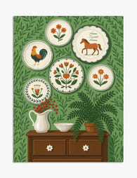
Folk Art Plates on Green Wall Illustration Art Print
Translation missing: en.products.product.sale_price From €17,95€29,95 -

Graceful Balance Minimal Art Print
Translation missing: en.products.product.sale_price From €17,95€29,95 -
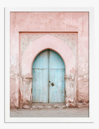
Pastel Archway Entrance Art Print
Translation missing: en.products.product.sale_price From €17,95€29,95 -

Garden Path to Home Art Print
Translation missing: en.products.product.sale_price From €17,95€29,95 -

Patterned Steps & Potted Greens Canvas Print
Translation missing: en.products.product.sale_price From €64,95€107,95 -

Sunlit Forest Pathway Art Print
Translation missing: en.products.product.sale_price From €16,95€23,95 -

Lush Staircase Sanctuary Art Print
Translation missing: en.products.product.sale_price From €17,95€29,95


More from The Frame

Curated or Collected? Creating Your Equestrian ...
There is a fine line between a gallery wall that reads as considered and one that reads as a horse-mad teenager's bedroom. The difference is not how much you spend...

Curated Tropical Gallery Wall vs Chaotic Jungle...
Tropical prints are the trickiest gallery wall category to pull off. Get it right and your wall feels like a considered Mediterranean villa. Get it wrong and it looks like...

Landscape vs Portrait Wall Art: Which Orientati...
Most advice on this topic ends with "trust your eye" and leaves you scrolling for another hour. We're going to do the opposite: give you specific rules tied to specific...