Building a Louis Wain Gallery Wall: From Edwardian Cats to Psychedelic Patterns
How to curate his three artistic eras into a single wall that tells a story worth talking about.

Most gallery walls feature one mood, one palette, one feeling. A Louis Wain wall does the opposite. His work spans soft Edwardian parlour scenes, riotous middle-period crowds, and the famous kaleidoscopic cats, which means a single arrangement can move from 1900 to abstraction in three feet of plaster.
Why Wain's evolving style makes for a uniquely compelling gallery wall
Most artists give you a mood. Wain gives you a timeline. His career stretched from the 1880s into the 1930s, and across those decades his cats shifted from gentle, anthropomorphic creatures playing cricket and drinking tea, through brighter and more chaotic social scenes, into the fractal, jewel-toned patterns that have made him a cult figure today.
That progression is the gift. A gallery wall built around a single style can feel decorative but flat. A wall that travels across Wain's eras has built-in visual tension: tea parties next to fractals, soft sepia next to electric magenta. Guests notice. They ask questions. You get to answer them.
It also sidesteps the most common gallery wall failure, which is matching everything so carefully that the wall reads as one large piece of wallpaper. Wain's work refuses to behave like wallpaper. The contrast is the point.
A quick note on the mental illness narrative. The popular story is that his late, psychedelic cats document a deteriorating mind, and that the more abstract a piece is, the later it must be. Art historians have largely debunked the chronological version of that theory. Many of his most abstract works were made earlier than assumed, and the patterns appear throughout his career as deliberate experiments. Treat the late work as bold artistic exploration, not a clinical chart.

Choosing your prints: how many, which eras, and what to balance
Start with three decisions: how many prints, which eras, and what your anchor piece will be.
For most walls, three to seven prints is the right range. Fewer than three and it isn't really a gallery wall. More than seven and Wain's already busy compositions start to overwhelm each other. Five is the sweet spot for a sofa wall or above a console.
Aim to represent at least two of his three eras, ideally all three:
- Early Edwardian (roughly 1890s to 1905). Anthropomorphic cats in waistcoats, tea parties, golf, music recitals. Muted palettes, ink linework, often sepia or soft colour washes.
- Middle period (roughly 1905 to 1914). Bigger crowds, more saturated colour, looser brushwork. Cats at the seaside, at parties, in chaotic Edwardian society scenes.
- Late kaleidoscopic (the famous "psychedelic" works). Cats dissolving into floral, gothic, and fractal patterns. Vivid colour, geometric energy, sometimes barely a cat at all.
Pick one anchor. This is your largest print and your visual centre of gravity. A late kaleidoscopic piece works brilliantly as the anchor because it pulls the eye and gives the quieter Edwardian works something to orbit. If you prefer a calmer wall, anchor with a detailed middle-period crowd scene and use the psychedelic prints as smaller accents.
Then balance. For every loud kaleidoscopic piece, include at least one softer Edwardian scene. The eye needs somewhere to rest. A wall of all-late-period Wain becomes visual noise within a week. A wall of all-Edwardian feels timid given what his work is capable of.
Browse the full range of Louis Wain art prints to see what's available across the eras before committing to a layout.
Size and layout: the arrangements that work best for 3, 5, and 7 prints
Layout is where most gallery walls fall apart. The fix is to plan on the floor before you touch a hammer. Lay your prints out, photograph them from above, adjust, and only then transfer to the wall.
The 3-print arrangement
A horizontal row works best above a sofa, sideboard, or bed. Use three prints at the same size, ideally 40x50cm or 50x70cm, with 5 to 8cm of space between frames.
For a Wain-specific twist, run them chronologically left to right: an Edwardian piece, a middle-period scene, a late kaleidoscope. This gives you the artistic timeline as a literal line.
If your wall is narrower, stack three 30x40cm prints vertically with the same 5 to 8cm spacing. Put your anchor piece in the middle and let the eye travel up and down through the eras.
The 5-print arrangement
Five is where it gets interesting. The classic layout is a centred grid: one large print (60x80cm or 70x100cm) in the middle, flanked by four smaller prints (30x40cm) arranged in a 2x2 pattern, two on the left and two on the right.
Put a late kaleidoscopic anchor in the centre. Pair it with two Edwardian scenes on one side and two middle-period works on the other. The contrast between the bold centre and the softer flankers creates immediate hierarchy.
Spacing: 6cm between all frames. Total wall footprint roughly 180cm wide by 100cm tall.
The 7-print arrangement
Seven prints work as an asymmetric salon-style cluster, which suits Wain's unruly spirit better than a strict grid. Anchor with one large 60x80cm piece slightly off-centre, and arrange six smaller prints (mixing 30x40cm and 40x50cm) around it.
The trick is to keep one consistent edge. Either align the top of all the upper prints, or the bottom of all the lower prints, or the left edge of the leftmost column. Pick one invisible line and stick to it. The rest can breathe.
Maintain 5 to 7cm between frames. Any tighter and the wall feels cramped. Any looser and the cluster reads as separate prints rather than a single composition.

Consistent framing vs. mixed frames: our recommendation
Mixed frames are tempting with vintage art. The argument goes: vary the frames to add character, layer the periods, make it feel collected over time.
For Wain specifically, we think this is wrong.
His work already does the variation for you. The colours, the styles, the energy across his career provide so much contrast that mixed frames push the wall from "intentionally curated" to "chaotic jumble." The frames need to be the calm element.
Our recommendation: pick one frame style and use it across every print. Black solid wood is our default for Wain. It contains the vivid kaleidoscope work and lends gravitas to the Edwardian pieces. Natural oak is the second choice if your room leans warmer or more Scandinavian. White-painted wood works in very minimal modern spaces but can feel weak against the saturated late prints.
On mounts (the cream or white border between print and frame): yes, use them, and keep them consistent. A 4 to 5cm cream mount unifies wildly different colour palettes more effectively than almost anything else. It gives each print breathing room and lets the kaleidoscope cats sit comfortably alongside the soft Edwardian scenes.
A practical note on what makes or breaks vintage prints: the framing itself. Warped boards, prints that bubble after a fortnight, frames that arrive separately and need assembling at home. Our framed prints arrive ready to hang in one box, with the print properly fitted, UV-protective acrylic glaze rather than glass, and solid FSC wood frames. For art you intend to keep on a wall for years, this matters more than people realise.
The best walls in your home for a Wain gallery arrangement
Not every wall suits this kind of arrangement. The ideal Wain wall has three qualities: enough scale, decent natural or directed light, and a sightline that gives guests time to look.
Best rooms:
- Living room, above the sofa. The classic location. A 5 or 7-print arrangement above a three-seater gives you the scale Wain deserves and the dwell time that makes the conversation aspect work.
- Hallway or staircase. Wain works exceptionally well in hallways because guests walk past slowly. A horizontal 3 or 5-print run at eye level turns a transit space into a small gallery.
- Home office or study. The Edwardian works in particular suit panelled walls and bookshelves. Use a smaller 3-print arrangement above a desk.
- Dining room. His tea-party and social scenes feel right at home above a dining sideboard.
Walls to avoid:
- Bathrooms with poor ventilation. Even with our UV-protective acrylic glaze, prolonged humidity isn't ideal for any framed paper-based art. If you want art in a humid space, canvas prints handle moisture better.
- Walls in direct, prolonged sunlight if you're using cheaper reproductions from elsewhere. Our giclée inks are rated to last hundreds of years even in direct sun, but lower-quality prints will fade within months.
- Anywhere too narrow. A cluster of seven Wain prints crammed into a 1.5m wall reads as panic, not curation.
For more options across periods and styles, the broader vintage art prints collection includes pieces that pair beautifully with Wain if you want to extend the gallery into adjacent walls.

Hanging tips: spacing, height, and getting it level first time
The single most useful tool for hanging a gallery wall is brown paper. Cut paper templates the exact size of each frame, mark the hanging point on each template, and tape them to the wall. Step back. Adjust. Step back again. Only when you're certain do you put a nail anywhere.
Centre height. The midpoint of your overall arrangement should sit at roughly 145 to 150cm from the floor. Above a sofa, leave 15 to 25cm between the top of the sofa back and the bottom of the lowest frame. Closer than 15cm feels cramped; further than 25cm and the art floats.
Spacing between frames. 5 to 8cm is the universal range. Tighter spacing (5cm) makes the arrangement read as one composition. Looser (8cm) lets each piece stand alone. For Wain, we lean tighter because the contrast across eras already provides separation.
Levelling. A spirit level on top of each frame is non-negotiable. For multi-print arrangements, use a long level or a laser level to align the top edges of any prints that should sit at the same height.
Fixings. Our framed prints arrive with fixtures already attached, so you only need a nail or picture hook in the wall. For larger prints (60x80cm and up), use two fixings spaced about 30cm apart for stability and to keep the frame level over time.
If you're buying multiple prints together, looking at curated wall art sets can save you the work of assembling pairings yourself.
Finishing touches: lighting and complementary decor
Lighting transforms a Wain wall. The kaleidoscopic prints in particular come alive under warm, directed light. Picture lights mounted above each print are the traditional answer, but a single well-placed floor lamp angled toward the wall does almost as much work for less commitment.
Avoid harsh overhead spotlights. They flatten the colour and create reflections, even on our matte non-glare paper. Aim for warm bulbs (2700K to 3000K) and indirect light where possible.
For surrounding decor, lean into the eras you've chosen rather than fighting them. A few specifics that work:
- Below the wall. A console or sideboard in walnut or dark stained oak. Skip glass-topped or highly modern pieces; they fight Wain's character.
- Soft furnishings. Velvet cushions in deep emerald, burgundy, or mustard pull the late kaleidoscope colours into the room without copying them.
- Plants. A trailing pothos or a generous fern softens the geometry of a tightly hung gallery and nods to Wain's botanical late patterns.
- One unexpected object. A brass cat figurine on the sideboard, or a stack of vintage hardback books. Small touches that suggest the wall was assembled by someone with a point of view.
What to skip: overly themed cat decor. Cat-shaped clocks, cat doormats, cushions printed with photographs of cats. The wall is doing the cat work. The room around it should feel like an adult home that happens to contain a brilliant collection.

A final thought
Build the wall in two passes. Hang your initial arrangement, live with it for a week, then swap one or two prints. The pieces that earn their place after a week of looking are the ones that belong. The pieces you stop noticing should be moved to a quieter wall or rotated out. A gallery wall isn't a one-time decision. It's a slow conversation with your own taste, and Wain's work, more than most, rewards the time you give it.

Fab products featured in this blog
-

Three Singing Cats by Louis Wain Canvas Print
Translation missing: en.products.product.sale_price From €64,95€107,95 -

I Am Happy by Louis Wain Canvas Print
Translation missing: en.products.product.sale_price From €64,95€107,95 -

Cats Carol Singing by Louis Wain Canvas Print
Translation missing: en.products.product.sale_price From €64,95€107,95 -

I Fell in Love with a Lovely Kitten by Louis Wain Canvas Print
Translation missing: en.products.product.sale_price From €64,95€107,95 -

Blue Cat by Louis Wain Art Print
Translation missing: en.products.product.sale_price From €17,95€29,95 -

Blue Cat by Louis Wain Canvas Print
Translation missing: en.products.product.sale_price From €64,95€107,95 -
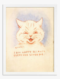
I Am Happy by Louis Wain Art Print
Translation missing: en.products.product.sale_price From €17,95€29,95 -
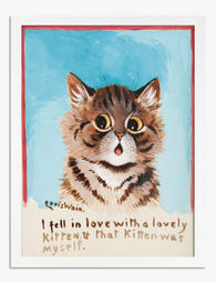
I Fell in Love with a Lovely Kitten by Louis Wain Art Print
Translation missing: en.products.product.sale_price From €17,95€29,95 -

Three Singing Cats by Louis Wain Art Print
Translation missing: en.products.product.sale_price From €17,95€29,95 -

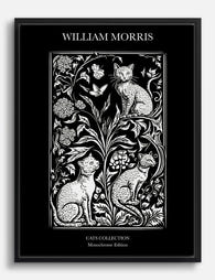
William Morris Classic Cats Canvas Print
Translation missing: en.products.product.sale_price From €64,95€107,95 -

Lodden with Black Cat by William Morris Canvas Print
Translation missing: en.products.product.sale_price From €64,95€107,95 -
Botanical Cats by William Morris Canvas Print
Translation missing: en.products.product.sale_price From €64,95€107,95 -

About Paris by Edward Penfield Canvas Print
Translation missing: en.products.product.sale_price From €64,95€107,95 -

Fashionable Feline in Coral Coat Canvas Print
Translation missing: en.products.product.sale_price From €64,95€107,95 -

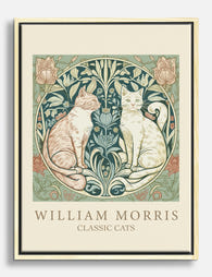
Classic Cats by William Morris Canvas Print
Translation missing: en.products.product.sale_price From €64,95€107,95 -

Cubist Cat Portrait Canvas Print
Translation missing: en.products.product.sale_price From €64,95€107,95 -

Van Gogh Garden Cat Art Print
Translation missing: en.products.product.sale_price From €17,95€29,95 -
William Morris Classic Cats Canvas Print
Translation missing: en.products.product.sale_price From €64,95€107,95 -

Klimt's Black Cat in a Garden Art Print
Translation missing: en.products.product.sale_price From €17,95€29,95


More from The Frame

Thrushes, Hares, and Peacocks: The Animals in W...
Why Morris put animals at the centre of his designs William Morris wasn't decorating walls with cute creatures. He was making a quiet argument. While Victorian factories churned out cheap,...

From Dutch Masters to Modern Minimalism: The Ke...
Search "types of flower bouquet art" and you'll get wedding centrepieces, posy guides, and cascading bridal arrangements. Useful if you're getting married. Useless if you're trying to choose what goes...

Every Flower in William Morris's World: A Guide...
William Morris designed roughly 50 wallpapers and around 30 chintzes across his career, and almost every single one features a plant. If you've ever stood in front of a Morris...