
 Order today for delivery by
 The Most Famous William Morris Designs, Ranked: From Strawberry Thief to the Deep Cuts
An opinionated ranking of Morris's greatest patterns, plus honest advice on which ones actually work on modern walls.


William Morris designed over 50 patterns in his lifetime, and roughly six of them get all the attention. That's mostly fair, but not entirely. Here's our honest ranking of the famous ones, plus the deep cuts worth knowing about if you'd rather not have the same print as everyone else on your street.
Strawberry Thief: yes, it really is number one, and here's why
Strawberry Thief (1883) is the most famous William Morris pattern, and the ranking is not close. You've seen it on tote bags, tea towels, phone cases, and probably a friend's downstairs loo. What makes it work is a rare combination of narrative and formal design: thrushes stealing strawberries from Morris's kitchen garden at Kelmscott Manor, arranged in a mirrored repeat that reads as both storybook and wallpaper.
The mythology helps. Strawberry Thief was Morris's first successful use of the indigo-discharge printing method, a fiendishly difficult process where fabric is dyed indigo, then bleached in a pattern, then over-dyed in other colours. It was expensive to produce and expensive to buy. That difficulty is part of why it feels precious even now.
As a framed print, it earns its status. The pattern has enough small detail to reward close viewing, but the birds give your eye something to land on, so it doesn't dissolve into visual noise the way some Morris repeats can. It also plays well with modern interiors: the deep indigo and cream ground sit happily next to off-white walls, warm oak, and pretty much any shade of sage or clay you've painted your lounge.
Buy it large. A william morris strawberry thief print at 30x40cm looks fussy. At 70x100cm, the birds are properly sized, the strawberries read clearly, and the whole thing has room to breathe.

Willow Boughs: the quiet classic that works in every room
Willow Boughs (1887) is the sensible sibling. Morris designed it as wallpaper, and it remains one of the best-selling wallpapers in Britain more than 130 years later, which tells you something about its longevity.
The pattern is almost entirely monochrome: soft willow leaves in muted sage or grey-green on a cream ground, no birds, no berries, no drama. That's the whole point. Willow Boughs is the Morris pattern you can live with in a small bedroom, a hallway, a home office, or anywhere Strawberry Thief would be too much.
It also works better than any other Morris design in genuinely contemporary interiors. If your flat is white walls, pale floors, and Muji-adjacent furniture, Willow Boughs adds warmth and history without shouting. It reads almost like a botanical study when framed, especially at smaller sizes where you're seeing one or two repeats rather than a busy tiled effect.
The trade-off: it's quiet. If you want a piece of art that draws people across the room, this isn't it. Willow Boughs rewards you slowly, over months of glancing at it while you make coffee.
Woodpecker and Bird: Morris's underrated bird masterpieces
If you're only going to know one thing about william morris bird designs beyond Strawberry Thief, know this: Woodpecker (1885) is a tapestry, and Bird (1878) is a heavy woven wool double cloth. Neither was designed as wallpaper. Both look completely different when translated to a flat print, and both are genuinely underrated.
Woodpecker was originally a full-length tapestry with a verse Morris wrote himself woven into the borders. The central bird sits in a scrolling acanthus tree, surrounded by fruit. As a framed print, it's one of the most striking pieces Morris ever produced, because it functions as a single image rather than a repeating pattern. You get composition, focal point, narrative. It behaves like art, not wallpaper.
Bird is trickier. In its original woven form, the two mirrored birds have a heavy, tactile quality that flattens on paper. But at large scale, in a good giclée print, the pattern's symmetry and rich blue-green palette translate surprisingly well. It's a favourite of people who find Strawberry Thief too obvious.
Both are worth exploring in our william morris bird art prints collection if you want something with more presence than the standard repeats.

Honeysuckle, Acanthus, and the foliage-heavy designs
Here's where we get contrarian. Acanthus (1875), Honeysuckle (1876), and their scrolling-foliage siblings are famous, historically important, and often terrible choices as prints for modern homes.
Acanthus is the one you see reproduced in every design book: enormous curling leaves in olive, ochre, and rust, designed as a wallpaper meant to cover an entire Victorian dining room. At full wallpaper scale, it's magnificent. Cropped down to a 50x70cm print, it becomes a confusing tangle of leaves with no focal point and a colour palette that fights almost every modern paint colour you might own.
Honeysuckle (designed by Morris's daughter May, actually, and often mis-attributed to William) is similar. It's a densely woven pattern where flowers, leaves, and stems all compete at the same visual weight. Beautiful as a fabric. Exhausting as a framed print above your sofa.
The general rule: patterns designed for large-scale wallpaper or upholstery need to be seen at scale to make sense. When you crop them to fit a print, you're often looking at the equivalent of one square metre of a design that was meant to cover 20. If you love these patterns, buy them at the largest size available (70x100cm minimum) and give them a whole wall to themselves.
While we're being honest: Golden Lily and Blackthorn, two designs frequently sold under Morris's name, were actually designed by John Henry Dearle, who took over Morris & Co. after Morris's death. They're often lovely. They're not Morris. If authenticity matters to you, that's worth knowing.
The patterns that look best as art prints vs. those designed for textiles
This is the distinction almost no one makes, and it's the single most useful thing to understand before buying a Morris print.
Designed as wallpaper (translate well to prints at large sizes): Willow Boughs, Chrysanthemum, Pimpernel, Trellis. These were meant to be seen flat, at reading distance, in a repeat. They frame beautifully because they were already designed to work on a wall.
Designed as printed textile (Strawberry Thief territory, translates excellently): Strawberry Thief, Brother Rabbit, Snakeshead. These have narrative elements (birds, animals, distinct motifs) that give your eye something to focus on. They're print-friendly because they already have composition, not just repeat.
Designed as woven textile or tapestry (translates unpredictably): Bird, Peacock and Dragon, Woodpecker. The original medium had texture, weight, and hand-feel. On paper, some of the magic is lost, but tapestries like Woodpecker gain something because you can see the full composition clearly for the first time.
Designed as heavy upholstery (usually don't work as prints): Tulip and Rose, Wandle, Cray. These were made for sofas and curtains, where you'd see fragments framed by furniture. As flat prints, they often feel like offcuts of a bigger thing.
Understanding which category a pattern belongs to tells you almost immediately whether it will work on your wall.

How to pick between the famous ones and the lesser-known gems
If you want Morris without the Strawberry-Thief-in-every-Instagram-flat feeling, there are proper deep cuts worth knowing about.
Snakeshead (1876) is the Morris pattern for people who don't want to look like they're trying. Deep purple-brown fritillary flowers on a small-scale repeat, restrained palette, works especially well in bedrooms. One of Morris's own favourites.
Cray (1884) is his most technically complex printed textile: 34 different printing blocks required to produce it. As a print, it's dense but rewarding, with a warm russet-and-blue palette that suits older houses beautifully.
Compton (1896), one of Morris's last designs, is genuinely underrated. It has the confidence of a late-career work: bigger motifs, more air between elements, easier on the eye than Acanthus but with the same grandeur.
Brother Rabbit (1882) is the sibling to Strawberry Thief that never got the same fame. Rabbits and birds among foliage, indigo-discharge printed, arguably more charming and definitely less recognisable.
These are the patterns that pay off if you're buying your second or third Morris print. For your first, we'd steer you back to the classics.
Where to start if you're buying your first William Morris print
If you've never owned a Morris print, buy Strawberry Thief. It's the safest choice for a reason: strong composition, familiar palette, works in almost every room, and looks better in person than in photos. Go 50x70cm minimum, 70x100cm if you have the wall for it.
If Strawberry Thief feels too obvious, buy Willow Boughs. It's the second safest choice, works in smaller spaces, and pairs with basically any colour scheme.
If you want something with more presence, buy Woodpecker. It's a proper piece of art rather than a repeating pattern, and it's the Morris print you're least likely to see in someone else's home.
A few practical notes on framing. Morris's palettes are already rich, so simple frames work best: natural oak, black, or off-white. Ornate gilt frames push these designs into pastiche territory very quickly. Matte paper is essential, because glossy prints add glare that fights the muted historical colours. And if you're hanging in a bathroom or kitchen where humidity is a factor, canvas holds up better than framed paper over time.
Morris's work is public domain, which means quality varies wildly between sellers. What you want to look for: high-resolution giclée printing (not inkjet), thick matte paper (not thin poster stock), and colour accuracy that respects the muted, earthy palette Morris actually used rather than the punchy, saturated versions you sometimes see. If you're browsing our full william morris art prints collection, that's the standard we hold to.

A final thought
Morris's designs have survived 150 years because they solved a specific problem: how to bring nature, pattern, and craft into rooms that would otherwise feel machine-made and cold. That problem hasn't gone away. If anything, it's more acute now than it was in 1883. Pick the pattern that answers it for the room you actually live in, not the one that looks best on a museum website. If that turns out to be Strawberry Thief, so be it. It got to number one honestly. For more nature-led options beyond Morris himself, our floral art prints collection is a good place to keep looking.

Fab products featured in this blog
-

Strawberry Thief by William Morris Art Print
Translation missing: en.products.product.sale_price From €17,95€29,95 -

Strawberry Thief Exhibition by William Morris Art Print
Translation missing: en.products.product.sale_price From €17,95€29,95 -

Strawberry Thief by William Morris Art Print
Translation missing: en.products.product.sale_price From €17,95€29,95 -

Strawberry Thief Exhibition by William Morris Canvas Print
Translation missing: en.products.product.sale_price From €64,95€107,95 -

Strawberry Thief by William Morris Canvas Print
Translation missing: en.products.product.sale_price From €64,95€107,95 -

Strawberry Thief by William Morris Canvas Print
Translation missing: en.products.product.sale_price From €64,95€107,95 -

Strawberry Thief by William Morris Art Print
Translation missing: en.products.product.sale_price From €23,95€40,95 -

Strawberry Thief by William Morris Art Print
Translation missing: en.products.product.sale_price From €17,95€29,95 -
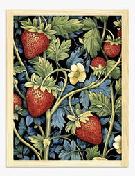
Strawberry Thief Garden by William Morris Art Print
Translation missing: en.products.product.sale_price From €17,95€29,95 -

Strawberry Thief by William Morris Canvas Print
Translation missing: en.products.product.sale_price From €58,95€96,95 -

Strawberry Thief by William Morris Canvas Print
Translation missing: en.products.product.sale_price From €64,95€107,95 -

Strawberry Thief by William Morris Art Print
Translation missing: en.products.product.sale_price From €17,95€29,95 -

William Morris Strawberry Fields Exhibition Art Print
Translation missing: en.products.product.sale_price From €17,95€29,95 -

Strawberry Thief Garden by William Morris Canvas Print
Translation missing: en.products.product.sale_price From €64,95€107,95 -

Strawberry Thief by William Morris Art Print
Translation missing: en.products.product.sale_price From €17,95€29,95 -

Strawberry Thief by William Morris Canvas Print
Translation missing: en.products.product.sale_price From €64,95€107,95 -

Strawberry Thief by William Morris Canvas Print
Translation missing: en.products.product.sale_price From €64,95€107,95 -
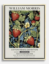
William Morris Strawberry Fields Exhibition Canvas Print
Translation missing: en.products.product.sale_price From €64,95€107,95 -

William Morris Cotton Prints Exhibition Art Print
Translation missing: en.products.product.sale_price From €17,95€29,95 -

William Morris Cotton Prints Exhibition Art Print
Translation missing: en.products.product.sale_price From €17,95€29,95


More from The Frame

Urban Jungle Interiors: Using Wall Art Instead ...
The urban jungle look is having a moment that refuses to end. But most of the people pinning those plant-drenched living rooms will never own 47 monsteras, and that's fine....

Room by Room: How to Hang William Morris Floral...
You've fallen for Morris. The question now is which floral goes where, at what size, in what frame. This guide skips the Arts and Crafts lecture and gets straight to...

Jungle Bedroom Ideas for Adults: Grown-Up Ways ...
Jungle bedrooms have a reputation problem. Search the term and you'll find nursery mood boards, cartoon monkeys, and bright kelly green walls that would keep anyone awake. The grown-up version...