How to Build a Traditional Art Gallery Wall That Looks Collected, Not Cluttered
The traditional art skeptic's guide to layering landscapes, still lifes, and portraits without ending up in stately home territory.

Most gallery wall guides assume you're working with abstract prints and quirky line drawings. Traditional art is a different beast: heavier subjects, richer palettes, more formal frames. Done wrong, you end up with a wall that feels like a country pub. Done right, it looks like you've been quietly collecting for a decade.
Gallery wall vs single statement: when to go for more
A single large print is the right answer above a fireplace, behind a freestanding bath, or above a console table where the wall is contained and the eye wants one resting place. Traditional art carries weight, and one well-chosen 70x100cm landscape will hold a focal wall on its own.
Go gallery wall when you have horizontal real estate to fill: an 8ft sofa wall, a long hallway, a staircase, a stretch above a sideboard. Above a bed can go either way, though we'd lean gallery wall for a king and single statement for a double.
The rule we use: if the wall is wider than 2 metres and the furniture beneath it is the focal point (sofa, bed, sideboard), a gallery wall pulls the whole arrangement together. If the wall itself is the focal point, one big piece does more.

Choosing a colour thread that ties traditional prints together
This is where most traditional gallery walls fall apart. People pick prints they love individually, hang them together, and wonder why the wall looks like a charity shop window.
The fix is a colour thread: one specific colour that appears in every print, even subtly. Not a palette. A single repeating colour. In traditional art, the easiest threads to spot and repeat are:
- Burnt sienna and terracotta, which appear in nearly every Italian landscape, Dutch still life, and 18th-century portrait background.
- Sage green and olive, common in pastoral scenes, botanical illustrations, and aged drapery in portraiture.
- Deep ochre and mustard, found in autumn landscapes, fruit still lifes, and Old Master skin tones.
- Prussian blue and slate, threading through seascapes, sky-heavy landscapes, and Delft-style still lifes.
Pick your thread first, then shop. Lay every print thumbnail next to each other on screen and ask: can I see this colour in all of them? If one print is missing the thread entirely, swap it. This single rule does more work than any layout trick.
For wall colour, traditional art looks best against warm neutrals (clotted cream, mushroom, putty), deep saturated tones (forest green, oxblood, navy), or soft historic shades (eau de nil, dusty rose). Bright white walls flatten traditional art and rob it of depth.
The best layout for traditional art (and why symmetry usually wins)
Eclectic gallery walls with random spacing and mixed orientations work for modern and pop art. They rarely work for traditional. Traditional subjects already carry visual weight, and asymmetric layouts make the wall feel unresolved.
Symmetry is the default for a reason. It signals intention. It tells the eye the arrangement was considered. The five layouts that work consistently for traditional art:
The grid
Equal-sized prints in a clean grid, usually 2x2, 2x3, or 3x3. Best for botanical sets, architectural studies, or a series of related landscapes. Spacing should be tight, 5 to 7cm between frames.
The symmetrical mirror
A central anchor print with matching pairs on either side. The pairs don't have to be identical, but they should be the same size and similar weight. This is the most flattering layout for mixing landscapes with still life and portraiture.
The salon hang (controlled version)
The traditional 18th-century salon style with prints stacked floor to ceiling, but reined in. Keep it to two horizontal rows with a clear top and bottom line, varied sizes within those rows. This is the layout that reads "collected" most convincingly when done with restraint.
The horizontal line
A single row of three to five prints at the same centre height, usually all the same size. Excellent above a long sofa or sideboard. Boring on its own, but unbeatable for clean rooms.
The anchor and orbit
One large print (50x70cm or bigger) with three to four smaller prints arranged around it on one side. Looser than full symmetry but still balanced. Best for awkward walls where true symmetry isn't possible.
The reason symmetry wins for traditional: the art itself is busy. Detailed brushwork, layered colour, complex composition. The frame around the art (literal and metaphorical) needs to be calm. Asymmetric layouts add visual noise to art that's already doing a lot.
Mixing subjects: pairing landscapes with still life and portraiture
Most people think a traditional gallery wall has to be all one subject. Six landscapes. Six botanicals. The reality is that mixing subjects is what stops the wall feeling like a hotel corridor.
A formula that works almost every time:
- 60% landscapes, including seascapes, pastoral scenes, and architectural views
- 30% still life, including botanicals, fruit, and tabletop arrangements
- 10% portraiture or figure studies, used as accents
Landscapes do the heavy lifting because they have depth and breathing room. Still lifes add intimacy and detail. A single portrait or figure study adds personality and stops the wall feeling like wallpaper. Don't skip the portrait. One face on a wall of landscapes is the difference between a curated home and a Premier Inn.
Anchor with a landscape. Always. The largest print should be a landscape or seascape because the horizon line gives the wall a horizontal axis to organise around. Browse the landscape art prints collection for anchor candidates first, then build outward with still life art prints for the supporting cast.
Eras can mix freely. A Georgian landscape, a Victorian botanical, and a Regency portrait sit perfectly together if the colour thread connects them. Don't try to date-match. Try to colour-match.

How many prints you actually need for common wall sizes
Most guides tell you to "choose various sizes" without specifying anything. Here are concrete starting points.
Above an 8ft sofa (240cm wide)
Seven to nine prints. A workable mix: two 50x70cm landscapes flanking a central 60x80cm anchor, with four 30x40cm still lifes filling the lower row. Total wall coverage roughly 200cm wide and 110cm tall.
Simpler version: three 50x70cm prints in a horizontal line, centred over the sofa, 6cm spacing between. Done.
Above a king bed (160cm wide)
Five prints. Two 40x50cm prints stacked on each side of a central 50x70cm anchor, or three 30x40cm prints across with two 21x30cm prints stacked above the outer two.
A 6ft hallway wall (180cm)
Four to six prints. A horizontal row of four 30x40cm prints at eye level works for narrow halls. For wider halls, do six prints in two rows of three.
Above a sideboard (150cm wide)
Three to five prints. Three 40x50cm prints in a line, or one 60x80cm anchor with two 30x40cm prints stacked beside it.
Bedroom wall opposite the bed (200cm)
Six prints in a 3x2 grid of 30x40cm, or four 40x50cm prints in a 2x2 grid.
These aren't laws. They're starting points that will look right without you having to think about it.
Frame consistency: matching or intentionally mismatching
The default for traditional gallery walls should be matching frames. All black, all natural oak, all walnut, all white. Matching frames are the single biggest reason a gallery wall reads as "collected" rather than "I bought these prints from different places."
Frame width matters more than people realise. Traditional art benefits from substantial frames, generally 2 to 3cm wide. Spindly modern frames look apologetic around a heavy oil painting reproduction. Thicker FSC wood frames give traditional prints the weight they need.
For matting, wide white mats (5 to 8cm) push traditional art toward a fine art aesthetic and make smaller prints feel more important. Narrow mats or no mats keep things informal. Pick one approach and apply it across the whole wall.
When mixing frames does work: use exactly two frame finishes, alternated symmetrically. Black and natural oak. White and walnut. Anything more than two finishes and you're back to charity shop territory.
What we'd avoid: ornate gilded frames in a modern home. They date the art instantly and lock the room into a specific historical mode. A clean wood or matte black frame lets traditional art feel current. Our framed prints come with UV-protective acrylic glaze rather than glass, which keeps colours saturated even on sun-facing walls and makes large frames considerably lighter to hang.
Hanging tips for getting spacing right first time
The 2 to 3 inch (5 to 7cm) spacing rule is universal advice, but for traditional art we'd push toward the tighter end. 5cm between frames. Traditional prints have detailed compositions that need to feel like a unified field, not floating islands. Looser spacing (10cm+) suits eclectic modern arrangements, not traditional.
Hang the centre of the gallery wall arrangement at 145 to 150cm from the floor. This is the museum standard and it works in homes too. Above a sofa, drop the bottom edge to 15 to 20cm above the sofa back. Above a bed, 20 to 25cm above the headboard.
The paper template trick saves real headaches: cut newspaper or brown paper to the exact dimensions of each frame, tape them to the wall in your planned layout, and live with it for a day. Move things around. Step back. Once it looks right, mark the hanging points through the paper, then take the paper down and hang.
For symmetrical layouts, work outward from the centre. Hang the anchor first. Hang the prints immediately flanking it. Then the outer pieces. This stops cumulative measurement errors from skewing the whole arrangement.
A spirit level is non-negotiable. Eye-balling level on traditional art ages the wall fast.

Our recommended traditional gallery wall starter sets
If decision fatigue is the thing stopping you, start with one of these three combinations. Each one assumes a single colour thread and matching frames.
The pastoral set (above an 8ft sofa)
Anchor: one 60x80cm English or Italian landscape with sage and ochre tones. Flanking: two 50x70cm botanical still lifes, one on each side. Lower row: four 30x40cm prints alternating fruit still life and architectural study. Frame all in natural oak with narrow white mats.
The drawing room set (above a sideboard or fireplace)
Three 50x70cm prints in a horizontal line: a seascape on the left, a still life with fruit and ceramics in the centre, a portrait or figure study on the right. Connected by a Prussian blue and burnt sienna thread. Frame in matte black, no mat.
The bedroom set (above a king bed)
Five prints in a symmetrical mirror: central 50x70cm landscape anchor, two 40x50cm botanicals immediately flanking, two 30x40cm still lifes on the outer edges. Sage green and cream thread. Frame in white with wide cream mats for a softer, more restful feel.
For pre-curated combinations that already share a thread, the wall art sets collection takes the colour-matching work off your plate. Otherwise, build from the traditional art prints collection by picking your anchor first, then adding supporting pieces that share its dominant colour.

What to do tonight
Pick your wall. Measure it. Decide on one colour thread. Choose your anchor print first, in the largest size your wall can take. Build outward from there using the proportions above, keep frames matching, and hang tight. Traditional art doesn't need to feel formal to feel intentional, and a gallery wall built on these rules will look like it took years to assemble even if it took an afternoon.

Fab products featured in this blog
-
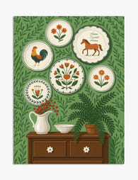
Folk Art Plates on Green Wall Illustration Art Print
Translation missing: en.products.product.sale_price From €17,95€29,95 -

Colorful Woodland Path Art Print
Translation missing: en.products.product.sale_price From €17,95€29,95 -

Snowy Day Gathering Art Print
Translation missing: en.products.product.sale_price From €17,95€29,95 -

Playful Gathering Canvas Print
Translation missing: en.products.product.sale_price From €64,95€107,95 -

Winter Gathering Canvas Print
Translation missing: en.products.product.sale_price From €64,95€107,95 -

Cozy Gathered Table Art Print
Translation missing: en.products.product.sale_price From €16,95€23,95 -

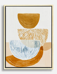
Warm Terracotta Layers Art Print
Translation missing: en.products.product.sale_price From €17,95€29,95 -

Folk Garden Wall Plates Canvas Print
Translation missing: en.products.product.sale_price From €64,95€107,95 -

Classical Elegance Art Print
Translation missing: en.products.product.sale_price From €17,95€29,95 -

Cozy Studio Gathering Art Print
Translation missing: en.products.product.sale_price From €17,95€29,95 -

City Holiday Gathering Art Print
Translation missing: en.products.product.sale_price From €17,95€29,95 -

Effortlessly Elegant Canvas Print
Translation missing: en.products.product.sale_price From €64,95€107,95 -

Garden Welcome Art Print
Translation missing: en.products.product.sale_price From €17,95€29,95 -

Terracotta Harmony Art Print
Translation missing: en.products.product.sale_price From €17,95€29,95 -

Modern Geometric Home Art Print
Translation missing: en.products.product.sale_price From €17,95€29,95 -

Vintage Garden Bird Art Print
Translation missing: en.products.product.sale_price From €17,95€29,95 -

Neutral Organic Flow Art Print
Translation missing: en.products.product.sale_price From €17,95€29,95 -
Modern Balance Study Canvas Print
Translation missing: en.products.product.sale_price From €64,95€107,95 -

Bauhaus Charm Canvas Print
Translation missing: en.products.product.sale_price From €64,95€107,95


More from The Frame

Vintage Venice Travel Posters: Why They're Havi...
Something has shifted in the way people are decorating walls. The minimalist beige phase is fading, and in its place: saturated colour, graphic shapes, and a romantic pull towards somewhere...

How to Build a Minimalist Plant Gallery Wall Th...
Most gallery walls fail in the same way: too many prints, mismatched frames, and spacing that looks accidental. A minimalist plant gallery wall flips the formula. You're not filling a...

How to Build a Calming Gallery Wall That Actual...
Most gallery walls promise serenity and deliver visual static. The fix isn't softer colours or gentler subjects, it's restraint, repetition, and a few specific measurements that almost nobody gets right....