What Size Art for a Hallway?
A width-by-width guide to choosing art that flatters narrow walls, awkward angles, and the obstacles every real hallway hides.

Hallways get treated like afterthoughts, which is exactly why the wrong-sized art ruins them so quickly. Too small and the wall swallows the print whole. Too large and you knock it with your shoulder every time you carry the shopping in. This guide gives you actual dimensions for actual hallway widths, plus the practical workarounds for thermostats, light switches and console tables that generic sizing guides ignore.
Start with your hallway width, not the wall
Most sizing advice begins with the wall. For hallways, start with the floor. The width of the corridor itself, the space you walk through, dictates how art will be experienced more than the wall dimensions do. You rarely stand back and admire a hallway piece the way you would in a lounge. You see it at an angle, in passing, sometimes from a metre away.
That changes what "right size" means. In a narrow hallway, large art reads almost like wallpaper because you can't get far enough back to take it in whole. In a wider hallway, the same piece feels balanced and intentional.
Measure your hallway width in three places: at the entrance, in the middle, and at the far end. Older homes often narrow unexpectedly. Take the smallest measurement as your working number.
Common hallway widths by home type
If you don't fancy getting the tape measure out yet, here are the typical ranges:
- Flats and terraced houses: 90cm to 110cm (roughly 3 to 3.5 ft)
- Standard semis and newer builds: 100cm to 130cm (3.5 to 4.5 ft)
- Older detached homes and Victorians: 120cm to 150cm (4 to 5 ft)
- Period homes with grand entries: 150cm and up
Your hallway probably falls into one of the first three categories. The recommendations below are organised around those bands.

Sizing for narrow hallways (under 110cm wide)
Narrow hallways are the most common and the most misunderstood. The instinct is to hang something small because the space feels small. That's the wrong move. Small art in a narrow corridor looks tentative, like you weren't sure whether to commit.
The 60-75% rule still applies, but you measure against the available wall section between architectural features, not the whole wall. If you have 140cm of clear wall between a doorway and a light switch, your art should be 84cm to 105cm tall (or wide, if you're going horizontal).
Go vertical, almost always
Vertical orientation is the cheat code for narrow hallways. Tall, slim prints draw the eye upward, which makes the ceiling feel higher and the corridor feel less cramped. A 50x70cm or 60x90cm print in portrait orientation gives you presence without crowding the walkway.
Horizontal art in a narrow hallway only works in two scenarios: above a console table, or as a deliberate series running along the length of the wall. Otherwise, you'll be fighting the geometry of the space.
Specific size picks for under 110cm
- Single statement piece between doorways: 50x70cm framed
- Tall vertical print on a longer clear wall: 60x90cm or 70x100cm
- Above a slim console table: 60x40cm landscape, or a pair of 30x40cm portraits
- Series of three down a long corridor: Three 30x40cm prints, spaced 15-20cm apart
For tighter walkways, frame depth matters more than you'd think. A chunky 4cm frame projects further into the space and catches sleeves and bags. Slimmer profiles sit closer to the wall and feel less in the way. This is one of the few cases where we'd recommend an unframed art print on a slim mount, or a flush-mounted canvas print, over a deeper framed option.
Sizing for standard hallways (110cm to 130cm wide)
This is the sweet spot. You have enough breathing room to use art at proper scale, and viewing distance is finally workable. You can stand at one end of the hall and actually see the piece.
The 60-75% rule applies cleanly here. Measure the wall section you want to fill, multiply by 0.6 to 0.75, and that's your target art dimension.
Worked examples
If your wall section is 180cm wide between a door frame and the end of the hall:
- 60% gives you 108cm of art width
- 75% gives you 135cm
So a 100x70cm landscape print, or two 50x70cm portraits hung side by side with 10cm between them, both land in range.
If your wall section is 240cm wide:
- 60% gives you 144cm
- 75% gives you 180cm
A single 70x100cm print is too small here. You're better off going to the largest framed size available (we cap framed prints at 70x100cm) or moving to a canvas print, which goes up to 100x150cm. Alternatively, run a gallery of three or four prints to fill the space.

When you have a console table
Hallway console tables change the maths. The art above should be 60% to 75% of the table's width, not the wall's. A 100cm console table wants art that's 60cm to 75cm wide. A 120cm console wants 72cm to 90cm.
Hang the bottom edge of the frame 15-25cm above the table surface. Closer than 15cm and it looks like the art is sitting on the table. Further than 25cm and the connection breaks, leaving an awkward gap that the eye reads as unfinished.
Sizing for wide hallways (130cm and up)
Wide hallways behave more like rooms than corridors. You can step back, you can take in larger pieces whole, and you have permission to go bold.
This is where you should be looking at the biggest sizes you can find. A 70x100cm framed print or a 100x150cm canvas isn't oversized here, it's correct. Anything smaller than 60x80cm risks looking lost on a wall this generous.
Landscape orientation finally earns its place
In wide hallways with high ceilings, horizontal art works beautifully because you have the visual room to support it. A 100x70cm landscape print over a console table, or a 150x100cm canvas as a single statement on a long wall, gives the space the gravity it needs.
If your hallway is wide and long, you have the best possible canvas (literal and metaphorical) for a properly considered piece. Don't apologise for the scale. Use it.
Long hallways: one piece or many?
Length is a separate variable from width. A 1.5m wide hallway might be 3m long or 10m long, and that changes everything.
Hallways under 3m long
One well-chosen piece is almost always the right answer. Multiple pieces in a short hallway fragment the space and create visual noise. Pick a single print at the largest size your wall section supports.
Hallways 3m to 6m long
You have a choice. Either one large statement piece positioned roughly two-thirds of the way down (the eye is drawn there naturally), or a series of two to three pieces spaced evenly. We'd push you toward the single statement piece if you have a console table or feature wall, and toward a series if the walls are otherwise unbroken.
Hallways over 6m long
A series is almost mandatory. A single piece, no matter how large, gets lost in a corridor this long. Three to five matching or coordinating prints, spaced 40-60cm apart, give rhythm to the walk. This is where a curated set from our gallery wall collection earns its keep, because the pieces are already chosen to work together.
Keep the centre line of every piece at the same height. This is the single rule that separates a considered gallery from a jumble. We'd suggest 145cm to 150cm from the floor to the centre of each print, slightly lower than standard gallery height because hallway viewing distance is closer.

How to measure around obstacles
Hallways are full of things you can't move. Light switches, thermostats, alarm panels, intercoms, radiators, the boiler cupboard. Generic sizing guides pretend these don't exist.
Here's how to handle them:
Light switches and thermostats. Treat the switch as a hard edge. Don't hang art that crosses or overlaps it, and don't try to hide it. Measure the clear wall space from the switch to the next obstacle, and size your art to 60-75% of that section.
Radiators. The bottom of your frame should sit at least 30cm above the top of the radiator. Heat rising over time can affect paper and inks, even with our UV-protective glaze. This isn't about safety, it's about longevity.
Doors that open into the hallway. Map the door's swing arc. Anything within that arc is going to get knocked, eventually. Hang above the arc or on a wall section the door can't reach.
Skirting boards and cornices. These define your usable wall height. Measure from the top of the skirting to the bottom of the cornice, then apply the 60-75% rule to that vertical dimension if you're going for a tall vertical piece.
The painter's tape trick (do it before you order)
Cut painter's tape to the exact outer dimensions of the frame you're considering. Stick it to the wall where you plan to hang. Live with it for 48 hours. Walk past it. Stand at the end of the hall and look at it. Open the doors that share the space.
You'll know within a day whether the size is right. If the tape outline feels too small, go up a size. If it feels imposing or you keep catching it in your peripheral vision and feeling crowded, go down. This costs nothing and saves you the irritation of getting it wrong.
Lighting compensations
Hallways are usually the darkest spaces in a home. Limited natural light, often a single overhead fitting. This affects what art will read well.
Dark, moody pieces disappear in poorly lit hallways. You'll walk past and barely register them. Lighter palettes, higher contrast images, and prints with strong graphic shapes hold up better. If you love a darker piece, plan to add a picture light or two wall sconces flanking it.
Matte finishes (which is what we use on both our framed prints and canvases) handle low, unflattering light far better than glossy alternatives. Glare from a single overhead bulb on a glossy print turns the image into a mirror. Matte simply absorbs and shows the work.
Scale illusions for narrow spaces
One large piece can make a narrow hallway feel wider, counterintuitively. The brain registers a single confident object as proof that the space can hold it, which reads as generous. Multiple small pieces, by contrast, emphasise the narrowness by creating busy visual chatter.
If your hallway feels cramped, your instinct will be to scale down. Resist it. Go bigger than feels safe, in a calm palette, and the space will read larger.
Horizontal lines within a vertical print (a horizon line in a landscape image, for example) also visually widen a narrow space. Vertical lines within a horizontal print do the opposite. Pick your composition with the effect you want in mind.
A quick reference summary
For hallways under 110cm wide, go vertical, use 50x70cm to 70x100cm prints, and consider slimmer frames or unframed mounts.
For hallways 110cm to 130cm wide, apply the 60-75% rule to your wall section, and aim for 70x100cm framed prints or pairs of 50x70cm portraits.
For hallways over 130cm wide, go large. 70x100cm framed minimum, or 100x150cm canvases for true statement walls.
For long hallways over 6m, plan a series with consistent centre lines at 145-150cm from the floor.
Measure your obstacles, tape out your sizes before you commit, and choose lighter palettes if your hallway lacks natural light. Get the scale right and the hallway stops being a corridor you pass through. It becomes a room.


Fab products featured in this blog
-

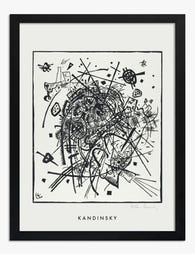
Kandinsky Small Worlds II Art Print
Translation missing: en.products.product.sale_price From €17,95€29,95 -

Winter Strolls Art Print
Translation missing: en.products.product.sale_price From €17,95€29,95 -

Quiet Pathways Art Print
Translation missing: en.products.product.sale_price From €17,95€29,95 -

Eclectic Botanical Stairway Art Print
Translation missing: en.products.product.sale_price From €17,95€29,95 -

Doorway Solitude Canvas Print
Translation missing: en.products.product.sale_price From €64,95€107,95 -

Waiting by the Door Art Print
Translation missing: en.products.product.sale_price From €16,95€23,95 -

Waiting at the Door Art Print
Translation missing: en.products.product.sale_price From €16,95€23,95 -

Meaningful Connections Art Print
Translation missing: en.products.product.sale_price From €17,95€29,95 -

Sunflower Serenity Art Print
Translation missing: en.products.product.sale_price From €17,95€29,95 -

Vibrant Shoe Corner Art Print
Translation missing: en.products.product.sale_price From €17,95€29,95 -
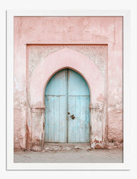
Pastel Archway Entrance Art Print
Translation missing: en.products.product.sale_price From €17,95€29,95 -

Winter Walk, Tiny Figures Canvas Print
Translation missing: en.products.product.sale_price From €64,95€107,95 -

Sunlit Forest Pathway Art Print
Translation missing: en.products.product.sale_price From €16,95€23,95 -

Garden Welcome Art Print
Translation missing: en.products.product.sale_price From €17,95€29,95 -

Lush Staircase Sanctuary Art Print
Translation missing: en.products.product.sale_price From €17,95€29,95 -

Kandinsky Small Worlds I Art Print
Translation missing: en.products.product.sale_price From €17,95€29,95 -
Kandinsky Small Worlds VIII Art Print
Translation missing: en.products.product.sale_price From €17,95€29,95 -

Winter Stroll Companions Art Print
Translation missing: en.products.product.sale_price From €17,95€29,95 -

Snowy Forest Stroll Art Print
Translation missing: en.products.product.sale_price From €17,95€29,95


More from The Frame

Art for Above the Sofa: A Complete Guide
The wall above your sofa is the single most-looked-at surface in your home. Get it right and the whole room clicks into place. Get it wrong and you'll feel the...

Two Medium Prints or One Big Print? How to Decide
You've measured your wall. You've found prints you love. Now you're stuck between buying one big statement piece or two medium prints side by side. This guide gives you a...

Going Bigger Than You Think: Why Most People Un...
Walk into almost any home and you'll find it: a 30x40cm print floating awkwardly above a three-seater sofa, marooned in a sea of empty wall. The owner spent weeks choosing...