Why William Morris Prints Look Better in Modern Homes Than You'd Expect
How a Victorian designer became the unlikely hero of minimalist, Scandi, and japandi interiors.

The idea that William Morris prints belong in oak-panelled drawing rooms and chintzy country cottages is one of the most persistent myths in interior design. It is also wrong. His garden patterns work brilliantly in white-walled flats, japandi living rooms, and pared-back Scandi spaces, often better than the abstract prints people default to instead.
Morris is the accidental godfather of biophilic design
Biophilic design, the idea that interiors feel better when they reference the natural world, is the dominant thread in contemporary interiors right now. It shows up in the rise of houseplants, raw timber, linen everything, mushroom lamps, and earthy paint palettes from brands like Farrow and Ball and Little Greene.
Morris was doing this in 1875. His patterns were drawn from his own garden at Kelmscott, observed plant by plant, bird by bird. Strawberry Thief is literally about thrushes nicking fruit from the netting. Willow Bough is just willow leaves. Trellis is a rose climbing a fence.
That is why his work slots so naturally into modern rooms. A contemporary interior craves organic shapes, hand-drawn texture, and a sense of the natural world brought indoors. William Morris wall art delivers all three in a single frame, with none of the synthetic flatness of digital botanical prints.
The Victorian association is real but superficial. Strip away the heavy mahogany furniture and the dark wallpaper, hang one Morris print on a white wall above a low oak bench, and the print reads as nature study rather than period drama.

In minimalist spaces, one bold print beats a gallery wall
The instinct with patterned art is to cluster it. Three smaller Morris prints in a neat row, or a gallery wall mixing botanicals with quotes and line drawings. In a minimalist room, this almost always looks worse than a single large piece.
Here is why. Morris patterns are dense. They contain dozens of motifs per square metre, repeated and interlocking. When you hang several together, the eye cannot rest. The patterns compete and the room reads as busy rather than considered.
A single large-format Morris print, framed simply, does the opposite. It becomes a focal point. The pattern density reads as one rich texture rather than visual noise, and the surrounding white space gives it room to breathe.
Our rule of thumb: if your room has fewer than three patterns elsewhere (cushions, rugs, curtains), go large and singular. A 70x100cm framed print above a sofa or sideboard does more for a minimalist space than four 30x40cm prints ever will. If your room is already pattern-rich, pick a smaller paired arrangement instead.
When the gallery wall actually works
There is one exception. If you have a long, narrow wall, a hallway, or a stairwell, two or three smaller Morris prints in matching frames can work beautifully. The key is matching frames, matching mounts, and prints from the same colour family. Three different Morris patterns in three different frame styles will look like a jumble sale.
The colour palette that makes Morris feel modern
Morris greens are the secret weapon. His sage, olive, and deep forest tones are almost identical to the colours dominating contemporary paint cards: think Farrow and Ball's Card Room Green, Calke Green, or Sap Green.
Pair a Morris green print with these wall colours and the room reads as cohesive and current, not historical. Even on a plain white wall, a green-toned Morris print pulls the room towards a contemporary natural palette the moment you add warm neutrals around it.
The formula we keep coming back to:
- Walls: off-white, warm white, or a muted sage
- Large furniture: natural oak, walnut, or cream linen upholstery
- Textiles: unbleached linen, oatmeal wool, raw cotton
- Accents: brass or aged bronze hardware, ceramic in cream and terracotta
- Greenery: one large plant, ideally a fig or olive tree
Drop a Morris print into that mix and it stops looking Victorian and starts looking like a curated nature reference. For more options that play well with this palette, green art prints extend the same logic across other styles.
Avoid: glossy black furniture, chrome, anything chintzy or floral in pink. These pull the print backwards in time. Morris with chintz reads as grandma's parlour. Morris with linen and oak reads as a Copenhagen apartment.
The best Morris garden prints for white-walled modern flats
Not every Morris pattern works equally well in a contemporary space. Some are too dense, too dark, or too tied to specific period associations. These are the ones that translate cleanly.
Strawberry Thief. The most adaptable of the lot. The deep blue ground and red strawberries give it enough graphic punch to hold a modern wall, and the bird motif keeps it playful rather than fussy. Works in living rooms, bedrooms, and dining areas.
Willow Bough. The minimalist's choice. It is essentially a green-on-cream pattern of willow leaves with no flowers, no birds, no extra business. Reads almost as a textured solid from across the room and looks particularly good in japandi spaces.
Trellis. Morris's first wallpaper, with climbing roses on a wooden lattice. The geometric trellis structure gives it a modern bone structure that pure floral patterns lack. Pairs well with mid-century furniture.
Pimpernel. Larger scale, looser composition, more breathing space between motifs. Good for bigger walls where you want pattern but not pattern density.
Blackthorn. Dark, rich, and dense. Best as a single statement in a moodier room, perhaps a study or a snug with deeper wall colours.
Browse the full range of William Morris garden art prints to see how each pattern reads at scale.

Sizing and placement: get the scale right
This is where most people go wrong. They buy a Morris print at 30x40cm, hang it above a three-seater sofa, and the print floats in space looking lost and apologetic.
The rule professional stylists use: art above furniture should occupy roughly two thirds to three quarters of the width of the furniture below it. Above a 200cm sofa, you want a print (or arrangement) around 130 to 150cm wide. Above a 120cm sideboard, aim for 80 to 90cm wide.
For Morris prints specifically, we recommend going one size larger than you think. The patterns are detailed and benefit from being readable at sofa-distance. A 70x100cm framed print is the workhorse size for living rooms. For hallways and smaller walls, 50x70cm works. For statement walls behind a dining table or bed, the canvas range goes up to 100x150cm and that is rarely too big.
Hang centre of the print at roughly 145 to 150cm from the floor for a standalone piece. Above furniture, leave 15 to 25cm of breathing space between the top of the sofa or sideboard and the bottom of the frame. Less than 15cm and the print looks like it is sitting on the furniture. More than 30cm and it looks unmoored.
Paired prints
If you go for two prints side by side, treat them as a single unit. The combined width should still hit that two-thirds rule, with 5 to 8cm of space between the frames. Two 50x70cm prints with 6cm between them gives you 106cm of total width, ideal above a 140 to 160cm sideboard.
Framing choices that keep it contemporary
Frame choice does more heavy lifting than people realise. The same Morris print in a heavy gilt frame versus a slim natural oak frame is essentially two different objects.
Three frame finishes work for modern homes:
Natural oak. Our default recommendation for Scandi, japandi, and most contemporary spaces. The pale wood echoes the warm-neutral palette and lets the print's colours do the work. Particularly good with Willow Bough, Trellis, and other green-dominant patterns.
Black. Crisp, graphic, slightly editorial. Best for white-walled flats with a more minimalist or mid-century lean. Black frames make Strawberry Thief and Pimpernel look almost like fashion illustration.
White. Subtle, recedes into the wall, lets the print be the only visual event. Good in very pared-back rooms or when you want the print to feel like wallpaper rather than a discrete object.
What to avoid: ornate gold, dark mahogany, anything with carved detail. These frames are what create the Victorian-parlour effect people are reacting against. The print itself is not the problem.
A practical note: framed prints arrive ready to hang with fixtures fitted, the print properly mounted behind UV-protective acrylic. The biggest failure in this category is frames that arrive separately from prints, leaving you to wrestle with mounting at home. We send everything in one box, properly fitted, with no warping.
Three room mockups
The living room
A 220cm linen sofa in oatmeal against a warm white wall. Above it, a single 70x100cm framed Strawberry Thief in natural oak, hung 20cm above the sofa back. To the side, a tall fig tree in a terracotta pot. On the sofa, two linen cushions in sage and one in muted rust. A pale wool rug underneath.
The Morris print does the work of a feature wallpaper without the commitment. The blue and red ground gives the room its anchor colour, and the oak frame ties it to the wooden coffee table.
The hallway
A narrow hallway with a 90cm console table in walnut. Above it, two 40x50cm Morris prints (Willow Bough and Pimpernel) in matching black frames, 6cm apart. A small ceramic bowl on the console, brass key hooks below.
Hallways are forgiving. The walls are short, you walk past quickly, and the matching black frames create rhythm. Two different Morris patterns work here because the frame uniformity holds them together.

The home office
A pale oak desk against a white wall. Behind the desk chair, a 50x70cm Willow Bough framed in white, hung at eye level when seated. A bouclé desk chair, brass desk lamp, one trailing plant on a shelf.
Willow Bough is the right choice here because it is calm. You do not want a busy print competing for attention while you work. The green tones support focus without being clinical.
Layering Morris with contemporary art
You do not have to commit fully to a vintage aesthetic to use Morris prints. They mix surprisingly well with abstract art, line drawings, and black and white photography, as long as you respect a few rules.
Keep the colour palette tight. If your Morris print is green and cream, the abstract piece next to it should pull from the same palette. A Morris print next to a hot-pink abstract will look accidental.
Vary the visual density. Morris is dense. Pair it with something sparse: a single brushstroke, a minimal line drawing, a high-contrast photograph with lots of negative space. The contrast in density is what makes the pairing work.
Match the frames. Mixing a heavy ornate Morris frame with a slim modern frame on its neighbour is the fastest way to make a wall look incoherent. Same frame, different art, is the formula.
For more historical patterns that mix well with contemporary work, the vintage art prints collection extends beyond Morris into adjacent territory.
A note on quality
Morris's patterns were designed to reward close looking. The detail in his work, the layered colours and fine line work, only comes through when the print is reproduced at high resolution on decent paper. Cheap reproductions flatten the colour and lose the texture, which is precisely what makes the work feel alive.
Giclée printing on thick matte paper preserves the depth. Water-based inks on FSC-certified paper keep the colours true and last for centuries even in direct sunlight, which matters for a print you might hang opposite a window.
These are not Victorian botanical prints you have to baby. They are made to live with.
The takeaway
Morris prints work in modern homes when you treat them as nature studies rather than period pieces. Go large and singular over small and clustered. Frame in natural oak, black, or white. Pair with linen, oak, brass, and warm neutrals. Avoid chintz, gilt, and mahogany.
Pick one pattern that suits the room's mood: Willow Bough for calm, Strawberry Thief for character, Trellis for structure. Hang it at the right height, give it room to breathe, and let it do its job.


Fab products featured in this blog
-

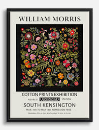
William Morris Cotton Prints Exhibition Art Print
Translation missing: en.products.product.sale_price From €17,95€29,95 -

Liberty London Roses Exhibition Poster Art Print
Translation missing: en.products.product.sale_price From €17,95€29,95 -

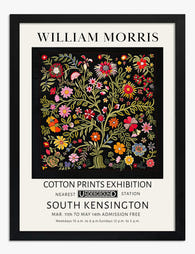
William Morris Cotton Prints Exhibition Art Print
Translation missing: en.products.product.sale_price From €17,95€29,95 -
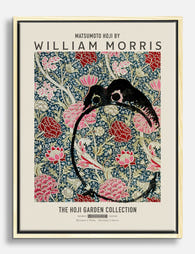
Hoji Garden by William Morris Canvas Print
Translation missing: en.products.product.sale_price From €64,95€107,95 -

William Morris Tulip Liberty London Poster Art Print
Translation missing: en.products.product.sale_price From €17,95€29,95 -

Flower Garden Textile by William Morris Canvas Print
Translation missing: en.products.product.sale_price From €64,95€107,95 -

William Morris Cotton Prints Exhibition Art Print
Translation missing: en.products.product.sale_price From €17,95€29,95 -

William Morris Cotton Prints Exhibition Poster Art Print
Translation missing: en.products.product.sale_price From €17,95€29,95 -

William Morris Cotton Prints Exhibition Canvas Print
Translation missing: en.products.product.sale_price From €64,95€107,95 -
William Morris Cotton Prints Exhibition Canvas Print
Translation missing: en.products.product.sale_price From €64,95€107,95 -

William Morris Birds Art Print
Translation missing: en.products.product.sale_price From €16,95€23,95 -

William Morris Bird & Fruit Exhibition Poster Art Print
Translation missing: en.products.product.sale_price From €17,95€29,95 -

Liberty London Roses Exhibition Poster Canvas Print
Translation missing: en.products.product.sale_price From €64,95€107,95 -

Morris Botanical Vase, Fig. 08 Art Print
Translation missing: en.products.product.sale_price From €17,95€29,95 -
William Morris Cotton Prints Exhibition Art Print
Translation missing: en.products.product.sale_price From €17,95€29,95 -

William Morris Exhibition Poster Art Print
Translation missing: en.products.product.sale_price From €17,95€29,95 -

Kennet by William Morris Canvas Print
Translation missing: en.products.product.sale_price From €64,95€107,95 -

William Morris Lodden Floral – Liberty London Art Print
Translation missing: en.products.product.sale_price From €17,95€29,95 -

William Morris Pink Botanicals Exhibition Canvas Print
Translation missing: en.products.product.sale_price From €64,95€107,95


More from The Frame

Jungle Bedroom Ideas for Adults: Grown-Up Ways ...
Jungle bedrooms have a reputation problem. Search the term and you'll find nursery mood boards, cartoon monkeys, and bright kelly green walls that would keep anyone awake. The grown-up version...

The Strawberry Thief: Everything You Need to Kn...
Strawberry Thief is the William Morris design people search for by name. It's also the one most often bought badly: wrong size, wrong colourway for the room, wrong print quality...

Our Favourite Jungle Prints for Every Room: The...
Jungle prints have a reputation problem. Done badly, they tip a room into themed-restaurant territory faster than almost any other trend. Done well, they add depth, movement and a sense...