How to Decorate a Wall That Already Has Windows (Without It Looking Crowded)
The tactical guide to styling art around windows, including the continuity trick that makes window walls feel intentional rather than awkward.

A wall with a window in it is the most awkward wall in your house. It's not blank enough to fill, not full enough to leave alone, and every guide you read keeps telling you to buy better curtains. This is the guide for the actual wall.
The challenge: why walls with windows feel impossible to decorate
Windows break up the rhythm of a wall. They create asymmetrical leftover space, pull your eye toward whatever's outside, and bounce light around in ways that compete with anything you hang nearby. Most people respond by either ignoring the wall completely or hanging something tiny next to the window frame and hoping for the best.
Both responses are wrong. The wall feels bare without art, and small pieces near a window read as hesitant rather than considered. The fix is to treat the window as part of the composition, not an obstacle blocking it.
There are two principles that make this work. First, scale up. Window walls swallow small art. Second, choose subject matter that has a relationship with what you can see through the actual window. That second one is where botanical art earns its place.
The continuity trick: matching botanical window art to your actual view
Here's the move that almost no one talks about. If your window looks out onto a garden, hang botanical art on the same wall. If you can see trees, hang leafy prints. If you're staring at a courtyard with succulents and low planting, hang desert botanicals. The art and the view start talking to each other, and the window stops feeling like a hole in your decorating scheme.
This works because your brain reads the wall as a single composition. Glass and frame, paint and print, all of it together. When the printed leaves echo the real ones outside, the room reads as intentional and immersive. When they don't, you get visual dissonance and the art feels marooned.
You don't need a literal one-to-one match. A general feeling of green-and-leafy is enough if you live near woodland. Ferns, monstera leaves, palms, eucalyptus, pressed botanicals, vintage botanical illustrations, all of these read as "outside" in a way that abstract art and figurative work don't. Browse botanical art prints with this in mind: pick the ones that share a colour palette or plant family with your view.
If your view is uninspiring (a brick wall, a car park, a neighbour's bins), the continuity trick still works in reverse. Choose botanical window art that gives you the view you wish you had, framed and arranged so the eye lands on the art before it lands on the window.

Placement rules for art beside, above, and between windows
Eyeballing it doesn't work on window walls because the window itself is a strong horizontal and vertical reference point. Any sloppiness becomes obvious. Use these rules instead.
Beside a window
Hang the art so its top edge aligns with the top of the window frame, or with the top of the window's architrave if you have one. This creates a clean horizontal sightline across the wall and makes the window feel like a deliberate element of the arrangement rather than an interruption.
Leave at least 15 to 20cm of clear wall between the art and the window frame. Less than that and you create visual clutter where the eye doesn't know where to land. More than 30cm and the two elements stop relating to each other.
Above a window
This is rarer because most windows are tall, but if you have a low or transom-style window, hang art centred above it with about 10 to 15cm of breathing room. Match the width of the art to the width of the window for symmetry, or go slightly narrower so the window remains the anchor.
Between two windows
This is prime real estate. The wall section between two windows is essentially framed for you. Hang one substantial piece (or a tightly arranged pair stacked vertically), centred horizontally and aligned at the top with the window tops. Don't centre vertically in the gap, that almost always sits too low. Top-align and let the bottom fall where it falls.
General eye line
The standard "centre the art at 145cm from the floor" rule still holds, but window-top alignment overrides it. If the two conflict, follow the window. The window is the strongest visual element in the room and your art needs to play nicely with it.
Size guide: why going too small is the most common mistake here
Almost everyone underestimates scale on a window wall. The window draws your eye outward and makes everything inside the room feel smaller by comparison. A 30x40cm print that would look fine on a blank wall will look orphaned next to a six-foot sash window.
As a working rule, the art beside a window should be at least two-thirds the height of the window itself. For a standard UK sash window of around 120cm tall, that means art at least 80cm tall. For taller windows, scale up accordingly.
For art beside a window, we'd suggest 50x70cm as a sensible minimum, and 70x100cm if you want it to genuinely hold its own. For art between windows, go bigger again. A 100x70cm landscape print, or a vertical 70x100cm, will read as substantial without competing.
For canvas, you have more headroom because canvas reads as lighter visually, even at large sizes. A 100x150cm canvas above a low window or filling the wall beside a tall one is dramatic without feeling heavy. The mirrored edge wrapping means the image doesn't get cropped, which matters more than people realise on big formats.
If you're nervous about scale, mock it up. Cut newspaper to size, tape it to the wall, live with it for a day. The piece you think is too big is almost always the right size.
Creating a gallery wall around a window without visual clutter
Gallery walls and windows are not natural friends, but they can coexist if you treat the window as one of the "frames" in the arrangement.
Start by establishing a clear grid or alignment. Either align all the tops of your art with the top of the window, or align all the bottoms with the bottom of the window frame. Pick one and stick to it. The window then becomes part of the rhythm rather than an exception to it.
Asymmetrical gallery walls work better than symmetrical ones around windows because the window itself is rarely centred on the wall. Lean into the imbalance. Cluster three or four pieces on the larger side of the wall, with one or two pieces continuing across the smaller side. The window provides the negative space the composition needs to breathe.
Keep the spacing tight, around 5 to 8cm between frames, and consistent throughout. Inconsistent gaps are what make gallery walls feel chaotic.
Stick to one or two frame finishes maximum. Mixing oak, black, and white frames around a window pulls your eye in too many directions when the window is already commanding attention. A pre-curated wall art set takes the guesswork out, since the pieces are already designed to work together.

The "frame the window" technique
The simplest gallery layout for a window wall is two matching pieces, one on either side of the window, hung at identical heights. The window becomes the centre of an unintentional triptych. This is foolproof, looks expensive, and works in almost any room.
For best results, match the art to the window proportionally. Tall vertical prints next to tall sash windows. Square prints next to square windows or porthole-style ones. Two pieces of botanical window art in matching frames will do more work than ten unrelated pieces clustered together.
Light considerations: how sunlight affects art (and how UV glazing solves it)
Hanging art near windows means hanging art in light, and light fades art. This isn't a small effect. A standard print in direct south-facing sun can show visible fading in a year or two, particularly in reds and yellows.
There are three things you can do about this.
First, choose the right materials. Museum-grade giclée printing on archival paper, with proper lightfast inks, lasts dramatically longer than cheap pigment prints. Our framed prints use UV-protective acrylic glaze rather than glass, which blocks the wavelengths that cause fading and means the inks last hundreds of years even in direct sunlight. Acrylic also doesn't shatter and is much lighter than glass, which matters when you're hanging large pieces.
Second, think about glare. Sunlight hitting glossy art creates reflections that obscure the image entirely at certain times of day. Matte paper and matte acrylic eliminate this. If you're going to hang art opposite or adjacent to a window, matte finishes are non-negotiable.
Third, consider canvas. Canvas has no glaze at all, no glare, and the matte finish handles bright rooms beautifully. The trade-off is that canvas is more vulnerable to direct UV over very long periods, so if your art will sit in unfiltered direct sun for hours every day, framed prints with UV-protective acrylic are the safer choice.
Colour temperature and orientation
North-facing windows give cool, blue-tinted light. South-facing windows give warm, yellow-tinted light. East and west are warm at sunrise and sunset respectively, cooler in the middle of the day.
Match the temperature of your art to the room. Cool, foggy, eucalyptus-green botanicals look beautiful in north-facing rooms. Warm, golden, autumnal botanicals come alive in south-facing ones. You can fight against this for contrast, but going with the natural light is the easier path to a room that feels coherent.
Five real examples of botanical window prints styled on window walls
A few combinations that we've seen work consistently. Use these as starting points and adapt to your space.
1. The leafy lounge with a garden view. A pair of large fern prints (70x100cm each) in oak frames, hung either side of a French door looking onto a garden. Tops aligned with the door frame. The indoor leaves and outdoor leaves blur together at dusk and the room feels twice as large.
2. The kitchen herb wall. A horizontal triptych of botanical herb illustrations (three 30x40cm prints, tightly spaced) above a kitchen window that looks onto a small herb planter outside. The continuity is almost comically literal and it works.
3. The bedroom palm. One oversized 100x150cm canvas of a single monstera leaf, hung on the long wall of a bedroom adjacent to a window with a leafy view. Canvas was the right call here, no glare from morning sun, and the scale matches the window's drama. See more in living room art prints for similar oversized options that translate to bedrooms.
4. The hallway sash. Two narrow vertical pressed-flower prints (40x60cm) flanking a tall sash window in a Victorian hallway. Frames in matching black, top-aligned with the window. Simple, symmetrical, makes the corridor feel intentional.
5. The asymmetric gallery. Five mixed-size botanical prints (one 70x100cm anchor, three 30x40cm, one 50x70cm) clustered to the left of a centred living room window. All tops aligned with the window. The empty wall to the right of the window stays empty, which is what makes the cluster feel deliberate rather than crowded.

Seasonal rotation, if you want to commit
The most ambitious version of the continuity trick is changing your botanical art with the seasons to match your view. Spring blossoms in April, lush green in summer, autumn leaves in October, bare branches and evergreens in winter. Most people won't bother, but if you have wall space and storage, it's a genuinely lovely way to keep a room feeling current.

A few mistakes to avoid
Hanging art too close to the window frame, less than about 15cm, makes the wall feel cramped. Choosing art with colours that compete directly with your view (bright red art against a green garden) creates visual tension instead of harmony. Picking pieces too small for the wall is the cardinal sin and the one most people commit. And blocking the operation of the window with art that swings into its path is, surprisingly, more common than you'd think. Check the window opens before you drill.
The window wall is one of the most rewarding walls in the house once you stop treating it as a problem. Pick art that talks to your view, scale up further than feels comfortable, align with the window tops, and let the natural light do the rest.

Productos Fab destacados en este blog
-

Lámina porción de pizza vibrante
Translation missing: es.products.product.sale_price Desde £11.95£19.95 -

Lámina botánica soleada en ventana
Translation missing: es.products.product.sale_price Desde £11.95£19.95 -

Lámina de plantas vibrantes en el alféizar
Translation missing: es.products.product.sale_price Desde £11.95£19.95 -

Lienzo vista floral desde la ventana
Translation missing: es.products.product.sale_price Desde £44.95£74.95 -
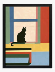
Lámina de planta al sol junto a la ventana
Translation missing: es.products.product.sale_price Desde £11.95£19.95 -

Lienzo planta al sol junto a la ventana
Translation missing: es.products.product.sale_price Desde £44.95£74.95 -

Lienzo interior con ventanas abiertas de Raoul Dufy
Translation missing: es.products.product.sale_price Desde £55.99£79.99 -
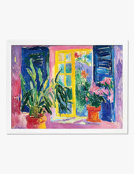
Lámina vista desde la ventana inspirada en Matisse
Translation missing: es.products.product.sale_price Desde £11.95£19.95 -

Lienzo ventana abierta de Henri Matisse
Translation missing: es.products.product.sale_price Desde £55.99£79.99 -

Lienzo ventana Matisse con gato
Translation missing: es.products.product.sale_price Desde £44.95£74.95 -

Lienzo ventana con tulipanes vibrantes
Translation missing: es.products.product.sale_price Desde £44.95£74.95 -

Lienzo ramo floral moderno junto a la ventana
Translation missing: es.products.product.sale_price Desde £44.95£74.95 -

Lámina ventana verde bañada de sol
Translation missing: es.products.product.sale_price Desde £13.99£19.99 -

Lámina interior con ventana abierta inspirada en Matisse
Translation missing: es.products.product.sale_price Desde £11.95£19.95 -

Lámina botánica con macetas sobre estante, fondo amarillo
Translation missing: es.products.product.sale_price Desde £11.95£19.95 -

Lienzo escalera botánica con plantas de interior
Translation missing: es.products.product.sale_price Desde £44.95£74.95 -

Lienzo serenidad tras la ventana
Translation missing: es.products.product.sale_price Desde £44.95£74.95 -

Lienzo vista desde la ventana inspirado en Matisse
Translation missing: es.products.product.sale_price Desde £44.95£74.95 -

Lienzo vista de ventana al estilo Matisse
Translation missing: es.products.product.sale_price Desde £44.95£74.95 -

Lámina flores de primavera junto a la ventana
Translation missing: es.products.product.sale_price Desde £11.95£19.95


Más de The Frame

How to Display Typography Prints Without the Cl...
Typography prints break the rules of normal art display. Text demands to be read, not just glanced at, which means the standard gallery wall advice you've absorbed from interiors content...

How to Build a Picasso Gallery Wall That Actual...
Most gallery wall guides tell you to "play around with the layout" and "trust your eye." That advice is useless when you're staring at over a hundred Picasso prints trying...

How to Build a Market-Themed Gallery Wall That ...
A gallery wall of market scenes does something a single print never can: it tells a story across cultures. You're not decorating with one image, you're curating a small museum...