The Only William Morris Gallery Wall Guide You Need
From subject pairings to exact spacing measurements, here's how to turn three Morris prints into a styled gallery wall.

Buying William Morris prints is the easy part. The hard part is making three or five or seven of them look like a curated set on your wall, rather than a collection of nice things hung in roughly the right area. This guide takes you from prints in a box to a finished gallery wall, with the spacing, sizing and pairing rules an interior designer would use.
Why Morris prints are ideal for gallery walls and sets
Morris designed everything within a tight visual language: flat planes, repeating motifs, naturalistic subjects, and a palette of sage, ochre, indigo, terracotta and cream. That internal consistency is exactly what gallery walls need. Most people fail at gallery walls because their prints fight each other on colour or style. With Morris, the work is already half done.
The other advantage is variety within unity. You can pull together a butterfly study, a Strawberry Thief pattern and a Willow Bough botanical, and they'll still read as one family. Try that with three random posters and it falls apart immediately.

Finally, Morris's repeating patterns scale beautifully. A 70x100cm Strawberry Thief print holds detail at distance, but you can stand 30cm from it and still find new things in the design. That dual-distance readability is rare and exactly what you want for a feature wall.
The best subject combinations: butterfly + bird + botanical
Morris worked across four main subject categories: botanicals (Willow Bough, Acanthus, Pimpernel), birds (Strawberry Thief, the famous thrushes), butterflies and moths, and pure repeating patterns (Trellis, Honeysuckle). The rule we follow is simple: pick three subject types maximum, and make sure at least one of them is a pattern.
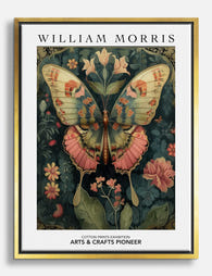
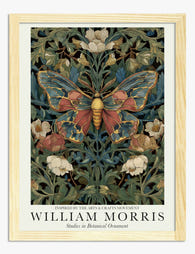
The reliable formula: butterfly + bird + botanical. A william morris butterfly print anchors the set with movement and small-scale interest. A bird print like Strawberry Thief adds a focal point with stronger colour. A botanical (Willow Bough is the safest choice) provides the calm pattern that lets the other two breathe.
Alternative: all-pattern set. Three repeating designs in the same colourway. Trellis, Willow Bough and Pimpernel in their green colourways look like wallpaper samples in a beautiful way. This is the move for a calmer, more decorative result.
Alternative: botanical-led with a butterfly accent. Two Willow Bough or Acanthus prints flanking a single butterfly study. The butterfly becomes the punctuation in a botanical sentence. This is where an arts and crafts butterfly print earns its keep — it adds a focal moment without disrupting the leafy mood.
What doesn't work: combining four or more subject types, or pairing two strong focal prints (two birds, or a bird and a butterfly at the same scale) without a calmer botanical to break them up.
Colour story matters more than subject
Morris reworked his designs across multiple colourways. Strawberry Thief alone exists in indigo, crimson and slate versions. Before you commit to subjects, pick a palette:
- Earthy: sage, olive, cream, soft ochre
- Cool: indigo, slate, ivory, muted teal
- Warm: terracotta, gold, brick, dusty pink
Pick one and stick to it across every print. A butterfly print in indigo and a Willow Bough in cream-and-sage will clash, even though both are "Morris." Browse the full william morris nature prints range with your palette already decided and the choice gets ten times easier.
Choosing consistent sizes and frames for a cohesive set
The single biggest visual upgrade you can make to a gallery wall is matching the frames. Same colour, same width, same finish. Different print subjects with matching frames read as a curated set. Matching subjects in mismatched frames read as chaos.
For Morris work, we recommend solid black or natural oak frames. Black gives a graphic, museum feel that suits the strong line work in Morris's designs. Natural oak picks up the warm tones in the prints themselves and leans more Arts and Crafts.
Size formulas that work
These are the combinations we'd actually order:
- Horizontal row of 3 (above a sofa or sideboard): three prints at 40x50cm or 50x70cm, all portrait orientation
- Asymmetric pair (between two windows or beside a bed): one 50x70cm and one 30x40cm, stacked or offset
- L-shape 3-print: one 50x70cm anchor with two 30x40cm prints to the side, in an L
- Grid of 4: four 40x50cm prints, all the same size, in a 2x2 square
- Statement 5-piece: one 70x100cm centre, two 40x50cm and two 30x40cm flanking
The rule: if you're mixing sizes, mix them dramatically. A 50x70cm next to a 40x50cm looks like a mistake. A 70x100cm next to a 30x40cm looks intentional.

Paper quality is doing more work than you think
When you hang multiple prints together, paper quality becomes visible in a way it isn't with a single print. Thin paper warps inside the frame, catches light unevenly, and makes the colour look flat. Heavy matte giclée paper sits flat behind glazing, holds saturation, and reads as one consistent surface across all your frames. This is the difference between a gallery wall that looks "homemade" and one that looks finished.
Frames that ship separately from prints are another common failure point. You end up trimming, fitting, and inevitably ending up with one print slightly off-centre in its mount. Ordering framed prints that arrive ready-assembled in one box removes the entire problem.
Layout templates: horizontal row, asymmetric pairs, and grids
Here are the four layouts that work for almost every space, with the exact arrangements.
The horizontal row of three
The default for above a sofa, bed, console table or fireplace. Three prints of identical size, identical orientation, hung in a straight line with equal spacing.
```
[ A ] [ B ] [ C ]
```
This is the easiest layout to execute well. The only rule: the total width of the arrangement (prints plus gaps) should be roughly two-thirds the width of the furniture below it.
The asymmetric pair
Best for narrow walls, beside beds, or in stairwells. One larger print, one smaller print, offset rather than aligned.
```
[ A ]
[B]
```
Align the bottom of the smaller print to roughly the middle of the larger one. Don't centre-align them vertically, it looks tentative.
The grid
Two by two, three by three, or two by three. All prints identical in size, equal spacing, hung as a perfect rectangle. This is the most formal layout and works brilliantly with four william morris butterfly studies of the same species in different colourways, or four botanical plates.
```
[ A ] [ B ]
[ C ] [ D ]
```
The L-shape or staircase
One anchor print with two smaller prints stepping off to the side. Good for filling awkward corners or working around furniture.
```
[ A ] [B]
[C]
```
Exact measurements: spacing, height and distance from furniture
This is where most guides go vague. Here are the actual numbers.
Spacing between frames: 5 to 8cm. We prefer 6cm as the default. Closer than 5cm and the prints fight; wider than 8cm and they stop reading as a set. Use the same gap horizontally and vertically.
Height from floor: the centre of the arrangement should sit at 145 to 150cm from the floor. This is gallery-standard eye level and works for almost everyone. Measure to the centre of the whole arrangement, not to the centre of any single print.
Distance above furniture: 15 to 20cm between the top of the sofa, headboard or sideboard and the bottom of the lowest frame. Less than 15cm feels cramped. More than 25cm and the art floats unmoored from the furniture below.
Distance from ceiling: at least 30cm of breathing room above the top frame. If you have low ceilings, this might mean dropping the whole arrangement lower rather than squeezing it up.
Room-by-room sizing:
- Above a 3-seat sofa (around 200cm wide): arrangement should be 130 to 140cm wide total
- Above a queen bed (150cm wide): arrangement should be 100 to 130cm wide total
- Above a king bed (180cm wide): arrangement should be 120 to 150cm wide total
- In a hallway: vertical arrangements work best, 3 to 5 prints stacked

The paper template method
Before drilling anything, do this. Cut kraft paper or newspaper to the exact size of each frame. Write the print name on each sheet. Tape them to the wall with masking tape in your planned layout.
Live with it for 24 hours. Walk past it. Look at it from the sofa. Adjust until it feels right. Then mark the position of the hanging hook through the paper directly onto the wall, drill, hang, and remove the paper as you go.
This single step is the difference between a gallery wall you love and one with three extra holes behind each frame.
How to order a matched set that arrives ready to hang
If you want a cohesive set, order it as a set. Pick your prints in one session, pick one frame style and one frame colour, pick consistent sizes from the formulas above. The wall art sets collection is designed exactly for this, and ordering everything together means it ships together and arrives in the same delivery rather than in dribs and drabs.
A few practical pointers when ordering:
- Match frame colour exactly across all prints. Don't mix black and natural oak in the same arrangement.
- Match sizes within the layout's logic. A row of three should be three identical sizes. An asymmetric layout should mix sizes obviously.
- Choose framed over unframed if you're new to this. Framed prints arrive with fixtures attached, properly fitted behind UV-protective acrylic, no warping, no separate assembly. The acrylic glaze (rather than glass) also means lighter frames, which matters when you're putting five of them on one wall.
- Order one size up if undecided. Gallery walls almost always look better with slightly larger prints than you think.
Browse the william morris bird art prints for your focal piece, then fill out the set from the wider william morris art prints collection.
Common gallery wall mistakes and how to avoid them
Hanging too high. Centre at 145-150cm. Almost every gallery wall mistake we see is hung 10cm too high. Trust the number.
Inconsistent spacing. Measure every gap. Don't eyeball it. A 4cm gap between two prints and a 7cm gap between the next two will look subtly wrong forever, even if you can't say why.
Too many subjects. Three subject types maximum. Butterfly, bird, botanical. Or three botanicals. Or four butterflies in a grid. Don't add a fifth voice.
Mismatched frames. Even if every print is by Morris, three different frame finishes will undo all your subject planning. One frame style, one colour, full stop.
Mixing colourways. Indigo Strawberry Thief next to a sage Willow Bough next to a terracotta Acanthus is too many palettes. Pick one and commit.

Skipping the paper template. It takes twenty minutes and saves you forty minutes of patching holes. Always do it.
Underestimating scale. A single 30x40cm print above a three-seat sofa looks lost. Either go bigger or add prints until the arrangement fills roughly two-thirds of the furniture width.
Hanging before living with the layout. Even with the paper template, leave it up overnight. The arrangement you think is perfect at 8pm often needs a small adjustment by morning.
The takeaway
Pick one colourway. Pick three subject types maximum, with at least one pattern. Pick one frame style. Use the size formulas, the 6cm spacing rule, and the 145cm centre-line. Template with paper before you drill. That's the whole method, and it's the same method behind every gallery wall you've ever admired.

Prodotti Fab presentati in questo blog
-

Tela farfalla e fiori ispirata a William Morris
Translation missing: it.products.product.sale_price A partire da £49.95£74.95 -
Tela con farfalla in stile William Morris
Translation missing: it.products.product.sale_price A partire da £49.95£74.95 -

Poster giardino di farfalle di William Morriss
Translation missing: it.products.product.sale_price A partire da £11.95£19.95 -

Tela farfalla ispirata a William Morris
Translation missing: it.products.product.sale_price A partire da £49.95£74.95 -

Poster farfalle in stile William Morris
Translation missing: it.products.product.sale_price A partire da £11.95£19.95 -
Poster farfalla botanica in stile William Morris
Translation missing: it.products.product.sale_price A partire da £11.95£19.95 -

Poster farfalla con motivi botanici ispirato a William Morris
Translation missing: it.products.product.sale_price A partire da £11.95£19.95 -

Poster farfalla in stile botanico ispirata a William Morris
Translation missing: it.products.product.sale_price A partire da £11.95£19.95 -

Poster farfalla botanica ispirata a William Morris
Translation missing: it.products.product.sale_price A partire da £11.95£19.95 -

Tela farfalla tra fiori color panna in stile William Morris
Translation missing: it.products.product.sale_price A partire da £49.95£74.95 -

Poster giardino di farfalle ispirato a William Morris
Translation missing: it.products.product.sale_price A partire da £11.95£19.95 -

Tela con farfalla ispirata a William Morris
Translation missing: it.products.product.sale_price A partire da £49.95£74.95 -

Poster farfalle e fiori di William Morris
Translation missing: it.products.product.sale_price A partire da £11.95£19.95 -

Tela botanica con farfalla bianca in stile William Morris
Translation missing: it.products.product.sale_price A partire da £49.95£74.95 -

Poster farfalla di William Morris
Translation missing: it.products.product.sale_price A partire da £11.95£19.95 -

Tela con farfalla botanica ispirata a William Morris
Translation missing: it.products.product.sale_price A partire da £49.95£74.95 -

Poster farfalla nel giardino di William Morris
Translation missing: it.products.product.sale_price A partire da £11.95£19.95 -

Tela farfalle botaniche stile William Morris
Translation missing: it.products.product.sale_price A partire da £49.95£74.95 -

Poster farfalla bianca di William Morris
Translation missing: it.products.product.sale_price A partire da £11.95£19.95 -

Tela con farfalla botanica ispirata a William Morris
Translation missing: it.products.product.sale_price A partire da £49.95£74.95


Di più da The Frame

Arts and Crafts Animal Prints: The Victorian De...
The Arts and Crafts revival: why Victorian animal prints are trending again Scroll through any interior design hashtag right now and you'll see them everywhere: hares peering through curling foliage,...

You're Overthinking Your Arts and Crafts Galler...
Most gallery wall advice assumes you're working with clean, simple imagery. Photographs. Line drawings. Quiet little prints with breathing room baked in. Arts and Crafts prints are the opposite of...

Watercolor Painting Styles Explained: From Bota...
A quick primer on why watercolour looks the way it does Watercolour behaves unlike any other medium. Pigment suspended in water, applied to absorbent paper, with the artist controlling roughly...