Vintage or Modern Kitchen Prints? How to Match Art to Your Kitchen's Personality
A decision framework for choosing kitchen art that actually fits the room you cook in.

Most kitchen art guides tell you to "choose what you love" and leave you to it. That's not advice, that's a shrug. The real question is whether your kitchen leans vintage or modern, and once you know that, the choice between a 1920s botanical plate and a bold abstract gets a lot easier.
Two camps, one kitchen: the case for vintage and the case for modern
Vintage kitchen prints lean into nostalgia. Old market scenes, hand-painted botanical illustrations, retro food advertising, faded citrus studies. They make a kitchen feel lived-in before you've even cooked in it. They suggest the room has a history, even if you only moved in last March.
Modern kitchen prints do the opposite. They make a statement, they introduce contrast, and they pull the eye to one focal point rather than layering atmosphere. Bold abstracts, minimal line drawings, high-contrast food photography, geometric prints. Less storytelling, more visual punctuation.
Neither is better. What matters is which one supports the kitchen you already have. A sleek handleless kitchen with quartz worktops and pendant lighting will fight a sepia botanical plate. A Shaker kitchen with brass taps and open shelving will look uneasy under a neon Pop Art abstract. Match the art to the architecture and the rest looks after itself.

Vintage kitchen prints: what they are and the kitchen styles they suit
When we say vintage kitchen prints, we mean a specific visual vocabulary: 18th and 19th century botanical plates (lemons, figs, herbs, fennel), French market scenes, Italian still life, antique seed catalogue illustrations, vintage wine and produce posters, soft watercolour studies of fruit and vegetables. Muted palettes. Sepia, cream, sage, terracotta, dusty rose, ochre. Visible paper texture. The feeling of something that was printed once, then printed again, then framed by someone's grandmother.
These prints belong in kitchens with warmth built in. Shaker and farmhouse kitchens are the obvious match. Painted cabinets in sage, off-white or soft grey, butcher block or marble worktops, a Belfast sink, brass or aged nickel hardware. A framed botanical of artichokes or a vintage citrus study above the counter looks like it has always been there.
Country kitchens, cottage kitchens, and traditional kitchens with panelled cabinetry and rich wood tones also work well. So do "modern rustic" kitchens that mix exposed brick, reclaimed timber and natural linen. The faded palette of a vintage print picks up the patina of the room.
One thing to avoid: the cockerel-and-chicken school of vintage kitchen art. Roosters on a red gingham background, cartoon pigs holding cleavers, anything that looks like it was bought from a roadside antique stall in 1997. There's a clear line between vintage that reads as timeless and vintage that reads as dated, and the difference usually comes down to whether the image has genuine art-historical roots (botanical plates, Renaissance still life, real vintage advertising) or is just a modern pastiche of "country charm."
The botanical shortcut
If you're not sure where to start, botanical prints are the safest entry point into the vintage end of the spectrum. They suit almost every traditional kitchen, the colour palette is naturally muted, and they read as considered rather than themed. A pair of fig or olive studies in 30x40cm above a coffee station does more than three roosters ever will.
Modern kitchen art: what it looks like and when to go bold
Modern kitchen prints reject the muted, nostalgic palette entirely. Think bold colour blocking, monochrome line drawings of fruit or coffee cups, abstract shapes in primary colours, high-contrast black-and-white photography of olive oil pours or espresso shots, geometric pattern prints, typography-led work. The mood is graphic, confident, and present-tense.
These belong in kitchens that have already made a clean stylistic commitment. Contemporary minimalist kitchens with handleless cabinets, integrated appliances, slab worktops in white quartz or dark stone. Mid-century modern kitchens with walnut veneers, tapered legs and atomic-era hardware. Industrial kitchens with exposed concrete, steel shelving and pendant cage lights. Scandi kitchens that lean into pale wood and lots of negative space.
The rule of thumb: the more architectural restraint your kitchen shows, the more your art can do the heavy lifting. A minimalist kitchen with no upper cabinets and a single floating shelf is begging for one large 70x100cm abstract above the dining end, not a cluster of small prints.

Mid-century kitchens are interesting because they sit between camps. They have warmth (timber, mustard, burnt orange, olive) but graphic confidence (clean lines, bold forms). Modern prints with a slightly retro palette, think 1960s graphic posters, abstract shapes in mustard and teal, work brilliantly here. You can browse the broader modern art prints collection to see what we mean by graphic without being cold.
The mistake to avoid with modern prints is choosing something that feels designed for an office. Corporate-looking motivational typography, generic grey-on-grey abstracts, anything that could double as a stock image. Sophisticated modern art has a clear point of view. Bland modern art has been to too many meetings.
Mixing vintage and modern: when it works and when it just looks confused
Mixing the two is possible, but it needs a rule. Without one, you get a kitchen that reads as indecisive rather than eclectic.
The cleanest rule is colour palette unity. If your vintage botanical and your modern abstract share a palette (say, sage, cream and rust), they can sit on the same wall and feel intentional. If one is sepia-and-ochre and the other is electric pink and black, you have two arguments happening at once.
The second workable rule is frame consistency. Identical frames across radically different artwork creates an immediate visual link. Six prints of mixed style, all in the same 30x40cm black frame, will read as a collection. The same six prints in six different frames will read as a junk drawer.
The third rule is hierarchy. Pick a dominant style (say, 80% vintage) and use the other as an accent. One modern line drawing among five botanical plates feels like a deliberate counterpoint. A 50/50 split rarely does.
Transitional kitchens, the ones that mix Shaker cabinets with industrial pendants, or marble with matt black hardware, are genuinely the best candidates for mixing styles. They've already committed to bridging two worlds, so the art can do the same.
Frame choices that reinforce your style
Frame choice is not a finishing detail. It's half the decision.
Oak and natural wood frames push everything they hold toward vintage. The warm grain, the visible knots, the slight unevenness of real timber all reinforce a sense of age and craft. A modern abstract in an oak frame becomes warmer, softer, more domestic. A botanical plate in oak becomes inevitable.
Black frames push everything toward modern. They sharpen edges, increase contrast, and signal "gallery" rather than "heirloom." A vintage botanical in a black frame stops feeling like it belongs in a country cottage and starts feeling curated, almost editorial. This is one of the most useful tricks if you love vintage imagery but live in a contemporary kitchen.
White frames sit in between, leaning slightly modern. They disappear against pale walls and let the artwork speak. Good for Scandi and minimalist kitchens where you want the print to feel almost unframed.
Our frames are solid FSC-certified wood (no MDF, no veneer) with a UV-protective acrylic glaze rather than glass. The acrylic is a real consideration in a kitchen: lighter to hang, harder to break, and crucially, it prevents fading even in the bright sunlight that kitchens tend to get. Glass shatters; acrylic doesn't.
One practical point worth flagging: framed prints arrive with fixtures already attached, fitted properly, and shipped in one box with the print. You don't get the common disaster of a frame arriving separately from the artwork and warping in transit. That single issue is why most people give up on framed art for kitchens.
Colour matching: warm vintage palettes vs. high-contrast modern tones
Vintage palettes are warm, low-saturation and analogue. Sepia, cream, sage, terracotta, dusty rose, ochre, faded indigo, olive. They pick up natural materials beautifully: oak worktops, brass taps, linen tea towels, ceramic crockery, exposed brick. If your kitchen is built around earth tones and natural finishes, your art should sit inside the same palette, not interrupt it.
Modern palettes split into two camps. The high-contrast camp is black, white, and one bold accent, usually red, cobalt, mustard or emerald. The monochromatic camp is a single colour stretched across several values, all greys, all creams, all blacks. Both work in modern kitchens; both look out of place in traditional ones.
The simplest colour test: stand in your kitchen and identify the three colours that already dominate. Cabinet colour, worktop colour, hardware colour. Your art should either echo two of those three (safe, harmonious) or deliberately contrast all three (bold, confident). What it shouldn't do is introduce a fourth random colour with no relationship to the rest.

Our top picks: vintage kitchen prints we love right now
A few directions worth exploring within the kitchen art prints collection if you're leaning vintage.
Botanical plates of edible plants. Figs, olives, citrus, herbs, artichokes. These work in almost any traditional kitchen and pair beautifully in sets of two or three at 30x40cm. The detail in a museum-grade giclée print on matte paper is genuinely worth seeing up close, the fine line work and colour variation that gets lost on a screen.
French and Italian market scenes. Soft watercolour or gouache studies of produce stalls, café exteriors, vineyard rows. These add narrative without being literal "kitchen art." A 50x70cm market scene above a dining table grounds the whole room.
Antique still life. Dutch-style fruit and game compositions, Renaissance bread-and-wine studies, 17th century floral arrangements. These read as serious art rather than decorative kitchen prints, which is exactly why they work above a sideboard or in a dining-kitchen.
Vintage produce posters. Early 20th century citrus crate labels, wine region maps, original-style olive oil advertising. More playful than botanicals, still firmly in the vintage camp. Best as single statement pieces rather than gallery walls.
Our top picks: modern kitchen prints worth a look
If you're going modern, four directions are doing particularly well.
Minimal line drawings. Single-line illustrations of fruit, coffee cups, wine glasses, kitchen tools. They feel current, they're easy to live with, and they suit small wall spaces between cabinets where a busy print would feel cramped. Best in white or thin black frames at 30x40cm.
Bold colour-block abstracts. Large geometric forms in two or three confident colours. These need scale to work, ideally 70x100cm or larger on canvas. Canvas works particularly well here because the mirrored edge wrapping means the colour continues around the sides, giving you a clean, gallery-style finish without a frame.
Contemporary food photography. High-contrast, close-up images of pomegranates splitting, olive oil pouring, espresso crema. The trick is choosing images that feel artistic rather than stock-photo-ish. Look for unusual crops, dramatic lighting, single-subject compositions.
Graphic typography. Single words or short phrases in strong typefaces. Tread carefully here, this is the easiest category to get wrong. Avoid anything that sounds like a slogan. Lean toward foreign-language menus, vintage typographic posters reinterpreted in modern colourways, or abstract type that works as shape rather than message.

A final thought
The decision between vintage and modern kitchen prints isn't about which one is more tasteful. It's about which one your kitchen has already chosen, whether you realised it or not. Look at your cabinet style, your hardware, your worktop, your floor. The kitchen has been telling you what it wants the whole time. Your job is to listen to it, then pick the print that agrees.

Fab-produkter som visas i denna blogg
-

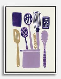
Poster köksredskap – lekfull illustration i lavendel och plommon
Translation missing: sv.products.product.sale_price Från 180.00 kr257.00 kr -

Poster lekfullt modernt köksmotiv
Translation missing: sv.products.product.sale_price Från 180.00 kr257.00 kr -

Poster lekfulla köksredskap
Translation missing: sv.products.product.sale_price Från 180.00 kr257.00 kr -

Poster moderna köksredskap
Translation missing: sv.products.product.sale_price Från 180.00 kr257.00 kr -

Canvastavlor modern oas i köket
Translation missing: sv.products.product.sale_price Från 719.00 kr1,027.00 kr -
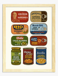
Poster retro skaffericharm
Translation missing: sv.products.product.sale_price Från 180.00 kr257.00 kr -

Poster solbelyst kök i vintagestil
Translation missing: sv.products.product.sale_price Från 180.00 kr257.00 kr -

Canvastavlor kök i linjeteckning med färgklickar
Translation missing: sv.products.product.sale_price Från 719.00 kr1,027.00 kr -

Poster italienska köksklassiker
Translation missing: sv.products.product.sale_price Från 180.00 kr257.00 kr -
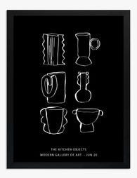
Poster stilrent köksmotiv i svartvit linjeteckning
Translation missing: sv.products.product.sale_price Från 180.00 kr257.00 kr -

Poster livfull kökskänsla
Translation missing: sv.products.product.sale_price Från 180.00 kr257.00 kr -
Canvastavlor med moderna köksredskap
Translation missing: sv.products.product.sale_price Från 719.00 kr1,027.00 kr -

Canvastavlor moderna köksredskap i varma lila toner
Translation missing: sv.products.product.sale_price Från 719.00 kr1,027.00 kr -

Canvastavlor köksfavoriter i blått
Translation missing: sv.products.product.sale_price Från 719.00 kr1,027.00 kr -

Canvastavlor lekfulla linjer för köket
Translation missing: sv.products.product.sale_price Från 719.00 kr1,027.00 kr -

Poster Matisse-inspirerat köksmotiv
Translation missing: sv.products.product.sale_price Från 180.00 kr257.00 kr -

Poster Kitchen Rules – svartvit texttavla för köket
Translation missing: sv.products.product.sale_price Från 180.00 kr257.00 kr -

Poster färgsprakande urban köksmotiv
Translation missing: sv.products.product.sale_price Från 180.00 kr257.00 kr


Mer från The Frame

Why William Morris Prints Look Brilliant in Mod...
William Morris has been quietly miscategorised for decades. His patterns get filed under "country cottage" or "Arts and Crafts revival" and rarely escape, which is a shame because his tree...

Why Arts and Crafts Nature Prints Are the Antid...
The minimalism hangover: why bare walls stopped feeling calming For about a decade, the aspirational interior was a white box with one boucle chair in it. That look has officially...

Botanical Petal Art: Why Close-Up Prints Feel M...
Full florals have had a long run, and they're not going anywhere. But if you've noticed that the botanical art appearing in design magazines, boutique hotel lobbies, and the better-styled...