


 Order today for delivery by
The Best Art for Maximalist Homes: What Actually Works on the Wall
A practical decoder for shopping maximalist art, from dense botanicals to clashing abstracts and the framing choices that hold it all together.


Most advice about maximalist art stops at "go bold." That's not advice, that's a shrug. This guide breaks down the actual subjects, palettes, print styles and framing choices that make maximalist walls sing, so you can shop with intent rather than just adding another bright rectangle to the pile.
What makes art 'maximalist' (hint: it's not just about colour)
Maximalism isn't saturation. A neon pink print of a single lemon is bright, but it's visually thin. Put it on a wall surrounded by patterned wallpaper, a velvet sofa and a stack of books, and it dies. It has nothing to say back to the room.
Maximalist art works because of density, layering, pattern complexity and detail that rewards close viewing. You should be able to stand in front of a maximalist print for a full minute and keep noticing new things: a tiny insect tucked into the foliage, a secondary colour hiding in the brushwork, a repeated motif you missed the first three times.
The quick test we use when curating: cover the print with your hand so only a small corner is visible. Is that corner still interesting? If yes, it has the density to hold its own in a busy space. If the corner is just blank background, the print is a statement piece masquerading as maximalist.
Minimalist art subtracts until only the essential remains. Maximalist art adds, layers, overlaps, and trusts you to keep looking. Those are opposite philosophies, not opposite colour schemes.
Five print styles that always work in maximalist spaces
1. Dense botanicals and vintage florals
Not a single tulip on a white background. We mean overlapping blooms, trailing vines, foliage that fills the frame edge to edge. Think antique Dutch flower paintings, Victorian botanical plates, or contemporary illustrators who treat flowers like wallpaper. The density gives your eye something to chew on, and the organic shapes soften harder patterns elsewhere in the room.
2. Layered abstract compositions
Abstracts work in maximalist spaces when they have real depth: visible brushwork, overlapping shapes, multiple colour fields fighting for attention. Flat geometric prints with three colours and clean lines are a minimalist move. You want abstracts that look like someone kept painting after they probably should have stopped. Browse abstract prints with gestural marks and layered colour rather than clean graphic shapes.
3. Ornate vintage and classical reproductions
Old master still lifes, Renaissance portraits, antique maps, 18th-century ornithological plates. The intricate detail of pre-modern art was designed for close viewing in rooms stuffed with furniture and textiles, which is essentially what maximalism revives. A moody classical oil reproduction next to a punchy modern abstract is one of the most reliable maximalist combinations going.
4. Pattern-forward illustration
Illustrated prints where the pattern IS the subject: Moroccan tilework, Indian block prints, Art Nouveau borders, Memphis-era graphics. These bring repetition and rhythm, which maximalist rooms need to feel composed rather than chaotic.
5. Photography with visual noise
Street photography, dense market scenes, crowded cityscapes, overgrown gardens. Clean architectural photography and minimalist portraits don't earn their place on a maximalist wall. You want images where the frame is full.

Colour pairing: how to pick prints that clash beautifully
Here is where most guides fail you. "Mix bold colours" tells you nothing. These are the frameworks we actually use.
Anchor two or three colours across mismatched pieces
Pick two or three colours that will repeat across your prints, even when the subjects are wildly different. A burgundy you can trace from a floral to an abstract to a vintage portrait. A mustard that appears in the border of one print and the background of another. The subjects clash. The palette doesn't. That's the trick.
Jewel tones hold hands with each other
Emerald, sapphire, ruby, amethyst, topaz. These saturated deep tones were born to sit next to each other, which is why Victorian and Art Nouveau interiors leaned so heavily on them. If you're nervous about colour clashing, start here. Jewel tones almost never fight.
Warm against cool, deliberately
The most electric maximalist walls set warm against cool with purpose: a hot terracotta next to a cold ultramarine, a dusty pink against a forest green. The contrast is the point. What you want to avoid is accidentally landing in muddy territory, where warms and cools blend into beige rather than crackle against each other.
What "bad clashing" actually looks like
Bad clashing happens when prints share no colour relationship at all and sit at the same intensity. Three equally loud prints with no repeating hues read as noise. Rescue it by introducing one piece that bridges them: a print that contains both of the warring colours, or a quieter tonal piece that gives the eye somewhere to rest.
Our colourful prints collection is a good place to start building a working palette.
Scale and detail: why maximalist art rewards close-up viewing
Minimalist art is designed to be read from across the room in one gulp. Maximalist art is designed to be approached. You should want to walk up to it.
This is why print quality genuinely matters here. Dense, detailed prints need to hold up at nose distance. Pixelation, muddy colour reproduction and flat tones that look fine from two metres away become distracting from thirty centimetres. Our prints are produced using museum-grade giclée on thick matte paper, which keeps fine detail sharp and colours true even in prints packed with information. Matte finish also means no glare, which matters more than you'd think when you're hanging a print somewhere people will actually look at it closely.
The scale paradox
Bigger isn't automatically more maximalist. One enormous print on a wall can read as surprisingly minimalist if the composition is simple. Three or five medium prints (think 40x50cm or 50x70cm) arranged together often create more maximalist energy than a single 100x150cm statement piece, because the eye has more edges, more frames and more transitions to process.
That said, don't go too small. Anything under A4 tends to disappear in a maximalist room unless it's part of a tight cluster. The threshold for "a print that holds its own" starts around 30x40cm.
Subjects that maximalists gravitate toward and why
Certain subject categories keep showing up in maximalist homes, and there are reasons beyond trend.
Nature in excess: dense gardens, jungles, bird collections, botanical taxonomies. Nature's own default state is maximalist. Rainforests and English cottage gardens are visually overwhelming on purpose. These subjects give you permission to pile on. Our botanical art prints lean into this.
Interiors within interiors: paintings of rooms, still lifes with layered objects, Dutch domestic scenes. There's something satisfying about hanging a maximalist painting of a maximalist room inside your own maximalist room. It reinforces the aesthetic recursively.
Portraits with personality: not corporate headshots, but faces with character. Vintage ancestral-style portraits, bold illustrated faces, surreal figures. Portraits give a wall a sense of being watched, which maximalist rooms often court deliberately.
Food, feasts and still lifes: particularly good in dining rooms and kitchens. A dense still life of fruit, game, flowers and silverware has centuries of maximalist pedigree behind it.
Maps, charts and taxonomies: anything that catalogues the world in grid form. Vintage star charts, antique maps, insect collections, mushroom identification plates. The built-in grid structure of these prints is quietly maximalist, repetition at scale.

The role of framing in pulling bold art together
Framing is where most maximalist walls fall apart, and it's where most buying guides go silent. Here's what actually matters.
Match the frame family, not the frame
You don't need every frame to be identical. In fact, matching frames can make a maximalist wall feel oddly corporate, like a hotel corridor. What you do need is a frame family: all warm woods (oak, walnut, natural pine) OR all black OR all white OR all ornate gilt. Pick a family, then vary within it. An oak frame next to a walnut frame next to a pine frame reads as intentional. An oak frame next to a chrome frame next to a plastic white frame reads as a jumble sale.
Ornate vs. simple
Ornate gilt and carved wood frames pair brilliantly with contemporary abstract prints (the contrast is the whole point) and amplify vintage/classical subjects. Simple thin black or oak frames calm down very busy prints and give salon walls a graphic structure. Our framed prints use solid FSC-certified wood (no MDF, no veneer) in simple profiles that hold their shape and don't warp, which matters when you're committing to a wall of them.
Why framing often goes wrong
The classic maximalist wall failure: prints and frames bought separately, trimmed badly to fit, with uneven borders and warping over months. Our frames and prints ship together in one box, properly fitted, ready to hang. When you're building a wall of twelve pieces, you really don't want to be re-trimming and re-mounting things on your kitchen floor.
Gallery wall architecture
Two approaches, and both are valid.
- Grid: identical sizes, identical frames, tight even spacing. Looks surprisingly maximalist when the prints themselves are busy, because the regimented layout contains the chaos. Great for taxonomies, botanical plates, series.
- Salon-style: mixed sizes, mixed orientations, varying frames within one family, hung densely. Highest maximalist payoff but hardest to get right. Start with a large anchor piece in the centre-left or centre-right, then build outward with smaller pieces, keeping gaps between frames at roughly 5-8cm throughout.
Room-by-room picks: living room, bedroom, hallway, dining room
Maximalism plays differently depending on where you're standing and how long you're staying.
Living room
Highest tolerance for intensity. This is where salon-style walls earn their keep. Mix a large abstract (think 70x100cm) with smaller vintage florals, a portrait or two and a photography piece. Repeat two anchor colours. Expect to spend evenings noticing new details, which is exactly the point.

Bedroom
Dial the intensity down about 20%. You want visual richness without the walls shouting at you when you're trying to sleep. Lean toward botanicals, moody landscapes, softer abstract work. Avoid high-contrast graphic prints and busy portraits above the bed specifically (you don't want a face staring at you at 3am). Deep tones work better than acid brights here.
Hallway
The most underused maximalist opportunity in most homes. Hallways are transitional, so people pass through quickly, which means you can get away with higher density and more clashing than almost anywhere else. A full salon wall running the length of a hallway is one of the most impressive maximalist moves available. Vintage prints, maps and small photographs particularly shine here because the close viewing distance of a hallway rewards their detail.
Dining room
Historically the most maximalist room in the house (think wood-panelled rooms with layered still lifes), and still the easiest to go bold in. Candlelight and evening lighting flatter saturated colour and ornate frames. Food-related subjects, dense still lifes, moody classical reproductions and large single statement pieces all work. If you have the ceiling height, go large: an 80x100cm piece above a sideboard looks genuinely cinematic.
Building a maximalist wall over time
You don't need to buy twelve prints in one go. The best maximalist walls are built. Start with one anchor piece you genuinely love, something with real colour depth and detail. Live with it for a few weeks. Add a second piece that shares one colour with the first but a completely different subject. Then a third. Give yourself permission to swap things out as the collection grows.
If you're buying for someone else, gifts for maximalists is a sensible shortcut, especially if you're not sure what they already own.
The short version
Maximalist art works when it has density, detail and a palette you can trace across mismatched pieces. Shop for prints that reward close viewing, pick a repeating colour anchor, commit to a frame family rather than identical frames, and let different rooms set different intensities. The goal isn't loud. The goal is layered.


Fab products featured in this blog
-

Maximalist Tiger in Colour Art Print
Sale price From £11.95£19.95 -

Maximalist Bouquet in Pink and Red Art Print
Sale price From £19.95£34.95 -

Maximalist Bouquet in Pink and Red Canvas Print
Sale price From £59.95£119.95 -

Pink Kitchen Maximalist Interior Art Print
Sale price From £11.95£19.95 -

Maximalist Tiger in Colour Canvas Print
Sale price From £49.95£74.95 -

Potion Garden Maximalist Bloom Art Print
Sale price From £11.95£19.95 -

Modernist Living - The Art of Living Art Print
Sale price From £11.95£19.95 -

Modernist Living, Miami Interior Poster Art Print
Sale price From £11.95£19.95 -
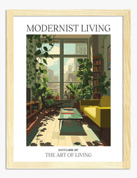
Modernist Living — The Art of Living Art Print
Sale price From £11.95£19.95 -

Rainbow Painted Leaves Art Print
Sale price From £11.95£19.95 -

Modernist Living — The Art of Living Art Print
Sale price From £11.95£19.95 -

Modernist Living Colour Pop Room Art Print
Sale price From £11.95£19.95 -

Modernist Living — The Art of Living Art Print
Sale price From £11.95£19.95 -

Potion Garden Maximalist Bloom Canvas Print
Sale price From £49.95£74.95 -

Pink Room with Plants Art Print
Sale price From £11.95£19.95 -
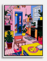
Pink Kitchen Maximalist Interior Canvas Print
Sale price From £49.95£74.95 -

Modernist Living — The Art of Living Art Print
Sale price From £11.95£19.95 -

Bold Modern Floral Burst Art Print
Sale price From £11.95£19.95 -
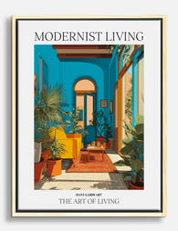
Modernist Living - The Art of Living Canvas Print
Sale price From £49.95£74.95 -

Modernist Living — The Art of Living Art Print
Sale price From £11.95£19.95


More from The Frame

Why Botanical Art Works Better in Small Living ...
Botanical art does something strange to small rooms: it softens them without crowding them. In large rooms, it often gets lost, floating on a wall that needs more weight. This...

Blending Vintage and Modern Décor? Start With Y...
Your furniture is already a mix. A mid-century sideboard here, a modern bouclé chair there, maybe your grandmother's wingback holding court in the corner. The walls are where you make...

7 Steps to Style a Woodland Gallery Wall with F...
A fox print is one of the most forgiving anchors you can build a gallery wall around. The silhouette is distinctive, the colour palette (rust, cream, charcoal, forest green) plays...