


 Order today for delivery by
The Best Art Prints for Every Room in Your Home (With Specific Picks)
Specific art recommendations for every room in your house, grounded in real design principles rather than vague inspiration.


Most room-by-room guides tell you to "choose what you love" and call it a day. That's not advice, that's a shrug. This guide gives you specific styles, subjects, sizes, and placement rules for every room, with the design reasoning behind each pick.
Living room: making a statement without trying too hard
Your living room is where you'll spend the most time looking at the art, so it needs to earn its space. The biggest mistake we see here is going too small. A pair of A4 prints floating above a three-seater sofa looks apologetic, not curated.
Apply the two-thirds rule: your art (or arrangement of pieces) should span roughly two-thirds the width of the furniture below it. Above a 220cm sofa, that means your art should measure around 140-150cm wide total. A single 70x100cm print works. Two 50x70cm prints with a 5cm gap between them also works. One 40x50cm print alone does not.
Hang the centre of the piece 145-150cm from the floor, or roughly 15-25cm above the sofa back. This keeps the art visually connected to the furniture rather than drifting toward the ceiling.
For subject matter, the best art prints for living room walls tend to be pieces with enough visual weight to anchor the room but enough restraint to not fight with everything else. Large-scale abstract art prints with a limited palette work beautifully here. So do moody landscapes with depth and atmosphere, the kind that pull your eye into the room.
Avoid anything too literal or busy. A hyper-detailed cityscape above the sofa will exhaust you by week three.

Bedroom: calming pieces that set the right tone
Your bedroom is the last thing you see at night and the first thing you see in the morning. The art needs to earn both of those moments.
The design principle here is low visual contrast. High-contrast, high-saturation pieces activate the brain. Low-contrast, tonal pieces calm it. That's why soft abstract washes, misty landscapes, hazy botanical studies, and quiet photography all work in bedrooms. Vivid pop art, graphic typography, and anything with sharp lines or confrontational subjects do not.
For sizing above the bed, apply the two-thirds rule to the headboard or bed width. Above a king-size bed (150cm wide), aim for roughly 100-120cm of art. A single large print centred above the bed is cleanest. A diptych (two matching or complementary pieces) also works and feels intentional.
Hang the bottom edge 15-20cm above the headboard. Any higher and it floats. Any lower and it looks cramped.
Good art print ideas for bedroom walls include soft botanical art prints with muted greens and creams, abstract pieces in sage, dusty pink, oatmeal, or warm grey, and atmospheric photography art prints featuring fog, water, or dawn light.
One honest trade-off: if you love bold art, your bedroom probably isn't the room for it. Save your statement pieces for the living room or home office and let the bedroom breathe.
Kitchen and dining area: colour, warmth, and conversation starters
Kitchens and dining rooms are social spaces, and the art should reflect that. This is where you can afford to be a bit louder.
In the kitchen, humidity and temperature swings are real. Canvas prints handle this better than framed prints because there's no glass or acrylic to fog up and no paper mount to absorb moisture. If you want a framed print in a kitchen, keep it well away from the hob and sink.
Subject-wise, kitchens love food-adjacent subjects without being too literal. Think vintage-style still lifes, abstract compositions in warm spice tones (saffron, terracotta, deep ochre), or botanical prints of herbs, citrus, or figs. Avoid photographic close-ups of actual food. They date fast and start looking like restaurant decor.
In dining rooms, the art is doing double duty: giving guests something to look at and giving conversations somewhere to drift. Modern art prints with intriguing compositions work well here. So do large single statement pieces that hold their own above a dining table.
Sizing above a dining sideboard follows the same two-thirds rule. Above the dining table itself, if your table sits beneath a pendant light, don't hang art directly above the table. Put it on the adjacent wall at eye level when seated, which is roughly 120-130cm from the floor.

Home office: prints that help you focus (not distract)
Home office art is where most people get it wrong in both directions. Too stimulating and you can't concentrate. Too bland and the room feels like a cubicle.
The sweet spot: pieces with depth but not drama. Landscapes work exceptionally well here because the eye reads them as "distance," which gives your brain a micro-break from screen fatigue. A print of a wide horizon, a quiet forest, or a mountain range in soft morning light does more for your focus than any productivity hack.
Abstract pieces also work if they're compositionally calm. Avoid high-energy abstracts with aggressive brush strokes or clashing colours. You're trying to think, not get hyped up.
Place art in your peripheral vision rather than directly behind your screen. If it's directly in front of you, it will either distract you or you'll stop noticing it entirely. Side walls, the wall behind your chair, and the wall across the room from your desk all work.
Sizing can be more flexible here because home office walls are often broken up by shelves, filing, or windows. A single 50x70cm or 60x80cm piece on one wall usually does the job. Resist the urge to cover every surface. Negative space helps the room feel like a space for thinking.
One of our favourite moves: a single large landscape above a low bookshelf or credenza. It gives the room focus and makes the whole setup feel intentional rather than purely functional.
Hallways and landings: making the most of narrow walls
Hallways are the most under-used walls in most homes. They're also where you can take creative risks because no one lingers long enough to get tired of a bold choice.
Narrow walls want vertical art. A tall portrait-orientation print (50x70cm or 70x100cm in portrait) elongates the space and draws the eye forward. Avoid wide landscape-format prints in narrow hallways. They fight the room's natural proportions.
Gallery walls work brilliantly in hallways and up staircases because you have a long surface to fill and viewers move past rather than sitting with any single piece. For a staircase gallery wall, follow the line of the stairs rather than hanging everything at the same height. The bottom edge of each frame should sit roughly 145cm above the step directly below it.
For straight hallways, hang the centre of each piece at 145-155cm from the floor. If you're doing a series of three or more prints, keep the gap between frames tight (4-6cm) so they read as a group.
Photography art prints excel in hallways. Black and white photography in particular looks sophisticated here and doesn't compete with whatever colour scheme is going on in the adjoining rooms.
Budget tip: hallways are a reasonable place to go slightly smaller or more affordable. You don't need your most expensive piece in a space people walk through in four seconds.

Bathroom: yes, you can hang art in here
The idea that bathrooms can't have art is nonsense. The idea that you can hang anything in a bathroom without thinking about moisture is also nonsense. The truth sits in the middle.
In a bathroom with good ventilation (extractor fan, window that actually opens), framed prints with UV-protective acrylic glazing hold up well. The acrylic doesn't fog or crack the way glass can, and quality framing prevents the paper backing from absorbing moisture. Canvas also works because there's no glazing to fog in the first place.
Keep art away from direct water exposure. The wall opposite the shower is fine. The wall directly beside the bath, less so.
Subject-wise, bathrooms suit the same calm palette as bedrooms. Botanical prints in soft greens, abstract watercolours in dusty blues and pale pinks, and minimalist photography all work. Avoid anything heavily textured or overly ornate. Bathrooms benefit from visual simplicity.
Sizing is usually smaller here because the walls are smaller. A single 40x50cm or 50x70cm print above the toilet or beside the mirror is plenty. Don't try to force a gallery wall into a small bathroom. One considered piece beats five crammed ones.
How to keep a cohesive feel across rooms without being matchy
This is the question nobody answers properly. You don't want your home to look like a hotel chain, but you also don't want each room to feel like it belongs to a different person.
The trick is to pick a thread and run it through the whole house. That thread can be any one of these:
A consistent frame style. If every print in your home sits in a natural oak frame or a slim black frame, the art itself can vary wildly in style and the house still reads as cohesive. This is the easiest unifier.
A consistent palette. You don't need every room to use the same three colours. You need a shared undertone. If your living room art is warm (terracotta, mustard, cream) and your bedroom art is also warm (dusty pink, sage, oatmeal), they'll feel related even though the specific colours differ.
A consistent treatment or medium. All photography. All abstract. All botanical. Pick one lane and the house feels curated.
Avoid the 60-30-10 trap applied too literally. The rule (60% dominant colour, 30% secondary, 10% accent) is useful inside a single room, but trying to force it across your whole house makes everything feel over-designed.
One more thing: resist matching art to furniture or wall colour exactly. Art that picks up a single accent tone from the room (not the dominant colour) looks far more sophisticated than art that matches the sofa. Complementary beats identical every time.
Our top picks by room right now
Living room: A large (70x100cm) abstract print with soft, overlapping colour fields in muted tones. Framed in oak for warmth, or in black for a sharper, more contemporary look. Hung alone above the sofa.
Bedroom: A tonal landscape or soft botanical in a 50x70cm or 60x80cm size, framed in a slim natural wood frame. Hung centred above the headboard, bottom edge 15-20cm above the headboard top.
Kitchen: A canvas print of a loose botanical study or warm-toned abstract, sized 40x60cm or 50x70cm. Canvas handles the humidity better than framed, and the matte finish won't catch glare from overhead lighting.
Dining room: A single statement piece on the main wall, 70x100cm or larger. A moody landscape or a bold abstract both work. Keep the frame simple so the art does the talking.
Home office: A calming horizon landscape or quiet abstract, 50x70cm, hung on the wall adjacent to your desk rather than directly behind your screen.
Hallway: Three vertical prints in matching slim frames, hung in a row with 5cm gaps, centre height 150cm from the floor. Black and white photography works especially well.
Bathroom: One 40x50cm botanical or soft abstract in a framed print with acrylic glazing, hung well away from the shower.

Buy for the room, not just for the print. A piece that looked incredible on a gallery wall at a friend's house might fall flat above your sofa, and vice versa. Start with the space, think about scale and tone first, and the right art will reveal itself much faster than if you shop by browsing.

Fab products featured in this blog
-

Modernist Living - The Art of Living Art Print
Sale price From £11.95£19.95 -

Modernist Living: The Art of Living Art Print
Sale price From £11.95£19.95 -

Modernist Living — Sunlit Room Poster Art Print
Sale price From £11.95£19.95 -

Modernist Living: The Art of Living Canvas Print
Sale price From £49.95£74.95 -
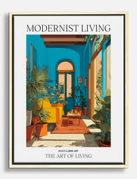
Modernist Living - The Art of Living Canvas Print
Sale price From £49.95£74.95 -
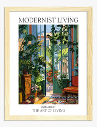
Modernist Living — The Art of Living Art Print
Sale price From £11.95£19.95 -

Modernist Living — The Art of Living Art Print
Sale price From £11.95£19.95 -
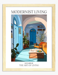
Modernist Living — The Art of Living Art Print
Sale price From £11.95£19.95 -

Modernist Living — The Art of Living Art Print
Sale price From £11.95£19.95 -

Modernist Living, Miami Interior Poster Art Print
Sale price From £11.95£19.95 -

Modernist Living - The Art of Living Art Print
Sale price From £11.95£19.95 -

Modernist Living — The Art of Living Canvas Print
Sale price From £49.95£74.95 -

Modernist Living — The Art of Living Art Print
Sale price From £11.95£19.95 -

Modernist Living — Sunlit Room Poster Canvas Print
Sale price From £49.95£74.95 -

Modernist Living - The Art of Living Art Print
Sale price From £11.95£19.95 -

Modernist Living Sunlit Room Art Print
Sale price From £11.95£19.95 -

Modernist Living — The Art of Living Canvas Print
Sale price From £49.95£74.95 -

Modernist Living — The Art of Living Art Print
Sale price From £11.95£19.95 -

Modernist Living — The Art of Living Canvas Print
Sale price From £49.95£74.95 -

Modernist Living — The Art of Living Canvas Print
Sale price From £49.95£74.95


More from The Frame

Transform Your Bedroom with Botanical Art: A Cu...
Botanical prints are the easiest art to buy and the hardest to style. One print looks considered; four looks like a garden centre gift shop. This guide is about restraint:...

Why Botanical Art Works Better in Small Living ...
Botanical art does something strange to small rooms: it softens them without crowding them. In large rooms, it often gets lost, floating on a wall that needs more weight. This...

Blending Vintage and Modern Décor? Start With Y...
Your furniture is already a mix. A mid-century sideboard here, a modern bouclé chair there, maybe your grandmother's wingback holding court in the corner. The walls are where you make...