The Best Matisse Prints for a Modern Living Room (and How to Style Them)
A curated guide to choosing the right Matisse print for your space, with three complete styling schemes to copy.

Matisse prints are everywhere right now, and for good reason. His cut-outs, botanicals and figure studies have a rare ability to feel both century-old and freshly modern. This guide helps you pick the right Matisse subject for your specific living room, rather than scrolling through hundreds of similar-looking prints hoping something clicks.
Why Matisse remains the go-to for modern living rooms
Modern living rooms tend to share a few traits: clean architecture, restrained palettes, a lot of straight lines. Matisse's work is the perfect antidote. His organic shapes, hand-cut edges and confident colour blocks soften hard angles without cluttering a space.
There's also a practical reason designers reach for him so often. Matisse's compositions read clearly from across a room, which matters when your art has to hold its own next to a three-metre sofa or a feature fireplace. A small etching can disappear in a modern open-plan space. A Matisse cut-out almost never does.
His palette is the other quiet superpower. Warm corals, sage greens, deep navies and ochres slot neatly into the colour schemes most modern homes already use, so you can introduce a Matisse print without rebuilding your whole lounge around it. Browse our full edit of Matisse-style art for the living room to see the range of palettes available.

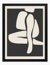
Cut-out style prints: the bold, graphic option
Cut-outs are the Matisse works most people picture first: flat shapes of pure colour, often blue, green or coral, arranged with the looseness of paper scissored by hand. They're the strongest graphic choice in his catalogue, and they reward scale.
If your living room leans minimalist Scandinavian, Japandi, or has a lot of white walls and pale wood, a single large cut-out print is the most efficient way to add personality. One 70x100cm framed print above the sofa can do the work of three smaller pieces, and it won't fight with your furniture for attention.
When cut-outs work best
Cut-outs suit rooms with restrained palettes and clean architecture. They are graphic enough to anchor a wall on their own, which is why they are the easiest "starter Matisse" if you have never bought art before. We particularly like cobalt or navy cut-outs in rooms with cool, north-facing light, and coral or terracotta cut-outs in warmer, south-facing spaces.
Where they struggle
In maximalist rooms with patterned wallpaper, heavy textiles and lots of competing colour, cut-outs can feel flat. They need breathing room. If your walls are already busy, look at botanicals or figure studies instead.
For more graphic options that pair well with cut-outs, our abstract art prints collection has plenty to layer in.
Matisse botanical prints: organic shapes that soften minimalist spaces
The botanical works (leaves, fronds, vine-like line drawings) are quieter than the cut-outs but no less useful. They tend to be more linear, often rendered in single colours against a neutral ground, and they bring movement to a wall without shouting.
These are the prints we recommend for anyone who finds cut-outs a bit too bold. They give you the Matisse signature (loose, confident, organic) without committing to a saturated block of colour. In a sage-green or off-white living room, a botanical line drawing can feel almost architectural.
Pairing botanicals with modern furniture
Botanicals look exceptional above mid-century furniture. The curve of a walnut sideboard or the tapered legs of a 1950s armchair pick up the organic energy of the line work. They also balance very linear pieces, like a boxy modular sofa, by introducing curves the room would otherwise lack.
If you want to build a small set, two botanicals of the same palette side by side (say, two 50x70cm prints spaced 8 to 10cm apart) create a strong horizontal anchor above a console or low sideboard. Our botanical art prints collection has a good range if you want to mix Matisse-style line work with other organic pieces.
Abstract figure prints: adding warmth and movement
Figure studies are where Matisse's hand shows most clearly. Single-line nudes, abstracted faces, dancers caught mid-movement. They're warmer than cut-outs and more characterful than botanicals, and they're the right call when you want your art to feel like a person is in the room.
These prints suit living rooms that already have a bit of personality: vintage rugs, mismatched cushions, a record player in the corner. They reward proximity, so they work well at eye level next to a reading chair, or as part of a gallery wall where you can take them in up close.
Sizing figure studies
We'd generally go smaller with figure studies than with cut-outs. A 40x50cm or 50x70cm framed print invites you to lean in, where a giant figure study can feel imposing in a domestic space. If you want scale, pair two or three medium prints rather than going for one oversized piece.

Mixing figure studies with other subjects
Figure studies are the most versatile Matisse subject for mixing. They sit comfortably alongside botanicals (organic energy on both sides) and even with cut-outs if you keep the palette consistent. If you're planning a gallery wall, anchor it with a figure study and build out from there.
How to choose between a single large print and a curated set
This is the decision most people get stuck on, so here's our honest take.
Choose a single large print (70x100cm or larger) if you have one obvious wall (above a sofa, above a fireplace, behind a dining table) and a relatively simple room. One print is calmer, easier to live with, and harder to get wrong. We'd put a single statement piece in nine out of ten modern living rooms.
Choose a curated set (two to four prints) if you have an awkward wall, a long stretch of empty space, or a room with enough furniture to warrant a gallery feel. Sets give you flexibility, but they also need more thought: spacing, alignment, and palette all matter.
Sizing above a sofa
The most reliable rule is two-thirds. Your art (whether one print or a grouping) should span roughly two-thirds the width of the sofa beneath it. For a standard three-seater of around 220cm, that's roughly 140 to 160cm of total art width. A single 70x100cm landscape print, or two 50x70cm portrait prints with a 10cm gap, both hit the mark.
Hang the centre of the artwork around 145 to 150cm from the floor, or about 20 to 25cm above the back of the sofa. Closer than that and the art feels squashed. Further and it floats off into nowhere.
Spacing multiple prints
For pairs and trios, keep the gap between frames consistent: 5cm for a tight, formal look, 8 to 10cm for something more relaxed. Match the frame finish across all prints unless you're deliberately building an eclectic gallery wall. Mismatched frames need confidence to pull off.
Framed vs. unframed: the right finish for a modern living room
Framing is the most under-discussed styling decision in art. The same print can read minimalist, traditional or playful depending on what surrounds it.
Black frames
Black frames are graphic and contemporary. They suit cut-outs especially well, sharpening the edges of the shapes and giving the print a confident, gallery-like feel. Use black frames in rooms with strong contrast already (white walls, dark furniture, monochrome accents). Avoid them in soft, tonal rooms where they'll feel heavy.
Natural wood frames
Natural oak or ash frames are the safest, most versatile choice for modern living rooms. They warm up cool palettes, complement Scandinavian and Japandi interiors, and let the print speak rather than the frame. We'd default to natural wood for botanicals and figure studies, and for any room with a lot of pale timber or rattan.
White frames
White frames disappear into white walls, which can be exactly what you want if the print is the hero and the architecture is minimal. They suit cut-outs in very pared-back rooms and work brilliantly in galleries of mixed art where you want visual cohesion across different subjects.
Framed prints vs. canvas
Framed prints feel more polished and finished, which suits formal living rooms and anywhere you want the art to read as a deliberate statement. Our framed prints arrive with the print already fitted to the frame in one box, with UV-protective acrylic glaze rather than glass (lighter, safer, no glare in direct sunlight) and fixtures already attached. The shipping issue that plagues most online frame purchases (warped frames, prints separate from frames, bubbling) is something we've engineered out, which matters when you're spending real money on a piece you want to live with.
Canvas suits rooms where you want a softer, more relaxed finish. The matte poly-cotton surface absorbs light rather than reflecting it, which works beautifully for cut-outs in particular: the flat colour reads almost like a painting. Canvas is also lighter, so it's the smarter choice for high-humidity spaces or walls where you can't fix into a stud. Our canvas prints go up to 100x150cm if you want real scale.

Putting it together: three modern living room schemes with Matisse art
Here are three complete schemes you can copy or adapt, each built around a different Matisse subject.
Scheme one: Minimalist Scandinavian with blue cut-outs
The room: White walls, pale oak floors, a low linen sofa in oatmeal, a boucle armchair, a single rounded coffee table.
The art: One 70x100cm cobalt or navy Matisse cut-out, framed in natural oak, centred above the sofa. Hang it 22cm above the sofa back.
The supporting cast: Pull the cut-out's blue into one cushion and a ceramic vase. Keep everything else neutral. The art is the only saturated colour in the room, which is what makes it work.
Why it works: The cut-out gives a calm, almost architectural room a single point of energy. The oak frame stops it feeling cold, and the restraint elsewhere lets the print do all the talking.
Scheme two: Warm mid-century with botanical prints
The room: Sage or olive walls, a walnut sideboard, a tan leather sofa, a vintage Persian rug, brass lighting.
The art: A pair of 50x70cm Matisse botanical line drawings in coral and ochre, framed in natural oak with a generous white mount. Hang side by side above the sideboard with a 10cm gap.
The supporting cast: Echo the coral in a throw or lampshade, and keep the ochre as a single accent (a candle, a book stack). Mid-century furniture provides the structure; the botanicals provide the softness.
Why it works: The line work picks up the organic curves of mid-century design without competing with the rich textures already in the room. Two prints, rather than one, give the wall the horizontal weight a sideboard wants.
Scheme three: Maximalist eclectic with mixed Matisse subjects
The room: A patterned wallpaper or a deep painted wall (think aubergine, forest green, or terracotta), a velvet sofa, layered rugs, a gallery of objects on open shelving.
The art: A gallery wall of four to six prints: one large cut-out, two figure studies, one botanical, all in a shared palette of warm reds, ochres and cream. Mix framed and unframed. Use a consistent white mount but vary the frame: natural oak for botanicals, black for the cut-out, thin walnut for figure studies.
The supporting cast: Repeat each art colour at least once in textiles. Don't try to match. The point of a maximalist scheme is loose tonal connection, not precision.
Why it works: Maximalist rooms need art that can hold its own against pattern and colour, and Matisse's bold forms do exactly that. Mixing subjects keeps the wall interesting; sharing a palette stops it descending into chaos.

A few mistakes to avoid
The most common error is going too small. A 30x40cm print floating above a three-seater sofa looks lost. When in doubt, go one size larger than you instinctively want.
The second is over-matching. If your cushion is exactly the same coral as the print, the room feels flat. Aim for tonal connection (similar warmth, related family) rather than identical colour.
The third is hanging Matisse work in direct, all-day sunlight without UV protection. Pigments fade, and even museum-quality inks benefit from a UV-protective acrylic glaze if the print sits in a south-facing window. This is one reason we glaze our framed prints by default.
Finally, don't feel obligated to buy a full set on day one. Start with one strong piece for the wall that bothers you most, live with it for a few weeks, then build outwards. Browse our modern art prints for pieces that layer well alongside Matisse over time.
Pick the subject that matches your room's personality first, then size up rather than down, then frame for the mood you want. Get those three decisions right and the rest of the styling tends to fall into place.

Fab products featured in this blog
-

Matisse Inspired Papiers Decoupes Brown Abstract Art Print
Translation missing: en.products.product.sale_price From £11.95£19.95 -

Matisse-Inspired Cutouts Papiers Decoupes Art Print
Translation missing: en.products.product.sale_price From £11.95£19.95 -

Papiers Decoupes Matisse Inspired Cutout Art Print
Translation missing: en.products.product.sale_price From £11.95£19.95 -
Matisse-Inspired Elegance Art Print
Translation missing: en.products.product.sale_price From £11.95£19.95 -

Matisse-Inspired Cutouts Canvas Print
Translation missing: en.products.product.sale_price From £44.95£74.95 -

Matisse-Inspired Elegance Canvas Print
Translation missing: en.products.product.sale_price From £44.95£74.95 -

Matisse Blue Botanical Art Print
Translation missing: en.products.product.sale_price From £11.95£19.95 -
Matisse Inspired Sunroom Art Print
Translation missing: en.products.product.sale_price From £11.95£19.95 -

Matisse Muse Organic Shapes Art Print
Translation missing: en.products.product.sale_price From £11.95£19.95 -

Matisse-Inspired Elegance Art Print
Translation missing: en.products.product.sale_price From £11.95£19.95 -

Matisse-Inspired Cutouts Canvas Print
Translation missing: en.products.product.sale_price From £44.95£74.95 -
Matisse-Inspired Sunroom Art Print
Translation missing: en.products.product.sale_price From £11.95£19.95 -

Landscape at Collioure by Henri Matisse Art Print
Translation missing: en.products.product.sale_price From £11.95£19.95 -

Matisse Cut-Outs Joy Art Print
Translation missing: en.products.product.sale_price From £11.95£19.95 -

Matisse Red Cut-Out Canvas Print
Translation missing: en.products.product.sale_price From £55.99£79.99 -

Matisse-Style Elegance Art Print
Translation missing: en.products.product.sale_price From £11.95£19.95 -

Matisse Blue Botanical Cutout Canvas Print
Translation missing: en.products.product.sale_price From £44.95£74.95 -

Matisse Paper Cut Elegance Canvas Print
Translation missing: en.products.product.sale_price From £44.95£74.95


More from The Frame

Two Medium Prints or One Big Print? How to Decide
You've measured your wall. You've found prints you love. Now you're stuck between buying one big statement piece or two medium prints side by side. This guide gives you a...

Going Bigger Than You Think: Why Most People Un...
Walk into almost any home and you'll find it: a 30x40cm print floating awkwardly above a three-seater sofa, marooned in a sea of empty wall. The owner spent weeks choosing...

How Big Is A1, A2, A3 in Real Life?
A1, A2 and A3 are the three most common sizes for wall art, posters and prints in the UK and Europe. But the actual dimensions only tell you so much....