Boho Prints in Every Room or Just the Bedroom? A Decorating Guide
A practical room-by-room playbook for placing bohemian prints, with the sizing maths and frame choices that stop them looking cheap.

Boho prints have a reputation for living almost exclusively above beds, which is a waste. They work in most rooms if you size them properly and pick the right frame. This guide walks you through every wall worth decorating, plus the handful of places boho genuinely doesn't belong.
Why bohemian prints work in almost every room (and the one place they don't)
Bohemian art tends to share three qualities: earthy colour palettes (terracotta, ochre, sage, rust, cream), organic shapes (arches, moons, botanicals, abstract female forms), and a hand-made feel even when printed. That combination is forgiving. It softens hard modern interiors, adds warmth to cold Scandi ones, and gives maximalist rooms a unifying thread.
Where it doesn't work: formal dining rooms with traditional joinery, corporate or home offices that need to read as serious, and ultra-minimalist spaces where any decorative print feels like a violation of the brief. If your room is doing one thing very deliberately (Victorian formality, Bauhaus austerity, clinical minimalism), boho will feel like an apology. Everywhere else, it earns its place.
The rest of this guide assumes you have a specific wall in mind. Grab a tape measure.
Living room: sizing and placement above the sofa or fireplace
The living room is where most people get sizing wrong. The professional rule is that art above a sofa should span 50 to 75 percent of the sofa's width. Doing the actual maths:
- Two-seater (160cm wide): your art should span 80 to 120cm
- Three-seater (210cm wide): your art should span 105 to 158cm
- Large four-seater (240cm wide): your art should span 120 to 180cm
For a single statement piece above a three-seater, a 100x150cm canvas in portrait or a 70x100cm framed print in landscape both land in the right zone. Go smaller and the wall swallows the art. Go wider than the sofa and the proportions collapse.
Hang the bottom edge 15 to 25cm above the sofa back. Any higher and the art floats; any lower and it looks crammed. For boho specifically, lean towards larger sizes. A small print on a big wall reads as timid, and timid is the opposite of bohemian.
Above a fireplace, match the width to the mantel or the firebox opening, whichever feels more visually dominant. A single piece almost always beats a gallery wall here. Fireplaces are already architectural features, so they need a partner, not a committee.

Bedroom: creating warmth with earthy boho prints above the bed
The bedroom is boho's spiritual home, and the sizing rules shift slightly. Above a bed, art should span roughly two-thirds of the headboard width.
- Double bed (135cm): aim for art around 90 to 100cm wide
- King bed (150cm): aim for 100 to 120cm wide
- Super king (180cm): aim for 120 to 150cm wide
For a single piece above a king bed, a 70x100cm framed print in portrait or a 100x70cm in landscape both work. If you want a pair, two 50x70cm prints hung 5 to 10cm apart will read as one composition.
Colour matters more in bedrooms than anywhere else because you wake up looking at it. Stick to warm, low-contrast palettes: terracotta on cream, sage on oat, rust on linen. Save the high-contrast graphic boho prints for the living room. You can browse a curated edit at bedroom wall art if you want a starting point.
Hang the bottom edge 20 to 30cm above the headboard. If you have no headboard, treat the top of the mattress plus 60cm as your bottom edge.
Hallway and entryway: first impressions with a single statement print
Hallways trick people into thinking small. A narrow hallway needs vertical art that pulls the eye up, not a row of postcard-sized prints that make the space feel busier.
For an entryway with a console table, a single portrait print sized at 60 to 75 percent of the console width works best. So a 100cm console wants a print roughly 60 to 75cm wide, which lands neatly at 50x70cm or 70x100cm framed.
For a long hallway, resist the gallery wall instinct unless you're committed to making it look intentional. Three identically framed prints of the same size, evenly spaced, will always beat a chaotic mix. Botanical prints work particularly well here because they create rhythm without competing for attention. Have a look at botanical art prints for options that hold up at repeat scale.
One practical note: if your hallway sees pushchairs, scooters, or dogs that shake water off after walks, hang the bottom edge of any print at least 100cm off the floor. Canvas survives knocks better than framed glass, but acrylic glazing (which our framed prints use instead of glass) won't shatter if something thuds into it.

Bathroom: yes, you can hang art in a bathroom (here's how)
Bathrooms are the most underused room for art, mostly because people assume moisture will ruin everything. It won't, if you're sensible.
Two rules. First, don't hang art in the direct splash zone of a shower or above a freestanding bath that gets heavy use. Second, pick a wall that gets ventilated. Behind the toilet, opposite the shower, or above a towel rail all work. Above the basin works only if your splashback is decent.
Canvas prints actually handle bathroom humidity better than you'd think because there's no glass to fog and no paper backing to wrinkle. A hand-stretched canvas on a solid wood frame will sit happily in a well-ventilated bathroom for years. Framed prints work too, particularly with acrylic glazing rather than glass, which doesn't condense the same way.
Bathrooms are also the one room where a single bold piece beats anything else. You've got tile, mirror, sanitaryware, and probably a window all competing visually. One confident 50x70cm print in a black or natural wood frame will anchor the room. A gallery wall will make it feel like a bric-a-brac shop.
Abstract boho prints suit bathrooms particularly well because the shapes echo the curves of taps, basins, and mirrors. Abstract art prints in muted earth tones work better than figurative pieces here.
Mixing boho with modern, Scandi, and maximalist interiors
Boho rarely exists in a pure form in real homes. Most people are mixing it with whatever furniture they already own. Here's how to make it work with the three most common base styles.
Boho with modern (clean lines, neutral palette, minimal clutter)
Modern interiors are too cold on their own, which is exactly the problem boho solves. Stick to one or two boho prints per room and let them do the warming work. Pair a 100x150cm canvas of an earthy desert landscape with an otherwise sleek grey sofa and you've got a room. Add five more boho elements and you've got chaos. The contrast is the point.
Boho with Scandi (light wood, white walls, functional design)
This is the easiest pairing. Scandi and boho share a love of natural materials and muted palettes. The trick is restraint with the boho colours: lean towards oat, cream, sage, and soft terracotta rather than deep rust and burnt orange, which fight Scandi's lightness. Frame finishes should stay light too (more on that next).
Boho with maximalist (pattern, colour, layered objects)
Boho thrives in maximalist rooms but needs anchoring. Pick one wall as the "art wall" with a coordinated set of three to five prints in a consistent colour palette, and let the rest of the room do its own thing. Without that anchor, the art disappears into the visual noise.
Choosing frame finishes to match your space
Frame finish is where most boho wall art goes wrong. The wrong frame can make a beautiful print look like petrol-station decor.
- Natural oak: the safest choice. Works with Scandi, modern, and most boho-leaning rooms. Adds warmth without fighting the print.
- Black: sharpens up softer boho prints and grounds them in modern or industrial spaces. Use it when your room needs more contrast, not less.
- White: best for ultra-light interiors with white walls. Can look insubstantial against darker walls or rich prints.
- Walnut or dark wood: works in older homes with period features, or rooms with darker furniture. Reads as more traditional and a touch more grown-up.
Avoid distressed, "rustic," or whitewashed frames that try to look reclaimed. They date quickly and they tend to fight whatever's in the print. A clean, solid wood frame (we use FSC-certified solid wood, no MDF or veneer) ages far better.
If you're hanging a gallery wall, match all the frames to one finish. Mixed frame finishes almost always look unintentional unless you're extremely confident with composition.

Common mistakes that make boho wall art look cheap (and how to avoid them)
Boho is forgiving until it isn't. These are the mistakes that consistently push it from "warm and curated" to "first-flat clearance shelf."
Going too small
A 30x40cm print on a wall above a three-seater sofa looks lost. If you're nervous about scale, do the phone test: open your camera, stand where you'd normally view the wall from, and frame the shot. Imagine the print at the size you're considering. If it looks small on the phone screen, it'll look smaller in real life.
Buying low-resolution prints
Boho prints often feature soft textures, washes, and gradients. Cheap printing turns those into pixelated mush. Look for giclée printing on thick matte paper, which holds detail and doesn't glare under lamps. This matters more for boho than for graphic styles because the appeal is partly tactile.
Frames shipped separately
The single biggest source of "this looks cheap" complaints in wall art is poor framing: warped frames, prints that aren't sitting flush, bubbling under glass, and the special hell of buying a frame separately and trying to fit it yourself. If you're buying framed, buy from somewhere that ships the print already fitted in the frame, ready to hang, in one box.
Cluttering the wall
There's a line between "eclectic gallery wall" and "I couldn't decide." The line is roughly seven pieces. Beyond that, you need a strict palette or a tight grid to hold it together. If you can't articulate why each piece is there, edit one out.
Mismatched undertones
Boho palettes split into warm (terracotta, rust, ochre, mustard) and cool (sage, eucalyptus, dusty blue, soft grey). Mixing across the divide without a plan looks accidental. Pick a side per room, or use cream and oat as bridge colours.
Ignoring what you already own
Before buying anything new, audit what's already on your walls and shelves. If you've got three sage green prints and a mustard cushion, your next print needs to bridge those, not introduce a fourth colour story. Most boho rooms get cluttered because owners keep buying pieces they love individually without checking whether they love them together. A good edit of bohemian art prints starts with knowing your existing palette.
A final word on commitment
The best boho rooms look like they evolved, not like they were ordered in one click. Buy your hero piece first, live with it for a few weeks, and let the gaps tell you what's missing. Rotate one or two pieces seasonally if you want a refresh without rebuilding the room. The wall is allowed to change. Just make sure every piece on it is earning its place.


Fab products featured in this blog
-

Boho Botanical Haven Art Print
Translation missing: en.products.product.sale_price From £11.95£19.95 -

Boho Botanical Harmony Art Print
Translation missing: en.products.product.sale_price From £11.95£19.95 -

Sun & Moon Boho Harmony Art Print
Translation missing: en.products.product.sale_price From £11.95£19.95 -

Bold Boho Geometry Canvas Print
Translation missing: en.products.product.sale_price From £44.95£74.95 -

Modern Boho Balance Art Print
Translation missing: en.products.product.sale_price From £11.95£19.95 -

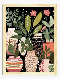
Boho Botanical Vases Art Print
Translation missing: en.products.product.sale_price From £11.95£19.95 -

Boho Dots & Waves Art Print
Translation missing: en.products.product.sale_price From £11.95£19.95 -
Modern Boho Blue Blossom Art Print
Translation missing: en.products.product.sale_price From £11.95£19.95 -

Boho Botanical Harmony Art Print
Translation missing: en.products.product.sale_price From £11.95£19.95 -

Boho Botanical Vases Canvas Print
Translation missing: en.products.product.sale_price From £44.95£74.95 -

Boho Cat & Blue Accents Canvas Print
Translation missing: en.products.product.sale_price From £44.95£74.95 -
Modern Boho Blossom Art Print
Translation missing: en.products.product.sale_price From £11.95£19.95 -
Boho Botanical Vases Art Print
Translation missing: en.products.product.sale_price From £11.95£19.95 -

Botanical Boho Vases Canvas Print
Translation missing: en.products.product.sale_price From £44.95£74.95 -

Boho Monochrome Lines Canvas Print
Translation missing: en.products.product.sale_price From £44.95£74.95 -

Boho Curves Collective Art Print
Translation missing: en.products.product.sale_price From £11.95£19.95 -

Cozy Minimalist Bedscape Art Print
Translation missing: en.products.product.sale_price From £11.95£19.95 -

Boho Botanical Blooms Art Print
Translation missing: en.products.product.sale_price From £11.95£19.95 -

Boho Cat & Blue Vase Art Print
Translation missing: en.products.product.sale_price From £11.95£19.95


More from The Frame

What Art Actually Works in a Kitchen (And What ...
Most kitchen art looks like it was chosen last, in a rush, from a homewares aisle. It doesn't have to. With the right materials and a bit of restraint, your...

From Scientific Illustration to Monstera Minima...
Botanical art has quietly become one of the most enduring categories in interior design, partly because it spans roughly 500 years of visual styles. Some of it looks like it...

Tropical Pool Prints or Coastal Calm? Finding Y...
There's a version of coastal style that involves rope-wrapped vases and starfish in apothecary jars. This is not that guide. This is about using swimming pool wall art as the...