


 Order today for delivery by
Botanical Art vs Botanical Illustration: Which Style Actually Belongs on Your Wall?
One is a 300-year-old science project. The other is a graphic design statement. Here's which belongs on your wall.


Google "botanical prints" and you'll fall into a terminology rabbit hole: botanical illustration, botanical art, floral prints, plant prints, specimen sheets. The distinctions matter, but not in the way most articles pretend. What actually matters is which style suits your space, your personality, and the rest of your walls.
A quick history: why botanical illustration exists in the first place
Botanical illustration started as science, not decoration. From the 1500s through to the Victorian era, before high-quality photography existed, illustrators were hired by botanists, apothecaries and explorers to document plants with forensic accuracy. The point was identification: a doctor needed to know which fern was medicinal and which was poisonous.
That's why classic botanical illustrations look the way they do. Plain cream or ivory backgrounds. Latin binomial names handwritten underneath. Roots, seeds and cross-sections included alongside the flower. Every leaf vein deliberately rendered because a botanist on the other side of the world needed to recognise the species from the drawing alone.
The golden age ran roughly from Pierre-Joseph Redouté in the early 1800s through to the Victorian specimen books that filled every well-off household's library. These were the images you'd find in a serious herbarium, bound into leather volumes and consulted like textbooks. They were never meant to be art in the modern sense. They became art because they were beautiful by accident, which is often how the best design works.
So when someone asks what are botanical prints called in a strict sense, the answer is: it depends on their purpose. Illustrations made for scientific identification are botanical illustrations. Everything else, including the beautifully rendered flower paintings you see today, falls under the broader umbrella of botanical art.

Contemporary botanical art: beauty over science
Contemporary botanical art drops the scientific pretence entirely. There's no Latin label. No root system. No requirement that the plant be anatomically correct, in season, or even real. The goal is aesthetic: colour, composition, mood, graphic impact.
This covers a huge range. On one end you have painterly, slightly loose watercolours that still reference the botanical tradition but prioritise feeling over accuracy. On the other, you have fully graphic treatments: a monstera leaf cropped to fill the entire frame, flattened into two or three colours, rendered almost like a poster. Both are botanical. Neither is botanical illustration.
The question of are botanical illustrations still relevant comes up a lot, and the honest answer is yes, but differently. They're no longer relevant as science (we have photography and DNA sequencing for that). They're relevant as decoration, as a connection to a slower craft tradition, and as a very specific aesthetic statement about the kind of home you want to live in.
Contemporary plant art prints do something different. They tap into the same biophilic instinct, that pull towards green and growing things, but filter it through a modern graphic sensibility. One style whispers "quiet library." The other says "I have opinions about colour."
Visual comparison: what each style actually looks like on a wall
Here's the quick test to tell them apart at a glance.
Vintage botanical illustration. Cream or off-white background. Single plant centred on the page, often with its root system showing. A sense of being lifted straight from a 19th-century book, including the slight paper yellowing and sometimes a page number in the corner. Palette is restrained: natural greens, muted pinks, soft ochres. Script or serif Latin name at the bottom.
Botanical art (the middle ground). Still accurate, still clearly a specific plant, but treated as a composition rather than a record. Backgrounds may be coloured, cropped, or textured. The plant might be arranged artistically rather than scientifically. Watercolour drips, visible brushwork, sometimes gold leaf. Palette is still fairly natural but used expressively.
Contemporary botanical. Bold colour, often non-naturalistic. The leaf might be navy on terracotta, or black on sage green. Scale is dramatic: a single palm frond filling a 70x100cm sheet, cropped at the edges. Graphic shapes, flat planes of colour, sometimes abstracted to the point where you register "plant" before you register "species."
This is really what the botanical art vs plant prints question comes down to. Botanical art, in the traditional sense, is representational and considered. Plant prints, as the contemporary shorthand, are graphic and expressive. One is a study. The other is a statement.
Vintage botanical illustration in modern interiors: when it works
Vintage botanicals get a bad rap for being "grandma." They can be. They can also be some of the most sophisticated art you'll ever hang, if you place them properly.
They work beautifully in:
Traditional and maximalist interiors. Panelled walls, deep paint colours (forest green, oxblood, inky navy), antique furniture, layered textiles. A grid of six framed specimen prints above a dining table or sofa looks considered rather than fussy. The historical quality of the images rewards a historically-aware room.
Mid-century modern. The clean lines of mid-century furniture (teak sideboards, tapered legs, low profiles) actually benefit from the softness and detail of vintage botanical prints. The contrast between structured furniture and organic illustration keeps the room from feeling too austere.
Country, cottage, and farmhouse. Obvious, but worth saying. Fern prints over a reclaimed wood console. Mushroom specimen sheets in a Shaker-style kitchen. The styles were basically made for each other.
Studies, libraries, home offices. Anywhere that leans intellectual. The Latin names, the diagrammatic quality, the suggestion of patient observation. These prints add gravitas.

Where vintage botanicals struggle: ultra-minimal Scandinavian rooms where every detail reads as too much, and sleek industrial lofts where the fussiness of the detailing fights the architecture.
One practical note. If you're drawn to the vintage look but your interior leans more Scandi-minimal, look for prints where the Latin label has been removed or minimised. The scientific text is often what pushes a print into "traditional" territory. Strip it out and you're left with a clean illustration that reads much more neutrally. Our vintage art prints collection includes both, so you can pick what suits.
Bold, graphic plant prints: the case for going contemporary
Contemporary botanicals solve a specific problem: how do you get the calm, grounding effect of nature on your walls without the room looking like it belongs to someone's great-aunt?
The answer is scale and reduction. A contemporary plant print typically does two things that a vintage illustration doesn't. It crops aggressively, treating a single leaf like a landscape, which creates a graphic weight that holds a modern room. And it reduces the palette, often to two or three colours, which lets the print function almost like a block of considered colour rather than a detailed image.
This is why contemporary plant prints are the default choice for:
Scandinavian and minimalist interiors. The restraint matches. A single large monstera print in muted tones does the work of three vintage prints without the visual noise.
Industrial and contemporary spaces. Oversized is the operative word. A 100x150cm canvas with a dramatic banana leaf gives a double-height loft wall the scale it needs. Vintage prints tend to disappear in these rooms.
Rentals and transitional spaces. Contemporary botanicals are flexible. They work with changing furniture, they're easy to re-home when you move, and they don't commit you to a specific historical aesthetic.
The format matters here too. Vintage botanicals almost always want a frame, ideally in a slim black or warm wood, to reinforce the "specimen sheet" reference. Contemporary botanicals can go either way: framed for polish, or on canvas for a more relaxed, no-glass look that reads as modern rather than museum-like. Canvas also handles larger sizes gracefully, which matters when you're going for scale.
How to mix both styles without your wall looking confused
The lazy answer is "don't." The actually useful answer is: you can, but you need a unifying element. Pick one of the following and stick to it.
1. The colour bridge. Choose two or three colours that appear in both the vintage and contemporary pieces. A dusty sage, a muted terracotta, a warm cream. If every print on the wall shares the same restricted palette, the stylistic differences become interesting rather than chaotic.
2. Frame consistency. If the prints vary wildly in style, make the frames identical. Same wood, same width, same mount. The frames become the visual constant that lets your eye accept the stylistic range.
3. Deliberate contrast zones. Instead of mixing styles within a single arrangement, dedicate different walls or areas to different styles. Vintage grid above the sofa, oversized contemporary piece in the hallway. The styles coexist in the home without competing in the same sightline.
4. The scale rule. Vintage botanicals almost always work in multiples (grids of 3, 4, 6, or 9). Contemporary botanicals work as singles or pairs. If you honour this distinction, your arrangements naturally feel considered.
The most common mistake we see is treating every botanical print as interchangeable because they share subject matter. They don't. A Victorian fern illustration and a graphic palm print have as much in common as a Dickens novel and a graphic novel. Related, but not the same room.

Our favourite botanical art prints for different interior styles
Rather than list specific products, here's what we'd actually choose for different rooms and personalities.
Scandinavian living room. One oversized contemporary plant print, 70x100cm, framed in natural oak or hung as a canvas. Muted palette: sage, cream, soft black. Hung slightly lower than you think, around 145cm to the centre, so it anchors the sofa properly. Browse plant art prints for cropped, graphic treatments.
Traditional dining room. A grid of six vintage botanical illustrations, 30x40cm each, in slim black frames with generous mounts. Hung in a tight 2x3 arrangement above a sideboard. The grid reads as one considered gesture rather than six separate prints.
Modern bathroom. Humid rooms are where canvas earns its keep: no glass to steam up, no frame to warp. A single large fern or palm on canvas, mirrored-edge wrap, hung opposite the mirror where you'll see it reflected. Choose moisture-loving plants in the imagery for coherence.
Bedroom. One calming single specimen, around 50x70cm, in a warm wood frame. Something painterly rather than scientific, so the room feels restful rather than studied. Our floral art prints collection has the softer, watercolour-leaning pieces that suit this.
Kitchen. Herbs and edibles work brilliantly here. A trio of small vintage botanical illustrations (basil, rosemary, thyme, say) above open shelving, or a single bold contemporary print of a lemon branch. The food reference ties the art to the room's function.
Hallway. This is where oversized contemporary works hardest. A single statement piece at the end of a corridor turns an underused space into a focal point. Go bigger than feels sensible. Explore the full botanical art prints range if you're not sure where to start.

A quick word on quality, because it matters more with botanical prints than most other genres. These are detail-rich images. Fine veining, delicate pencil work, subtle watercolour washes. Printing matters: a cheap print flattens all of that into muddy approximation. Giclée printing on thick matte paper is what makes a botanical print feel like something worth hanging, rather than a decorative placeholder. Framing matters too: a warped frame or a print that arrives bubbling behind the glazing undoes everything the artwork is trying to do.
The decision, simplified
If your home leans historic, layered, intellectual, or richly coloured: go vintage botanical, probably in a grid, probably framed. If your home leans minimal, modern, graphic, or scale-driven: go contemporary, probably as a single oversized piece, framed or on canvas.
If you're genuinely torn, start with one contemporary statement piece in a room you spend time in, and add a small vintage grid somewhere quieter (a hallway, a stairwell) later. You'll quickly learn which style your home actually wants more of. That's a more useful answer than any flowchart.

Fab products featured in this blog
-

The Botanical House Art Print
Sale price From £11.95£19.95 -

Gardens of the World Botanical Art Print
Sale price From £11.95£19.95 -

Bold Botanical Sketch Art Print
Sale price From £11.95£19.95 -

Spring Botanical Medley Art Print
Sale price From £11.95£19.95 -

The Plants and the Flowers Art Print
Sale price From £11.95£19.95 -

The Plants and the Flowers Art Print
Sale price From £11.95£19.95 -

Royal Botanic Garden, Edinburgh Art Print
Sale price From £11.95£19.95 -

Modern Botanical Burst Art Print
Sale price From £11.95£19.95 -

The Botanical House — Heritage Botanical Art Print
Sale price From £11.95£19.95 -

The Plants and the Flowers Art Print
Sale price From £11.95£19.95 -
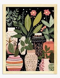
Boho Vases and House Plants Art Print
Sale price From £11.95£19.95 -

The Botanical House Art Print
Sale price From £11.95£19.95 -

Kew Gardens Botanical House Art Print
Sale price From £11.95£19.95 -

Bold Botanical Vases Art Print
Sale price From £11.95£19.95 -

Soft Botanical Flow in Green Art Print
Sale price From £11.95£19.95 -

Gardens of the World III Art Print
Sale price From £11.95£19.95 -

Organic Flow Botanical Art Print
Sale price From £11.95£19.95 -

British Botanical View Art Print
Sale price From £11.95£19.95 -

The Plants and The Flowers Art Print
Sale price From £11.95£19.95 -

The Plants and the Flowers Art Print
Sale price From £11.95£19.95


More from The Frame

Why Botanical Art Works Better in Small Living ...
Botanical art does something strange to small rooms: it softens them without crowding them. In large rooms, it often gets lost, floating on a wall that needs more weight. This...

Blending Vintage and Modern Décor? Start With Y...
Your furniture is already a mix. A mid-century sideboard here, a modern bouclé chair there, maybe your grandmother's wingback holding court in the corner. The walls are where you make...

7 Steps to Style a Woodland Gallery Wall with F...
A fox print is one of the most forgiving anchors you can build a gallery wall around. The silhouette is distinctive, the colour palette (rust, cream, charcoal, forest green) plays...