
 Order today for delivery by
 The Boutique Hotel Feel at Home: What to Copy, What to Leave
The art curation secrets boutique hotels guard closely, translated for homes that want to feel intentional, not generic.


There's a specific feeling you get walking into a good boutique hotel. The lobby art makes you stop. The bedroom print feels like it was chosen for that exact room. Nothing is accidental, and somehow it all hangs together without looking matched.
That coherence isn't luck or budget. It's a method, and it's surprisingly transferable to your own walls.
What boutique hotels actually do differently
Mainstream hotel chains buy art by the pallet. The same beige abstract hangs in 400 rooms across three continents. You've seen it. You've forgotten it the moment you checked out.
Boutique hotels work the opposite way. They commission or curate, they think about narrative, and they treat art as part of the building's identity rather than decoration applied at the end. The art tells you where you are and what kind of place this is.
The good news: you can apply the same principles at home without an art consultant, a procurement budget, or a wholesale account.

Principle one: repeat the artist, not the artwork
This is the single most useful trick boutique hotel curators use, and almost nobody talks about it in consumer contexts.
Instead of hanging unrelated pieces in different rooms, they pick two or three artists whose work shares a visual language and repeat them throughout the property. Different pieces, same hand. The result feels considered without feeling matchy.
At home, this looks like choosing one artist for both prints above your bed, then a second artist whose palette overlaps for the hallway and lounge. The repetition creates a thread that runs through the house. Guests can't quite articulate why your home feels coherent, but they feel it.
The mistake is buying one print at a time, each from a different artist, each chosen in isolation. You end up with a wall that reads as a collection of things you liked on different Tuesdays.
Browse abstract art prints and pick a handful from the same artist or visual family rather than one of each.
How many artists is too many?
Two to four across an entire home is the sweet spot. Five or more and the thread breaks. One only, and it starts to feel like a brand showroom.
Principle two: scale equals perceived luxury
Boutique hotels go big. The art above the bed is almost always larger than you'd instinctively choose for your own bedroom. There's a reason.
A 30x40cm print floating on a wall above a king bed looks apologetic. The same image at 70x100cm looks intentional. Same artwork, same wall, completely different room.
Here are the dimensions that actually work:
- Above a standard sofa (180-220cm wide): one piece at 70x100cm, or a pair at 50x70cm hung close together
- Above a king bed: one large piece at 70x100cm, or canvas at 100x150cm if you want the full hotel suite feel
- Hallway end wall: 60x80cm minimum, ideally larger. Hallways swallow small art
- Statement wall in a lounge: go to 100x150cm canvas, or hang two 70x100cm framed prints side by side
- Above a console or sideboard: match the width of the furniture roughly, so leave 5-10cm of furniture visible either side
The rule professionals use: art should fill roughly two thirds the width of the furniture below it. Most people undershoot this by 30%.
Principle three: abstract works because it doesn't fight
Walk through ten boutique hotels and you'll notice the dominance of abstract work, soft figurative pieces, and atmospheric photography. Literal subject matter is rare.
There's a practical reason. Abstract art coordinates with whatever colour scheme the room evolves into. It doesn't date the way trend-driven figurative work does. It doesn't impose a story the guest has to agree with. It sets a mood and steps back.
At home, this matters because your walls have to live with sofa changes, new cushions, repainted walls, and seasons of light. A muted abstract in dusty pink and warm grey survives all of it. A photorealistic print of a specific cityscape doesn't.
This isn't an argument against figurative work entirely. Botanical prints and quiet landscape pieces work beautifully in boutique settings when they're treated with restraint. The line to avoid is anything that reads as instructional or literal: motivational typography, generic city skylines, stock-photo florals.

Principle four: sense of place
The best boutique hotels make you feel somewhere specific. The art on the walls is part of that. A hotel in Lisbon shows you Portuguese ceramics and Atlantic light. A property in the Cotswolds shows you English landscape painting reinterpreted.
You can do this at home, and it's more interesting than it sounds. Your "sense of place" doesn't have to be where your house geographically is. It can be where you've travelled, where your family came from, or where you wish you were every February.
Practical ways to translate this:
- Pick imagery rooted in a specific landscape or culture you have a real connection to
- Use vintage and classic art prints to anchor a room in a particular era
- Choose one regional thread (Japanese woodblock influences, Scandinavian minimalism, Mediterranean coastal palettes) and let it inform two or three pieces
The goal is for someone walking in to sense that the house belongs to a person with a point of view, not someone who bought "stuff for the walls."
What NOT to copy from hotels
Some hotel art conventions are exactly the things that make chain hotels feel soulless. Avoid these religiously.
Mass-produced beige abstracts. The bland tan-and-cream "abstract" that looks like it was generated by a committee. These exist to offend nobody and inspire nobody.
Generic city skylines. Especially of a city the homeowner has no real connection to. New York skyline prints in a Manchester flat read as filler.
Inspirational typography. "Live Laugh Love" and its more design-literate cousins ("Adventure Awaits," "Home Sweet Home" in serif). Boutique hotels never do this. Neither should you.
Matching diptychs and triptychs sold as sets. The pre-packaged "three abstract canvases" sets you see in big box stores. They scream that no decision was made.
Black and white photography of European landmarks. The Eiffel Tower, Big Ben, the Brooklyn Bridge. Hotel cliché.
Anything pixelated or low resolution. A useful test: would the print look good in a guest's photo of your living room? If the answer is no, it's not boutique-caliber. Print quality is the fastest tell between considered and cheap.
The room-by-room boutique playbook
Entryway
This is your lobby. Boutique hotels invest disproportionately in lobby art because it sets expectation for the entire stay. Same logic applies at home.
Go larger than feels comfortable. One strong piece at 70x100cm framed, hung at eye level, on the wall directly facing the front door. This is the single highest-leverage piece of art in your home.
Lounge
Above the sofa is the obvious move. Less obvious: the wall opposite the sofa, where you actually see the art when you're sitting down.
Two pieces by the same artist, hung as a pair, work better than one solo piece for most rooms over 15 square metres. Frame both or float both as canvas, but don't mix.
Bedroom
Above the bed is non-negotiable for the hotel feel. Go big, go calm, and go abstract or atmospheric. This is not the room for a busy print.
Framed prints work especially well here because the frame creates a clean architectural line above the headboard. The polished finish reads as intentional, the way hotel art does.
Dining and breakfast spaces
Boutique hotel breakfast rooms tend toward lighter, warmer art. Morning light is unforgiving and cool palettes can read as cold. Choose pieces with warmth in them: ochres, soft terracottas, butter yellows, warm whites.
Hallways and corridors
The chance to repeat your second artist. Three smaller pieces (40x50cm or 50x70cm) hung at regular intervals create rhythm and pull you through the space the way a good hotel corridor does.

The colour palette move
Boutique hotels almost never use art to introduce a new colour into a room. They use it to anchor and deepen colours that are already there.
Look at your room. Identify the two or three colours that already dominate: the sofa, the rug, the wall paint. Now choose art that contains those exact tones, slightly intensified. The art becomes the place where the room's palette resolves.
This is the opposite of how most homeowners shop. The instinct is to use art as a "pop of colour," introducing something new and bright. That instinct produces rooms that feel busy and unsettled. The boutique instinct, restraint, produces rooms that feel finished.
Print quality: the difference nobody mentions
You can follow every principle above and still fall short if the physical print is mediocre. Boutique hotels know this. It's why they specify museum-grade printing and proper framing in their procurement documents.
What this actually means in practice:
- Paper matters. Thick matte paper holds detail and kills glare. Thin glossy prints look cheap regardless of the image
- Inks matter. Pigment inks (used in giclée printing) hold colour for decades without fading. Dye-based inks shift within years
- Framing matters more than you think. A great print in a warped frame, with the paper not properly fitted, looks worse than a mediocre print in a perfect frame
- Glazing matters. Glass reflects and breaks. UV-protective acrylic doesn't reflect as harshly and won't shatter
The biggest failure in the wall art category is framing that arrives separately, doesn't fit properly, or warps within months. If you've ever bought a print and a frame separately and ended up with a sagging mount and a fingerprint on the inside of the glass, you know the problem. Buying framed prints that ship pre-fitted in one piece eliminates the issue entirely.
If you want a deeper jumping-off point for the boutique aesthetic specifically, black and white art is the most reliable shortcut to that elevated, considered feeling. It coordinates with anything and dates more slowly than colour work.
Doing this on a real budget
The boutique look does not require a boutique budget. What it requires is restraint and editing.
Lower budget: Buy fewer pieces, larger. One excellent 70x100cm framed print on the right wall does more than five small prints scattered across the house. Resist the urge to fill every wall.
Mid budget: Build around two artists. Two pieces by one artist in the lounge, two by another in the bedroom. Done. The rest of the house can wait.
Higher budget: Add a third artist for hallways and secondary rooms. Consider going to XL canvas (100x150cm) for one true statement piece in the main living space.
At every tier, the principle is the same. Spend on fewer, better, larger pieces rather than many small ones.
The Instagram test
Here's a useful gut check. Imagine a friend takes a photo of your living room from the sofa. Does the art on the wall look like art, or does it look like a printed poster? Would the photo be flattering to your home, or would the art be the weakest element?
This is the test boutique hotel curators implicitly use. Guests photograph everything. The art has to hold up at close range, in casual snapshots, under bad lighting. If it doesn't, it isn't pulling its weight.
What to do this week
Pick one wall. The entryway, or the wall above the sofa, or above the bed. Just one.
Decide on one artist or one visual family. Choose one piece, larger than feels comfortable, in colours that already exist in the room. Hang it at eye level.
That single decision, applied properly, will do more for the boutique feel of your home than ten smaller purchases. The rest of the house can follow the same logic, one wall at a time.


Fab products featured in this blog
-
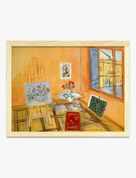
Atelier with Bouquet by Raoul Dufy Art Print
Sale price From £11.95£19.95 -

Cosy Everyday Essentials Canvas Print
Sale price From £49.95£74.95 -

Mi Casa Su Casa Art Print
Sale price From £11.95£19.95 -

Interior at Nice by Henri Matisse Art Print
Sale price From £11.95£19.95 -

Italian Riviera Retreat Art Print
Sale price From £11.95£19.95 -

Monaco Larvotto Beach Travel Poster Art Print
Sale price From £11.95£19.95 -

Mi Casa Su Casa Art Print
Sale price From £11.95£19.95 -

The Homebody Club Art Print
Sale price From £11.95£19.95 -

Bold Ampersand Art Print
Sale price From £11.95£19.95 -

Modernist Living — The Art of Living Art Print
Sale price From £11.95£19.95 -

Parisian Charm Art Print
Sale price From £11.95£19.95 -

Palma de Mallorca Flower Market Art Print
Sale price From £11.95£19.95 -

Seaside Bedroom, Matisse-Inspired Art Print
Sale price From £11.95£19.95 -
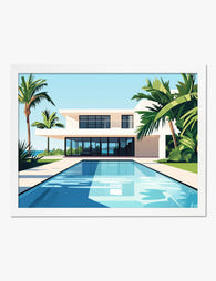
Modern Oasis Retreat Art Print
Sale price From £11.95£19.95 -

Monaco Larvotto Beach Travel Poster Canvas Print
Sale price From £49.95£74.95 -
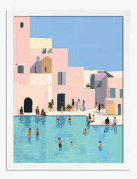
Sunlit Poolside Escape Art Print
Sale price From £11.95£19.95 -

Bookshop on the Square Art Print
Sale price From £11.95£19.95 -

Sunlit Spanish Retreat Art Print
Sale price From £11.95£19.95


More from The Frame

Lemon Decor: Timeless Trend or Passing Fad? You...
Lemon art is everywhere right now, which naturally raises the question of whether it belongs on your walls or in a time capsule marked "2023." The honest answer is more...

Beyond the Kitchen: 5 Unexpected Rooms Where Le...
Lemon art has a branding problem. Search for it online and you'll drown in kitchen shots: farmhouse signs, fruit bowls, tea towels with slogans. But a good lemon print is...

Lemon Art for the Kitchen: Where to Hang It, Wh...
Lemon art has quietly become the most-requested kitchen subject of the last few years, and for good reason. This guide skips the styled-shelf inspiration and gets straight to the decisions...