How to Create a Travel Gallery Wall with Italian Art Prints (Step by Step)
A practical, measurement-led guide to building an Italian gallery wall that feels collected, not crammed.

A travel gallery wall should feel like a love letter, not a souvenir display. The trick with Italy specifically is balancing the country's natural drama (lemon groves, Vespa-lined streets, terracotta rooftops) with restraint, so the wall reads as curated rather than crammed. Here's how to do it properly, with the measurements and combinations that actually work.
Why Italian scenes make the best gallery wall subjects
Italy gives you an unusually generous palette to work with. The colours repeat naturally across regions: ochre and terracotta in Tuscany, deep Mediterranean blues along the Amalfi Coast, sun-bleached pinks in Puglia, soft sage and olive across the countryside. That visual through-line means you can mix wildly different art styles and they still feel like they belong on the same wall.
The subject matter is also varied enough to avoid repetition. A gallery wall of "pretty European architecture" gets dull fast. A gallery wall featuring a Vespa parked outside a Roman trattoria, a watercolour of the Cinque Terre coastline, an illustrated lemon grove, and a black and white photograph of Florence rooftops tells a story.
This is what separates great travel walls from tourist gift shop walls: specificity. Lean into the small, particular details (espresso cups, striped beach umbrellas, hand-painted ceramics) rather than only generic landmarks.

Choosing a layout: grid vs. salon vs. horizontal line
Pick your layout before you pick your prints. Reversing that order is how gallery walls go wrong.
The grid
A grid uses identical print sizes (typically four, six, or nine prints) arranged in even rows and columns with consistent spacing. It's the most polished and modern option, and it works brilliantly for a series of related Italian scenes: six watercolours of different coastal villages, or a 3x3 grid of illustrated regional dishes.
Grids demand discipline. Every print must be the same size and ideally the same style. If you want to mix illustration with photography, this isn't your layout.
The salon hang
Salon style means asymmetric, varied sizes, prints of different orientations sitting together in a loose rectangle. This is the layout for mixing illustrated Italy art prints with photography and watercolours. It tolerates (and rewards) variety.
The rule with salon hangs is that the overall outer shape should still feel intentional. Think of it as a rectangle or square that the prints collectively fill, with edges roughly aligned even if the interior is varied.
The horizontal line
Three to five prints hung in a single row at the same height. Quiet, elegant, and ideal above a sofa or sideboard. Works particularly well with a series in the same medium (three watercolours, four photographs) but you can break it up with one illustrated print as a focal moment.
The sizes that work together (and the one combination to avoid)
Forget every size combination you've seen on Pinterest. These are the ones that actually hang well together.
The classic anchor combination: one 60x80cm anchor print, two 40x50cm prints, and three 30x40cm prints. Six pieces total. The anchor sits slightly off-centre, the mid-size prints flank it, and the smaller prints fill the corners. This works in roughly any room with at least two metres of wall width.
The minimal triptych: three 50x70cm prints in a horizontal row. Best above a sofa or bed. Spacing of around 5cm between prints gives them room to breathe.
The grid set: four or six prints, all 30x40cm or all 40x50cm. Identical sizes, identical frames, consistent 5cm gaps. Restrained and gallery-like.
The combination to avoid: one very large print (70x100cm) with several very small prints (under 30x40cm) and nothing in between. The jump in scale makes the smaller prints look like afterthoughts. You always need a middle size to bridge the gap. If you want a large anchor, include at least one or two prints in the 40x50cm to 50x70cm range to mediate.
This is also where the 2/3 rule comes in. Whatever your gallery wall's total width works out to, it should occupy roughly two-thirds of the width of the furniture below it. A 200cm sofa wants a gallery wall around 130 to 140cm wide. Wider than the furniture looks chaotic. Much narrower looks lost.
Mixing whimsical prints with photography and watercolour styles
This is the bit nobody talks about, and it's where most Italian gallery walls fall apart.
A whimsical illustrated print of an Italian piazza and a moody black and white photograph of the Pantheon are tonally opposite. Hang them side by side without thought and the wall feels confused. Three techniques solve this.
Use a shared colour palette as the connective tissue
Pick three or four colours that appear in every print, even subtly. For Italy, this is usually some combination of terracotta, deep blue, warm cream, sage or olive green, and a punchy yellow. An illustrated Vespa print with a teal scooter pulls toward the same palette as a watercolour Amalfi seascape and a photograph of yellow Roman shutters. The styles differ, but the colours unify.
If a print breaks the palette completely (a stark monochrome image when everything else is warm), it'll fight the wall. Either commit to it as a deliberate contrast piece or swap it out.
Distribute visual weight evenly
Whimsical illustrations tend to be high-contrast and graphic. Photography is often softer and more detailed. Watercolours sit in between. If you cluster all your bold illustrated prints on one side and your softer photography on the other, the wall looks lopsided even when the sizes are balanced.
Spread the loud prints out. Treat them like exclamation marks scattered through a paragraph.
Repeat at least one element
A second illustrated print echoes the first. A second watercolour gives the first a friend. Single outliers (one illustration in a wall of seven photographs) almost always look like a mistake. Aim for at least two of each style you include.

Spacing and alignment: the measurements that make it look intentional
Spacing is the single most overlooked element, and it's the one that separates "looks professional" from "looks like a teenager hung this."
Standard spacing between prints: 5 to 7cm. Closer than 5cm and the prints feel cramped. Wider than 8cm and they stop reading as a single composition. For grids, stick to exactly 5cm. For salon hangs, 5 to 7cm with some variation is fine.
Centre height: 145 to 150cm from the floor to the centre of the wall arrangement. This is gallery standard, designed to suit average eye level. If the wall is above furniture, hang the bottom edge of the lowest print 15 to 20cm above the top of the furniture. Too close and it feels stuck on. Too far and it floats.
Alignment in salon hangs: decide on either a top line, a bottom line, or a centre line and commit to it. Most salon walls work best with a consistent top line so the largest print sets the upper edge. Random alignment looks accidental rather than relaxed.
A trick that always works: lay the entire arrangement on the floor first. Photograph it from directly above on your phone. If it looks balanced in the photo, it'll look balanced on the wall.
Frame consistency vs. mixing finishes: our honest take
You'll read endless advice telling you to "mix and match frame finishes for an eclectic look." We disagree, mostly.
For a travel gallery wall combining illustration, photography, and watercolour, frame consistency does more heavy lifting than any other single decision. When the contents are varied, the frames need to be the calm backdrop. Mixing a chunky black frame, a thin gold frame, and a natural oak frame on the same wall reads as indecision, not intention.
Our position: pick one frame finish for the whole wall. Slim natural oak is the most forgiving and works with both warm and cool palettes. Black is sharper and more graphic. Off-white disappears into the wall and lets the art do everything.
The exception: if you're hanging a salon-style wall with eight or more prints and you want a deliberately collected, layered feel, you can mix two finishes (oak and black, for instance) at roughly a 70/30 ratio. Three or more finishes on one wall almost always looks chaotic.
Our framed prints come ready to hang with everything fitted properly, which matters more than people realise. The most common gallery wall disaster is frames warping in the post or arriving separately from the print, leaving you to wrestle a flat sheet of paper into a frame yourself. Frame and print should ship together, fitted, in one box.
Hanging your gallery wall without destroying your plaster
You don't need to drill twelve holes. Here's the system.
Step one: paper templates. Cut paper rectangles to the exact size of each print. Tape them to the wall in your chosen layout. Live with it for 24 hours. This is the single best way to avoid regret.
Step two: mark the hanging points. With the paper still in place, measure where each frame's hook or hanging wire will sit and mark through the paper directly onto the wall with a pencil.
Step three: pick your fixings based on the wall. For plasterboard, use proper plasterboard plugs rated for the weight of the print. For solid masonry, a small drill bit and a wall plug works. For lighter prints (anything under 1kg, which covers most A3-sized framed prints), adhesive picture-hanging strips genuinely work and leave no marks.
Canvas prints are notably lighter than framed prints because they don't have glazing. If you're nervous about your walls, canvas versions of Italian travel prints are a sensible choice, especially in larger sizes. They also handle humid rooms (kitchens, bathrooms) better than framed prints.
Step four: hang the largest piece first, then work outward. Use a small spirit level on each frame as you go. Step back after every two or three prints to check the overall composition.

Real examples: gallery walls featuring Italian art prints
A few configurations that work, with the reasoning behind each.
The Amalfi-inspired horizontal trio
Three 50x70cm prints in a row above a sideboard: a watercolour of Positano's stacked pastel houses, an illustrated print of a striped beach umbrella scene, and a photograph of a turquoise Mediterranean cove. Shared palette of blues, soft pinks, and cream. Slim oak frames. Spacing of 5cm.
The Tuscan salon wall
Seven prints in a salon arrangement above a dining sideboard. One 60x80cm anchor (a watercolour of cypress-lined hills), two 40x50cm prints (an illustrated wine bottle still life, a photograph of a stone farmhouse), and four 30x40cm prints (illustrated regional pasta shapes, a small photograph of olive groves, a watercolour of a Tuscan village square, an illustrated map of Chianti). Black frames throughout. Palette of olive, terracotta, and warm cream.
The Roman grid
Six identical 30x40cm prints in a 3x2 grid above a hallway console. All photography, all in black and white, all featuring Roman architectural details (a fountain, a columned doorway, a pavement detail, a window with shutters, a church facade, a piazza fountain). Consistent thin black frames, exactly 5cm spacing. Quiet, sophisticated, and easy to expand.
The whimsical kitchen wall
Five illustrated Italy art prints in a casual salon hang in a kitchen breakfast nook. A 50x70cm illustrated lemon tree, two 30x40cm illustrated prints of espresso cups and pastries, and two 30x40cm prints featuring a Vespa and an illustrated Italian market scene. Natural oak frames. Bright, warm, and unapologetically cheerful.
For more layout templates and curated combinations, pre-arranged wall art sets take the guesswork out entirely.

A final thought
The best Italian gallery walls aren't the most expensive or the most elaborate. They're the ones with a clear point of view: a specific region, a specific palette, a specific mix of styles that feels personal. Start with three or four prints you genuinely love, plan the layout on the floor first, measure twice before you hang anything, and resist the urge to fill every empty inch. A gallery wall that breathes always looks better than one that's stuffed.

Fab products featured in this blog
-
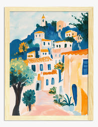
Sunlit Italian Village Art Print
Translation missing: en.products.product.sale_price From £13.99£19.99 -

Italian Riviera Retreat Art Print
Translation missing: en.products.product.sale_price From £13.99£19.99 -

Vibrant Italian Street Art Print
Translation missing: en.products.product.sale_price From £13.99£19.99 -

Italian Street Charm Canvas Print
Translation missing: en.products.product.sale_price From £44.95£74.95 -

Italian Street Watercolor Art Print
Translation missing: en.products.product.sale_price From £11.95£19.95 -

Italian Village Stroll Canvas Print
Translation missing: en.products.product.sale_price From £44.95£74.95 -

Colorful Italian Village Art Print
Translation missing: en.products.product.sale_price From £13.99£19.99


More from The Frame

What to Hang in Awkward Corners
Corners are the dead zones of most homes. Your eye skims past them, furniture refuses to sit flush against them, and you end up with a triangular patch of wall...

Art for Narrow Walls and Hallways
Narrow walls are the most under-decorated surfaces in most homes. Not because they're hard to style, but because most advice treats every awkward space as the same problem when really...

What to Put on a Big Blank Wall
Big blank walls feel impossible because they multiply your options instead of narrowing them. Every idea seems plausible, nothing feels right, and the wall stays empty for another six months....