


 Order today for delivery by
Decorating with Greeting Card Art: A Room-by-Room Styling Guide
Illustrative, whimsical, charming without being childish. Here's how to style greeting card art prints in every room.


Why greeting card art is having a serious interiors moment
For years, illustrative art with a hand-drawn, whimsical quality got filed under "nursery decor" or "cute but not serious." That's shifted. Walk into any thoughtfully styled home right now and you'll find pressed botanicals, loose watercolour florals, naive landscapes, and quirky still lifes hanging in lounges, kitchens, and halls, treated with the same intent as any gallery piece.
The appeal is obvious once you look at it properly. Greeting card style art prints offer warmth, personality, and a sense of the human hand behind them. They sit between fine art (which can feel precious) and mass-produced posters (which can feel soulless). And because the aesthetic is inherently approachable, they work across a far wider range of interior styles than you'd expect, from full-on cottagecore to pared-back Scandi to layered modern eclectic.
A quick point of clarification before we go further. This guide is about buying illustrative prints with a greeting card aesthetic as permanent wall art, not about framing actual greeting cards you've received. The former is a legitimate design choice. The latter is a sentimental craft project, and a different article entirely.

Kitchens and dining areas: warmth without pretension
Kitchens are often the hardest room to decorate because the surfaces are busy. Tiles, open shelves, appliances, utensils. The last thing you want on the walls is something that competes for attention. Greeting card style prints work beautifully here because they soften all that function without shouting.
Think loose watercolour fruit, botanical sketches, a quiet still life of ceramics, or a line-drawn lemon tree. Our botanical art prints collection is a good starting point if you want that gently illustrative feel without going full farmhouse.
For dining areas specifically, we'd steer you toward one slightly larger statement print (something around 50x70cm) above a sideboard or console, rather than a cluster of small ones. The eye needs somewhere to land when you're sitting at a table. A pair of 40x50cm prints flanking a shelf also works, as long as the subject matter is consistent in style.
What to avoid in kitchens
Skip anything overly delicate in paper quality near cooking zones. Steam, grease, and temperature changes aren't kind to cheap prints or poorly fitted frames. If your kitchen is open-plan or you're hanging art near a hob, a canvas print is often the safer call because there's no glazing to steam up and the surface is more forgiving of humidity.
Hallways and staircases: the perfect narrow-wall solution
Hallways are where greeting card art genuinely shines, and most people underuse them. The narrow proportions suit small-to-medium prints hung in sequences, and the typically shorter sightlines mean detail-rich illustrative work can actually be enjoyed up close rather than squinted at from across a lounge.
Our rule of thumb for hallways: pick a loose theme (botanicals, folk art, vintage travel, animal studies) and run with it across four to six prints at a consistent size, usually 30x40cm or 40x50cm. Hang them at 145-150cm centre height, with 5-7cm between frames. The repetition reads as intentional rather than cluttered.
For staircases, follow the line of the stairs rather than hanging prints at the same height. Keep the vertical spacing between the top of each frame and the step below it consistent (around 8cm works well), and let the gallery climb with you. A mix of 20x30cm and 30x40cm prints adds rhythm without chaos.
Browse our illustration collection if you want to build a cohesive hallway sequence. Illustrative work tends to hold together across multiple pieces far better than photography does, because the handmade quality itself becomes the unifying element.
Gallery wall layouts for small prints
If you're working with smaller greeting card sized prints (think 13x18cm or 18x24cm), group them in a tight grid rather than scattering them. A 3x3 grid of nine 18x24cm prints with 4cm spacing takes up roughly 70x90cm of wall and reads as one considered artwork rather than nine separate things. This works especially well at the end of a hallway or on a landing wall.

Bedrooms and nurseries: choosing calming vs. playful designs
The decision tree for bedrooms is simpler than people make it. If you want the room to feel restful, choose prints with limited colour palettes (two or three colours maximum), soft edges, and quiet subject matter. Botanical studies, misty landscapes, muted still lifes. If you want energy and personality, go bolder: folk-art animals, saturated florals, quirky figurative work.
Above a bed, we'd suggest one of two approaches. Either a single large print at 70x100cm centred above the headboard, or a pair of 50x70cm prints side by side with a small gap between them. Avoid tiny prints floating above a king-size bed. The scale fights you.
For nurseries, resist the urge to go full cartoon. Children grow fast, and prints that read as "baby" at six months look dated by age four. Greeting card style art with a slightly more sophisticated edge (a watercolour fox, a pressed flower study, a soft alphabet print) will carry the room from infant through early childhood without a rebuy.
Vintage and nostalgic options
If you want a bedroom to feel layered and lived-in rather than freshly decorated, mix in something with a bit of age to it. Our vintage art prints pair surprisingly well with contemporary illustration, because the colour palettes often share that same slightly dusty, slightly muted quality that defines the greeting card aesthetic.
Bathrooms and small spaces: making the most of compact walls
Bathrooms get neglected in art discussions, which is a shame because they're one of the easiest wins in the whole house. You usually only need one or two small prints to transform the feel of the room entirely.
Stick to smaller sizes here (20x30cm or 30x40cm) and hang them where you'd actually see them: opposite the toilet, above a towel rail, or on the wall facing the door as you walk in. A single 30x40cm botanical print above a toilet is often all a bathroom needs to feel considered.
The moisture question comes up a lot. A framed print with proper UV-protective acrylic glazing (not glass) and a solid wood frame will hold up fine in a well-ventilated bathroom. If your bathroom runs very steamy or has no window, go with a canvas print instead. The stretched canvas surface handles humidity without warping, and there's no glazing to fog up.
For downstairs loos and other small spaces, this is your chance to be bolder than you'd dare elsewhere. A tiny room can take a punchier print because you're not committing to looking at it for hours. A saturated folk-art piece or a quirky illustration that would feel too much in a lounge works beautifully in a one-metre-square cloakroom.

Choosing the right frame finish for greeting card prints
Frame choice does more heavy lifting than most people realise. The same print in a white frame versus a black frame versus natural oak reads as three different artworks. Our general guidance:
White frames suit cottagecore, coastal, French country, and classic traditional interiors. They let the illustration breathe and feel light. Best for pastel palettes, botanical subjects, and anything watercolour.
Black frames work for modern, Scandi-industrial, and gallery-style spaces. They add weight and definition, making illustrative prints feel more serious. Good for line drawings, bold graphic illustration, and anything with high contrast.
Natural oak and ash frames are the Scandi and boho default, and they're probably the most versatile choice overall. They warm up a space without competing with the art. Particularly good for botanical, folk, and nature-inspired illustration.
Dark walnut and darker wood suits mid-century, traditional, and maximalist interiors. Pairs well with vintage-feel illustrations and anything with earthy or muted palettes.
The matting question
A white mat border (usually 4-6cm wide) does two things: it gives the print room to breathe, and it makes a smaller print feel more significant on the wall. For greeting card style illustration, we'd say use a mat if the print is small (under 30x40cm) or if you want it to feel more formal. Skip the mat if the illustration already has lots of white space built in, or if you want the piece to feel more casual and immediate.
One advantage worth knowing: a properly framed print should arrive with the mat, backing, and glazing already fitted and ready to hang. If you've ever bought a print and a frame separately only to spend an hour wrestling with dust specks under the glass, you'll appreciate how much better it is when the whole thing ships together, properly assembled, in one box.
Sizing guide: which print size works for each room
Scale is where most people get this wrong, so here's a practical breakdown by room and function.
Bathrooms and cloakrooms: 20x30cm or 30x40cm. One or two prints maximum.
Hallways: 30x40cm or 40x50cm for sequences. 50x70cm as a single statement at the end of a corridor.
Kitchens: 40x50cm pairs above sideboards. 50x70cm single statements above dining tables (hung so the bottom of the frame is around 25-30cm above the table surface).
Bedrooms: 70x100cm single above a king-size headboard. Pairs of 50x70cm above a double. 40x50cm trios on a long wall opposite the bed.
Lounges: This is where you can go largest. 70x100cm or 100x70cm as the main piece over a sofa, or gallery arrangements built around one hero print.
Nurseries and children's rooms: 40x50cm trios work well above cots and changing tables. Avoid anything too large directly over a cot for safety reasons.
A note on mixing greeting card art with other art
Greeting card style prints play well with photography, abstract work, and vintage posters as long as you commit to a shared colour story. What doesn't work: mixing highly polished digital illustration with scratchy hand-drawn work in the same gallery wall. The illustration styles clash and the whole wall looks indecisive. Pick a lane and stay in it, at least within any single room.

A final word on sourcing
If you're drawn to this aesthetic specifically, our greeting cards and illustration collections are both built around this kind of illustrative, approachable work. The thing to look for when buying greeting card style art prints is print quality (museum-grade giclée on thick matte paper will look dramatically better than cheap digital printing), paper weight (thin paper curls in the frame over time), and lightfastness (if the inks fade in sunlight within a year, you've wasted your money and the illustrator's work).
Decorate room by room, pick frame finishes that genuinely suit both the art and the space, and don't be afraid to treat whimsical illustration as seriously as you would any other kind of art. It is.

Fab products featured in this blog
-

Sweetheart Scrolls on Checkerboard Art Print
Sale price From £11.95£19.95 -

Kitchen Cupboard Classics Art Print
Sale price From £11.95£19.95 -

Picnic Season Art Print
Sale price From £11.95£19.95 -

Graphic Floral Pop Bouquet Art Print
Sale price From £11.95£19.95 -

Always Room For Cake Art Print
Sale price From £11.95£19.95 -

Vibrant Interiors Kitchen Scene Art Print
Sale price From £11.95£19.95 -

Eclectic Origami Garden V Art Print
Sale price From £11.95£19.95 -

Cat's Cosy Breakfast Table Art Print
Sale price From £11.95£19.95 -

Colourful Garden Retreat Art Print
Sale price From £11.95£19.95 -

Buongiorno Coffee Cups Art Print
Sale price From £11.95£19.95 -

Pink Room with Plants Art Print
Sale price From £11.95£19.95 -

Bright Bouquet in a Patterned Vase Art Print
Sale price From £11.95£19.95 -

Eclectic Origami Garden V Canvas Print
Sale price From £49.95£74.95 -

Make Space to Bloom Art Print
Sale price From £11.95£19.95 -

Pink Kitchen, Red Coat Art Print
Sale price From £11.95£19.95 -

Vintage Wild Flower Bouquet Art Print
Sale price From £19.95£34.95 -
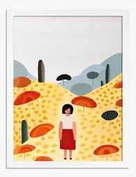
Sunny Hillside Stroll Art Print
Sale price From £11.95£19.95 -

Heart Balloon Bouquet Art Print
Sale price From £11.95£19.95 -
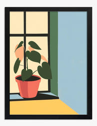
Heartfelt Greenery Art Print
Sale price From £11.95£19.95 -

Flower Garden, Klimt-Inspired Art Print
Sale price From £29.95£49.95


More from The Frame

Why Botanical Art Works Better in Small Living ...
Botanical art does something strange to small rooms: it softens them without crowding them. In large rooms, it often gets lost, floating on a wall that needs more weight. This...

Blending Vintage and Modern Décor? Start With Y...
Your furniture is already a mix. A mid-century sideboard here, a modern bouclé chair there, maybe your grandmother's wingback holding court in the corner. The walls are where you make...

7 Steps to Style a Woodland Gallery Wall with F...
A fox print is one of the most forgiving anchors you can build a gallery wall around. The silhouette is distinctive, the colour palette (rust, cream, charcoal, forest green) plays...