
 Order today for delivery by
 Dining Room Wall Art: 5 Modern Trends That Work in Real Homes
Five directions worth following in 2025, and how to adopt them without your dining room looking dated by 2027.


Dining rooms have spent a decade playing it safe with grey, beige and "calming" abstract shapes. That era is ending. The trends shaping dining walls now are warmer, more personal, and more willing to take up space, and they look just as good in a real terraced house as they do in a magazine.
Why dining room art trends are shifting away from safe neutrals
For years, the default dining room palette was cool: white walls, pale oak, a soft grey abstract above the sideboard. It was tasteful and forgettable, which was the point. After spending the better part of three years staring at the same four walls during the pandemic, most people have decided forgettable is no longer the goal.
What's replacing it is warmth. Terracotta, olive, ochre, burnt sienna, ink blue. Tones that feel lived-in rather than showroom-clean. The shift is partly a rejection of cold Scandinavian minimalism and partly a return to the idea that a dining room is meant for lingering, not photographing.
The other thing that's changed is scale. Small art floating in the middle of a big wall used to be acceptable. It no longer is. Trends in modern dining room prints are pushing larger, fewer, and more confident. One strong piece beats four hesitant ones every time.

Trend 1: Warm-toned abstracts that make a room feel inviting
The abstract print isn't going anywhere, but the palette has fundamentally shifted. The cool, dusty pastels that dominated 2018 to 2022 have been replaced by something earthier: rust, ochre, terracotta, deep olive, warm clay. Think sun-bleached pigment rather than studio paint.
These work in dining rooms because they do two things at once. They add personality without committing to a specific subject (no awkward conversations about whose still life that is), and the warm tones flatter both the food on the table and the people around it. Cool blue art under a warm pendant light makes a room feel disjointed. A rust-toned abstract under the same light feels intentional.
How to make it work
Hang it big. A 70x100cm framed print above a six-seat dining table is roughly right. The rough guide most designers use is that art should span around two-thirds the width of your table, so a 180cm table wants art at least 120cm wide, which usually means going to a canvas at the larger end of the scale or splitting into a diptych.
Pair the print with at least one other warm-toned element in the room, a rug, a ceramic, a wooden bowl. A single warm print marooned in an otherwise grey room reads as a mistake rather than a choice. Browse abstract art prints in earthy palettes if you're starting from scratch.
How to avoid it dating
Stay away from the most-Instagrammed shapes (the squiggle, the asymmetric blob, the three-circles composition). They're already starting to feel like a moment that's passed. Look for abstracts that reference older traditions, mid-century painters, hand-pulled prints, ceramic glazes. Those references give the work staying power that pure trend pieces don't have.
Trend 2: Oversized botanical prints as a single statement
Botanicals have been in the dining room for centuries, but the current version is bigger, looser, and less Victorian. Instead of small framed pressed ferns in a grid of nine, the trend is one enormous print: a single fig leaf, an oversized monstera, a loose ink-drawn olive branch. The kind of image that fills a wall and ends a conversation.
This works particularly well in dining rooms because the subject is calm. You can look at a giant leaf for an hour during a long dinner and it doesn't demand anything from you. Figurative art and busy scenes can feel exhausting in a room where you're meant to relax.

How to make it work
Go bigger than feels comfortable. People consistently buy art that's too small for the wall they're trying to fill. If your wall is two metres wide, a 40x50cm print will look like a postage stamp. For a single statement botanical above a sideboard or behind a dining table, aim for at least 70x100cm framed, or push up to 100x150cm on canvas if you have the wall for it.
Frame choice matters more than people realise. A thin black frame keeps a botanical feeling modern and graphic. A chunky natural wood frame pushes it toward farmhouse, which can work but is its own commitment. For most contemporary dining rooms, thin black or a slim oak frame is the safer choice. Our botanical art prints come in both options.
How to avoid it dating
Avoid anything that reads as overtly tropical (the palm leaf moment of 2019 is doing nobody any favours now). Stick with botanicals that have a longer cultural history: olive, fig, eucalyptus, oak, fern. These have been in art for hundreds of years and will look just as good in five years as they do today.
Trend 3: Photographic still life and food art (done tastefully)
Food in the dining room used to mean a wine bottle painting, a bunch of grapes, or a cursive sign that said "EAT." Mercifully, this is changing. The current version of food art is photographic, restrained, and closer to a Dutch Golden Age painting than a kitchen sign.
Think a single lemon on linen. A loaf of bread on a marble slab. A glass of wine half-lit from a window. The compositions are deliberately quiet, the colours are muted, and the styling references food photography from cookbooks rather than restaurant menus.
How to make it work
This trend lives or dies on tone. If the photograph is over-saturated, brightly lit, or obviously stocky, it tips into stock photo territory immediately. Look for images shot with natural light, with shadows, with a slight matte quality. The print finish matters here too. A high-gloss reflective surface kills the painterly mood. A thick matte paper, the kind you get with a museum-quality giclée print, holds the shadows properly and looks like an actual photograph rather than a printed reproduction.
You don't have to use food at all. Plenty of "still life" art works in a dining room without being literal. A photographic print of ceramics on a shelf, or a folded linen tablecloth, gives the same quiet, considered mood without anyone needing to wonder why you've got a picture of an aubergine on the wall.
How to avoid it dating
Skip anything that reads as a recipe card or a magazine cover. The closer the styling gets to "food blog," the faster it dates. Look for images that could plausibly hang in a gallery, where the subject happens to be edible but the composition would still hold up if it were a vase or a stack of books. For more options that lean editorial rather than literal, browse the wider dining room art prints collection.
Trend 4: Earthy, textured prints that pair with natural materials
The current obsession with natural materials, oak, linen, travertine, unglazed ceramic, stoneware, has filtered into wall art. The textured print trend is essentially art that looks like it belongs in the same family as your dining table. Earthy pigments, visible brushwork, paper that feels like paper. Anything that reads as handmade rather than digital.
These work because they extend the materiality of the room. If your dining table is solid oak and your bowls are hand-thrown ceramic, a glossy digital print breaks the spell. A textured, earth-toned print on matte paper reinforces it.

How to make it work
The print itself needs to look like it has texture, even if the surface is technically flat. This is where print quality genuinely matters. Cheap inkjet prints flatten out the texture and lose the depth. A proper giclée print on thick matte paper keeps the variation in tone, the brushwork, the grain. You should be able to walk up to it and see detail rather than pixels.
Pair these prints with other natural materials in the room. A textured print above a sideboard with a stoneware lamp, a wooden bowl and a linen runner reads as a complete idea. The same print above a glass-and-chrome console will look like it wandered in from a different house.
How to avoid it dating
Textured neutrals are a relatively safe trend because they're rooted in materials that have been popular for centuries. The risk is leaning too hard into "wabi-sabi" or "Japandi" branding, both of which have peak-trend energy. Buy the look without the label, and it will outlast the hashtag.
Trend 5: Curated sets of two or three prints for a gallery effect
The full Pinterest gallery wall, twelve frames at varying angles with a typewriter print and a "home sweet home," is essentially dead. What's replacing it is a much more restrained version: two or three prints, same size, same frame, hung in a clean line or a tight grid. It gives the visual interest of a gallery without the chaos.
This works particularly well in dining rooms because the room often has a long wall (above a sideboard or running alongside the table) that's awkward to fill with a single piece. A trio of 50x70cm framed prints fills that space cleanly and reads as deliberate rather than busy.
How to make it work
Stick to a tight visual relationship between the prints. They don't have to be by the same artist, but they should share a palette, a mood, or a subject. Three botanicals in different species. Three abstracts in the same earth tones. Three black and white photographs. The eye needs an obvious thread.
Frame consistency is non-negotiable. Three different frame styles, even if the art is related, will look like a jumble. Pick one frame profile and one colour and run it across the whole set. Frames that arrive properly fitted with the print, no warping, no bubbling, no gaps, will save you the disappointment of building a set that looks almost right but slightly off.
Space the prints evenly, with around 5 to 8cm between frames. Too close and they read as one chaotic block. Too far apart and they stop reading as a set.
How to avoid it dating
Avoid trend-heavy combinations like the "boho trio" (line drawing face, abstract, plant) or anything where the three prints are clearly designed to be sold together as a matching set. Those are precisely the combinations that will mark your dining room as "2024." Build the set yourself with prints that share a thread but aren't engineered to match. It takes more thought, but it looks less like a kit.

How to follow a trend without your dining room feeling dated in two years
Every trend in this article will look dated eventually. The question is whether it ages into "classic" or into "embarrassing." A few rules help.
Buy fewer, larger pieces rather than lots of small ones. A single substantial print is easier to swap out in three years than a wall covered in twelve frames you spent a weekend hanging. Scale is also what stops a trend from looking timid. A confident piece reads as a deliberate choice even after the trend cools.
Lean on subjects with long cultural histories. Botanicals, still lifes, abstracts referencing older traditions, landscapes. These have all been in homes for centuries. A photograph of a fig will look fine in 2035. A line-drawn face with one eye closed almost certainly won't.
Spend on frames and print quality, not on chasing the most current image. A cheap print in a warped frame looks cheap regardless of the trend. A well-printed image on thick matte paper, in a solid wood frame with UV-protective glazing, looks considered even when the trend it represents has moved on. Quality is the thing that converts "of the moment" into "ages well."
Hang it at the right height. The centre of the artwork should sit at roughly 145 to 150cm from the floor, which usually means the bottom edge sits about 15 to 25cm above the table or sideboard. Most dating-looking dining rooms aren't dated because of the art. They're dated because the art is floating awkwardly two feet too high.
And finally: if you're nervous about committing, start with one trend, not five. One warm-toned abstract above the sideboard tells a clearer story than a dining room where every wall is competing for attention.

Fab products featured in this blog
-

Wine and Wildflowers Supper Art Print
Sale price From £11.95£19.95 -

Blue Table, Wine and Wildflowers Art Print
Sale price From £11.95£19.95 -

Sunlit Kitchen Still Life Canvas Print
Sale price From £49.95£74.95 -

Pastel Table Gathering Art Print
Sale price From £11.95£19.95 -

Vibrant Fauvist Dinner Table Art Print
Sale price From £11.95£19.95 -

Conversation Over Wine Canvas Print
Sale price From £49.95£74.95 -
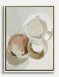
Soft Circles in Clay and Cream Canvas Print
Sale price From £49.95£74.95 -
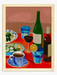
Red Tablecloth Still Life Art Print
Sale price From £11.95£19.95 -

Fauvist Dinner Table with Wine Canvas Print
Sale price From £49.95£74.95 -

Disco Ball Orange Art Print
Sale price From £11.95£19.95 -

Oysters, Wine and Wildflowers Art Print
Sale price From £11.95£19.95 -

Sardines, Wine and Tulips Art Print
Sale price From £11.95£19.95 -

Oysters, Wine and Wildflowers Canvas Print
Sale price From £49.95£74.95 -

Modern Brunch Table Art Print
Sale price From £11.95£19.95 -

Modern Spiral Bowls Art Print
Sale price From £11.95£19.95 -

Supper for Two with Tulips Art Print
Sale price From £11.95£19.95 -

Pink Table Fauvist Dinner Still Life Art Print
Sale price From £11.95£19.95 -

Soft Modern Still Life Art Print
Sale price From £11.95£19.95 -

Pastel Dinner Gathering Canvas Print
Sale price From £49.95£74.95 -

Vibrant Interiors Kitchen Scene Art Print
Sale price From £11.95£19.95


More from The Frame

William Morris vs Art Nouveau: What Style Is It...
Short version: William Morris was not Art Nouveau. He was Arts and Crafts, a movement he helped invent. The two styles overlap enough to confuse almost everyone, and getting the...

Whimsical Nursery Wall Art Ideas That Grow With...
Most nursery art is designed for the parents standing in the room at 3am, not the seven-year-old who will eventually sleep there. That's why so much of it gets swapped...

Whimsical Art vs Quirky Art: What's the Differe...
If you've ever been confused browsing for playful wall art, wondering if that dressed-up fox print is whimsical, quirky, or something else entirely, you're not alone. The two styles overlap...