


 Order today for delivery by
Farmhouse Wall Decor Ideas That Don't Look Like a Barn Conversion Gift Shop
How to build a country-style room with real design intelligence, starting with one very good cow.


Farmhouse decor has a reputation problem. Somewhere between the shiplap boom and the "Live Laugh Love" invasion, it stopped meaning "warm, rustic, layered" and started meaning "coordinated set of three signs from a garden centre." This guide is about pulling it back.
What modern farmhouse decor actually means in 2024
Modern farmhouse is no longer the whitewashed, sign-heavy, all-shiplap look that dominated the late 2010s. The current version is quieter, warmer, and more considered. Think curated country house rather than themed cafe.
The core principles are still there: natural materials, honest textures, references to rural life, and a preference for objects that look like they've had a life before you owned them. What's changed is the restraint. Modern farmhouse rooms use fewer pieces, better ones, and lean on tone and texture rather than novelty signage to do the work.
The easiest way to tell the difference: a good farmhouse room looks like it was assembled over ten years by someone with taste. A bad one looks like it was assembled over one weekend at a homeware retailer having a sale.
That principle applies to wall art more than anything else. The mistake most people make is buying a "collection" all at once, in matching frames, on matching themes. Real farmhouse walls look layered because they were layered, slowly. You can fake that, but only if you stop shopping in sets.

Cow art as the anchor: choosing one strong piece
Every good farmhouse wall setup needs an anchor, and cow art is the most versatile option available. A single strong cow print, sized properly and framed well, does more work than any other subject in the category. It signals countryside without shouting about it, adds personality, and gives every other piece in the room something to orbit around.
The key word is "one." A single 70x100cm portrait of a Highland cow above a fireplace is a design decision. Three matching cows on canvas in identical frames is a gift shop display. If you take one thing from this article, let it be this: buy one cow you genuinely love, print it large, and stop there.
What to look for in a cow print
Character over cuteness. You want a piece that feels like a portrait, not a cartoon. Look for close-cropped compositions where you can see the animal's expression, texture in the coat, and honest colour. Highland cows dominate the category for good reason (that fringe photographs beautifully), but Belted Galloways, Jerseys, and Aberdeen Angus all work if the composition is strong.
Style matters as much as subject. A moody, dark-background oil-painting-style Highland reads sophisticated. A pastel cartoon cow with a flower crown reads nursery. Both are technically "cow art." Only one belongs in a room you want adults to take seriously.
Size and placement
Go bigger than you think. Cow art fails when it's too small for its wall. Above a sofa, you want the print to occupy roughly two thirds of the sofa's width. Above a console or fireplace, similar rule. Anything smaller looks like an afterthought. Our farmhouse cow art prints go up to 70x100cm framed and 100x150cm on canvas, and the larger sizes almost always look better than people expect.
Canvas works particularly well for cow portraits because the matte finish and lack of glare suits the earthy, painterly quality of the subject. Framed prints on thick matte paper with a proper wood frame work too, especially in more polished rooms where you want a bit of structure.
Mixing subjects: landscapes, botanicals, and animals together
Once your anchor is in place, everything else is supporting cast. The three subject categories that live comfortably together in a farmhouse setting are pastoral landscapes, botanicals, and animal portraits. The trick is knowing how to combine them without creating visual noise.
The rule we use: one dominant subject (usually the cow or a large landscape), one supporting subject in a different medium, and one quiet subject that sits back. So a large Highland cow print, a medium pastoral landscape in oil-painting style, and a small botanical line drawing. Three subjects, three treatments, one coherent room.
Why matching sets kill farmhouse rooms
The strongest signal that a room was decorated in an afternoon is a set of three prints in identical frames on identical themes. Three cows. Three wildflowers. Three barn scenes. It reads catalogue, not collected.
Real country houses accumulate art over decades. A watercolour landscape from a holiday, a botanical print inherited from a grandmother, a photograph from a local market. The subjects don't match. The frames don't match. That's why the rooms feel warm rather than staged.
You can replicate that intentionally. Pick pieces you actually like across different subjects, sizes, and treatments, then trust that the country-life theme will pull them together.
Mixing artistic treatments
Farmhouse decor breaks when everything is the same medium. Three watercolour florals feel flat. Three photographs feel cold. Mix line drawings, watercolours, oil-painting-style prints, and photography within the same wall.
A pen-and-ink botanical next to a moody cow oil painting next to a soft watercolour landscape gives you variation in visual weight and mark-making. Your eye moves across the wall instead of skimming past it.

Colour palettes for farmhouse walls (hint: not everything has to be beige)
The default farmhouse palette gets stuck on warm white, cream, and greige. It's safe. It's also boring. The sophisticated version of farmhouse uses colour deliberately, in small doses, to give the neutrals somewhere to go.
Here are the palettes that consistently work.
Warm white, sage, and ochre. The most forgiving farmhouse palette. Warm white walls, sage green in botanicals and cushions, ochre or mustard as an accent in art. Feels like late summer.
Bone, muted blue, and charcoal. Cooler, more coastal-farmhouse. A muted denim blue in a pastoral sky, charcoal in a cow portrait, bone-white walls. Works well in north-facing rooms where warm whites can go yellow.
Cream, terracotta, and deep green. Richer, more Mediterranean-farmhouse. Terracotta pulls the warmth of a wood floor upward, deep green in a botanical grounds it, cream keeps it from feeling heavy.
Off-white, black, and one saturated colour. The most modern take. Off-white walls, black frames, and one confident colour (mustard, rust, or forest green) repeated across two or three pieces.
Whatever you choose, pick two or three colours from your art and echo them elsewhere in the room. A rust in a landscape shows up in a cushion. The green in a botanical shows up in a ceramic vase. This is what makes a room feel considered rather than accidental.
The pieces in our botanical art prints collection are useful for exactly this: they carry the greens and ochres that pull a warm neutral room together without dominating it.
Frame materials that suit country-style interiors
Frames matter more in farmhouse than in almost any other style, because the material of the frame carries as much rustic weight as the image inside it.
Natural wood (oak, walnut, ash)
The default choice and usually the right one. A solid wood frame with a visible grain reads honest, warm, and countryside without being kitsch. Oak works with most palettes. Walnut suits richer, warmer rooms with terracotta or deep green. Ash keeps things lighter and more Scandi-farmhouse.
Steer clear of anything obviously faux-distressed. The frames that look like they've been beaten with a chain in a factory are the ones that give farmhouse decor a bad name. If you want distress, you want the real thing, and even then, in moderation.
Our frames are all solid FSC-certified wood, not MDF with a printed wood effect, which matters more than it sounds. Veneered frames look fine from three metres away and reveal themselves the moment you walk past.
Thin black frames
The modernising move. A thin black frame around a rural landscape or botanical pulls the whole thing into a more contemporary register. Use them when your room is farmhouse-adjacent rather than fully country, or when you want to break up an all-wood scheme.
A useful rule: use black frames for graphic subjects (line drawings, photography, high-contrast prints) and wood frames for painterly subjects (oil-style, watercolour, moody portraits). It sounds arbitrary. It works.
Unframed canvas
The most relaxed option and often the best for cow portraits and large pastoral landscapes. A hand-stretched canvas on a solid wood stretcher with mirrored edge wrapping gives you the country warmth without any frame at all. It also survives humid rooms (kitchens, bathrooms adjacent to boilers) better than framed prints, which is worth knowing.
Gallery wall layouts for farmhouse hallways and kitchens
Gallery walls are where farmhouse decor most often goes wrong. The instinct is to fill the wall. The result is a room that feels like a busy pub.
Hallway layouts
Hallways benefit from a horizontal, linear composition. Three to five pieces at eye level (roughly 145cm to the centre of the arrangement), evenly spaced, all with their vertical centres aligned. The frames and subjects can vary. The alignment cannot.
Mix a landscape, a botanical, a small animal portrait, and a photograph. Keep the spacing generous, around 8 to 10cm between frames. Tight spacing looks nervous. Generous spacing looks confident.

Kitchen layouts
Kitchens work better with a denser, more clustered gallery, usually built around one anchor piece with smaller works around it. Above a dining table or a run of open shelving, cluster three to six pieces with the anchor placed slightly off-centre.
Keep the anchor at least 50 percent larger than any other piece in the cluster. This prevents the arrangement from looking like a grid and gives your eye somewhere to land.
Mix orientation aggressively. Two portraits, one landscape, one square. The variation is what makes the cluster feel collected rather than composed.
The negative space rule
Whatever the room, leave more empty wall than you think you need. A gallery wall works because of the space around it, not despite it. If your art extends within 20cm of a corner, a door frame, or a light switch, it will read as clutter no matter how good the individual pieces are.
Where to draw the line: keeping farmhouse decor sophisticated
Here is the short list of things that will drag your room into gift-shop territory faster than anything else.
Word art. Especially in cursive script. Especially involving the words "gather," "family," "blessed," "farmhouse," or any variation of "eat" hung in a kitchen. If the piece would work as a mug, it does not belong on your wall.
Matching sets of three. Three cows in matching frames. Three wildflowers. Three barn silhouettes. It's the visual equivalent of buying a starter pack. Break the set. Buy one really good one instead.
Fake distress. Frames deliberately scuffed to look old, prints printed to look faded, "vintage" typography treatments. Real farmhouse texture comes from real materials aging. Fake versions read as costume.
Everything beige. A room where the walls, the art, the frames, the sofa, and the rug are all within two shades of one another looks like a hotel lobby. Introduce one confident colour. A mustard cushion. A deep green vase. A charcoal frame.
Roosters. Just, generally, be careful with roosters.
The sophisticated version of farmhouse is defined by what you leave out. One strong cow. One landscape you love. One botanical you'd keep if you moved. Space around each of them. Frames chosen for their material, not their theme. Colours pulled through the room rather than concentrated in one spot.
If you're building a room from scratch, start with the anchor. Find the country style wall art you'd hang whether or not it fit a "farmhouse" brief, then let everything else follow from that piece. Rooms built around one thing you genuinely love always feel more considered than rooms built around a Pinterest board.

Buy one cow you love. Frame it properly. Give it room to breathe. Add slowly, from different subjects and in different treatments, over months rather than in an afternoon. That's the whole method.

Fab products featured in this blog
-

Whitewashed Farmhouse and Old Oak Art Print
Sale price From £11.95£19.95 -

Four Patterned Cows in Bloom Art Print
Sale price From £11.95£19.95 -

Four Patterned Cows in Bloom Canvas Print
Sale price From £49.95£74.95 -

Pastel Countryside Charm Art Print
Sale price From £11.95£19.95 -

Whitewashed Farmhouse and Old Tree Art Print
Sale price From £11.95£19.95 -
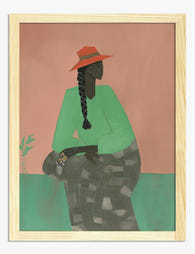
Countryside Muse Art Print
Sale price From £11.95£19.95 -

Rustic Holiday Warmth Canvas Print
Sale price From £49.95£74.95 -

Floral Cows in Blue Art Print
Sale price From £11.95£19.95 -

Whitewashed Farmhouse and Old Oak Canvas Print
Sale price From £49.95£74.95 -

Whitewashed Farmhouse and Old Tree Canvas Print
Sale price From £49.95£74.95 -

Highland Escape, Scotland Art Print
Sale price From £11.95£19.95 -
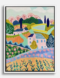
Pastel Countryside Charm Canvas Print
Sale price From £49.95£74.95 -

Farmhouse in Provence by Van Gogh Canvas Print
Sale price From £49.95£74.95 -

Rustic Holiday Warmth Art Print
Sale price From £11.95£19.95 -

Floral Cows in Blue Canvas Print
Sale price From £49.95£74.95 -

Rustic Door Abstract Canvas Print
Sale price From £49.95£74.95 -

Farmhouse in Provence by Van Gogh Art Print
Sale price From £11.95£19.95 -

Rustic Door Abstract Art Print
Sale price From £11.95£19.95 -

Countryside Muse Art Print
Sale price From £11.95£19.95 -

Highland Escape, Scotland Canvas Print
Sale price From £49.95£74.95


More from The Frame

Why Botanical Art Works Better in Small Living ...
Botanical art does something strange to small rooms: it softens them without crowding them. In large rooms, it often gets lost, floating on a wall that needs more weight. This...

Blending Vintage and Modern Décor? Start With Y...
Your furniture is already a mix. A mid-century sideboard here, a modern bouclé chair there, maybe your grandmother's wingback holding court in the corner. The walls are where you make...

7 Steps to Style a Woodland Gallery Wall with F...
A fox print is one of the most forgiving anchors you can build a gallery wall around. The silhouette is distinctive, the colour palette (rust, cream, charcoal, forest green) plays...