
 Order today for delivery by
 Flower Print Ideas for Your Living Room: Sizes, Styles and Placement
How to solve the big blank wall above your sofa with floral art that actually fits the space.


You have an eight-foot sofa, a ten-foot wall above it, and absolutely no idea what to put there. This guide is a decision tree, not a mood board. By the end you will know exactly what size, style and finish of floral print to buy.
Why flower art works in every style of living room (yes, even minimalist ones)
Flower prints get a bad reputation as fussy or feminine, which is a leftover from chintz curtains and grandma's spare bedroom. Modern floral wall art looks nothing like that. A single black-and-white photographic peony at 100x70cm reads as graphic and architectural, not pretty.
The trick is matching the style of floral to the room. Vintage botanical illustrations belong in traditional and farmhouse interiors. Moody dark florals on near-black backgrounds suit transitional and maximalist spaces. Abstract watercolour florals work in soft, modern rooms with linen sofas and pale oak. Photographic close-ups, often monochrome, are the move for genuinely minimalist spaces where you want one strong statement instead of a busy gallery.
So when someone says florals are too traditional, they mean one specific kind. The category is much wider than that, and there's almost certainly a version that suits your room.

Sizing guide: what size flower print for above a sofa, fireplace, or console
This is where most people get it wrong. The single most common mistake in wall art is buying something too small. A 40x50cm print floating above a three-seater sofa looks like a postage stamp on an envelope.
The two-thirds rule
Your art (or arrangement of art) should be roughly two-thirds to three-quarters the width of the furniture below it. Measure the sofa, multiply by 0.66 and 0.75, and you have your target width range.
- 180cm sofa (two-seater): aim for 120-135cm of total art width
- 210cm sofa (standard three-seater): aim for 140-160cm
- 240cm sofa (large three-seater): aim for 160-180cm
- 280cm+ sectional: aim for 185-210cm, which almost always means a diptych or triptych
For a standard three-seater, a single 100x70cm framed print works if it has visual weight (dark background, strong subject). If the print is light and airy, go bigger or pair two prints side by side.
Above a fireplace
The mantel is your width reference, not the wall. Art should be roughly the width of the mantel itself or slightly narrower, never wider. For a typical 120cm mantel, a 70x100cm portrait-orientation floral works beautifully. Leave 15-20cm between the top of the mantel and the bottom of the frame.
Above a console
Consoles are usually 100-150cm wide, so a single 50x70cm or 60x80cm print sits well, especially with a lamp or vase breaking the visual line. This is also a great spot for a small gallery wall of three to five smaller botanical prints.
The 8-10 inch gap rule
Hang art so the bottom of the frame sits 20-25cm above the top of the sofa back. Any higher and the art floats off into space, disconnected from the furniture. This is the single biggest hanging mistake people make.
Test before you buy
Cut your chosen size out of newspaper or mark it with painter's tape on the wall. Live with it for a day. Sizes always look smaller in a big room than they do on a screen.
Going big: when a single extra-large floral print beats a gallery wall
A gallery wall is the default suggestion for anyone with a big blank space, but it isn't always the right call. Here's when to pick a single large piece instead.
Choose one large floral print when:
- Your ceilings are over 2.7m and you need vertical drama
- Your sofa is 240cm or longer and you want one clean horizontal statement
- The room style is modern, minimalist or transitional
- The rest of the room is busy (patterned rug, mixed cushions, lots of objects)
- You want the art to feel like an investment piece, not a collection
Choose a gallery wall when:
- Ceilings are standard (2.4m) and you want to fill vertical space with multiple smaller pieces
- The room style is traditional, eclectic or farmhouse
- You're drawn to vintage botanical illustrations, which historically came in sets
- You like the idea of swapping pieces in and out seasonally
- The wall is interrupted by a light switch, radiator or awkward feature
For most living rooms, especially with a three-seater sofa and standard ceilings, we think one big floral print at 70x100cm or 100x150cm canvas hits harder than five smaller ones. It reads as deliberate. A gallery wall can read as deliberate too, but it needs more planning and tends to fight with busy furniture.
If you have an enormous wall (over 3m wide) and a sectional, the answer is usually a diptych or triptych of large florals rather than either extreme. Two 70x100cm framed prints hung 8-10cm apart give you 150cm of art width with room to breathe. Browse large wall art for pieces designed to anchor this kind of space.

Colour strategy: matching flower prints to your existing room palette
There are two valid approaches to colour, and they produce very different results.
Approach one: pull accent colours from the room
Look at what's already in the space. The terracotta cushion, the sage throw, the muted blue of the rug. Choose a floral print where those exact colours appear in the petals or background. This makes the art feel inevitable, like it was always meant to be there.
This is the safer, more cohesive choice. It works well in transitional and traditional rooms where harmony matters more than contrast.
Approach two: introduce a new focal colour
The floral print becomes the source of a new colour the rest of the room can borrow from. You buy a print with deep burgundy peonies, then add one burgundy cushion and a burgundy candle on the coffee table. The art leads, the accessories follow.
This is the more confident choice and the one that makes a room look styled rather than matched. It works particularly well when your existing palette is neutral (white, beige, grey) and the room needs an injection of personality.
Warm vs. cool
Don't mix temperatures unless you know what you're doing. A warm room with oak floors, cream walls and brass lighting needs a warm-toned floral: peach, coral, ochre, dusty pink, terracotta. A cool room with grey walls, chrome and pale floors needs a cool floral: blue hydrangeas, lavender, white magnolias against grey.
The exception is black-and-white photographic florals, which are temperature-neutral and work in almost any room. If you're paralysed by colour choice, this is your shortcut.
For more colour-led options, the floral wall art prints collection is organised so you can browse by dominant tone.
Framed print vs. canvas: choosing the right finish for your living room
This question gets asked constantly and the honest answer is that both work, but they signal different things.
Framed prints
A framed art print on thick matte paper with a solid wood frame reads as more formal, more considered, more gallery-like. The matte paper has no glare, which matters in a living room with multiple light sources (windows, lamps, overhead). Our frames use UV-protective acrylic glaze rather than glass, so the print won't fade even in a sunny south-facing lounge, and acrylic is lighter and won't shatter.
Framed prints suit:
- Traditional and transitional living rooms
- Rooms with other framed objects (mirrors, photos)
- Detailed florals where you want every petal to read crisply
- Spaces where you want the art to feel like a long-term investment
The trade-off is weight. A 70x100cm framed print is heavier than the canvas equivalent and needs a proper wall fixing, especially on plasterboard.
Canvas prints
Canvas has a softer, more relaxed presence. The poly-cotton surface with its smooth matte finish absorbs light rather than reflecting it, and the lack of frame means the image extends all the way to the edge. Our canvases use mirrored edge wrapping, so the main image is never cropped at the sides.
Canvas prints suit:
- Modern, minimalist and Scandi living rooms
- Larger sizes (canvas goes up to 100x150cm without becoming visually heavy)
- Rooms where you want the art to feel casual rather than formal
- Humid spaces or rooms with big temperature swings, where canvas handles changes better than paper
The trade-off is that canvas reads as slightly less precious. For a very formal lounge, framed almost always wins.
Both arrive ready to hang in one box, with fixtures attached. The print and frame ship together, properly fitted, so there's no warping, no separate assembly, no fighting with a frame that doesn't quite fit the print inside it. This is the part the cheap end of the market gets wrong, and it's why so many people end up with art that looks worse on the wall than it did online.

Placement rules that actually matter (and the ones you can ignore)
Hanging advice on the internet is full of rules that contradict each other. Here's what's worth following.
Rules that matter
Centre line at 145-150cm from the floor. This is the museum standard and it works because it places art at average eye level. The centre of the artwork, not the top, should sit at this height.
Exception: when hanging above furniture, ignore the eye-level rule. Instead, leave that 20-25cm gap above the sofa back or mantel. The art relates to the furniture, not to your eye level.
Centre the art over the furniture, not the wall. If your sofa is off-centre on a long wall, centre the art over the sofa anyway. The eye reads the sofa-and-art as a single composition.
For diptychs and triptychs, treat the whole arrangement as one piece. Centre the gap between prints over the centre of the furniture, and keep gaps consistent (8-10cm between prints works for most sizes).
Rules you can ignore
Never hang art on a feature wall. Sometimes a feature wall needs art. Trust your eye.
Always match frame colour to other metals in the room. Black frames work with almost everything, including brass and chrome.
Florals need to be hung in odd numbers. This is decorator folklore. A diptych of two large florals is one of the strongest moves you can make above a sofa.
Our top flower print picks for living rooms right now
A few specific directions worth considering, depending on your room.
For modern minimalist spaces: a single large black-and-white photographic floral at 100x70cm framed in black. Magnolias, peonies and orchids photograph particularly well in this style. The graphic quality keeps the floral from feeling fussy.
For warm transitional rooms: moody dark florals on near-black backgrounds, framed in natural oak. Look for compositions with one or two dominant blooms rather than busy bouquets. A 70x100cm portrait orientation above a sofa, or a diptych on a wider wall.
For Scandi and modern spaces: abstract watercolour florals on canvas at 100x150cm. The softness of watercolour pairs well with linen, pale wood and stone. Skip the frame, let the canvas read clean.
For traditional and farmhouse interiors: vintage botanical illustrations in sets of three or four, framed in slim black or natural wood. Hang as a tight gallery above a console or in a 2x2 grid above a sofa. The botanical art prints collection is the right starting point here.
For a sectional or extra-wide wall: a triptych of three matching florals at 50x70cm each, hung with 10cm gaps for a total width of around 170cm. Or two larger 70x100cm prints for a cleaner, more architectural feel.
For broader options that work across living room styles, the living room wall art collection is filtered by orientation and size, which makes the sofa-width calculation much faster.

The five-minute version
Measure your sofa. Multiply by 0.66 and 0.75 for your art width range. Decide single large piece (modern, tall ceilings, sectional) or diptych/gallery (traditional, standard ceilings, busy room). Pull a colour from the rug or cushions, or commit to introducing a new focal colour. Choose framed for formal rooms with detailed prints, canvas for relaxed rooms and larger sizes. Hang it 20-25cm above the sofa back. Tape the outline on the wall before you buy, because the right size always looks bigger than you think.

Fab products featured in this blog
-

Woman in Floral Coat Canvas Print
Sale price From £49.95£74.95 -

Vintage Garden Blooms Art Print
Sale price From £11.95£19.95 -

Bustling Flower Market Art Print
Sale price From £11.95£19.95 -

Flower Garden by Gustav Klimt Art Print
Sale price From £11.95£19.95 -

Floral Statement Style Art Print
Sale price From £11.95£19.95 -

Lavender Bloom on Checkered Ground Art Print
Sale price From £11.95£19.95 -

Tulip on Checkered Floor Art Print
Sale price From £11.95£19.95 -

Bold Scandi Flower Shapes Canvas Print
Sale price From £49.95£74.95 -

Flowers in a Vase by Pierre-Auguste Renoir Art Print
Sale price From £11.95£19.95 -

The Botanical House — Purple Peony Canvas Print
Sale price From £49.95£74.95 -

Orange Bloom Garden Canvas Print
Sale price From £49.95£74.95 -
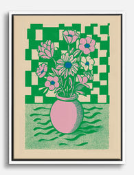
Graphic Floral Pop Bouquet Canvas Print
Sale price From £49.95£74.95 -

Klimt-Inspired Wildflower Meadow Art Print
Sale price From £11.95£19.95 -

Fern Flourish Vase Art Print
Sale price From £11.95£19.95 -

The Botanical House — Chrysanthemum Canvas Print
Sale price From £49.95£74.95 -

Klimt's Garden Blooms Exhibition Poster Canvas Print
Sale price From £49.95£74.95 -
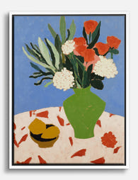
Bold Blooms on Blue Canvas Print
Sale price From £49.95£74.95 -

Bold Scandi Flower Shapes Art Print
Sale price From £11.95£19.95 -

Striped Muse with Flower Art Print
Sale price From £11.95£19.95


More from The Frame

Why Do Palm Prints Work So Well in Minimalist B...
Palm prints have a reputation problem. Say the words and most people picture tiki bars, holiday postcards, and hot pink flamingos. Done properly, though, palm art is one of the...

9 Vintage House Decor Ideas That Start With Wha...
Most vintage decor advice starts with the wrong thing. It tells you to hunt flea markets, install crown moulding, or refinish a dresser before you've decided what the room is...

What Art Actually Looks Good in a Kitchen (Spec...
Most kitchen art advice tells you to "choose what speaks to you." That's useless. You need a framework for elimination, specific subjects that work with the function of the room,...