
 Order today for delivery by
 Framed or Frameless? Your Guide to Minimalist Plant Wall Decor
Stop overthinking that blank wall. A clear, opinionated framework for choosing, framing, and hanging plant prints that actually finish a room.


You've got the blank wall. You've probably got a tab open with a few plant prints saved. What's stopping you is the decision: which one, what frame, how big, and will it clash with the monstera in the corner. This guide answers all of that with actual rules, not vague inspiration.
Why minimalist plant art works where busier prints don't
Minimalist plant art does one thing very well: it adds calm without adding visual noise. A single fig leaf on a cream background gives your eye somewhere soft to land, which is exactly what most living rooms and bedrooms need.
Busier prints, abstract florals, dense landscapes, gallery-style collages, force the room to compete with the art. A minimalist botanical print does the opposite. It recedes when you want it to, and steps forward when the light hits it.
This is also why it ages well. Trend-driven prints feel dated in two years. A clean line drawing of an olive branch looks the same in 2024 as it will in 2034. You're buying something that finishes the room rather than dominates it.

The rooms where simple botanical prints have the most impact
Not every room benefits equally. Here's where minimalist plant art actually pulls its weight.
Living rooms
The wall above the sofa is the most obvious home for a botanical print, and for good reason. It's the longest sightline in most flats, and minimalist plant art softens the formality of a sofa without competing with cushions or throws. One large print or a pair works better here than three or four smaller pieces. Browse living room wall art if you're starting from scratch.
Bedrooms
Above the bed is the second strongest placement. Plant art is restful by nature, which is exactly what you want in a room designed for sleep. Stick to muted tones: sage, sand, terracotta, cream. Skip anything high-contrast or bright.
Hallways and entryways
Narrow walls love tall, slim botanical prints. A 50x70cm portrait-orientation print of a single grass stem or palm frond turns a forgotten corridor into something deliberate.
Bathrooms
If you've got a bathroom with natural light, a small framed plant print works beautifully. Just be honest about humidity. Canvas tends to handle steam better than framed prints with paper, so a small canvas print of a eucalyptus stem above a sink is a smart move.
Kitchens
A single herb-themed line drawing on a small wall, somewhere between the kettle and the spice rack, gives a kitchen warmth without making it feel cluttered. Don't overdo it. One piece is plenty.
Where to skip it
Open-plan rooms with strong architectural features, exposed brick, statement fireplaces, floor-to-ceiling windows, generally don't need minimalist art. The room is already doing the work.
Choosing between colour, black and white, and line art
This is where most people stall. Here's a simple decision tree.
Choose colour prints if:
- Your walls are white or very pale grey
- The room gets good natural light
- Your furniture is neutral and you want the art to add warmth
- You want one focal piece rather than a series
Choose black and white prints if:
- Your walls are already coloured (sage, navy, terracotta, mustard)
- The room has a lot of texture: linen, wood, stone, rattan
- You're hanging a pair or trio and want them to feel cohesive
- You want a more graphic, editorial feel
Choose line art if:
- The room gets low natural light (line art reads cleanly in dimmer conditions where colour can look muddy)
- You're working with a tight budget and want maximum impact with minimum visual weight
- The room already has plenty of pattern or colour elsewhere
- You want something that feels modern without trying too hard
A practical rule: if you can't decide between colour and black and white, default to black and white. It's almost impossible to get wrong, and it works with every wall colour we can think of. Explore minimalist plant art prints if you want to compare side by side.
Frame finishes: black, white, or natural oak and when to use each
Frame choice is more important than people realise. The wrong finish can make a beautiful print look cheap, and the right one can elevate something simple into something gallery-worthy.
Black frames
Use black frames when you want the print to feel anchored and intentional. They work brilliantly with:
- White or off-white walls (high contrast, very crisp)
- Black and white prints (the frame echoes the artwork)
- Modern interiors with dark accents: black taps, matt black lighting, dark wood
Avoid black frames in very warm, traditional rooms. They can feel cold next to soft furnishings and aged wood.
White frames
White frames almost disappear, which is exactly the point. Use them when:
- Your walls are coloured (sage, blush, navy) and you want the print to float
- You're hanging multiple prints and don't want the frames to dominate
- The room is small and you want to keep things airy
The trade-off: white frames show wear faster, and they can look slightly clinical in rooms without much texture.
Natural oak frames
This is our default recommendation if you can't decide. Natural oak adds warmth without competing for attention, and it works across almost every interior style: Scandi, Japandi, mid-century, modern farmhouse, contemporary. Use oak when:
- You have wooden furniture or floors you want to echo
- The room features linen, wool, rattan, or other natural textures
- You want the art to feel inviting rather than formal
- You're pairing prints with real plants (more on this below)
Our framed prints use solid FSC-certified wood (no MDF or veneer), and UV-protective acrylic glaze instead of glass. The acrylic matters here because it doesn't reflect overhead lights the way glass does, which means you can actually see the print from across the room.

Sizing guide: matching print dimensions to your wall and furniture
Wrong-sized art is the most common styling mistake we see, and it's almost always too small. Here are the rules that actually work.
Above furniture
The print (or group of prints together) should be roughly two-thirds the width of the furniture below it. A 200cm sofa wants art that spans around 130-140cm. That's either one 100x70cm landscape print, or a pair of 50x70cm portrait prints hung 5-8cm apart.
Hanging height
The centre of the print should sit at 145-150cm from the floor, which is roughly average eye level. Above furniture, leave 20-25cm between the top of the sofa or headboard and the bottom of the frame. Any higher and the print floats; any lower and it looks crowded.
Standalone walls
For a wall with no furniture below it, scale the print to fill roughly 50-60% of the visible wall space. A narrow hallway wall might suit a single 50x70cm print. A large blank wall in a living room can easily take a 70x100cm piece, or our XL canvas at 100x150cm.
Pairs and trios
Hang pairs with 5-8cm between frames. Trios work best when all three frames are the same size and the spacing is consistent. Don't mix orientations in a series unless you genuinely know what you're doing. It rarely looks deliberate.
When in doubt, go bigger
Most people hang art that's one size too small. If you're choosing between a 50x70cm and a 70x100cm for above your sofa, the 70x100cm is almost always the right call.
Pairing prints with real houseplants without overdoing it
This is the part nobody talks about, and it's where most minimalist rooms tip into looking try-hard.
The first rule: don't duplicate species
If you have a monstera in the corner, don't hang a monstera print above the sofa. It looks like you're trying to make a theme out of one plant, and themes are the enemy of minimalism. Vary the leaf shape: pair your real monstera with a print of a slim grass stem, an olive branch, or a fern frond.
The second rule: vary the scale
If your real plants are big (fiddle leaf fig, large monstera, bird of paradise), choose prints with smaller, more delicate subjects. A single leaf, a sprig, a stem. If your real plants are small (succulents, trailing pothos, little herbs on a shelf), you can go bigger and bolder with your prints.
The third rule: count your green
A useful guideline: in any single room, aim for no more than three "moments of green" in your sightline at once. That might be one large plant, one small plant, and one botanical print. Or two prints and one plant. Once you cross four, the room starts to feel like a garden centre.
The fourth rule: separate them spatially
Don't hang a botanical print directly above a real plant of similar height. Your eye will read them as one cluttered shape. Leave a clear wall behind your largest plant, and put the print on a different wall, or above furniture rather than above another plant.

Three room setups we love
Here's how the rules come together in practice.
Setup one: the calm living room
Wall: Warm white above a 200cm linen sofa.
Print: One 70x100cm colour botanical print in muted sage and cream tones (a single fig branch, an olive sprig, or a soft watercolour eucalyptus).
Frame: Natural oak.
Real plants: One tall fiddle leaf fig in a terracotta pot to the left of the sofa. Nothing else on this wall.
Why it works: The oak frame pulls in the wood tones of your floor or coffee table, the print softens the sofa, and the single tall plant balances the composition without crowding it. Total green moments: two. Browse botanical art prints for the kind of pieces that work here.
Setup two: the restful bedroom
Wall: Sage green behind a low oak bed.
Prints: A pair of 50x70cm black and white line art prints (a palm frond and a grass stem, varied subjects, same style).
Frames: White, to lift them off the coloured wall.
Real plants: One trailing pothos on a bedside table. That's it.
Why it works: The white frames disappear into the visual quietness of the wall, the line art keeps things graphic and modern, and the single trailing plant adds movement without competition.
Setup three: the working corner
Wall: Off-white, narrow wall beside a desk.
Print: One tall 50x70cm portrait canvas print of a single grass stem or palm leaf in muted tones, hung unframed for a softer, more contemporary look.
Real plants: A small ZZ plant on the desk.
Why it works: An unframed canvas feels less formal than a framed print, which suits a workspace. The single tall print fills the narrow wall without crowding it, and the small desk plant keeps the green understated. Hand-stretched canvas with mirrored edges means nothing gets cropped, and the matte finish reads beautifully in side light from a window.

A quick word on editing
The fastest way to make a minimalist room feel chaotic is to keep adding. Once you've finished a wall, stop. If you want to refresh things later, swap a print rather than adding a new one. The whole point of minimalist plant wall decor is restraint, and restraint requires you to leave space empty.
If you're stuck between two prints, hang one and live with it for a fortnight before deciding. The room will tell you whether it needs more. Most of the time, it won't. For more pared-back options, the full minimalist art prints range is a good place to look.
Final thought
Pick one focal wall. Choose one print sized to two-thirds the width of the furniture below it. Frame it in natural oak unless your walls are coloured (then go white) or you want maximum graphic punch (then go black). Hang it at 145cm centre height. Add one real plant on a different sightline. Stop there.
That's the whole guide. The room is finished.

Fab products featured in this blog
-

Effortless Botanical Lines Canvas Print
Sale price From £49.95£74.95 -

Houseplants on a Step Stool Art Print
Sale price From £11.95£19.95 -

Mustard Botanical Cut-Out Art Print
Sale price From £11.95£19.95 -

Playful Potted Blooms Canvas Print
Sale price From £49.95£74.95 -

The Plants and the Flowers Canvas Print
Sale price From £49.95£74.95 -

House Plants Leaf Chart Art Print
Sale price From £11.95£19.95 -

Big Cream Bloom on Green Art Print
Sale price From £11.95£19.95 -

Soft Botanical in Warm Brown Art Print
Sale price From £11.95£19.95 -

Modern Vase Bloom Still Life Canvas Print
Sale price From £49.95£74.95 -

Striped Herb Botanical Study Art Print
Sale price From £11.95£19.95 -

Boho Botanical Vases Art Print
Sale price From £11.95£19.95 -

Houseplant in the Corner Canvas Print
Sale price From £49.95£74.95 -

Botanical Stairway Canvas Print
Sale price From £49.95£74.95 -

Quiet Bloom in Deep Red Art Print
Sale price From £11.95£19.95 -

Potted Plant Sketch Art Print
Sale price From £11.95£19.95 -

The Botanical House Art Print
Sale price From £11.95£19.95 -
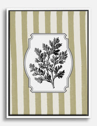
Wormwood Herb Botanical Study Canvas Print
Sale price From £49.95£74.95 -

Boho Botanical Harmony Art Print
Sale price From £11.95£19.95 -

Modern Green Botanical Burst Art Print
Sale price From £11.95£19.95


More from The Frame

Vintage vs Modern Floral Prints: How to Choose
Both styles are called floral art, but they behave in opposite ways on a wall. Vintage botanicals whisper, group together and rely on architectural detail. Modern florals shout, stand alone...

The best dog art by breed, from dachshunds to r...
Dog art has a long history, from Egyptian tomb paintings of sight hounds to Landseer's Victorian retrievers, and each breed carries its own visual language. The trick to choosing a...

The best bird art for a bedroom, from flight si...
Bird art is one of those categories that can drift into cliché fast. Done well, it brings movement, calm and a sense of open sky into the most private room...