
 Order today for delivery by
 Framing William Morris Prints: Wood, Colour and Mount Choices
The frame, mount and wood choices that let Morris's densest patterns breathe and his subtlest ones sing.


Morris designed patterns for entire rooms, not for postcards. That matters when you're framing his work, because the wrong frame can turn a masterpiece of Victorian botanical design into visual noise. This guide covers the technical choices that actually matter: wood tones, mount widths, glazing, and how to match the frame to the specific pattern rather than treating every Morris print the same.
Start with the pattern, not the frame
The most common framing mistake is choosing a frame before really looking at the print. Morris's catalogue spans wildly different visual densities, and each one asks for something different.
Strawberry Thief (1883) is dense, multi-coloured and busy across the entire surface. Willow Bough (1887) is essentially a two-tone repeat with plenty of negative space. Pimpernel is rich and jewel-toned. Golden Lily is warm, ornate and highly detailed. Trellis, his very first design, is open and airy with clear pockets of white ground.
You cannot frame these the same way and expect a good result. Dense patterns need calm frames. Open patterns can handle more decoration. This single principle solves most framing problems before they start.

Wood tone: warm, cool or black
The wood you choose should either echo the dominant colour temperature of the print or provide deliberate contrast. Random choices read as random.
Warm woods (oak, natural pine, honey-stained)
Warm oak works beautifully with prints that carry reds, terracottas, ochres and warm greens. Strawberry Thief is the obvious example, its red-berry accents and warm indigo ground both sit well against natural oak. Golden Lily, with its ochres and honey-golds, is another natural fit. Pimpernel's ruby and rust tones also lift against warm timber.
Warm frames add depth to prints that already feel earthy. They can look heavy against cooler blue-green Morris designs, so use them where the print's palette invites them in.
Cool woods and black ash
Black ash and dark-stained frames are your friends when the print is dominated by cool greens, deep blues and silvery botanicals. Willow Bough is the classic case. Its muted sage and olive tones sharpen dramatically against a black frame, and the graphic simplicity of the two-tone pattern can carry the visual weight of a dark surround.
Trellis also handles a black frame well, because the open composition prevents the darkness from closing the image in. Acanthus, with its deep foliage greens, is another candidate.
Natural, unstained finishes
A pale, unfinished or lightly limed frame is the safest choice when your walls are already colourful, or when the room's existing palette is unpredictable. It flatters almost every Morris design without competing. If you're uncertain, this is the default that fails least often.
Mounts: the decision most people get wrong
A mount (the paper border between the print and the frame) is not decorative padding. It's a breathing space that separates the pattern from the wall, and with Morris prints it can be the difference between "considered" and "costumey."
When to use a mount
Use a generous mount with dense patterns. Strawberry Thief, Golden Lily and Pimpernel all benefit from 5 to 8cm of clean paper between the artwork and the frame. This gives the eye somewhere to rest and prevents the pattern from feeling like it's pressing against the glass.
When to skip it
Open, spacious designs like Trellis or a simplified Willow Bough motif often look better without a mount, or with a very narrow one. The negative space is built into the composition already. Adding a mount can make the print feel small and lost inside its own frame.
Cream, white, or coloured?
Bright white mounts are rarely the right answer for Morris. His palette is built on natural pigments and slightly muted tones, and modern optical-brightened white can make his colours look dirty by comparison.
Off-white, ivory or warm cream mounts are almost always the better choice. They flatter the aged, hand-printed feel of the original designs without introducing a new colour to the composition.
Coloured mounts (sage, deep ivory, soft indigo) can work for a very deliberate look, but they carry risk. If the mount colour doesn't appear somewhere in the print already, it will fight for attention. If in doubt, cream.

Size: what actually works on a wall
Morris designed at scale, and reproductions read best when they're allowed to be generous. Small Morris prints on large walls tend to disappear.
Above a standard three-seater sofa (200-220cm wide): aim for a single frame around 60x80cm portrait or 70x100cm landscape. The artwork should occupy roughly two-thirds of the sofa's width. Smaller than that and the composition feels stranded.
Hallways and narrow spaces: a series of three 30x40cm or 40x50cm prints in matching frames works better than one large piece. The repetition suits Morris's own design logic.
Bedrooms, above a headboard: a single 50x70cm or 70x50cm landscape frame usually sits well. Portrait orientation over a bed can feel top-heavy.
Kitchens and smaller rooms: stick to 30x40cm or 40x50cm. Morris patterns work in small formats, but only if the surrounding wall isn't asking them to do heavy lifting.
Framed and unframed options both go up to 70x100cm at Fab, and canvas prints stretch to 100x150cm for genuinely large statement walls. Browse the full range of William Morris art prints to see how the sizes compare in context.
Glazing: why it matters more than you think
Morris used natural pigments and woodblock printing techniques that produce specific, subtle colour depths. Modern reproductions should be protected in a way that respects this.
Standard picture glass creates glare that flattens the visual depth of dense patterns. Worse, unprotected prints fade in direct sunlight, and Morris's warm reds and yellows are among the first pigments to shift.
UV-protective acrylic glazing solves both problems. It cuts glare, it protects the print from fading over years of daylight exposure, and it's lighter than glass, which matters when you're hanging a 70x100cm framed piece on plasterboard. Every framed print at Fab uses UV-protective acrylic as standard for exactly this reason.
The authenticity problem
Search "William Morris prints" and you'll find a flood of AI-generated imitations that vaguely resemble his work but aren't real designs. The colours are usually too saturated, the pattern repeats don't quite line up, and the botanical details are anatomically wrong (leaves that don't match any real plant, flowers that morph mid-stem).
Authentic Morris designs come from a defined catalogue, most of them produced between 1862 and 1896. Strawberry Thief, Willow Bough, Pimpernel, Golden Lily, Trellis, Acanthus, Fruit, Blackthorn, Snakeshead and Honeysuckle are among the genuine designs regularly reproduced. If a "Morris" print you're looking at doesn't correspond to a documented pattern name, treat it with scepticism.
This matters for framing because AI imitations often have unnatural colour balances that don't respond well to the traditional framing choices Morris's real designs invite. Starting with an authentic reproduction saves you from framing decisions that will never quite land.
You can browse verified Morris designs across our botanical art prints, flowers and pattern collections.

Frame style: keep it simple
Morris designed within the Arts and Crafts movement, which valued honest materials and restrained decoration. His work does not want an ornate, gilded, heavily-moulded frame. It wants a frame that gets out of the way.
Flat or gently profiled frames in solid wood are the correct register. Chunky box frames can work for very large pieces (70x100cm and up) where the depth adds gravity. Thin frames (1 to 2cm profile) suit smaller prints where the artwork should dominate.
Avoid: ornate baroque mouldings, gold leaf, distressed shabby-chic finishes, anything that tries to make the frame itself decorative. Morris does the decorating. The frame just holds it.
Pattern by pattern: quick reference
Strawberry Thief: warm oak or natural wood, cream mount 6-8cm, flat profile. Give it space.
Willow Bough: black ash or dark walnut, thin mount or none, minimal frame profile. Let the graphic quality lead.
Pimpernel: warm mid-tone wood, cream mount 5-6cm. The frame should echo the print's ruby warmth without competing.
Golden Lily: natural oak or honey-stained wood, warm ivory mount. This pattern already carries a lot of golden warmth, so the frame should extend it rather than contrast it.
Trellis: natural or lightly limed wood, no mount or very narrow (2-3cm). Open patterns lose weight behind wide mounts.
Acanthus: black or very dark wood, cream mount 5cm. The dark frame anchors the deep foliage tones.
Hanging multiple Morris prints together
Frame uniformity matters far more than pattern coordination when you're grouping Morris prints. Three completely different Morris designs in matching frames read as a considered collection. The same three designs in three different frame styles read as chaos.
Pick your frame (wood tone, profile, mount width) once, and apply it consistently across the group. If you want variation, vary the size or orientation, not the frame.
For a two-print pairing above a sofa, two 50x70cm portrait frames spaced 8-10cm apart work well. For a three-print row in a hallway, three 40x50cm frames in identical mounts and identical wood create rhythm without noise.
Avoid the trap of trying to build a full salon-style gallery wall out of Morris prints. His patterns are already busy. Twelve of them together, even in matching frames, becomes overwhelming.

Room-by-room considerations
Living rooms: one large statement piece above the sofa. Warm oak framing tends to sit best with the soft furnishings and lighting typical of a lounge.
Bedrooms: cooler tones (Willow Bough, Trellis) tend to feel more restful. Black or dark wood frames add calm.
Hallways: repetition works. Series of three or four in matching frames.
Kitchens and bathrooms: canvas prints handle humidity better than framed paper. If you want Morris in a steamy room, canvas is the more sensible choice.
Home offices: dense patterns like Strawberry Thief or Golden Lily behind you on video calls become a signature. Just make sure the framing is clean enough that it doesn't fight the composition.
What to check when your print arrives
A well-framed Morris print should arrive with the print sitting flat behind the glazing, no bubbling or warping in the paper, the frame corners tight and mitred cleanly, and the fixtures already attached to the back so it's ready to hang. If any of that is off, the framing was done badly and no amount of styling will rescue it.
At Fab, print and frame are fitted together in one workshop and shipped as a finished piece, which prevents the warping and misalignment that happens when frames arrive separately from prints. You can check the piece within the 99-day return window if anything doesn't sit right.
The one rule to remember
Match the frame's calm to the pattern's density. Busy print, quiet frame. Open print, more room to play. Get that right and the rest of the decisions (mount colour, wood tone, size) become much easier to make.

Fab products featured in this blog
-

William Morris Cotton Prints Exhibition Poster Art Print
Sale price From £11.95£19.95 -

William Morris Exhibition Poster Canvas Print
Sale price From £49.95£74.95 -

William Morris Exhibition Poster Art Print
Sale price From £11.95£19.95 -
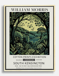
William Morris Cotton Prints Exhibition Poster Canvas Print
Sale price From £49.95£74.95 -

William Morris Centenary Poster Art Print
Sale price From £11.95£19.95 -

William Morris Cotton Prints Exhibition Art Print
Sale price From £11.95£19.95 -

William Morris Exhibition Poster Art Print
Sale price From £11.95£19.95 -

William Morris Centenary Poster Canvas Print
Sale price From £49.95£74.95 -

William Morris Bee Exhibition Poster Art Print
Sale price From £11.95£19.95 -
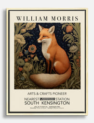
William Morris Fox Exhibition Poster Canvas Print
Sale price From £49.95£74.95 -

William Morris Bee Exhibition Poster Canvas Print
Sale price From £49.95£74.95 -

William Morris Birds Art Print
Sale price From £11.95£19.95 -

William Morris Cotton Prints Exhibition Canvas Print
Sale price From £49.95£74.95 -
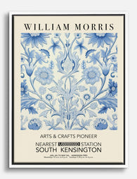
William Morris Exhibition Poster Canvas Print
Sale price From £49.95£74.95 -

William Morris Exhibition Poster Canvas Print
Sale price From £49.95£74.95 -

William Morris Fruit Vase Art Print
Sale price From £11.95£19.95 -

William Morris Cat Charm Exhibition Poster Canvas Print
Sale price From £49.95£74.95 -

William Morris Cotton Prints Exhibition Art Print
Sale price From £11.95£19.95 -

William Morris Centenary Poster Canvas Print
Sale price From £49.95£74.95 -

Studies in Botanical Ornament by William Morris Canvas Print
Sale price From £49.95£74.95


More from The Frame

Vintage vs Modern Floral Prints: How to Choose
Both styles are called floral art, but they behave in opposite ways on a wall. Vintage botanicals whisper, group together and rely on architectural detail. Modern florals shout, stand alone...

The best dog art by breed, from dachshunds to r...
Dog art has a long history, from Egyptian tomb paintings of sight hounds to Landseer's Victorian retrievers, and each breed carries its own visual language. The trick to choosing a...

The best bird art for a bedroom, from flight si...
Bird art is one of those categories that can drift into cliché fast. Done well, it brings movement, calm and a sense of open sky into the most private room...