


 Order today for delivery by
Functional or Decorative? Choosing the Right 2026 Wall Calendar
The calendars worth framing, hanging, and keeping on your wall long after December 2026.


A good wall calendar does two jobs. It tells you what day it is, and it earns its place on your wall for twelve months straight. Most calendars manage one of those at best.
Why most wall calendars end up in the recycling bin by March
You know the ones. Thin paper, stock photography of golden retrievers or Tuscan hillsides, a grid so busy it drowns out whatever image sits above it. They cost six quid at the supermarket and look it.
The problem isn't that they're cheap. The problem is they're designed as functional objects first and decorative objects a very distant second. The image is a filler, chosen from a stock library to tick a theme box. The typography is usually a default sans-serif, sized too large, printed in a colour that fights the artwork underneath.
By February, you've stopped noticing it. By March, it's drifted off the hook or you've swapped it for a magnetic one on the fridge. By summer, it's in the paper recycling and you don't remember what any of the months looked like.
A calendar that lives on your wall deserves more thought than that. It's one of the largest single objects in the room for a full year.
What makes a calendar worth framing (and keeping on the wall all year)
Three things separate a disposable calendar from one worth building a room around.
The image has to work as art on its own. Strip the date grid off, would you still hang it? If the answer is no, you've got a planner with pictures, not a piece of wall art. The best calendars commission original work from illustrators and designers, or license strong existing pieces, rather than pulling from stock libraries.
The paper and printing matter more than you think. Thin uncoated paper curls, fades, and goes dog-eared within weeks. A proper art calendar is printed on thick matte stock using giclée or equivalent museum-grade methods, which means the colour stays accurate and the surface doesn't glare under a ceiling light.
The grid has to serve the artwork, not compete with it. Look at the typography. Is the month name set in a quiet serif or a confident geometric sans, or is it screaming at you in bold red? Are the numbers evenly weighted or do weekends dominate? The grid should feel like part of the composition, not a sticker slapped on top.

Pay attention to attribution too. If the calendar names its illustrator or photographer, that's usually a sign someone cared about the work. If it's anonymous, it probably came out of a template.
Our full edit of 2026 wall art calendars is built around these three tests. Every piece is designed to earn the whole year on your wall.
Best 2026 wall calendars for kitchens and dining spaces
Kitchens get looked at more than any other room in the house. They also take more abuse: steam, cooking splashes, variable lighting, the general chaos of a space that works for a living. A calendar in a kitchen needs to be readable from across the room and resilient enough to handle the environment.
We'd point you towards botanical and food-adjacent illustration here. Line-drawn herbs, loose watercolour fruit, pressed-flower compositions. Something with warmth and a bit of life, but not so dense that it clashes with tiled splashbacks or open shelving.
Avoid anything with glossy coating in a kitchen. Glossy paper picks up every spotlight and pendant reflection, and you end up seeing more glare than calendar. Matte paper behind UV-protective acrylic (not glass) gives you a clean, readable surface that handles overhead lighting without bouncing it back at you.
Size-wise, kitchens tend to suit something in the 50x70cm range. Big enough to read while you're standing at the hob, not so big it dominates a wall that's already working hard with cabinetry and shelving.
For dining rooms, you can go larger and more ambitious. A 70x100cm framed calendar above a sideboard or buffet acts almost as a seasonal painting. Monthly imagery that shifts in mood (brighter palettes in summer months, deeper tones in winter) gives you a quiet rhythm to the room across the year.
Best 2026 wall calendars for home offices and studios
A calendar in a workspace has a different job. You're looking at it multiple times a day, often while on calls or thinking through something else. It needs to be functional at a glance and visually calm enough that it doesn't become a distraction.
This is where we'd push you towards minimal typography-led designs or abstract compositions with restrained palettes. Think Swiss grid design: generous white space, a single confident typeface, muted colour. The sort of calendar that holds its own in a workspace without demanding attention.

Position matters. Hang it where you can glance at it without turning your whole body, usually to the side of the monitor rather than directly behind it (behind the monitor creates a competing focal point on video calls and looks fussy). Eye level when seated is the sweet spot.
For a creative studio or a shared workspace, you can afford more character. A graphic illustrator's calendar with a stronger palette works well because studios tend to have less visual noise competing with it. Pair it with the rest of your office wall art rather than treating it as a one-off.
If you work from home and your "office" is a corner of the lounge, lean towards something that reads first as art and second as a date tracker. Guests shouldn't walk in and immediately see a wall planner. They should see a nice piece of art that happens to tell you it's Wednesday.
Bold and graphic: modern calendar prints for minimal interiors
If your walls lean white, your furniture leans low and linear, and your palette is built around neutrals and one or two accent colours, you want a calendar that holds its own without clutter.
The best modern 2026 wall calendar designs in this category treat each month as a standalone composition. Bauhaus-influenced geometry. Block colour. Confident sans-serif typography set at a generous scale. These calendars work because they borrow the vocabulary of modernist poster design, which was built to communicate across a room.
Our picks here tend to sit comfortably alongside the sort of pieces you'd find in our abstract art prints collection. Scale and colour are the two levers to pull. A single bold calendar on an otherwise bare wall can act as the anchor piece in a minimal room, which means you can go bigger than you'd think, up to 70x100cm framed, or even larger as a canvas.
A note on frames for this style: matte black or natural oak are the safe calls. Avoid anything ornate or stained dark walnut, which fights the graphic flatness of the artwork. If your interior is very pared back, a frameless canvas with a mirrored edge wrap can look even cleaner than a framed print, because there's no visible transition between the art and the wall.
The honest trade-off: canvas is lighter and works beautifully in rooms with high humidity or softer lighting, but framed prints have a sharper, more finished feel. For a bold graphic calendar in a modern interior, we'd usually frame it. The crisp edge rewards the design.
Botanical and illustrative: calendars with a softer feel
Not every room wants a graphic statement. Bedrooms, nurseries, snug lounges, hallways: these spaces often want something warmer, more hand-drawn, with a bit of texture.
Botanical illustration is the obvious category here, and for good reason. A well-drawn series of monthly plants or flowers brings seasonality into the room in a way that stock photography never can. Pressed botanicals, loose ink studies, soft gouache paintings. Look for calendars where you can see the hand of the artist in the mark-making.

Illustrative calendars featuring landscapes, interiors, or figurative work can be beautiful in these rooms too. The key is cohesion across the twelve months. A calendar that jumps between radically different styles month to month feels incoherent on the wall. The best illustrated calendars commission a single artist for the full year, so January and November feel like they belong to the same body of work.
Our botanical art prints edit is a useful reference point for the kind of illustration quality that holds up as framed art. If a calendar's monthly images could sit happily inside that collection as standalone prints, it's probably worth hanging.
An artistic 2026 wall calendar in this style also gives you an afterlife. When the year ends, you can pull your favourite months and frame them individually, or build a small gallery wall from four or five of them. Not every month will be a winner (that's true even of the best calendars), but you often end up with three or four prints that genuinely deserve wall space on their own.
Choosing the right size and frame for your calendar print
Size is the thing most people get wrong. They buy small because small feels safe, and then the calendar looks lost on the wall.
Here's a rough guide we trust:
- Above a desk or console table (120cm wide): 50x70cm framed
- Above a sofa or bed (180cm+ wide): 70x100cm framed, or 100x150cm canvas
- In a narrow hallway or alcove: 40x50cm or 50x70cm
- As a kitchen focal point: 50x70cm framed
- In a large open-plan space: go as big as you can, 100x150cm canvas works beautifully
The viewing distance rule professional art hangers use: whatever the longest wall-facing dimension of the artwork is, that's roughly the minimum distance from which it reads best. A 70cm-wide calendar wants at least 70cm of standing-back space to be appreciated properly.
On frames, the three choices that work for almost any calendar are matte black, natural oak, and warm walnut. White frames can look clean but they tend to disappear against white walls, and that defeats the point of framing. Avoid anything with a decorative moulding or a wide mount border, both of which pull attention away from the artwork.
A 2026 decorative wall calendar framed properly looks like a piece of considered art. The same calendar bulldog-clipped to a wire hanger looks like temporary office furniture. The difference costs very little once you're already buying the print.
How to order and what to expect when it arrives
The single biggest failure in the wall calendar category (and the wider art print category generally) is poor framing. Prints shipped separately from frames, materials that warp in transit, acrylic that arrives scratched, fixtures missing from the back of the frame so you can't hang it without a trip to the hardware shop.
Made-to-order art prints solve most of this. The print and frame are produced together, fitted properly, and shipped in one box. Your calendar arrives ready to hang, with fixtures already attached, so there's no assembly stage between opening the box and getting it on the wall.

A few things worth knowing before you order:
- Prints made on thick matte paper with UV-protective acrylic glaze won't fade in direct sunlight, so you don't need to worry about hanging in a bright room
- Giclée printing holds colour and detail that stock photography and offset printing can't match, especially at larger sizes
- Solid FSC-certified wood frames (not MDF or veneer) stay flat and don't warp with changes in household temperature
- Canvas prints use mirrored edge wrapping, so the main image isn't cropped around the sides
Most people are surprised that the colours look richer in person than on screen. That's partly the paper (matte stock reads warmer than a backlit display) and partly the printing method. It's a nice surprise, but worth factoring in if you're ordering based on how a bright palette looks on your phone.
Returns are worth checking too. A 99-day returns window gives you time to live with the piece on your wall through a full change of seasons and light, which is a much more honest test than deciding in the first week.
The right calendar isn't the one that tracks the most dates. It's the one you'd happily keep on the wall even if the dates ran out. Buy for the image first, the paper second, and the grid third, and you'll end up with a piece that earns its space for the full twelve months and often well beyond.

Fab products featured in this blog
-

Bauhaus 1919 Geometric Poster Canvas Print
Sale price From £49.95£74.95 -

Bauhaus 1919 Geometric Poster Art Print
Sale price From £11.95£19.95 -

Bauhaus 1923 Concentric Circles Art Print
Sale price From £11.95£19.95 -
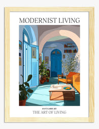
Modernist Living — The Art of Living Art Print
Sale price From £11.95£19.95 -

Modernist Living — The Art of Living Canvas Print
Sale price From £49.95£74.95 -

Bauhaus Frankfurt Exhibition 1923 Canvas Print
Sale price From £49.95£74.95 -

Modernist Living: The Art of Living Art Print
Sale price From £11.95£19.95 -
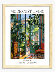
Modernist Living — The Art of Living Art Print
Sale price From £11.95£19.95 -

Modernist Living — Sunlit Room Poster Art Print
Sale price From £11.95£19.95 -

Bauhaus Exhibition 1919 Poster Canvas Print
Sale price From £49.95£74.95 -

Modernist Living: The Art of Living Canvas Print
Sale price From £49.95£74.95 -

Bauhaus Frankfurt Exhibition 1923 Art Print
Sale price From £11.95£19.95 -

Bauhaus Facade Study Art Print
Sale price From £11.95£19.95 -

Bauhaus Ausstellung 1919 Dot Grid Canvas Print
Sale price From £49.95£74.95 -

Bauhaus Exhibition 1919 Poster Art Print
Sale price From £11.95£19.95 -

Bauhaus 1923 Concentric Circles Canvas Print
Sale price From £49.95£74.95 -

Bauhaus Ausstellung 1919 Art Print
Sale price From £11.95£19.95 -

Bauhaus Ausstellung 1919 Dot Grid Art Print
Sale price From £11.95£19.95 -

Modernist Living — The Art of Living Canvas Print
Sale price From £49.95£74.95 -

Bauhaus Exhibition Frankfurt 1923 Art Print
Sale price From £11.95£19.95


More from The Frame

Transform Your Bedroom with Botanical Art: A Cu...
Botanical prints are the easiest art to buy and the hardest to style. One print looks considered; four looks like a garden centre gift shop. This guide is about restraint:...

Why Botanical Art Works Better in Small Living ...
Botanical art does something strange to small rooms: it softens them without crowding them. In large rooms, it often gets lost, floating on a wall that needs more weight. This...

Blending Vintage and Modern Décor? Start With Y...
Your furniture is already a mix. A mid-century sideboard here, a modern bouclé chair there, maybe your grandmother's wingback holding court in the corner. The walls are where you make...