
 Order today for delivery by
 Geometric vs Organic Abstract Art: How to Mix Them Without Clashing
A practical styling guide for combining hard edges and soft curves on one wall, without the chaos.


Mixing geometric and organic abstract art feels risky. One side is all clean lines and structure, the other is loose, flowing, almost liquid, and putting them together on the same wall sounds like a recipe for visual noise. It isn't, if you follow a few specific rules.
Geometric vs organic abstract shapes: a quick visual explainer
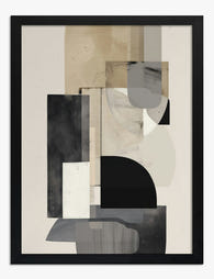
Geometric abstract art uses shapes you could draw with a ruler and compass. Think circles, squares, triangles, hard edges, sharp angles, repeating grids. The Bauhaus school, Mondrian's red-yellow-blue grids, and modern minimalist abstract shapes art all sit firmly in this camp. The feeling is calm, ordered, intentional.
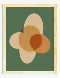
Organic abstract art uses shapes you'd find in nature. Soft curves, irregular blobs, flowing brushstrokes, asymmetric forms. Think Matisse cut-outs, the rounded shapes in a Georgia O'Keeffe close-up, or the fluid strokes of contemporary brush-mark prints. The feeling is relaxed, human, slightly imperfect.
The easiest way to tell them apart: if the shapes look like they were planned, it's geometric. If they look like they grew, it's organic. Most pieces lean clearly one way, but plenty sit in between (a hand-drawn circle, a slightly wonky grid), and that middle ground is where mixing gets interesting.
What is abstract shape art doing in either case? It's giving you composition, colour and feeling without depicting anything literal. That's what makes it so flexible for a home. You're not committing to a subject, just a mood.

Why mixing styles actually makes a space more interesting
A wall of pure geometric prints can feel like a corporate lobby. A wall of pure organic prints can feel like an art student's bedroom. The contrast between the two is what makes a room look styled rather than decorated.
Designers reach for this trick constantly because the human eye gets bored quickly. Pair a sharp grid print with a loose ink wash and each piece makes the other one look better. The structure of the geometric piece highlights the freedom of the organic piece, and vice versa.
There's also a practical reason. Most homes already contain a mix of geometric and organic elements without you noticing. Your sofa is rectangular but the cushions are soft. Your coffee table is round but your rug is striped. Mixing your art the same way mirrors what's already happening in the room.
The fear of clashing usually comes from one specific worry: that the wall will look random rather than curated. That fear is valid. The difference between "intentional eclectic" and "random poster wall" comes down to two things, colour discipline and a clear hierarchy. Both are fixable.
The shared-palette trick: limiting your colours across prints
Here's the rule that does most of the heavy lifting: every print on your wall should share at least two colours with at least one other print. That's it. Style can vary wildly, but colour creates the thread that holds everything together.
Pick three to five colours total for your whole arrangement. A typical palette might be: warm white, charcoal, terracotta, and one accent like sage green or mustard. Every print you choose, geometric or organic, must pull from that palette. Nothing outside it.
This is why mixing styles works in design magazines but fails on most real walls. The magazine version uses a tightly controlled palette across very different shapes. The failed version uses every colour of the rainbow because each print was bought separately without thinking about the others.
A practical way to test this: lay out the prints (or photos of them) on the floor next to each other. Squint. If your eye picks out one piece because the colour is wrong, swap it. The geometric print and the organic print should feel like they came from the same family even if their shapes have nothing in common.
For a curated starting point, the abstract shapes art prints collection is built around a few recurring palettes specifically so pieces work together across both styles.
Choosing a dominant style and an accent style
If you give two styles equal weight, you get a tie, and ties look indecisive. Pick one to dominate and let the other accent. The ratio we recommend is 70/30, or 60/40 if you want a more balanced look.
In a five-piece arrangement, that means three or four pieces in your dominant style and one or two in your accent style. In a three-piece arrangement, two of one and one of the other. The minority style does the work of breaking up the rhythm without taking over.
How to choose which dominates? Look at the room. Hard, modern interiors (concrete floors, steel kitchens, leather sofas) usually benefit from organic art as the dominant style because they need softening. Soft, textured interiors (linen, wood, rugs, plants) usually benefit from geometric art as the dominant style because they need structure.
If you're not sure, default to making the larger or more central piece your dominant style. Whatever your eye lands on first sets the tone. The accent pieces sit around it and add interest without arguing.

Layout examples: three-piece and five-piece arrangements
The three-piece horizontal row
Sizes: three prints at 50x70cm, hung in a straight line above a sofa or sideboard, 5cm between frames.
Composition: organic piece on the left, geometric piece in the middle, organic piece on the right. The geometric piece in the centre acts as an anchor and the two organic pieces frame it. All three share a tight palette of cream, rust, and ink black.
This layout works best above furniture between 180cm and 220cm wide. The total wall coverage is around 160cm, which sits nicely above a standard three-seater.
The three-piece stacked column
Sizes: three prints at 30x40cm, hung vertically with 5cm between frames.
Composition: geometric at the top, organic in the middle, geometric at the bottom. The vertical line works well in narrow spaces, beside a doorway, in a hallway, or next to a tall bookcase. Pick a dominant geometric style and let the organic middle piece break up the rhythm.
The five-piece salon arrangement
Sizes: one large at 70x100cm, two medium at 40x50cm, two small at 30x40cm.
Composition: the large piece sits slightly off-centre, with the medium and small pieces clustered around it. Treat the imaginary outer edge as a rectangle and keep all pieces inside it. Three of the five should be your dominant style, two should be your accent.
This is the trickiest arrangement and benefits from being mocked up first. Cut paper rectangles to the right sizes, stick them to the wall with masking tape, and live with it for a day before drilling.
The five-piece grid
Sizes: five identical 40x50cm prints in a row, or in a 2x3 grid with one piece omitted.
Composition: rotate between geometric and organic across the grid in a deliberate pattern. Geometric, organic, geometric, organic, geometric. The matching size and frame across all five pieces makes the variety in style feel intentional rather than chaotic.
Browse wall art sets for pre-curated combinations if you'd rather skip the mocking-up phase.
Common mistakes (and how to avoid the 'random poster wall' look)
Mistake 1: too many colours. Five prints with five different palettes will always look like a poster wall. Cap your total palette at four or five colours and stick to it ruthlessly.
Mistake 2: equal weighting of styles. Three geometric and three organic with no clear hierarchy. Pick a dominant style. The wall needs a leader.
Mistake 3: random sizing. A 30x40cm next to a 70x100cm with no other pieces to bridge the gap looks like an accident. Use intermediate sizes or repeat sizes to create rhythm.
Mistake 4: mismatched frames with no logic. Three different frame colours across three prints reads as chaotic. Either match all your frames (safe and effective) or commit to a deliberate two-frame system, for example all geometric pieces in black and all organic pieces in oak. Random is the enemy.
Mistake 5: ignoring the room. A wild mixed-style wall in a small busy room competes with everything else and loses. Mixed-style walls work best with calm surroundings (plain sofa, neutral rug) so the wall can be the focal point.
Mistake 6: skipping the test layout. Drilling first and judging later is how you end up with regret. Lay everything on the floor, photograph it from above, then move things around for ten minutes before committing.
A note on framing itself: cheap framing ruins even the best print pairing. Warped MDF frames, prints that bubble inside the mount, glass that catches every light source. If you've ever bought art and felt let down when it arrived, that's almost always a framing failure rather than a print failure. Solid wood frames with UV-protective acrylic and prints fitted properly before shipping is the bar to look for.

Frame selection when mixing styles
Frames either reinforce cohesion or undermine it. The simplest approach: match every frame across the wall. Same colour, same width, same finish. Identical frames around varied art is the most foolproof way to make a mixed-style wall look intentional.
If you want more contrast, use a two-frame system tied to the art itself. All geometric prints in black frames, all organic prints in natural oak. Or all dominant-style pieces framed, all accent-style pieces unframed canvas. The logic must be visible. If a guest can't work out the rule within a few seconds of looking, the rule isn't strong enough.
Avoid mixing three or more frame styles unless you're an experienced stylist with a clear vision. The risk-to-reward ratio is bad.
Scale, proportion and negative space
When pairing one geometric and one organic piece, make the dominant style noticeably larger. A 70x100cm dominant piece next to a 50x70cm accent piece reads as deliberate. Two pieces at the same size next to each other can feel like a stalemate.
Leave at least 10cm of wall between framed pieces. Tighter than that and they fight. More than 20cm and the arrangement falls apart. The exception is a salon-style cluster, where 5cm gaps create a tighter, more dense composition.
Above a sofa, the bottom of your art should sit roughly 20 to 25cm above the back of the sofa. Higher and it floats, lower and it looks cramped. The whole arrangement should span between two-thirds and three-quarters of the furniture's width.
Our favourite geometric-meets-organic pairings right now
Bold circles with loose brushstrokes. A black-on-cream geometric circle print paired with a single sweeping ink-wash piece. Tight palette, strong contrast in shape language, calm overall feeling. Works above a bed in a bedroom with linen bedding and a wood headboard.
Mondrian-inspired grids with Matisse-style cut-outs. Both styles use flat colour and clean execution, so they speak the same visual language despite the geometric/organic split. Pull both palettes toward the same three or four colours and the pairing sings.
Soft pastel grids with botanical organic shapes. A muted grid in dusty pink and sage paired with loose plant-form shapes in matching tones. Quiet, sophisticated, ideal for a hallway or home office. Look at minimalist art prints for the grid component and pair with softer organic pieces from the same palette.
Architectural geometric prints with cloud or water organic forms. Sharp lines paired with atmospheric softness creates an emotional contrast that adds depth without complicating the colour story.
Repeating geometric pattern with one wild-card organic piece. Three identical-style geometric prints in a row, with one larger organic piece sitting above or to the side as an anchor. The repetition makes the geometric side feel intentional, the wild-card piece keeps it from feeling clinical. Worth exploring once you've nailed the basics. Browse geometric art prints for the repeating component.

Before you buy, do this
Pick your palette first. Three to five colours, written down, taped to the wall if you have to. Choose your dominant style based on the room (hard rooms get organic, soft rooms get geometric). Decide on your layout shape, three-piece row, vertical column, or five-piece salon. Then shop within those constraints rather than buying pieces you like and hoping they'll work together. The pieces will work together because you forced them to.

Fab products featured in this blog
-

Neutral Organic Flow Art Print
Sale price From £11.95£19.95 -

Organic Neutral Flow Art Print
Sale price From £11.95£19.95 -

Earthy Overlap Art Print
Sale price From £11.95£19.95 -

Coral Bloom on Terracotta Canvas Print
Sale price From £49.95£74.95 -

Soft Geometry Botanical Art Print
Sale price From £11.95£19.95 -

Organic Flow in Cream and Black Art Print
Sale price From £11.95£19.95 -
Urban Neutral Geometry Art Print
Sale price From £11.95£19.95 -

Neutral Organic Flow Canvas Print
Sale price From £49.95£74.95 -

Organic Neutral Flow Canvas Print
Sale price From £49.95£74.95 -

Earthy Overlap Canvas Print
Sale price From £49.95£74.95 -

Modern Boho Balance Canvas Print
Sale price From £49.95£74.95 -

Earthy Overlap Abstract Art Print
Sale price From £11.95£19.95 -

Bone Leaf on Warm Brown Canvas Print
Sale price From £49.95£74.95 -

Neutral Shapes & Earth Blocks Art Print
Sale price From £11.95£19.95 -

Earthy Overlap Abstract Art Print
Sale price From £11.95£19.95 -
Earthy Overlap Shapes Art Print
Sale price From £11.95£19.95 -

Organic Flow in Cream and Black Canvas Print
Sale price From £49.95£74.95 -

Geometric Botanical Harmony Art Print
Sale price From £11.95£19.95 -

Neutral Shapes & Earth Blocks Canvas Print
Sale price From £49.95£74.95


More from The Frame

Whimsical Nursery Wall Art Ideas That Grow With...
Most nursery art is designed for the parents standing in the room at 3am, not the seven-year-old who will eventually sleep there. That's why so much of it gets swapped...

Whimsical Art vs Quirky Art: What's the Differe...
If you've ever been confused browsing for playful wall art, wondering if that dressed-up fox print is whimsical, quirky, or something else entirely, you're not alone. The two styles overlap...

Vintage vs Modern Floral Prints: How to Choose
Both styles are called floral art, but they behave in opposite ways on a wall. Vintage botanicals whisper, group together and rely on architectural detail. Modern florals shout, stand alone...