Hallway Art: The Most Overlooked Surface in the House
You walk past it thirty times a day and still treat it like storage. Time to fix that.

Your hallway is the most-viewed room in your home. You pass through it every time you make coffee, take a shower, answer the door, or go to bed. And yet it's almost always the last surface to get any thought at all.
That's a strange oversight, because hallways are the easiest space in the house to transform. No furniture to rearrange, no rugs to budget for. Just walls, waiting.
The frequency paradox
Count it up honestly. A typical adult moves between rooms 20 to 40 times a day. Every one of those transitions happens through a hallway. If you have kids or housemates, double it.
Compare that to your living room, which you might properly sit in and look at for an hour or two in the evening. The hallway wins on sheer exposure by an order of magnitude. So why does the living room get the velvet sofa, the curated coffee table books, and three pieces of art, while the hallway gets a coat hook and a smoke alarm?
Partly it's because we don't linger in hallways, so they don't feel like rooms. Partly it's because they're tricky: narrow, often dim, awkwardly proportioned. Mostly it's habit. We've decided hallways are functional space, and functional space doesn't get art.
That decision is wrong, and reversing it is the highest-leverage decorating move in the house. You're not adding art to a room you sometimes use. You're adding it to a surface you stare at hundreds of times a week.

Why hallways are an opportunity, not a problem
Most guides treat hallways as a design problem to solve. We'd rather you treat them as the easiest win you've got.
Here's why. Hallway art doesn't compete with sofas, rugs, curtains, or shelving. There's almost nothing else visually happening, which means a single well-chosen piece does more work than the same piece would in a busy lounge. The signal-to-noise ratio is brilliant.
Hallways are also relatively cheap to transform. You're not buying furniture. You're buying art, hanging it properly, and possibly adding a picture light. That's a project you can finish in an afternoon, for a fraction of what it would cost to refresh any other room.
And because hallways are smaller, you can be braver. A bold, saturated piece that might overwhelm a living room often sings in a corridor. The compressed sightline forces you to engage with it.
Sizing: the rules that actually matter
The single biggest mistake in hallway art is going too small. A 30x40cm print floating alone above a radiator looks apologetic. Hallways need confident scale.
The basic rule professional designers use is the two-thirds rule. Your art (or arrangement of pieces) should occupy roughly two-thirds to three-quarters of the available wall width, or the width of the furniture beneath it if there's a console table. Anything less and the wall swallows the piece.
For a typical UK hallway wall of around 120cm wide between doors, that means art at least 80cm wide. A single 60x80cm piece works. So does a pair of 40x50cm prints with a small gap between them.
Portrait or landscape?
Narrow hallways under 120cm wide want portrait orientation. Vertical pieces echo the verticality of the walls and don't fight the proportions. A 50x70cm portrait print at eye level is one of the most reliable choices you can make.
Wider hallways above 150cm can take landscape pieces, especially above a console table or bench. Landscape works particularly well at the end of a hallway where you're approaching it head-on rather than glancing sideways.
Hanging height
Centre your art at 145 to 150cm from the floor. This is gallery standard and it works because it matches average eye level. The exception is when you're hanging above furniture, in which case leave 15 to 20cm between the top of the furniture and the bottom of the frame.
Spacing in a series
If you're hanging multiple pieces along a hallway, space them 40 to 60cm apart, centre to centre. Closer than that feels cramped. Wider and the eye loses the connection between them.
Gallery wall or statement piece?
This is the first real decision. The answer depends on the length of your hallway and the sightlines.
Statement piece works best when you have one good wall, especially at the end of a hallway where the eye naturally lands. A single large piece (think 70x100cm framed) at the end of a corridor turns a tunnel into a destination. You walk towards the art every time you enter that part of the house.
Gallery wall works best when you have a long uninterrupted side wall, ideally 3 metres or more. Gallery arrangements reward slow walking, giving the eye something new every metre. They also let you build slowly, adding pieces as you find them.
Hybrid approaches work too. A single large piece at the end of the hallway plus a smaller pair or trio along one side wall gives you both a focal point and visual rhythm.

The lighting problem (and how to fix it)
Most hallways have one overhead bulb and no natural light. This is the single biggest reason hallway art underperforms. You can hang a beautiful piece and barely see it after sundown.
The fix is dedicated art lighting. A picture light mounted above the frame, or a small wall sconce angled towards it, transforms how the piece reads. Aim for around 30 to 50 lumens per foot of hallway length, with picture lights ideally in the 2700K to 3000K warm white range to flatter colour.
Battery-operated picture lights have improved enormously and are a renter-friendly option. Hardwired versions look more polished but require an electrician.
If lighting upgrades aren't on the cards, choose art accordingly. Lighter tones, warmer palettes, and pieces with strong contrast read better in dim conditions. Dark, moody pieces need light to work. Save those for better-lit walls.
This is also where print quality matters more than people realise. Cheap prints look fine in showroom lighting and dead in real hallway lighting. Giclée printing on thick matte paper holds detail in low light because there's no glare bouncing off a glossy surface, and the colour doesn't flatten out. If your hallway has any direct sun at all, UV-protective acrylic glazing is worth it because hallway art tends to stay on the wall for years, and fading is real.
Creating cohesion without matching
Hallway art needs to relate to the rooms it connects, or it feels disconnected. But it doesn't need to match.
The trick is to find one anchoring element and let everything else vary. Three approaches that work:
Palette cohesion. Pick two or three colours from adjacent rooms (the rust cushion from the lounge, the sage tile from the bathroom) and choose hallway art that uses those colours, in any style. Subject matter and medium can vary wildly.
Tonal cohesion. Keep everything in the same brightness register. All muted and earthy, or all bright and graphic, or all moody and saturated. Style varies, mood doesn't.
Frame cohesion. Mix subjects and styles freely but keep frames consistent. All black, all natural oak, all white. This is the easiest cohesion to execute and the hardest to mess up.
A good place to start browsing if you want options that play well together is the abstract art collection, which gives you a lot of flexibility on palette without committing to a strong subject.
Hallway art by type
Not all hallways are the same. The approach should change with the function.
Entry hallways
This is the one most guides obsess over because of the "first impression" angle. It's overrated as a frame, because you'll see this hallway thousands of times for every guest who sees it once. But it's still the most public hallway, so it tends to attract the boldest choices.
A single statement piece works beautifully here, especially something with personality. A bold print, a piece of typography, or a striking photographic landscape above a console table tells visitors and yourself something about the house in one glance.
Upstairs hallways and landings
These are more private and tend to lead to bedrooms. Soften the tone. Botanical, abstract, or landscape pieces in calmer palettes work better than graphic or high-contrast art. You're transitioning towards rest, and the art should reflect that.
Landings are often underused. The wall at the top of a staircase is one of the best display spots in the house because you approach it slowly as you climb, with the art in full view the whole time. Don't waste it on a small piece.
Long corridor hallways
If you have a hallway longer than 4 metres, you have a gallery. Use it. A series of related pieces along one wall, evenly spaced, turns a dead transitional space into something you actually want to walk through.
Hallways to bathrooms
Humidity is real. Canvas prints handle moisture better than paper-based prints over time, which is worth considering for any wall that catches steam from an open bathroom door. The canvas art collection gives you the same image quality with a more forgiving material.

Common mistakes that keep hallways feeling sad
A few patterns we see again and again.
Everything hung at exactly the same height in a long line. This creates a horizon line that feels institutional. Vary heights slightly, or commit to a proper gallery arrangement with clear logic.
Art that's too small for the wall. A 30x40cm piece on a 2-metre wall reads as an afterthought. Go bigger than feels comfortable. You can almost always go bigger.
Ignoring the end of the hallway. That terminal wall is the most valuable surface in the entire hallway because everyone walks towards it. If it's blank or hidden behind a coat rack, you're wasting it.
Frames shipped separately from prints. This is one of the most common failures in the category. Cheap framing arrives warped, with prints that don't sit flat, or with cardboard backing that bows within months. If you're buying framed, buy from somewhere that fits the print into the frame properly before it ships and uses solid wood rather than MDF. It's the difference between art that looks crisp for a decade and art that needs replacing in a year.
Hanging too high. When in doubt, lower. Most people hang art 10 to 20cm higher than they should because they're worried about furniture clearance. Trust the 145 to 150cm centre rule.
The seasonal rotation case
Here's a small luxury most people don't think about. Because hallway pieces tend to be smaller than living room statement pieces, and because you're working on one focused surface, hallways are perfect for rotating art with the seasons.
Buy one set of frames in standard sizes (50x70cm and 40x50cm are the most versatile) and swap the prints inside them twice a year. Warm, autumnal, moody pieces from October to March. Brighter, lighter, more botanical pieces from April to September.
It's a tiny intervention that makes the house feel attentively cared for. And because hallway frames stay put, you only buy new prints, not new frames. The botanical print collection is a good source for the warmer half of the year.
The renter's version
If you can't drill into walls, you still have options. Heavy-duty adhesive strips hold framed prints up to about 3kg, which covers most pieces up to 50x70cm if you go for lighter materials. Canvas is significantly lighter than glass-fronted framed prints and is the obvious choice if you're working with adhesive.
A picture rail is a more elegant solution if your landlord allows one small fixing. Hang multiple pieces from cord or chain and rearrange whenever you like, with one set of holes total.
Lean a large piece against the wall on a console table. This works particularly well at the end of a hallway and looks intentional rather than improvised.
Where to start
Pick the wall you look at most. Usually it's the one directly opposite a doorway you pass through several times a day. Measure it. Pick a piece (or pair) sized to two-thirds of the wall width. Hang it at 145cm centre. Add a picture light if you can.
Do that one thing, well, and the rest of the hallway will start asking for attention. That's the right order. Solve the most-viewed wall first and let momentum carry you through the rest.


Fab products featured in this blog
-

Garden Path to Home Art Print
Translation missing: en.products.product.sale_price From £11.95£19.95 -

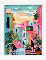
London Colourful Alleyway Art Print
Translation missing: en.products.product.sale_price From £11.95£19.95 -

Sunlit Tuscan Hills Art Print
Translation missing: en.products.product.sale_price From £11.95£19.95 -

Retro Roadside Vibes Art Print
Translation missing: en.products.product.sale_price From £11.95£19.95 -

Garden Path to Home Canvas Print
Translation missing: en.products.product.sale_price From £44.95£74.95 -
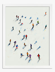
Winter Wanderers Art Print
Translation missing: en.products.product.sale_price From £11.95£19.95 -

Year of the Horse Art Print
Translation missing: en.products.product.sale_price From £11.95£19.95 -

Waiting at the Door Art Print
Translation missing: en.products.product.sale_price From £11.95£19.95 -

Amsterdam Canal Houses Watercolour Art Print
Translation missing: en.products.product.sale_price From £11.95£19.95 -

Retro Roadside Vibes Canvas Print
Translation missing: en.products.product.sale_price From £44.95£74.95 -

London Colourful Alleyway Canvas Print
Translation missing: en.products.product.sale_price From £44.95£74.95 -

Sunlit Tuscan Hills Canvas Print
Translation missing: en.products.product.sale_price From £44.95£74.95 -

William Morris Exhibition Poster Art Print
Translation missing: en.products.product.sale_price From £11.95£19.95 -

Strolling the Greens Art Print
Translation missing: en.products.product.sale_price From £11.95£19.95 -

Waiting by the Door Art Print
Translation missing: en.products.product.sale_price From £11.95£19.95 -

Sunlit Doorway to the Courtyard Art Print
Translation missing: en.products.product.sale_price From £11.95£19.95 -

Sorrento Cliffside Views Art Print
Translation missing: en.products.product.sale_price From £11.95£19.95 -
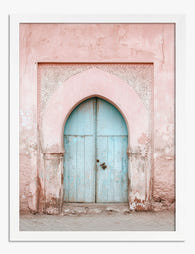
Sunset Alley in Marrakech Art Print
Translation missing: en.products.product.sale_price From £11.95£19.95 -

Coastal Surf Trio Art Print
Translation missing: en.products.product.sale_price From £11.95£19.95 -
Pastel Archway Entrance Art Print
Translation missing: en.products.product.sale_price From £11.95£19.95


More from The Frame

The Gallery Wall Edit: Curated Layouts That Fee...
There is a specific kind of gallery wall that haunts the internet. Six matching black frames in a perfect grid, a Matisse line drawing, an "abstract neutral", and possibly the...

Glass vs Acrylic Glazing: The Bit Nobody Explains
Every guide to picture frame glazing reads the same way: a tidy pros and cons list, a vague nod to "personal preference," and a recommendation that conveniently aligns with whatever...

Why We Frame with Real Wood (And What Flat-Pack...
Most people buying a framed print never think about the frame itself. That's fair. You're buying the art. But the frame is the structure that protects it, defines it on...