Hallway Wall Art: First Impressions That Last (Ideas, Sizes, and Layouts)
The most ignored wall in your home is also the easiest to transform. Here's how to do it properly.

Your hallway is the first thing guests see and the last thing you walk past every day, yet it's almost always the emptiest wall in the house. The good news: hallways respond to art faster than any other room. A bare corridor looks unfinished. The same corridor with two well-sized prints looks intentional, considered, and twice as wide.
Why hallways are the easiest room to transform with art
Hallways have no competing furniture, no sofa to balance against, no rug to coordinate with. The walls are the room. That means a single piece of art does more work here than it would anywhere else.
They're also the most forgiving space for trying things you wouldn't risk in a lounge. Bolder colours, denser gallery walls, more graphic subjects. People move through hallways, they don't sit and study them, so the art reads as a flash of impression rather than a focal point you stare at.
The reason hallways stay empty isn't taste. It's that people don't know what size to buy or where to hang it. We'll fix both.

Narrow hallways: why landscape beats portrait
If your hallway is under 1 metre wide, landscape orientation almost always wins. Here's why.
Portrait prints draw the eye up and down. In a narrow space, that vertical pull emphasises how tight the walls are, because your peripheral vision is already squeezed. Landscape prints do the opposite. They pull the eye along the length of the corridor, which makes the space feel longer and, counterintuitively, wider.
The break-point we'd suggest: under 900mm wide, go landscape. Between 900mm and 1200mm, you can mix. Over 1200mm, portrait works fine and a tall piece can actually anchor the space.
A medium 16x20in (40x50cm) landscape print, or a pair of them spaced evenly along one wall, transforms a typical Victorian terrace hallway. Browse landscape-shape art prints if you want to see the format in action, or head straight to our curated hallway art prints selection.
Standard UK hallway widths and the sizes that fit
- 750-900mm (narrow Victorian terrace): 11x14in or 12x16in landscape, hung in a sequence of two or three
- 900-1100mm (1930s semi, mid-century): 16x20in landscape, or a pair of 12x16in
- 1100-1300mm (modern new-build, larger period homes): 18x24in or 20x28in, portrait or landscape
- Over 1300mm (open-plan entry, generous Edwardian): 24x32in statement piece, or a full gallery wall
Hang the centre of the artwork at 145-150cm from the floor. That's slightly below traditional gallery height because hallway sight lines are usually closer than living room ones.
The staircase gallery wall: following the angle without the wonky look
"Follow the angle of the stairs" is the standard advice, and it's the reason most staircase galleries look wrong. Frames hung on a perfect diagonal create a snake effect, and the eye gets confused about whether to read each frame as level or as part of a slope.
The fix is the parallel top-edge method. Instead of stepping each frame down with the staircase, you group frames so the top edges of each cluster sit parallel to the ceiling, and the bottom edges step down with the stairs. The overall shape follows the diagonal, but each individual frame sits square. Your eye reads it as intentional rather than tilted.
A few rules that make this work:
- Keep frame spacing tight: 3-4cm (about 1.25-1.5in) between frames. Wider gaps fragment the cluster.
- Use a paper template. Cut newspaper to each frame's size, tape it to the wall, stand back from the bottom of the stairs, and adjust before you hammer anything.
- Lay everything out on the floor first. Photograph it from above. Move pieces around until the shape feels right.
- Stick to two frame styles maximum. In a sequence you walk past, mismatched frames look chaotic rather than eclectic.
A cohesive wall art set takes most of the guesswork out, because the proportions and palette are already designed to work together.

Entryway statements: one bold piece or a curated pair
The entry wall, the first thing you see when the front door opens, deserves a decision rather than a default.
Go with one bold piece if: you have at least 1.2m of clear wall, the rest of your hallway is busy (patterned floor, statement lighting, console with objects), or you want maximum impact with minimum fuss. A 24x32in or 28x40in framed print does this brilliantly.
Go with a curated pair if: the wall is wider than 1.5m, you want symmetry, or there's a console or radiator cover beneath that needs balancing. Two matching 16x20in or 18x24in prints, hung 8-10cm apart, read as one composition while giving you room to play with subject pairing (a city and a landscape, two botanicals from the same series, a diptych).
Avoid three pieces in a row at the entry. It almost always looks like you couldn't decide. Three works on long corridor walls, not on the first wall you see.
Subjects that create brilliant first impressions
Hallways set tone. Whatever's on the wall is what guests subconsciously assume the rest of the house will feel like, so subject choice matters more here than in a back bedroom.
Travel and places. A cityscape of somewhere you love, a coastal print, a mountain you've climbed. These spark conversation and tell guests something about you in three seconds. Our travel and places collection and cityscape prints work especially well in narrow halls because most are landscape format.
Vintage and archival. Old maps, botanical illustrations, antique advertising posters. Vintage gives a hallway instant character, particularly in period homes where the architecture already has texture. Browse vintage art prints for options that pair well with original features.
Architectural. Line drawings of buildings, doorways, arches. Architectural subjects flatter hallways because they echo the geometry of the space itself.
Botanical. The safest brilliant choice. Botanical prints bring greenery into windowless spaces without needing actual plants (which struggle in dark hallways anyway). Pair with William Morris prints if you want something more decorative and pattern-rich.
What we'd avoid: anything too dark or moody, anything overly personal (family photos belong further into the house), and abstract pieces that need context to read properly. Hallways aren't where people pause to interpret.
Lighting: making art work in dark hallways
Most UK hallways are dark. Victorian terraces have no windows in the corridor, 1930s semis get one fanlight at the front, modern new-builds borrow light from adjacent rooms. Choosing art that survives this is half the battle.
What works in low light:
- Light backgrounds (cream, ivory, soft pastels, white)
- High-contrast graphic subjects (line drawings, bold typography, monochrome photography)
- Warm colours (terracotta, mustard, ochre) which read as warm even in dim conditions
- Metallic or gold elements in the print itself, which catch what little light there is
What struggles:
- Dark backgrounds (deep navy, black, charcoal) which disappear into shadow
- Subtle tonal pieces where the detail is in mid-tones
- Anything with a glossy finish (which is why our matte giclée paper is genuinely useful here, no glare from overhead lights)
For lighting itself, picture lights solve the problem properly. If you can wire one in, aim for 200-300 lumens per piece. If you're renting, battery-operated LED picture lights stick on with adhesive and last weeks per charge. They're not as elegant as hardwired but they make a real difference.
UV-protective acrylic glazing means you don't have to worry about the rare patch of direct sunlight from a fanlight bleaching your art over time, which matters more than people realise in south-facing entries.

The console table wall: getting the proportions right
If you have a console table, the art above it follows a simple rule: the artwork should be roughly two-thirds the width of the table. A 90cm console wants a print around 60cm wide. A 120cm console wants closer to 80cm.
Hang the bottom edge of the frame 15-20cm above the table surface. Closer than 15cm looks cramped. Further than 25cm and the art floats, disconnected from the furniture beneath.
The one-vs-pair decision for console walls:
- One piece if the console is under 100cm or the styling beneath is busy (lamp, tray, books, ceramics).
- A pair if the console is over 110cm and the surface styling is minimal. Two prints hung side by side echo the horizontality of the table.
- A small gallery cluster if you want a relaxed, collected look. Keep the cluster within the width of the console.
Lean smaller prints against the wall on the console itself if you're renting and can't drill, or want a less formal feel. A 6x8in or 11x14in framed piece propped behind a lamp adds depth without commitment.
The end-of-hallway focal point
A long hallway that ends in a blank wall is wasted opportunity. The terminus is where the eye lands every time you walk in, so it deserves the boldest piece in the sequence. A single large framed print, 20x28in or larger, hung centred on that end wall draws you through the space and makes the whole corridor feel composed rather than accidental.
If there's room, add a small console or shelf beneath with a lamp. Mirror plus art plus light is the classic formula and it works because each element solves a different problem: the mirror bounces light, the art gives focus, the lamp warms the corner.

A few last things
Hallways are high-traffic. Bags catch on frame corners, kids' coats brush past, the dog wags into things. Hang slightly higher than you would in a bedroom (centre at 150cm rather than 145cm) and consider acrylic glazing rather than glass for any wall near the front door, where things get knocked.
Buy the frames properly fitted from the start. Hallways are the worst place to discover a frame has warped in transit or arrived in pieces, because you'll be looking at it every single day. Framed prints that ship ready-hung, with the print already fitted and fixtures attached, are worth the small premium for the time they save and the headache they avoid.
Start with one wall. The entry wall, ideally. Get the size right, hang it at the right height, and see how the rest of the hallway suddenly asks for more.

Fab products featured in this blog
-

Winter Strolls Art Print
Translation missing: en.products.product.sale_price From £11.95£19.95 -

Vibrant Urban Entryway Canvas Print
Translation missing: en.products.product.sale_price From £44.95£74.95 -
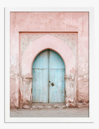
Pastel Archway Entrance Art Print
Translation missing: en.products.product.sale_price From £11.95£19.95 -

Eclectic Botanical Stairway Art Print
Translation missing: en.products.product.sale_price From £11.95£19.95 -

Lush Staircase Sanctuary Art Print
Translation missing: en.products.product.sale_price From £11.95£19.95 -

Botanical Staircase Haven Canvas Print
Translation missing: en.products.product.sale_price From £44.95£74.95 -

Garden Welcome Art Print
Translation missing: en.products.product.sale_price From £11.95£19.95 -

Vibrant Stairway Canvas Print
Translation missing: en.products.product.sale_price From £44.95£74.95 -

Vibrant Hillside Journey Art Print
Translation missing: en.products.product.sale_price From £13.99£19.99 -

Botanical Staircase Haven Canvas Print
Translation missing: en.products.product.sale_price From £44.95£74.95 -

Sunflower Serenity Art Print
Translation missing: en.products.product.sale_price From £11.95£19.95 -

Sunlit Forest Pathway Art Print
Translation missing: en.products.product.sale_price From £13.99£19.99 -

Colorful Woodland Path Art Print
Translation missing: en.products.product.sale_price From £11.95£19.95


More from The Frame

How to Build a Gallery Wall with Japanese Art P...
Gallery walls go wrong for predictable reasons: too many frames, too many styles, too little breathing room. Japanese art demands the opposite of all three. This guide walks you through...

Art Prints as Gifts: The Complete Guide to Givi...
Giving art feels risky because it sits on someone's wall every day, judging your taste. The good news: there's a small, reliable playbook that takes most of the anxiety out...

How Many Art Prints Do You Actually Need? The R...
Most people buy too many prints that are too small. They end up with what designers quietly call the postage stamp effect: a scattering of A4 frames floating in acres...