How to Decorate with Australian Art Prints (Without Making Your Home Look Like a Tourism Office)
A confident, opinionated guide to celebrating Australia on your walls without turning your home into a Qantas lounge.

You love Australia. You also don't want guests walking in and assuming you work part-time for Tourism NT. The good news: there's a clear difference between a home that nods to Australia beautifully and one that looks like a souvenir shop, and most of it comes down to restraint, mixing, and choosing the right rooms.
The number one mistake people make with travel-themed wall art
The single biggest error is treating Australian art as a theme rather than a subject. Once you commit to the theme, every decision starts compounding: a Bondi print here, a Uluru print there, a kangaroo silhouette in the hallway, eucalyptus prints in the kitchen. Each piece is fine on its own. Together, they read as a gift shop.
The fix is simple. Treat your favourite Australian print as you'd treat any other piece of art you love: a stand-alone object that needs to earn its place on the wall through composition, colour, and scale, not through its passport stamp.
A useful test we call the lived-there-versus-visited-there check: does the print feel like something you chose because it's genuinely beautiful, or because it reminds you of a holiday? Both are valid, but the second category needs more careful curating. A moody, abstract photograph of a lesser-known West Australian inlet will always feel more personal than the hundredth identical shot of Bondi from above.

Choosing one anchor piece vs. building an Australian gallery wall
Most homes are better served by one anchor piece than by a full Australian gallery wall. An anchor is a single large print, usually 70x100cm or bigger, that holds a wall on its own. It's confident, it doesn't need backup, and it lets the rest of the room breathe.
Gallery walls of Australian prints can absolutely work, but they require discipline. The two failure modes are matchy (six near-identical beach shots) and chaotic (one Uluru, one koala, one Sydney Opera House, one rainforest). Both kill the room.
If you want a gallery wall, follow this rule: pick one Australian print as the hero, then build out with two or three non-Australian prints that share its palette or mood. An ochre desert landscape pairs beautifully with an abstract terracotta print and a black-and-white botanical. Now you have a curated wall that happens to feature Australia, not a wall about Australia.
For pre-balanced pairings, wall art sets take the guesswork out of proportion and palette, which matters more than people realise once you start hanging things.
When the gallery wall actually works
Stairwells, long hallways, and home offices. These are spaces where you want visual rhythm and where viewers move past the art rather than sitting with it. A six-print Australian-leaning gallery wall up a staircase reads as collected. The same wall behind your sofa reads as themed.
Australian beach prints: which rooms they work in and which they don't
Australian coastal wall art is the most popular and the most overused subject in the category. It works brilliantly in the right room and falls flat in the wrong one.
Where it works:
- Living rooms with neutral palettes (warm whites, oat, soft greys), where a single dramatic ocean print becomes the focal point.
- Bedrooms with linen bedding and natural wood, especially headboards in oak or walnut. Coastal prints lean calm, which is what you want above a bed.
- Hallways and entryways, where a tall vertical coastal print (think 50x70cm or 70x100cm portrait) creates a sense of arrival.
- Home offices, where a quiet ocean horizon helps you stop staring at your laptop.
Where it kills the vibe:
- Bathrooms. Counterintuitive, but stick with us. Hanging a beach print in a bathroom is the most clichéd move in styling. It's the design equivalent of a hotel room. If you want art in a bathroom, choose something unexpected: a botanical, an abstract, a portrait.
- Kitchens. Beach prints rarely have the visual energy a kitchen needs. Kitchens want food, plants, or graphic prints with strong shapes.
- Formal dining rooms, unless the print is moody and abstract. A bright sunny Bondi shot fights the candlelit-dinner mood.
If you're committed to coastal, our broader coastal art prints collection includes pieces beyond the obvious turquoise-and-sand formula, which is where most coastal styling goes wrong.
Mixing outback tones with Scandi, modern, and traditional interiors
The outback palette (terracotta, ochre, rust, eucalyptus green, charcoal, bone) is one of the most flexible in interior design. The trick is knowing how to bridge it into the style you already have.
Outback meets Scandi
Scandi interiors are built on pale woods, white walls, and restraint. Australian landscape prints with red earth and warm rust tones add the warmth that Scandi sometimes lacks without breaking the simplicity.
The bridge: textiles. A terracotta linen cushion, a rust-coloured wool throw, a ceramic vase in unglazed clay. These small accents tell the eye that the warm tones in the print belong to the room, not just the wall. Frame choice matters here. Go with natural oak or a thin black frame. Avoid anything ornate.
Outback meets modern
Modern interiors (clean lines, monochrome bases, statement furniture) handle dramatic Australian landscape prints beautifully. The contrast between a hard-edged room and an organic, weathered desert print is exactly what makes the room feel collected rather than catalogued.
Scale up. In a modern room, your Australian print should be large, often 70x100cm or bigger on canvas, hung low and central. The drama is the point.
Outback meets traditional
Traditional interiors (deeper colours, layered textures, antique pieces) need Australian art with a similar sense of age and depth. Skip the bright contemporary photography and look for prints with painterly textures, muted palettes, and visible brushwork or grain.
A heavy walnut or dark-stained oak frame keeps the print in conversation with traditional furniture. Avoid white frames here. They float oddly against richer wall colours.

How to pair Australian art with non-Australian prints for a cohesive look
This is where most people give up and just buy more Australian prints. Don't. The non-Australian buffer is what stops your home looking themed.
The 70/30 rule
In any room with Australian art, no more than 30% of the visual art content should be explicitly Australian. The remaining 70% can be abstract, botanical, figurative, architectural, anything, as long as it shares a palette or mood with your Australian piece.
In practice, that often means one Australian print per room as the headline, supported by two or three pieces that complement rather than echo it.
The colour bridge technique
Pick two or three colours from your Australian print and find non-Australian prints that share them. An ochre-and-eucalyptus desert landscape connects easily to:
- A French still life with terracotta pottery
- An abstract print in burnt orange and sage
- A black-and-white botanical with eucalyptus leaves (no nationality required)
The viewer's eye reads colour relationships before subject matter. If the palette ties together, the room reads as cohesive even when the subjects are wildly different.
The texture pairing technique
If your Australian print is a sweeping landscape photograph, balance it with something handmade-looking: a textured abstract, a line drawing, a vintage botanical. Mixing media (photographic, painted, illustrated) is what stops a wall feeling flat.
Browse nature art prints for botanicals and organic abstracts that bridge naturally into Australian landscape palettes without doubling down on the theme.
Frame and size guide: getting the proportions right for each room
Bad framing is what kills more wall art than any other single factor. Frames that warp, prints that don't sit flat, glass that catches every overhead light. We use solid FSC-certified wood frames (no MDF, no veneers) and UV-protective acrylic glaze instead of glass, which means no glare and no fading even in rooms that get strong afternoon sun. Worth knowing if you're hanging coastal prints in a sunny lounge.
The two-thirds rule, applied to Australian prints
Your art should be roughly two-thirds the width of the furniture beneath it. So:
- Above a 200cm sofa: a single 100x150cm canvas, or a pair of 50x70cm framed prints with a small gap between them.
- Above a 140cm sideboard: a single 70x100cm framed print works perfectly.
- Above a 160cm bed: a 60x80cm or 70x100cm landscape-orientation print, or two 40x50cm prints stacked horizontally.
- In a hallway: vertical 30x40cm or 50x70cm prints sit best, hung at eye level (centre of the print roughly 145-150cm from the floor).
Framed vs. unframed canvas
Framed prints look more polished, hold their shape forever, and suit traditional and modern interiors equally. They're heavier, which matters for plasterboard walls.
Canvas is lighter, more casual, and works particularly well for coastal subjects in relaxed rooms (bedrooms, sun rooms, holiday homes). Our canvas prints use mirrored edge wrapping so the main image isn't cropped, which is a common issue with cheaper canvas prints where you lose part of the horizon to the side of the frame.
For Australian landscape prints in particular, we lean towards framed for outback subjects and canvas for coastal. Outback prints have detail and depth that benefits from the precision of a frame. Coastal prints have softness that suits the slightly textured surface of canvas.
Frame colour by interior style
- Scandi: natural oak, thin profile
- Modern: black, thin profile
- Traditional: walnut or dark oak, slightly chunkier profile
- Coastal-leaning: white or natural oak

Colour palettes that complement Australian landscapes
The Australian landscape gives you two main palettes to work with: coastal (whites, sands, blue-greens, deeper navy) and outback (terracotta, ochre, rust, eucalyptus green, charcoal, bone). Most rooms work better when you pick one and commit.
Coastal palette
Pair with: warm whites (not stark white), oat, sand, soft sage, weathered timber, brushed brass. Avoid cool greys, which fight the warmth of Australian beaches.
A coastal-anchored living room might have an oat linen sofa, a jute rug, a weathered oak coffee table, brass lighting, and a single large Australian coastal print above the sofa. That's the whole formula.
Outback palette
Pair with: cream walls (not white), terracotta and rust textiles, sage or eucalyptus green accents, warm timber, unglazed ceramics, brushed black or aged brass metals. Avoid chrome and cool-toned greys.
The accent colour shortlist
If you're working with Australian art in any room, these accent colours will almost always pull the scheme together:
- Terracotta (cushions, ceramics)
- Eucalyptus green (plants, glassware)
- Ochre (textiles, lampshades)
- Bone (curtains, walls)
- Charcoal (frames, lighting)
Use two or three of these consistently across the room and your Australian print will feel integrated rather than imported.

A note on rotation
You don't have to hang everything at once. The fastest way to keep Australian art feeling fresh is to rotate seasonally. Lead with coastal prints in summer, swap in moodier outback or rainforest pieces in winter. A single hook and a small stash of prints under the bed gives you a different room four times a year for the cost of one decision.
The Australia art prints collection is worth bookmarking for this reason. Pick two or three pieces that share a palette and you've built a year-round rotation without ever needing to redecorate.
The takeaway
Treat Australian art the way you'd treat any other art you love: choose one strong piece, frame it properly, place it thoughtfully, and surround it with pieces that share its mood, not its subject. The moment you stop thinking of it as Australian art and start thinking of it as a print that happens to feature Australia, your home stops looking like a tourism office and starts looking like yours.

Fab products featured in this blog
-

Australian Outback Vista Art Print
Translation missing: en.products.product.sale_price From £11.95£19.95 -

Sunkissed Coastal Retreat Art Print
Translation missing: en.products.product.sale_price From £13.99£19.99 -
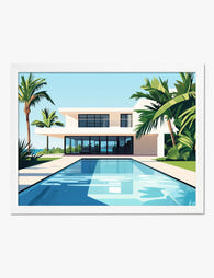
Modern Oasis Retreat Art Print
Translation missing: en.products.product.sale_price From £11.95£19.95 -

Modern Oasis Retreat Art Print
Translation missing: en.products.product.sale_price From £11.95£19.95 -

Coastal Shell Study Art Print
Translation missing: en.products.product.sale_price From £11.95£19.95 -
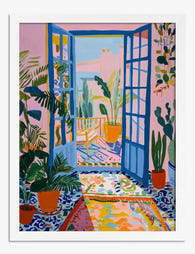
Matisse-Inspired Sunroom Art Print
Translation missing: en.products.product.sale_price From £11.95£19.95 -
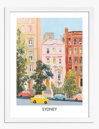
Pastel Sydney Streetscape Art Print
Translation missing: en.products.product.sale_price From £11.95£19.95 -

Mediterranean Coastal Lane Art Print
Translation missing: en.products.product.sale_price From £13.99£19.99 -

Brisbane Botanical Vintage Art Print
Translation missing: en.products.product.sale_price From £11.95£19.95


More from The Frame

How to Create an Edinburgh Gallery Wall That Ac...
Edinburgh is a city built for gallery walls. The dramatic skyline, the moody stone architecture, the sudden bursts of colour in Dean Village or the Grassmarket. The problem is that...

How to Create an Escher Gallery Wall That Actua...
Most gallery wall advice assumes you're hanging family photos or breezy abstract pastels. Escher is a different beast entirely. His tessellations and impossible architectures carry so much visual information that...

How to Build a Cityscape Gallery Wall That Tell...
A gallery wall of cityscapes is one of the few decorating projects that gets better the more personal it becomes. The cities you've lived in, the skylines you've watched from...